


Type on the Grid
For many students and educators, The Bauhaus has become a symbolic point of entry to art and design education. The precision of the grid in design and architecture was made relevant through studies at The Bauhaus. In Ellen Lupton's The ABCs of (triangle, square, circle) The Bauhaus and Design Theory, the movement is credited as being "the mythic origin of modernism" as founder Walter Gropius and László Moholy-Nagy were devoted to creating a "universal language" and embraced methods of mass production (Lupton and J. Abbott Miller, 2).
The grid is utilized in all areas of design as a structure upon which forms can be precisely placed, reflected, balanced or imbalanced. The grid is the invisible underlying structure that sustains the relationships between all formal elements in print design, interactive design, industrial design, architecture, fashion, and more. Its origins are established in the High Neolithic Era (4500 - 3500 BCE), according to Joseph Campbell who defines the grid as "a geometrical organization of an aesthetic field." While the origin of the grid as an organizational structure precedes the Bauhaus art movement and institution by more than 5,500 years, the Bauhaus movement perceived the grid as not only an organizational structure, but as a structure that could be easily multiplied and reproduced. By understanding the relationship between the grid and the organizational requirements of automation and mass replication, The Bauhaus is responsible for design solutions utilizing the grid that became popular in the 1920s and is still noticeable today.
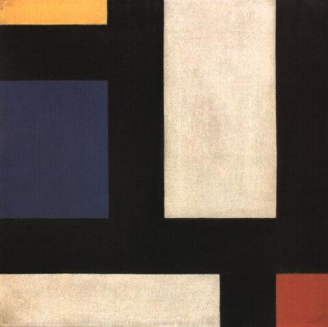
Image Caption: Counter-Composition IV, Theo van Doesburg, oil on canvas, 1924.
Piet Mondrian and Theo van Doesburg created oil paintings of grid structures that illustrate the foundations of Modernism. Mondrian was a Dutch painter who contributed to the De Stijl (in English, "The Style") movement founded by Theo van Doesburg. Although neither Mondrian nor van Doesburg were masters at The Bauhaus, Bauhaus members were aware of De Stijl and influenced by contemporary art movements. These grid-compositions have been an inspiration to artists and designers who rely upon the grid as an organizational design asset.
While the black and white paintings with brief areas of vibrant hues in primary colors appear to be simple horizontal and vertical intersections, the renderings might allude to a city map, an electrical circuit board, or an abstracted blueprint. The negative space in the composition can be perceived as the windows of tall buildings. The grid is understood as a layout or a supporting structure while these compositions are the essence of the often unnoticed foundations of modernity. Formulating an abstract concept from simple lines and planes is a practice in translating visual cues into language-based meanings. It is the goal of any visual communicator to learn to do this as both the reader of the message and the generator of visual content.
Preview: Here is what you will make in the following exercises

Exercise 1: Using guides to create a grid
1. Create a new document by choosing File > New. Use File > Document Properties to set the document size to 8.5 by 11 inches (US Letter).

Choose File > Save As and name the file the_grid. It will automatically be saved in SVG file format.

2. Rulers can be turned on or off. They appear at the top and left side of the document window. If the rulers are off, turn on the rulers by choosing View > Show/Hide > Rulers. If your rulers are not measured in inches, Choose File > Document Properties and select the Page Tab under General to change the unit of measurement.
3. In this step we will create guides by clicking the mouse within the rulers of the document and dragging the new guides onto the page. Guides are available in Inkscape. They are always dragged from the rulers onto the page. Guides are used to make the page into a visible grid, which is useful for aligning compositional elements such as text and graphics. The grid occurs when two guides (one horizontal and one vertical) intersect. The grid is used for assessing the relationship of the formal elements within the composition (images and text) to the positive and negative space (where other elements are and where there is nothing but empty space).
Click on the Selector tool, then place your cursor within the ruler area at the top of the document. Click on the ruler and drag the mouse in a downward motion. A guide will be set in place when you release the mouse. Release the first guide at 5 inches on the ruler against the left edge of the page.
| Watch Out! If you release the mouse too soon, guides will be made in places where you don't want them! |

4. Repeat this step for the vertical guide, by pulling from the vertical ruler from the left edge and releasing the mouse at 4 inches on the ruler against the top edge of the page.
Exercise 2: Lines
Lines can be thin or thick, bumpy or smooth, dotted or solid, or straight or curvy. A line is the result of connecting any two points on a plane. In this exercise we make a straight, thick, black line. In later chapter exercises, you will create lines by alluding to them with repetitious single forms or by the gaze of the photographically reproduced subjects within the composition. Lines can be used to provide direction, to separate parts of the page, or to support elements on which images or typography rests. Many of the typographic visual references from The Bauhaus (1919 - 33) include heavy lines that are used to separate areas of the page and provide direction for the viewer's gaze. Notice that while the line we will create does separate the headline from the body copy on the page, it does not cut the page into two distinct parts by running from edge to edge of the document. By leaving negative space at the left edge of the composition, this line creates negative space that pushes the viewer's gaze towards the body copy within the composition.
1. Click on the Bezier (Pen) tool. Click a point on the Canvas, release the mouse then move it to a new location and click again. You will have created a line. Press the Enter or Return key to finish drawing your line segment. Create a new straight line across the horizontal guide. Pressing the Control key will keep the line restricted to a horizontal or vertical movement.
2. If you want your line to be black, then select the Selector tool and click the line. You will know that it is selected by the transform arrows that appear on the corners of the line segment. Choose Object > Fill and Stroke, then select whatever fill and stroke colors you desire. Click on the Stroke Style tab and choose the width to set the weight of the stroke.


4. Adjust the line so that it begins at about an inch into the page from the left edge by using the Selector tool. The line may extend beyond the page edge on the right side. Anything that is outside of the page, represented by the black frame of the Canvas, will not be printed.

5. Deselect the line by clicking anywhere on the Canvas outside of the transform arrows surrounding the line with the Selector tool.

Exercise 3: Using the Type tool to create a headline
Headlines are typically larger than body copy and maintain a heavier weight on the page than most other elements. The scale of the headline often relates to the scale of an accompanying photograph or illustration (it may be the same width or half of the width, for example, as a photograph on the front page of a newspaper). System fonts (the fonts that are installed on all computers, such as Arial, Chicago, Times, New York, and so on) are usually reserved for the body copy on web pages; and they are not typically used as headlines. For print designers, it is a good idea to stay away from system fonts! Web designers have to rely on them for body copy. Display fonts (ornamental fonts, such as those that are free to download on http://chank.com/freefonts.php) are not legible enough to be used for body copy, but are often selected for headlines as they tend to be more ornate. Sans serif type was first invented by William Caslon IV (1816) and was reserved, as John Kane writes in his A Type Primer, "almost exclusively for headlines" (36). Using a sans-serif font for headlines is not a rule, but often commands attention as they are sleek and authoritative in comparison to serif fonts. In this exercise, Gill Sans was the typeface used for both the headline and the body copy. The ultra-bold font style creates a weighty headline, and the regular variation of the type face is very easy to read as body copy.
1. Select the Text tool in the Toolbox.
2. Click anywhere on the Canvas with the Text tool. Do not drag. Clicking just one time will change the tool into a flashing cursor. When you see the flashing cursor begin typing the headline, "Grid Systems." Inkscape is a smart program, but it doesn't know when you are finished using the Text tool. You have to tell it "I'm done." When you are finished typing your headline, click on the Selector tool. The type is automatically selected as an object and the flashing cursor is gone.
3. Once the type is created, it can be edited. If your type is not selected, click on it with the Selector tool.
4. While the type is selected, choose a font by choosing Text > Text and Font. Choose Bitstream Vera Sans or any other font of your choice under the Font tab.

5. The font size can be edited by typing a number into the font size box or by scaling the type with the Selector tool. To scale the type, click on any of the transform arrows at the corners of the selected type object and drag towards (decreases the scale) or away from (increases the scale) the center of the type while holding the Control key. In this exercise, the headline is 44 points.

6. Use the Selector tool to pick up the headline and move it so that the baseline is within the black line and the S in Systems is just to the right of the vertical guide.
7. Kerning is the space between the letters in a single word. When you set body copy you usually do not have to be concerned with kerning. The digital fonts are created to be well-kerned at smaller font choices (such as 10 - 12 points). However, when working with display text, such as a 44 point headline, the kerning should be studied. Traditionally, the amount of space between each letter should be even.
In this exercise, we will adjust the space between the i and r in Grid and the s and t as well as the t and e in Systems. Highlight the letter i in Grid. Click when you see that the cursor looks like a single line so that you are able to edit the word.
| Watch Out: If you accidentally click when the Type tool looks like a T with a dotted-box around it, you will make a new type object. Use the Selector tool to select it and then press the Delete key. |
Once the Text tool is between the i and the r in Grid, press the Option key + the right or left Arrow keys to nudge the letters to the left or right. This is the method of manually adjusting the kerning of the display text in Inkscape. Repeat this for the s/t and t/e in the word, "Systems".
Exercise 4: Creating body copy with the Text tool
Body copy is the content of an article, a book chapter, an essay on a web page, and so on. Body copy should be set within a text box in Inkscape. As body copy is usually set within rectangles, consider the overall shape of text to normally create a rectangular shape on the page. By utilizing a grid system, the production artist controls how many columns of text appear in the final layout.
The artist should be interested in creating legible body copy. Legible body copy is not too big, too small, too lengthy, too short, too light, or too dark. For a considerable amount of body copy (a full article, for example), the copy should be set in columns between 3.5 and 4 inches in length or 35 - 65 characters. This is the point at which many readers begin to read back over the words that they have already read. Instead of re-reading the same words, a 3.5 inch line of body copy encourages the reader to move to the next line of type at about the time that she is ready to move her eyes from right to left.
Assessing body copy is easy: squint your eyes while looking at the printed body copy. The overall grayscale value of the printed rectangle (body copy) should be about 40 - 50%. It should not read as stripes of black against the page. In this exercise we will consider adjustments that can be made if the copy is too light or dark.
| Watch Out: If the final product will be printed, the designer should always take time to assess the printed version of the composition. It is incredibly difficult to assess printed typography on the computer screen. |
1. Create a new vertical guide at the end of the last "s" in Systems.
2. The Text tool will create a type box when you click and drag with the Text tool instead of clicking one time and entering text. Create a type box at about 7.25 inches (vertically), between the two vertical guides. If you want to you can set a guide at 7.25 inches.
In the example we have used a paragraph of "dummy" (or placeholder) text that graphic designers have been using since the 1500s. The text begins with the two words, Lorem ipsum, and is often simply referred to as "Lorem ipsum" (ie. "Put some Lorem ipsum in there for now, we should be receiving the copy in a couple of days."). Lorem ipsum is used as placeholder body copy when the actual text is not available, as the letters within the Lorem ipsum text are more or less evenly distributed. Looking at "dummy text inserted here, dummy text inserted here" repeated enough times to create a block of body copy draws attention to itself as the repetition of such few amount of letters becomes a noticeable pattern. At the time of writing this book, lipsum.com offers Lorem ipsum by the word count, paragraph count, and byte count. Included on the disk is a text file with the Lorem ipsum place holding text used here, but if you have access to the internet and if lipsum.com is still active, you should generate two paragraphs of text.
3. Copy and paste several paragraphs of Lorem ipsum text generated on lipsum.com to your new text box. We used Bitstream Vera Sans at 11 points in this exercise.
4. The body copy pasted into the new text box should be left-justified by default; but if it is not, choose Text > Text and Font and click on the Alignment Left button. While the text is left justified, there is a sharp line created by the single letters in a column on the left side. This line extends to the headline, as it is aligned with the S in Systems. By the property of continuation, a line is made from the S to the body copy on the page. While this "line" created by the left margin is not as literal or heavy as the black line made in Exercise 2, it is just as relevant to the layout as it provides an intersection with the black line, further defining the grid on the page.
5. Leading is the space between lines of type. The body copy is set at 11 points, and the leading is set at 15.2 points. This is traditionally referred to as 11/15.2. Insert the Text tool into any area of the body copy and then press Control+A on the keyboard to select all of the type within this type box. With all of the type selected, choose Text > Text and Font. Under the Font tab, choose the line spacing percentage. In the following two images, the leading has been adjusted and the text box has been resized in consideration of the margin space at the right and bottom of the composition. Notice how opening or loosening the leading creates a slightly lighter grayscale value when you squint your eyes and look at the block of text.
| Although this did not occur in our exercise, two other typographic problems to look out for are orphans and widows. An orphan is a single word that dangles on the last line of body copy, and a widow is a single word at the top of a new column of text, before a paragraph break. These are undesirable type happenings that create imbalance and draw attention to a place on the page where you don't necessarily want the viewer to focus. |
Exercise 5: Using color to direct the viewer
In this exercise, the dot over the "i" will be replaced with a red square. A red square is also placed towards the bottom of the composition, near the start of the body copy. By repeating this form on two parts of the page, a relationship is made between the headline and the body copy. Red is used intentionally to push the viewer"s eye from the headline to the body copy.
1. To create a focal point in the headline, replace the dot over the i in "Grid" with a red square. Removing one part of a letter is easy, but the letter must first be transformed from a line of editable text to a group of shapes. Before we do this, it must be noted that creating outlines of the original type will annihilate editing possibilities on the text object. When creating outlines around a piece of text, it is a beneficial practice to duplicate the text and leave it in the white space outside of the Canvas for reference or later editing possibilities.
With the Selector tool, click on the "Grid Systems" type, then choose Edit > Copy followed by Edit > Paste. Drag the duplicate copy of the text off of the Canvas. Select the original "Grid Systems" type on the Canvas, then click Path > Object to Path.

After choosing "Object to Path" the type will be grouped together, so that each of the single letters would move or be transformed as one whole group.
3. Use the Node tool to delete the dot over the i. The nodes will show up as small gray diamonds or squares when you choose the Node tool; they will turn red when you hover over them and blue when you click to select them. Select the nodes of the dot and delete by pressing the Backspace or Delete key on your keyboard. Zooming in on the type will increase the likelihood of getting this the first time you try it, so don't be afraid to use the Zoom tool or the Plus (+) and Minus (-) keys.
4. Create a square in place of the dot over the eye with the Rectangle tool; hold down the Control key while dragging the Rectangle tool to constrain the rectangle so it creates a square. Change the fill color to a red hue of your choice.

5. Duplicate the square and move it to the bottom of the composition, just above the first word in the body copy, by using the Selector tool and holding the Control key while dragging.
6. While the copy of the square is still selected, go to the W(idth) and H(eight) fields in the Tool Controls bar and scale their values up by 300%.


7. Finally, position the red square in place above the copy at the bottom of the page, to the right of the guide.
Exercise 6: Adjusting shapes with the Node Editing Tool
1. Click on the top left node of the "d" in "Grid" with the Node tool. Notice that the anchor point turns red as you hover over it with the Node tool. Click the top left node of the "d" to select it; it will turn blue. Press the Shift key and click on the node on the top right of the "d" in "Grid" to add it to the selection.
2. With only the top two anchor points of the letter d selected, expand the size of the d's ascender by using the up Arrow key. In this exercise, we pressed the up Arrow while holding the Shift key six times.
