


Color Theory and Basic Shapes
Color has always been present in our natural environment and in art across the world. From the 30,000-year-old Chauvet-Pont-d'Arc cave drawings in southeastern France, where the creators used carbon black and ochre pigments to represent Paleolithic horses, to the Tournament of Roses Parade on January 1, 1954, which was the first national television broadcast in color, color has been a focus of artistic creation.
Artists, mathematicians, and scientists have developed theories of color since the 17th century. Color theories are usually encapsulated in what is referred to as a color model. German Bauhaus school educators Josef Albers and Johannes Itten helped define and expand upon the RYB (red-yellow-blue) color model during the years 1919 - 1923. Albers created a course in color theory that inspired the tutorial in this chapter. College-level art and design students typically complete these color studies using pigment and brushes or Color-Aid paper. However, formal color studies can be executed in the digital environment. In the following four exercises hue, value, and contrast are exploited to achieve various color relationships.
The traditional, analog color wheel utilizes the RYB (red-yellow-blue) color model. In this color model, red, yellow, and blue are the primary hues (what we think of as colors), which can be mixed together to create any other color on the color wheel. Complementary colors are opposite, while analogous colors sit side-by-side on the wheel. A surface appears colored because it reflects some light frequencies while absorbing others. When the pure primaries are mixed together in this subtractive system, the resulting product is black because all light shining on it is absorbed, leaving no light to reflect back to the eye and convey color.
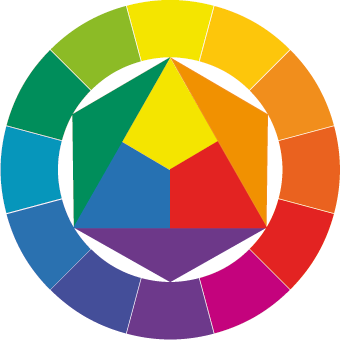
Caption: Farbkreis, Johannes Itten, 1921

We usually encounter digital media as a projection of light or as a print made with ink. Art may be projected on a screen or uploaded to an electronic device such as an iPod, or it may be printed on an inkjet or a four-color press. There are different color models for various display purposes.
The CMYK (cyan, magenta, yellow, and black) color model is specific to the print industry. Artists and designers often create art for high-volume printing using the CMYK color model to synchronize the digital file with the four corresponding printing inks. Even though it is worked on with digital tools and examined via the projected light of a computer screen, this system is also subtractive, meaning overlapping inks create a darker hue.
Television screens and computer monitors do not use ink or paint - they use red, green, and blue light. RGB is an additive color model. Colored light is mixed to create hue and value with red, green, and blue as the primary colors. When the primary colors in the RGB model are mixed together, the result is white.

Caption: RGB Color Wheel
Vocabulary
- Hue is color (e.g. red, blue, green, yellow).
- Intensity, Saturation, Chroma and Brilliance all refer to how much pigment is in a color, which translates to how vivid a color appears.
- Value is measured by how much white or black is mixed with a hue, or, it can be registered as the grayscale equivalent of a color.
- Shades are a hue mixed with black.
- Tints are a hue mixed with white.
- Analogous colors are adjacent on the color wheel.

Homage to the Square, Joseph Albers, 1950 - 1975.
Stamp featuring Homage to the Square, Josef Albers, 1950 - 1975.
Analogous colors are demonstrated on this stamp. Albers began working on this series in 1950 and made over a thousand works addressing the square over the course of 25 years.
- Complementary colors directly oppose each other on the color wheel.

Portrait of Madame Manet On A Blue Sofa, Edouard Manet, 1880, oil on canvas.
Complementary colors are used in Manet's painting to create contrast between the blue couch and the orange wall in the background. Notice how Madame Manet's clothes are neutral, creating harmony between herself and the couch.
Preview

The results of Exercises 1, 2 (top row), 3 and 4 (bottom, left to right).
Exercise 1: Hue has value!
1. Create a new document (Shift+Control+D) in Inkscape in portrait orientation.

2. Using the Rectangle tool (F4), draw five squares on the Canvas. Press the Control key while dragging each square to keep the proportions equal.
3. For each square, choose a fill color of a different hue with different values. Drag the desired color from the Color palette at the bottom of the screen onto the shape. Do not use a stroke. View the Fill and Stroke dialog (Shift+Control+F). Click on the Stroke paint tab and make sure that X is selected so there is no outline.


4. Select all of the shapes by marqueeing over them with the Selector tool (F1) or hold Shift and click each shape with the Selector tool. Press Control+D to duplicate the set. The duplicate set is directly on top of the original. Hold down the Control key and begin to drag the group of shapes downwards. The duplicate copy will only move in a straight line because the Control key is pressed.

5. Select one of the duplicate squares with the Selector tool. Go to the menu at the top and click Effects > Color > Grayscale. This removes the hue from the square and results in demonstrating the value or lightness of the associated hue. Repeat this step for each of the squares in the duplicate set.

6. To observe how the lightness (L) of each shape has an associated value, view the Fill and Stroke (Shift+Control+F) dialog. Click on the Fill tab and the HSL tab below that. You will find a numerical value located to the right of Lightness (L). This is the Lightness value.

7. Rearrange the color-grayscale pair according to the grayscale value, with the closest to white on the right, and black on the left. Select each pair (either by marqueeing with the Selector tool, or by Shift+clicking on one square followed by the next) and drag it left or right in the grayscale order. Be sure to press the Control key once you begin dragging the mouse as this will keep the movement strictly vertical or horizontal.

Exercise 2: Top or bottom?
1. Create a new file in Inkscape in landscape orientation.
2. Use a guide to separate the page into two halves (top and bottom). Position your mouse in the top ruler, and create a new guide by clicking and dragging down from this mouse position. Guides are made by clicking on the ruler and dragging onto the Canvas area. Double-click on the guide to see a dialog box about the guide. Change the value of Y to 4.25. This should center the guide and divide the page in half, horizontally. Then create a new guide by clicking and dragging from the left ruler onto the page (it seems like you are pulling a guide from the left ruler to the right). Double-click on the guide to use the dialog box again. This time change the value of X to 5.5. Now the two guides divide the page into four equal quadrants.

3. Create a 2 x 2" horizontally centered square on the top half of the page by aligning the bottom of the square to the horizontal dividing line. To make the square exactly 2 by 2", draw any sized rectangle anywhere on the page using the Rectangle tool. When the square is created, the second row of tool bars at the top of the interface is used to alter objects numerically. Before you change the width and height, click on the arrow to the right before the "Fill" and "Stroke" properties. Change the units to inches. Then change both the width (W) and height (H) of the square to 2. Now choose the Selector tool and select the square. Move the square into position. It should snap into place.


Using the Fill and Stroke Dialog
4. Colors have three properties: Hue, Value and Saturation. Hue is the name used to define the color. For instance red, yellow, blue, and so on, are hues. Value refers to how much white or black is mixed into the color. Baby blue has white in it, while navy blue has a greater black value. Saturation is the level of intensity of the color. The color of pale winter tomatoes are less saturated than the color of ripe summer tomatoes.
Double-click on the fill color in the bottom of the Toolbox or press Shift+Control+F. The Fill and Stroke dialog appears - this is another way to choose colors. The Fill and Stroke dialog has controls for all three properties, hue, lightness and saturation. Choose a Hue (H) on the top most slider. Then choose a lightness by moving the arrows left or right on the Lightness (L) slider. The further right you move the arrow, the higher the value and the lighter the color appears. The more left the arrows are placed correlates to a lower value so the color becomes darker. Choose a Saturation (S) by moving the arrows left or right. The further to the left the arrows are moved, the lower the saturation. The color becomes more gray. The more right you move the arrows, the higher the saturation value, and the more intense the color becomes.
5. Make sure that the square is selected before choosing a color in this step. Use the Fill and Stroke dialog to choose a hue with a low value for the fill color of the square. Do not assign a stroke.

6. Press Click+Space and drag your square to the left to create a copy. Pressing the Control key after you start dragging will retain it to a movement along the x-axis.
7. Repeat this action to make a copy of the square to the right.

8. Select all three of the squares and Click-Space-Drag them down to the right so that 1 inch of the upper left corner of the new squares overlap with 1 inch of the bottom right corner of the original squares.

9. While all three new squares are selected, assign all of them a new hue with a higher value from the top three. Also choose a higher lightness value so the color has less black in it.

10. Select the left set of two squares (marquee over them with the Selector tool, or click on one then Shift+click the second with the Selector tool).
11. Duplicate the two selected objects using Control+D. While two overlapping squares are selected, choose Path > Intersection (Control+*). Intersecting the two duplicated objects creates a new shape at the intersection of the paths. The overlapping space is the one inch square.

12. Repeat steps 10 and 11 with the middle and right set of squares.
Creating foreground and background depth using hue and value
Now we will modify the color of the middle squares, starting with the left square. The purpose of this exercise is to see how hue and value can be used to create space or depth within a color field. You will set the middle colors to see how that middle square can be pulled forward or pushed back in space, in relationship to the other two squares.
13. For the left set of squares, modify the center square such that it is part of the top square, and both it and the top square are floating above the bottom square. Achieve this by choosing a hue and value that creates strong contrast with the bottom square (you will especially see this at the boundary between the two shapes), and little or no contrast in value with the top square.
14. For the center set of squares, modify the smaller middle square such that it is floating over both of the larger squares. This is achieved by choosing a hue and value that creates strong contrast with both of the other squares.
15. For the right set squares, modify the smaller middle square such that it is part of the bottom square, and both it and the bottom square are floating over the top square. This effect is achieved by choosing a hue and value that creates strong contrast with the top square, and little or no contrast with the bottom square.

Exercise 3: Interaction of values
1. Create a new document in landscape orientation.
2. Use the Rectangle tool to create a 20% gray rectangle that covers the whole page, by using the Fill and Stroke dialog color sliders to set the (K) value on the CMYK tab to 20% and all other sliders to 0%.
3. Open the Layer dialog by choosing Layer Menu > Layers or Shift+Control+L. The gray shape you just made should be located on Layer 1. Lock Layer 1 so that the gray shape does not move while completing the following steps.
4. Create a new layer by clicking on the "+" button in the Layer dialog. Name the new layer Layer 2.


4. With Layer 1 locked and Layer 2 selected or highlighted in the Layer dialog, the following steps will be accomplished on Layer 2.
5. Create Two 3" x 3" squares on top of the gray background. Fill one with white, eliminate any stroke color, and fill the other with black. Place the squares side by side, so that the left edge of one touches the right edge of the other in the middle of the gray background shape.

6. Create one .75" x .75" square in the center of the white square. Fill the square with middle gray, which is 50% black (K).
7. Click-Space-Drag a copy of this square to the middle of the black square with the Selector tool (F1).

Notice how the middle gray squares inside the black and white areas appear to have different values. When values are placed near or on top of each other, we perceive their values as interacting and affecting one another. It is important to keep this in mind when choosing hue and value combinations, as one value will always influence the appearance of another.
Exercise 4: Interaction of hues
And now for the magic trick: in the next exercise three colors appear as four colors.
1. Re-save your Exercise 3 file with a new name using File > Save As.
2. Shift+click to select the two smaller squares and use the Fill and Stroke dialog to assign them the same hue.

3. Select the larger square on the left (in this example, the white square is selected) and assign it a middle value and a complementary hue to the hue you just chose for the smaller square. You can use the Fill and Stroke dialog or the Color palette.
4. Select the larger square on the right (in our example, the black square) and assign it an analogous hue to the hue of the smaller square (ours is green) with a middle gray value. We used the Fill and Stroke dialog to choose an analogous hue, see the screen shot for clarification.

5. Notice that the two small squares look like they are different colors. They are, in fact, the same color, but the presence of the complementary and analogous colors influences our perception. The complementary color emphasizes the perception of the hues, and the analogous color subtracts the perception of the hues. The green square in the middle of the the larger square on the right appears less saturated than the one in the middle of the blue square on the left.
