


Glossary
Various terms used in Scribus and in publishing.
Analog
The concept of an analog object is in distinction to a digital object. It might be the same sort of object (e.g., a thermometer), yet they show information in very different ways.
An analog object presents information often from some physical measurement (mercury level, an electrical signal, ...) which is continuous, and therefore has no predefined smallest unit, potentially of high resolution if precision of measurement is high. Anything measuring natural elements is analog.
The main drawback of analog data is that it is subject to noise and other errors of transmission, after which the quality of the information can be vastly reduced. Also, if one wishes to retransmit analog data, specific methods and signal attributes must be used.
Bezier Curve
In 1962, the French engineer Pierre Bézier invented this process that bears his name to describe automotive parts using computers. Since that time, Bezier curves have become known for being a very powerful and accurate means of describing curves geometrically, and therefore any vector graphics program will make use of them.
The basic principle is to define two points through which the curve passes, each point having zero, one, or two vectors. The vectors then influence the shape of the curve by their length and the direction in which they exert this influence. A longer vector exerts greater influence.
By increasing the number of points and vectors, any kind of complex curve can be represented. If a curve reaches its point of origin, it can become a closed path, in which the vectors at each end influence the adjacent curve.
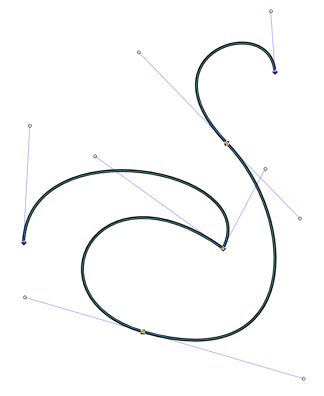
In vector graphical applications, Bezier curves have two main attributes: the description of the curve itself, and then the stroke, which determines color, width, and perhaps pattern or style of the line.
Bitmap or raster
This refers to the descriptive format for graphics and images, in which the picture is described by a series of lines of pixels (monitor) or dots (ink), each pixel or data point representing a particular color. Ultimately, representation of some image either on screen or on paper requires representation as a bitmap. A vector image must therefore be rasterized to be represented in these media. Higher data density (more PPI or pixels per inch, or DPI, dots per inch) will achieve greater precision and fidelity, at the expense of larger files and processing time for manipulation.
Scribus has some internal ability to manipulate bitmap images in various ways (see Image Effects in the Context menu), but also can rely on Gimp for more complex editing. Common bitmap formats are JPEG, PNG, GIF, and TIFF.
Bleed
The bleed is an extra space around the final document margins. Most printing equipment cannot print literally to the edge of the paper. In situations where it is desired that an image or graphical object literally goes completely to the edge of the space, the designer takes the border of this graphical content into the bleed area.
After the actual printing of the necessary inks, the paper passes through a trimmer, which cuts off this excess. Inside the bleed area there may also be other content, such as registration marks and the color palette of the document. Cut marks may be added as well, but your printer may prefer not to have these.
CMYK
This refers to a color space, and also a printing process, using the colors Cyan, Magenta, Yellow, and Black (the K is perhaps from the word Key). By printing layers of these ink colors on paper, one should be able to produce most colors (within the gamut of the color space). In practice, greens and bright orange may pose great difficulty, and even though CMY can produce deepening shades of gray, a true black is never quite achieved. Thus the inclusion of an actual black ink for this purpose.
Color wheel
Scribus offers a color scheme generator, which you bring up by selecting Extras > Color Wheel.
In design you must frequently come up with color choices which satisfy one (or both) of two possible intents:
- finding colors which do not clash with each other, i.e., are harmonious.
- finding colors which offer great contrast
Newton is credited with the first depiction of a color circle, but it was Goethe who offered some further and more pertinent work, particularly in regard to the pleasing and emotional effects of various color combinations. Since then, many others have offered their own refinements, sometimes for specific purposes.
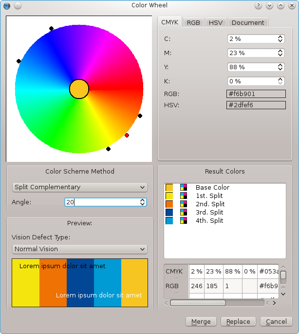
The color wheel offers a visual representation of color showing colors which are close together in hue (analogous), and others dissimilar (complementary). It arranges the primary colors around the circle, 120° from each other, and thus secondary colors midway between each pair of these. In practice, the color wheel allows us to choose among the following color schemes:
- Monochromatic – a single color is chosen for the base, with variants differing in lighter or darker versions.
- Analogous – here our base color is chosen, along with two nearby colors, each the same distance (angle) away on the wheel.
- Complementary – in addition to our base color, we are given its complement 180° away on the circle.
- Split complementary – from our base color, two analogous colors are created, then each of these analogous colors creates its complement, for a total of five colors.
- Triadic – from our base color, two additional colors are selected, each 120° away on the wheel.
- Tetradic (double complementary) – here we have a scheme of four colors, our base color, its complement, a single analogous color one direction or the other around the wheel, and finally its complement.
Also, do not overlook the inclusion of the Vision Defect Type selector at the bottom, where we have a chance to see if our color choices will be perceived in a sensible way by those with various color vision defects.
Digital
As noted in the entry on Analog, data or some measurement may be represented in an analog or digital way.
In theory at least, analog data is continuous, and therefore should not have any limits on its resolution – there may, of course, be limits on the resolution, precision, or accuracy of the measuring device. Digital information, in contrast, will have a finite limit of resolution based on the smallest unit one bit of data represents.
The adoption of the wide use of digital data and information relates to its ease in saving, altering, and transmitting of the binary information, which when combined with standards for some data format, allows for any machine anywhere to interpret the data.
One big disadvantage is that once the data resolution has been set, this remains the limit of the data detail. If we consider creating our data with ever higher resolution, we then face the practical limits of computing power and space to manage such massive amounts of data. We also know that digital systems are fallible at many points, with data loss or corruption as constant threats, yet hopefully as infrequent as possible.
For Computer Graphics, coming as it has out of the digital revolution, we use this digital information, manipulating it mathematically, accepting its advantages and disadvantages.
Editorial Channels
This isn't a commonly used term, but the concept is rather ubiquitous these days: the idea of having content which might be formatted and finalized for some particular purpose (or channel). In Scribus, one might simultaneously create a document for sharing on the web and also for print publication. The former would need to be of a lighter weight, and would require less precision and could have a lower resolution for graphics. Having scripts or specially purposed software for this would be a great time-saver.
Em and En
Em (also called quad or quadrilateral) is a unit of measurement which traditionally referred to the length and width of a block of type. Since in early typography the letter M entirely filled the block, this led to this name. Its size is then determined according to the size of the font being used. In Scribus, you will mainly encounter this in reference to the width of spaces or dashes (em space or em dash).
En is designated as one-half the size of em. Once again, you will encounter this in reference to spaces and dashes (en space or en dash).
Fixed width (monospaced or non-proportional)
Often simply called Mono (short for monospaced), is a combination of glyph and line spacing which each character, including the space from preceding and following characters, has the same width as all other characters. Thus each line of text will have a specific number of characters for its length. A positive result from this is that aligning characters in columns is easy. A negative result is the challenge of alignment of the lines for justification.
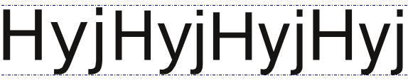
Font size
This is typically represented in points, but what does it refer to? Traditionally, in the time of printing presses using metal type, the size of a font referred to the height of the block of lead alloy for the glyphs, not the size of the glyphs themselves. This is perhaps why two different typefaces of the "same" size may have different heights
For example, here are groups of 3 letters, "Hyj", sequentially using DejaVu Sans, Droid Sans, Free Sans, and Nimbus Sans L, all at 36 points. The spacing between the horizontal guides is 36 points.
Frame (box) in Scribus
This is another traditional typesetting term which applied to the physical frame used to hold the type in printing for alignment and keeping it in place.
In Scribus it is the name of the containers used for text, images, and other graphics. Each type of container can only have one type of content – only text in a text frame, for example. When you convert from one frame type to another, its content will at least appear to be lost, and certainly would not be exported. However, if you might for example convert an image frame with image to a text frame, then later change your mind, you will see your image again when you convert back.
Graphical workflow
This term describes the entire process involved in the ultimate creation of some graphical work which results in the printing of multiple copies of some document. It includes creation, pre-press, and finally the mass printing.
Gutter
This is the name for the space between two columns of text, needed to visually separate the material, and also to give the page some "breathing room", so consider both of these needs as you decide on the width of the gutter.
Halftone and Duotone
Halftone is a printing technique in which, rather than printing an area with color homogeneously, an array of tiny dots of ink of variable size, shape, and spacing is printed. What this accomplishes is an ability to have subtle changes in color intensity, and is particularly suitable for printing photographs. The process can be extended to using more than one ink, giving the impression of an almost infinite array of colors on the printed page.
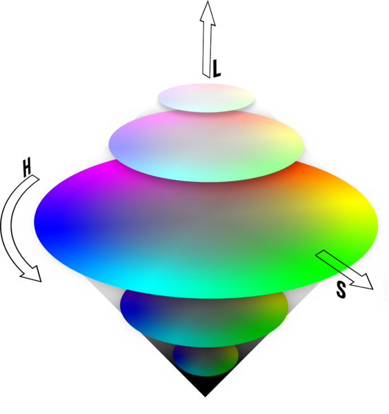
HSV or HSL
Stand for Hue, Saturation, and Value, and Hue, Saturation, and LIghtness respectively. They are not necessarily the same thing, although the lack of standardization means that you may find them used interchangeably.
Scribus uses the HSV designation. Changing the H component will change the hue or color in a circular fashion, while changing S adjusts the intensity of the color. For example, if we consider and RGB color of (0,0,100) and another (0,0,255), the latter will be more saturated and therefore more intensely blue.
The value or lightness is more complex, and in this case consider RGB (0,0,255) and (100,100,255), in which case the latter will be lighter, and in a sense more washed out. At maximum value all colors become white, at minimum, black.
Imposition
When one conceives or reads a book or document, we think of the pages in order: 1, 2, 3, ..., to the end. If we have only 2 pages, we might simply print both sides of a sheet of paper and be finished. For any larger number of pages, and especially if we fold this into some pamphlet (as in the Hands On chapter), booklet, or book, we can see that the actual printing requires some work and calculation to reorder the pages so that when the pages are folded, when the book is assembled, the reader see them in the correct order. This reordering is called imposition.
In a simple 4-page pamplet, made by folding an A4 sheet of paper, we can see that one side of the paper must have page 4 on the left and page 1 on the right, and the other side has page 2 on the left and page 3 on the right.
If we consider a 16-page booklet we might denote the following sequence to indicate the pairs of printed sheets. Here we depict the printing of the front and back side of 4 sheets of paper to create a 16 page booklet after assembly and folding.
16-1
2-15
14-3
4-13
12-5
6-11
10-7
8-9
The actual order in which the sheets of paper are printed would of course depend on the specific printing equipment used. There are also more complicated processes used in the printing of books, in which many more than two pages are printed at the same time on a large sheet of paper, with the complex folding and cutting then occurring afterward. For a depiction of this see Document format: Principles of Imposition.
Layers and Levels
Imagine that you are in design school, attaching various objects to some work you are doing. Since each object is physical, it will either be on top of or underneath some other object in your workspace. In Scribus, this is the concept of Levels, and just as you can reorder this positioning in design, you can reorder it in Scribus. Just as in design, no two objects can be at the same place or level.
Now, imagine that you have a sheet of clear plastic on which you have placed many objects, creating a whole new set of levels. You then take this sheet of plastic and lay it down on top of your original workspace with its levels of objects, another layer of objects. This is the concept of Layers in Scribus, except that your sheet of plastic is virtual and invisible, yet just as with that sheet, you can put it on top of or underneath any of the other layers you are working with. In Scribus, note that you can only work on one layer at a time – this is a useful feature to keep you from accidentally making unintended changes elsewhere. You can also move any object from one layer to another.
Master Pages
Master Pages are pre-formatted pages which have limited content, perhaps a chapter heading or page numbering, used repeatedly in a document, typically a multipage document (you might also use a Master Page in a single page document when you produce different issues or versions). If used for page numbering, you will often need at least two versions, one for right-sided pages, and the other for left-sided.
Offset printing
A major advance in printing dating from the late 19th and early 20th centuries. Prior to that, printing was a very labor-intensive and slow process, either using metal type or lithography. In these two methods, ink is directly transferred from the original material to the paper. In offset printing, the original model in cylindrical shape transfers ink to a cylinder covered with a rubber sheet, which then transfers the ink to paper. The rubber allows for more intimate contact with the paper and therefore is of high quality. Furthermore, prints can be made in large quantities without degradation of the original, and therefore costs are much lower.
Only rotogravure or photogravure will produce higher quality images in quantity, but due to the cost of this process, one needs to make a very large number of copies for this to be economically advantageous.
Paper
If you visit a printing operation, you will see that paper comes in an amazing array of sizes, colors, and thicknesses. Outside of the realm of professional printing, we are mostly familiar with some standard sizes of paper, formerly used in typewriters, and now in the printer we attach to our own computers.
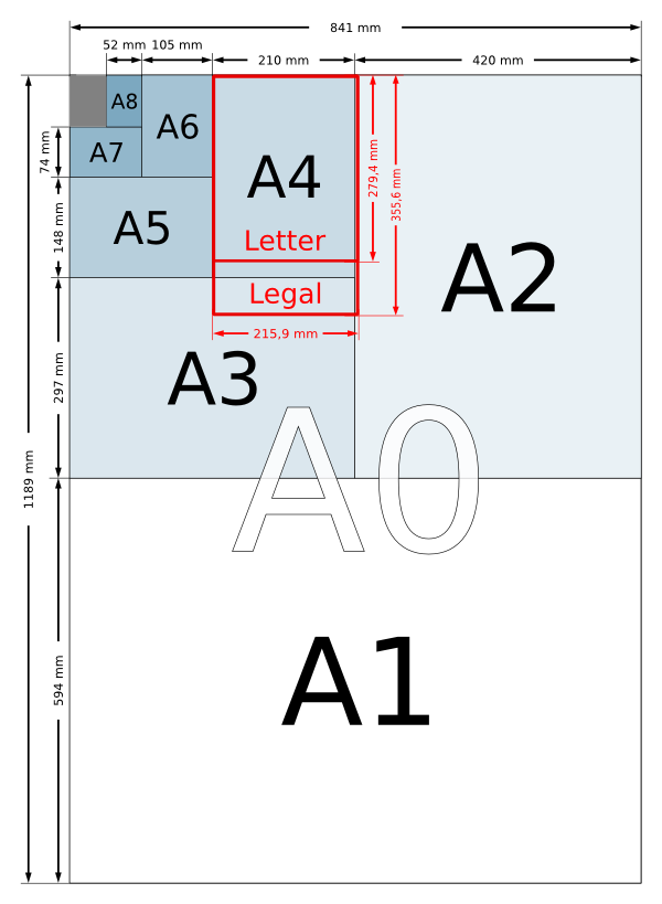
Internationally, the A series of paper sizes takes precedence. It was developed in 1922 by German engineer Walter Prostmann, with the design principle that the ratio of the length to the width is equal to the square root of two (approximately 1.414213). The importance of this is that when you fold or cut such a sheet in half, you create two sheets half the area, but having the same proportions as the original.
Thus, in the diagram below, we see that A4 is half the size of A3, A5 is half the size of A4. What this leads to in design is greater ease in resizing a document, since the pages' proportions are the same.
In the US and Canada, for historical reasons, US Letter and US Legal sizes remain the standards, and their relationships to the A series are also shown.
Proofs and proofing
The word proof comes from the German Prüfung, meaning test. Thus, the term refers to a test printing of the final product to judge various aspects of the creative and printing process, in particular the fidelity of colors as they were originally conceived. Some printers may request an actual signature on the proof before they will proceed with the production printing. In these situations the signed proof is something of a contract for the printing services.
Proportional spacing
In contrast to fixed width or monospacing, proportional spacing adjusts the width of glyphs and surrounding space in order produce a pleasing effect and improve readability. For example, the glyph for "i" does not require as much space as "m". In many cases proportionally spaced text will require less total space than the same monospaced text. A given proporional font may have variants: a regular, a condensed (narrower), and extended (wider).
Pull quote
This refers to some selected text which you copy from or pull out of the main body, then enhance it, perhaps by enlarging the font or making it bold. In Scribus, you would most likely create a new text frame, then strategically place it for the desired effect.
RGB
A colorspace made from the light colors Red, Green, and Blue, used for screen display, video, and stage lighting. In contrast to CMY(K), light colors are additive, and the maximum mixture of all three should be white. They are also similar to the particular wavelengths of light which the various cones in the retina can respond to.
While adjusting RGB values is simple and intuitively easy as a process, it can be cumbersome when one is searching for a particular result, and therefore many prefer using the HSV (hue-saturation-value) method for adjusting RGB colors.
Scrapbook (in Scribus)
Scribus can store sets of arbitrary objects of all types it supports in a library called Scrapbook, which can be saved in an external file. It is a practical addition to tools and templates, to be used for editable objects, recurring elements in the layout, or to prepare standard content.
Spacing
Space between characters in typography. Spacing is fixed in monospaced fonts, but especially in typography one is more often using proportional fonts, in which the width of characters varies in some relationship to em (the width of the letter "m"). There are two types of spacing: group spacing, which are the general rules for all characters in the font, and kerning, which applies to the spacing between character pairs. In some cases letters may combine to form ligatures, which are a single character/glyph (æ, œ, ff, fl for example).
Spot color
These are mostly proprietary inks having a particular color, and thus not requiring a mixture of CMYK for their appearance in a printed document. Some spot colors, such as gold or silver, cannot be represented in the CMYK colorspace, thus their utility.
To use a spot color you must be sure that the color exists and is available to your printer. If not, there may be an opportunity for a digital emulation of the color.
Scribus has a number of spot color palettes, as permitted by the patent holder of the ink.
Typographic color
Typographical color is the subjective impression produced as one sees the relative darkness of a block of space on the page consisting not only of the text itself, but any spaces between letters and lines.
Some examples are shown in the section Composing:Typographic Color.
The particular factors which contribute to typographical color will be the font used, its weight, adjustments to height and width of glyphs, spacing and kerning, line spacing, and justification. One may also get an impression of the homogeneity of this gray, perhaps disrupted by excessive gaps between words or letters at some locations.
Vector graphics or images
In addition to a bitmap representation of images (described above), there are also various vector formats, in which images can be described by geometrical formulas. Bezier curves would be considered a kind of vector format, and may be incorporated into some vector drawing.
In contrast to a bitmap image, a vector image has no inherent resolution, and therefore should show crisp detail even at higher magnifications. Therefore, the final detail is limited only by the display or printing device.
The main drawback of vector graphics will be seen where there are subtle and gradual changes in color or shading, often the case in photographic images, for example. This is why digital cameras typically use some bitmap format – in addition, of course, the photodetectors are arrayed in a raster format, so saving in vector would require a conversion.
Common vector formats useful in Scribus are SVG, PS or PostScript, EPS, and AI.