


Trusting your eyes
Font design is the process of iteratively testing the individual choices that collectively add up to a complete design. You will be testing your font to see if the combination of decisions you have made:
- allow you to read the font
- make the font feel right to you
- make the font useful for the the jobs you want the font to be able to do
As you test the design, trust your eyes. Much of type design requires that you make letters similar and that you repeat forms.
It is tempting to assume that if you measure the parts and the spaces between the glyphs, then you will get reliable results. While very useful, this approach has real limitations. You should expect to make adjustments if something looks wrong to you. Furthermore, you should feel confident that making changes until it "looks right" is the correct thing to do.
The reason this is true is that there are a number of natural optical illusions that all readers are subject to. These illusions must be accounted for by altering the shapes of letters until they look right to you.
Examples of illusions
Some illusions involve the perceived weight of lines, some involve the perceived length of lines, and others involve the eye's perception of shapes.
Horizontal versus vertical weight
The example on the left shows an H which is composed of bars which are precisely equal in in thickness. This looks wrong. This example on the right has a horizontal bar which has has been thinned to appear equal in thickness.
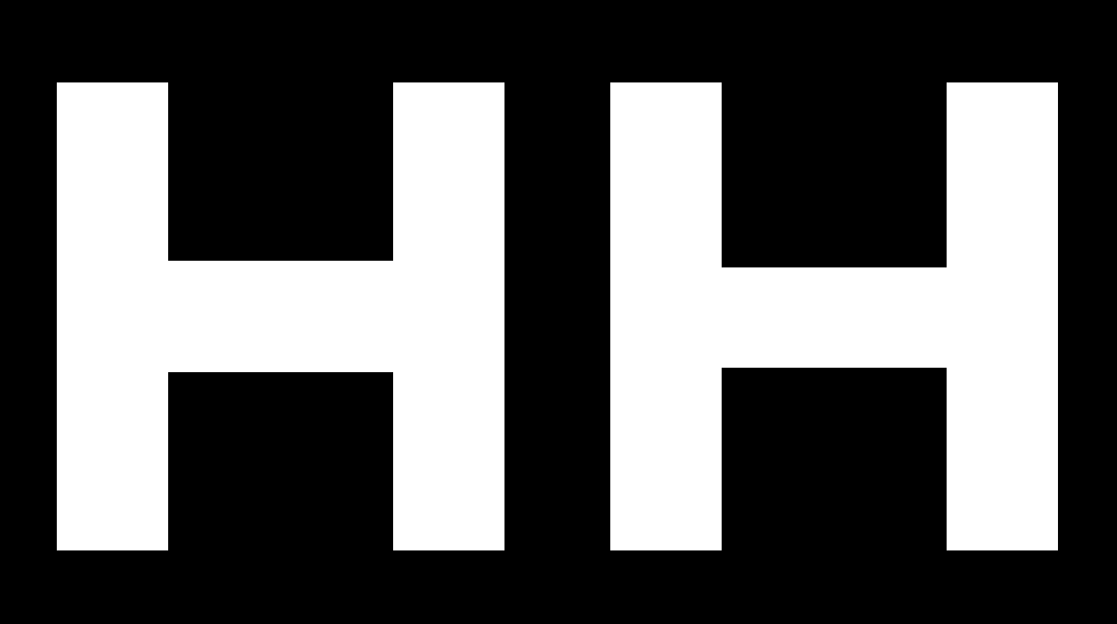
Glyphs in which this illusion is relevant are numerous and include A, E, F, L, H, f, t, and z.
Diagonal thickness
Similarly, if you have bars of the same width and one of them is set at a diagonal, the diagonal bar will seem slightly heavier than the vertical bar and slightly thinner than the horizontal. If you want it look right, you will have to adjust it to be lighter like the horizontal example, but just a little less.
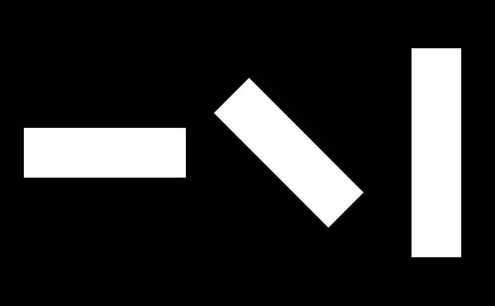
Glyphs in which this illusion may be relevant are quite numerous but include k, K, N, Q, R, v, V, w, W, x, X, y, Y, 7, 2, &, ł, Ł, ø, Ø,√, ∕, ‹, ›, «, », ½,⅓,¼, ≤, ≥, and ×.
Length and perceived diagonal angle
Longer shapes need to slant less than short shapes in order to give the appearance of same slant.
The image below has diagonal lines that are all at the same angle. The long one appears to be at a different angle.
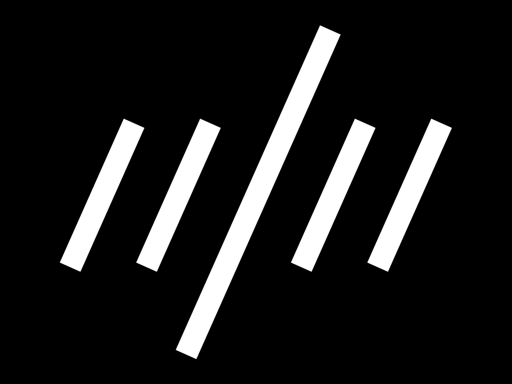
In this next example, the slant of the longer line has been adjusted:

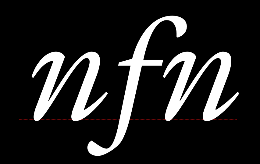
Next, in this image of an actual italic, you can see this principle applied to real type.
Crossing diagonals
When a bar crosses another diagonal or a straight line, if it isn't adjusted then it will apear to be misaligned.
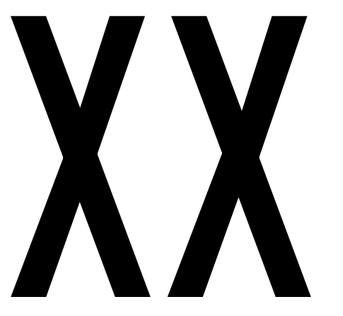
In the example above, the X on the left has two unadjusted bars crossing each other. The example on the right has been adjusted so that they appear to be aligned.
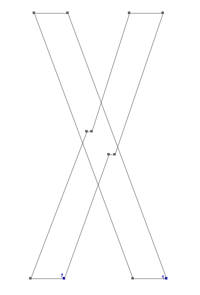
As you can see in this outline view, the X that appears visually aligned involves an offset.
Glyphs in which this illusion is relevant include x, X, k, K, ×, #, and the icelandic letter 'eth' (ð).
Perceived height
The shape of a glyph will contribute to how high it needs to be in order to look as if it is the same height as the other glyphs. Round glyphs need to overshoot the height of flat glyphs by a little bit. Glyphs which have pointier shapes will need to overshoot more. The sharper the shape, the more it will need to overshoot in order to look correct.
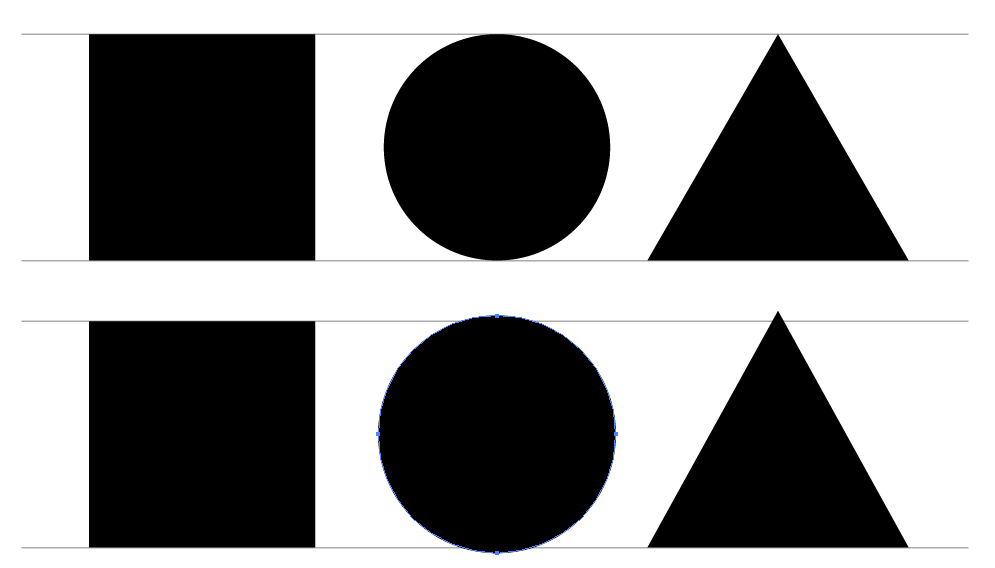
In the image above, the top three shapes are unadjusted -- that is, they have identical heights. The three shapes on the bottom have been adjusted so that appear more similar in height.
This illusion is relevant for any glyphs that have parts which are either round or pointy. Examples include O, Q, C, S, A, V, W, and so on.
You are fully qualified to correct for these illusions
Because you can see both the illusion and the effect of correcting for the illusion, you will be able to make these corrections for yourself. You just have to trust your eyes.
Test for fitness of purpose
Just as you are able to see illusions and correct for them, you are also able to see if a font is working for the specific use (or uses) you may have in mind. You should also trust that you are able to see if the font works well for these purposes.
Quite separately, it is worth noting that no font can be evaluated apart from the way it is used and what it is used for. This is why it is essential to begin testing from the very beginning of the design process, and to continue testing until you feel the project is done.
What will these tests be like? The tests will be simple at first, allowing you to test the first design choices. As your design becomes more complete, your tests will need to keep pace and let you evaluate the relative success or failure of the newest choices you have made -- or, even better, to compare two (or three, or more ... ) options you are considering.
Sometimes you will find you have to double back and change a design choice you thought was already working well. This is normal. Making a font requires balancing many variables, and surprises often occur. The more you design fonts, the less often you will be surprised but surprises cannot be eliminated.
Near the end of the process, if the font will be used in a simple way, the tests may also have stayed simple. However, if a font will be used in many ways or in a wide range of printing or screen environments, then it should be tested across that range of situations. Similarly, a font that will be used in complex documents should be tested in documents that simulate that use.
It can save you design time to have a well defined idea of the final use you intend. However, this is not always possible and your ideas may evolve. The key thing is to think about and define this use as completely as you can, then to ensure that your tests keep pace with the questions you are asking yourself in the design process.