


Inkscape Interface
The Inkscape interface is constituted of elements designed to make work simple, harmonious and contextual. It is composed principally of a single window in which one creates and manipulates drawings. Within the window, lie particular components which this chapter will identify, enabling readers to easily navigate the software.
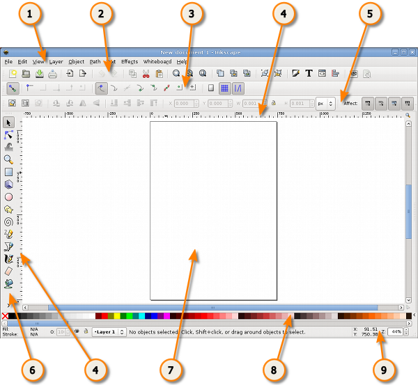
We may divide the window into nine major areas:
- the Menu (at the top of the window)
- the Commands Bar
- the Snap Controls Bar
- the Rulers, Guides and Grids
- the Tool Controls Bar (also called just Controls Bar)
- the Toolbox
- the Canvas
- the Color Palette
- the Status Bar
The many toolbars that are available in Inkscape can take up a lot of visual space on your screen. To reduce the toolbar size. Use File > Inkscape Preferences... then select the Interface option. Here you can individually set the Commands Bar Icon Size, the Tool Controls Bar Icon Size and the Main toolbar Icon Size.
The Menu
As in most GTK applications, the Inkscape Menu contains the essential functions of any program, those which concern the application itself: New, Open, Save, Export, Quit, etc. The Menu also consists of functions related to drawing.
The Commands Bar
The Commands Bar is located at the top of the workspace directly underneath the Menu. It contains icons which are shortcuts to commands otherwise accessible from the menus or shortcut keys. It also houses other controls for manipulating the document and drawing objects. For example, from the Commands Bar one can open a new or existing document, print, import an image, undo previous commands, zoom, open the dialog to adjust document properties, etc. Hovering the mouse cursor over each icon will display its functions through tooltips.
There may be an arrow on the right side of the Commands Bar pointing down. Clicking this will reveal any command shortcuts that unable to fit on the bar due to monitor size or resolution settings.

The Toolbox and Tool Controls Bar
The Toolbox, consisting of vertically aligned buttons located on the left of the window, is Inkscape's main editing control. It contains the basic set of drawing utilities, particularly those for creating and editing shapes. There are controls for geometric shapes as well as free-form shapes and lines, text, and fills (colors and gradients).
Located directly under the Commands Bar is the Tool Controls Bar.

Selecting a tool in the Toolbox changes the Tool Controls Bar to show particular options associated with that tool. Depending on context, some of these options affect a selected object while some take effect only when drawing a new object; others can affect either existing or new objects.
The Canvas
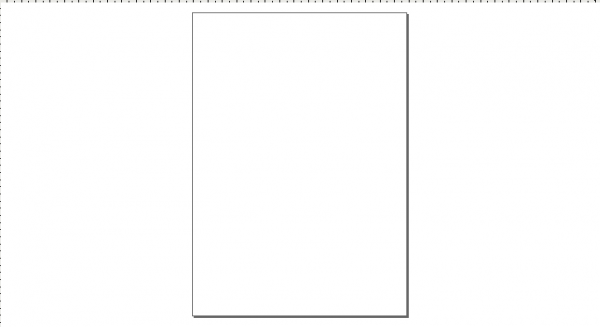
The Canvas is the main workspace. It is the most central and important part of the interface since a user creates and views drawings there. It occupies the middle of the window and is represented as a blank "page" surrounded by open space. By default, rulers measuring pixels (the standard SVG unit) run above and to the left of the Canvas, but one can adjust these defaults (ruler visibility and unit) in Document Properties.
While the "page" defines the boundaries of a document intended for certain media (print, export, etc.), the page boundaries do not limit the actual SVG image. In fact, users may make the page border and shadow invisible in the Document Properties. Some artists prefer to use a particular page boundary and use the white space as "scratch paper"; others prefer not to be limited by page boundaries.
Rulers
The Rulers are graduated lines placed on top and left of the canvas. The first is called "horizontal" and the second "vertical". Graduations represent distances and are expressed in units that can be set in the Units option of the Page tab of the File > .
When the mouse is over the canvas, two triangles appear in the rulers to show its X and Y coordinates, relative to the page's bottom left corner. Those coordinates are also displayed in the Status Bar (at the bottom of the document window) on the right, near the Zoom Control.
Ctrl + R is a quick way to hide or display the Rulers. One can also do that with the View>>

Guides
Guides are user-defined 'magnetic' lines. Using Guides makes object alignment easy even with the mouse. To use Guides, click and drag from the Rulers to the point where the Guide is to be inserted and release. Clicking and dragging from the horizontal Ruler produces a horizontal Guide. Clicking and dragging from the vertical Ruler produces a vertical Guide.
How to use
Moving Guides
When the Selector Tool F1 is active, passing the mouse over a Guide will change its color to red. Then, click and drag the Guide where you want.
Deleting guides
To delete a guide, just drag it to the appropriate Ruler with the Selector Tool F1
Guide Visibility
To make Guides invisible, without deleting them, select View > from the Menu Bar. The keyboard shortcut for toggling Guide visibility is Shift | (hold shift and press the pipe - | - key, which is usually paired with the backslash key.)
File > lets you define if Guides should be displayed by default, and the color of both the Guide itself and the highlight when the mouse is passing over.Guides are also often used with snapping making it much easier to place objects on the canvas, especially for precise or technical drawings. In this case just check the checkbox.

Grids
Instead of using lots of Guides, it can be useful to activate Grids. Do this with the View > menu or press # (Shift + 3 ).
Grids are of 2 types : rectangular and axonometric. They can be defined in the window from the File > menu. Most commonly used is the rectangular Grid which is made of vertical and horizontal lines.
Axonometric Grids allow the user to define any kind of angled Grid which can be interesting for technical or architectural drawings.


How to Use
Use the drop down list in the "Document Properties" dialog to select which type of grid to use then click the "New" button. A new tab is created under "Defined grids" (several grids can be defined for a single document). Then define the units you would like to use and both the Origin point and the distance (Spacing) between two lines of the Grid. When using Axonometric Grids there is also the option to define the angle of two grid lines.
Enabled
Tick the box to use this grid in the current document. Can be left 'on' in invisible grids to maintain snap to grid controls.
Visible
Tick to display the grid on the canvas. Switch off to make the grid invisible. This option sets the default value for each grid so that even if Visible is ticked here, it is still possible to toggle View Grid on and off via the menu or by hitting the # key. If the View > Grid menu is unchecked, the grid won't be visible on the canvas even if "Visible" is checked here.
Grid Units
Many commonly used units are available from mm, to feet and px. Choose the one that best suits your needs. If no special needs, keep the default px.
Origin X and Y
Defines the beginning point of the Grid. Usually set to '0' (zero) it can be useful to change these if an offset is needed, especially to define margins from the edge of the Canvas.
Spacing X and Y
Defines the space between two lines of the Grid. These spaces can be different for horizontal and vertical lines so that the Grid pattern can be set to any kind of rectangle.
Angle X and Z
Only available for Axonometric Grids. Defines the the angles for the Grid Lines on the X and Z axes.
Grid line color
The default color for the Grid is blue, but this can be changed here. There are two kinds of line. The most often used is the Grid line, but when the grid spacing is short and many lines are displayed the Major Grid line helps to evaluate distances. In this case a different color can be defined for each type of line and the frequency of the Major Grid line can be set (usually 5 or 10).
Show dots instead of lines
Available on Rectangular Grid Only. Since lines can overload the screen, it can be uneasy working with Drawing Tools when the grid is visible. This option toggles between lines and dots for displaying the grid, creating a less overloaded screen.
Snap Controls Bar
The Snap Controls Bar gives easy access to object snapping enabling you to quickly turn snapping on when required and the off when finished. It also allows customisation of the snapping feature letting you select what can be snapped and what objects can snap to.
Color Palette
The Color Palette is a quick way to apply color to shapes. It is displayed at the bottom of the Canvas, or can be opened in a window by selecting > ( Shift + Ctrl + W )
How to Use
To find the color you like, just scroll along the swatch line and choose. You can change the color palette with another preset by clicking the triangle at the right of the bar and choosing one.
To apply a color to a shapes "Fill color", just click on a color after selecting one or more shapes.
To apply color to the "Stroke", press Shift while clicking and it's done.
Status Bar
Status Bar is the bottom-most area of the Inkscape interface. It includes (from left to right) :
- Color indicator for the object
- Quick layer selector
- Help message area
- Mouse Coordinate indicator
- and finally a Zoom Factor in which one can write the exact zoom factor they want to use.