


Tonal Scale
The tonal range is the change in value from black to white. It is the set of grayscale information in an image. Sometimes tonal range must be adjusted so images have a full range of values in the shadows, midtones, and highlights. Adjusting the tonal range addresses these common problems.
| Watch Out: All monitors are different. If you consistently see a color cast in all your images and in an area you know to be a neutral gray use the buttons on your monitor to calibrate it until the monitor can display a neutral gray. |
1. The image is too light or too dark. There may be a lot of detail in the light areas or in the shadows that can be made visible or printable through an adjustment.
2. Contrast is too low or too high. A low-contrast image has a flat tonal range. A high-contrast image has very light highlights and very dark shadows, and very little detail in the midtones.
3. The image displays a color cast - evidence of a hue in areas that should be neutral gray or white.
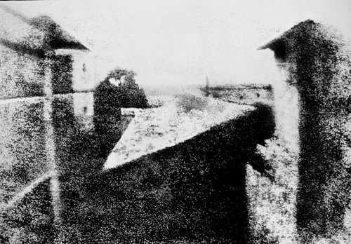
View from the Window at Le Gras, Nicéphore Niépce, 1826, Saint-Loup-de-Varennes, France. Captured on 20 x 25 cm oil-treated bitumen. In this first recorded photograph, the exposure time was 8 hours! Notice the limited tonal scale due to such high contrast among the dark and light values.
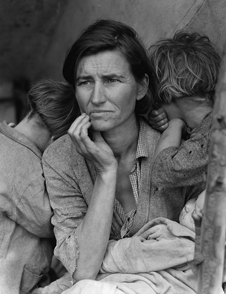
Migrant Mother, Dorothea Lange, 1936. Silver gelatin print.
This photograph was commissioned by the Farm Security Administration (FSA). Florence Owens Thompson looks towards the future with worry, as her children bury their heads into her shoulders. The FSA was part of The New Deal, a set of programs initiated by Franklin Delano Roosevelt to stimulate and revitalize weak economies from 1933 - 1938. The FSA hired photographers, such as Lange, Walker Evans and Marion Post Wolcott to document America after the Great Depression. Notice how the range of tonal values expresses the details in Florence's face and the blanket on her lap.
Results of Chapter 8 Exercises

On the left is the original image, on the right is the final image made in Chapter 8 Exercises. Notice minor differences in the contrast and value of the image tones. You should aim for minor image adjustments, not large changes in the tonal range or color intensity.
Before You Start:
You will need to download the following files from http://www.digital-foundations.net/downloads/floss:
rgb-trees.xcf and gray_trees.xcf.
Exercise 1: Minor adjustments to the original file
1. For this exercise, open any image from your digital camera or scanner in Gimp. You may also use the file in the downloads area called rgb-trees.psd.
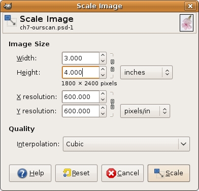
2. If the image needs to be rotated or cropped, make this adjustment now. On our image, we cropped the original image so that it is exactly 3 by 4 inches. Click on the Crop tool icon in the Toolbox, and click and drag over the image. Then use the Crop Tool Options dialog to set the area at exactly 3 by 4 inches. When most of the image is selected, as in our illustration below, press the Return or Enter key on your keypad to finalize the selection size. From the Layer menu, choose Crop to Selection.
3. Use the Scale Image dialog box to review the changes you just made.
4. Choose Tools > Color Tools > Brightness-Contrast to adjust the contrast within the image file.
5. Press Control+Z on the keypad to undo the last step. Press Control+Z again and Gimp continuously undoes previous steps. You can also undo previous steps by using the History dialog. We'll explore the History dialog in the next few steps.
| Tip: The menu item for "Undo" is Edit > Undo. It is almost not even worth mentioning as you will use this Gimp command so frequently that it should be one of the first hot keys you will memorize. |
Exercise 2: Understanding the Histogram dialog
Now we will take a look at the tonal range within the image. This can be done in any color mode, but for the purpose of keeping this process easy for the first time, we'll change the image to grayscale color mode.
1. Click on Image > Mode > Grayscale to convert the image from RGB color mode to Grayscale. Save the file as gray_trees.xcf.
2. Click Colors > Info > Histogram.
The next part of this exercise is to be observant about the value of the light and dark tones in your image.
The Histogram dialog conveys information about the grayscale tones in the document. This is true regardless of whether the document is in color or grayscale, as color images are rendered digitally by compositing separate color channels (red, green, and blue, for example), each with corresponding grayscale values. So once again, the Histogram displays information about grayscale values, even if they correspond to color information. Here's the quick version of how to read a histogram:
The overall graph displays the amount of information within the image (y-axis) at the various levels of gray from black (on the left side of the x-axis) to white (the right side of the x-axis). There are 255 levels of gray in any 8-bit image. Consumer scanners and digital cameras capture 8-bit images. There are professional scanners and cameras that capture 16-bit images, yielding more options for adjusting the tonal range; but for the beginning digital media artist, we will remain focused on 8-bit images.
Look at the histogram below to make the following observations in parts A, B, and C:

Notice the histogram for this image is clipped on the shadow side.
A. Does the histogram start and end at the beginning (dark values) and end (light values) of the x-axis? This would mean that there actually exists image information in the darkest shadow areas and the lightest highlight areas. If the graph seems to end before the edges of the box containing the histogram, the graph is "clipped" and there is no information at one (or both) end(s) of the spectrum. There is probably a noticeable lack of contrast in the image if the graph is clipped.
B. Where on the x-axis of the graph is most of the image information stored? In other words, where are the spikes in the graph? This should make sense in terms of how dark or light the overall image appears.
Imagine in the image above of the histogram that the midway point is where 50% gray occurs in the image. In this image the highest spike appears somewhere between the blackest shadow and 50% gray.
C. Does the histogram have any gaps where information does not exist? This means that there is no image information in areas where gray values between black and white are expected. This is usually a result of "over-tweaking" an image with tonal adjustments, as opposed to something that will be noticeable from a scan or digital camera capture. Sometimes this is a reasonable result of increasing contrast in an image, especially when certain areas are particularly hot (bright or blown out highlights).
In this image, the histogram has no gaps. In the next exercise we will be making changes to the histogram and you will see gaps as a result.
Exercise 3: Adjusting the histogram in Levels
For this exercise we will complete the first step (Levels) on the grayscale image that was used in exercise two, trees_gray.xcf. Then we will use the color version of the file, rgb-trees.xcf.
1. Click Colors > Levels, which is used to control tonal adjustments specifically in the shadow and highlight areas. The Levels dialog box displays the histogram that we just viewed in the previous exercise. At the left side, tonal information is presented for shadow areas, then mid-tones, followed by highlights on the right side. Moving the input level sliders (the small triangles just beneath the graph) to correspond to image areas where there is information on the left and right sides of the histogram readjusts where 100% black and 100% white occur within the image. Tonal manipulations occur as a result of adjusting the numbers associated with each slider. If the objective is to make the image look abstract through high contrast, push the sliders towards each other. If the objective is to make the image seem true to life, the sliders should be used carefully. Adjust the sliders to your taste and click OK.

The image on the left with the Levels dialog box on top of it is the "before" version of the file. The image on the right is the "after" version. Notice that the shadows are considerably darker and it appears there is more contrast between the dark and light areas of image information.'
2. Open any image in RGB color mode (you can use your own color image or rgb-trees.xcf) for this step. Look at the Histogram dialog to see information about the grayscale values in the image.
3. Choose RGB from the Channel pull-down menu in the Histogram dialog to see the histogram for the composite RGB channel. Even though the image is seen in color, the overall scale of gray values should be evaluated. Notice the graphs in the Histogram dialog for each of the three separate channels (ask the same questions as we posed when evaluating a grayscale image in exercise two).

Look at the individual histograms for the red, green, and blue channels. Notice that there is more highlight information in the red channel, while all three channels peak around the same point in the shadow areas. Also notice that the red channel has the most color information across the x-axis while the other two channels have steeper slopes towards the start and ending points of the curves.
Exercise 4: Adjusting the image with the Curves dialog
1. Click Colors > Curves. Once again, the histogram is presented in the Curves dialog box. Curves, like Levels, can be used to adjust the tonal scale within the image.
2. This time, don't touch the RGB composite histogram. Instead, adjust each of the red, green, and blue graphs so that there is image information where the deepest shadows and lightest highlights appear. To do this, start by using the Channel pull-down menu from within the Curves dialog box to select Red. Click on the black endpoint of the line graph and drag it to the right until you reach a point where image information exists.


3. Choose Green from the Channel pull-down menu. Click and drag the black endpoint of the line graph to the point where image information exists.

4. Choose Blue from the Channel pull-down menu. Click and drag the black endpoint of the line graph to the point where image information exists.

5. Click OK. Adjusting the Curves (or Levels, either dialog could have been used for this last exercise) manually for each color channel produces a better result than simply doing this one time for the composite RGB channel.
Exercise 5: Targeting saturation levels
Colors > Hue-Saturation can be used to increase or decrease the saturation of specific hues within the image. This dialog is often used to make a dominant color appear more vibrant within an image, but it is hard to notice if the image is not being viewed at 100 percent. Even then, sometimes it is easier to see the results of this image adjustment in the final print. If you are using the file we provided at the download page you can follow the adjustments that we made on the file to demonstrate this concept. You can use any image for this exercise, but the primary color you select may differ from ours.
1. Click Colors > Hue-Saturation. In the Select Primary Color to Adjust area press the G radio button to work specifically on the green areas of the image.
2. Use the Saturation and Lightness sliders to modify the image. The image below demonstrates our settings, but remember that our monitors may be calibrated differently. It is best to eyeball these numbers, rather than follow our specific settings. Remember, be sure the image is showing at 100 percent (use the Zoom tool to zoom in or out) before making any adjustments.

Exercise 6: Sharpening the image
1. For this exercise, open any image from your digital camera or scanner or open the file called "rgb_trees.xcf" in Gimp. All of our files are available at digital-foundations.net/downloads/floss.
2. Whenever an image is scanned or captured digitally, the process of digitizing a three dimensional reality into a two dimensional file results in a loss of contrast. Unsharp Mask is a filter that is commonly used to compensate for this loss. Choose Filters > Enhance > Unsharp Mask.

This filter looks at edge areas where there is contrast and increases the contrast of those pixels. Be sure that the Preview button in the Unsharp Mask dialog box is checked. Look at the image while clicking on the Preview button. Un-checking the Preview button displays the "before state," checking it reveals what the image will look like after the filter is applied. There are no set rules, but the guiding relationship is between the settings in this dialog box and file size. The larger the file size, the larger you will set the threshold, radius and amount. With smaller file sizes (anything less than 30 megs) you will probably leave the threshold at 0, the radius lower than 1.0 and adjust the percentage by eye between .20 and 1.00. You will know when you've gone too far, the increased contrast will result in an image that looks pixilated and forced. Applying this filter should produce a minor modification.
