Multiple Pages: Tension, Chaos, Disarray
A common exercise in print design is the tri-fold brochure. A tri-fold is one page of paper, folded twice at one-third of the length or height of the printed page. Typically this can be made on a standard letter size sheet of paper in landscape orientation (11 by 8.5 inches). The folded areas can be thought of as "gutters" where you would normally want to avoid placing text. Images can run across a fold, but only if they are much larger than the folded area.
For this chapter, we will use the tri-fold brochure as the platform for an approach to graphic design that resists the rules of the grid. Creating tension with a sense of chaos among type and images was part of the Futurist, Constructivist and Dadaist anti-art aesthetic in the early 20th Century. The urge to stray from the rigid surface of the grid resurfaced in the latter part of the 20th Century when designers took a vested interest in a more subjective interpretation of the content that they were designing. Neville Brody's work on Fuse Magazine and David Carson's Ray Gun Magazine are examples that cannot be left out of this paragraph. It is important to note that although the aesthetics in Brody and Carson's work feel as chaotic as a montage by Hannah Hoch or Raoul Haussmann, the Dadaists (especially the Germans) were motivated by their passionate feelings about World War I and the Industrial Revolution. The designers in the late 20th Century were responding in a visual manner to a sense of stagnation in graphic design.
Carson's work is often referred to as "deconstruction" in graphic design. In Hillman Curtis' documentary short film about David Carson (you can view it here at the time of this writing:http://www.hillmancurtis.com/index.php?/film/watch/david_carson/), Carson says, "When I started doing magazines I just did what made sense to me. I read an article and tried to interpret it...So as we get more computerized, I think it becomes more important than ever that the work become more subjective, more personal...so that you pull from who you are as a person and put that into the work."
Deconstruction is also a philosophical movement led by Jacques Derrida in the 1960s in which the structure of a linguistic system is revealed through a critical analysis of its application. Carson's interpretation of the essays he designed in Ray Gun attempted to expose the underlying meaning of the copy with graphic design. His method of using graphic design to reveal the meaning of a text is similar (albeit by using a different methodology) to Derrida's notion of deconstruction.
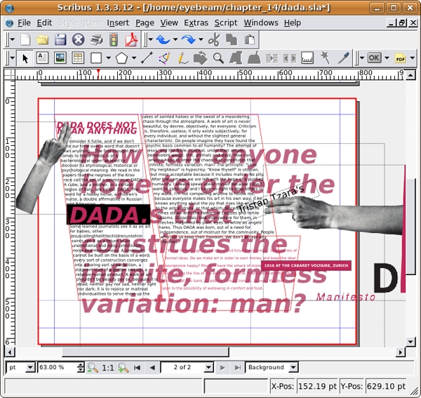
While the trifold is often considered anything but experimental, we will approach it with deconstruction in mind. The copy to design is part of Tristan Tzara's Dada Manifesto (included on the disk and available on the web). The first exercise is the front side of a single page. The second exercise is the layout for the back of the page. When you finish the exercises you can print out page one, turn the paper over, and print page two on the back. Fold the paper in thirds and you will create a trifold. As the design approach is chaotic, tense, and full of disarray, some of the text will be covered by other portions of the type. Images may cover words. Type will be set in narrow columns and hierarchy is established through contrast, scale, and value.
Results of Chapter 14 Exercises
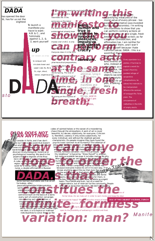
When both exercises are complete, the Scribus file contains two pages. Print page one on a sheet of paper and page two on the back of the same page, then fold the single sheet in thirds to create a tri-fold.
Before You Start:
You will need to download the following files from http://www.digital-foundations.net/downloads/floss
dada-title.png.jpg, dada-manifesto.odt, and hand.png.jpg
Exercise 1: Using images, text boxes, and type to create tension
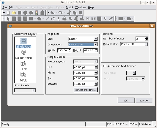
1.Create a new document with 2 pages. Do not check the facing pages or master text frame options. Use letter size set in landscape orientation.
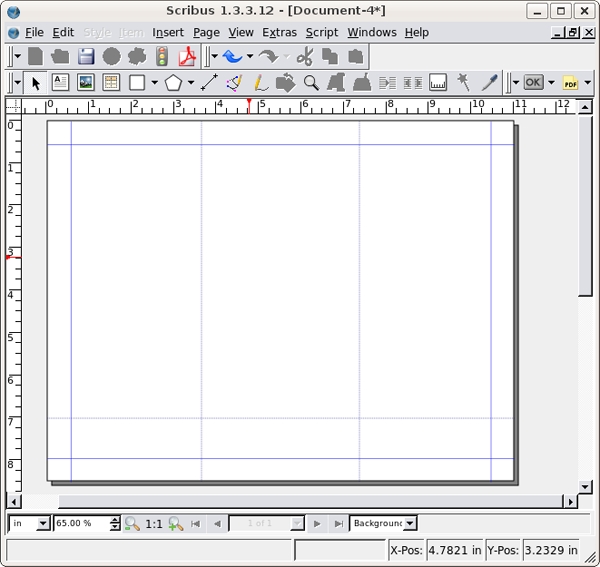
2. Double-click on the Normal master page in the Arrange Pages dialog. Pull two guides on Normal master page from the left ruler with the Selection tool to divide the page into thirds. Add a horizontal guide at 7 inches by pulling from the top ruler.
3. Close the Edit Master Pages dialog. Using the Image Frame tool, draw a blank image frame anywhere on Page 2 (size does not matter).
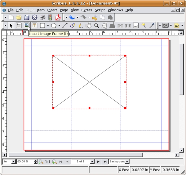
4. Right-click the image frame, and select Get Image... from the contextual menu. Navigate to the directory where you saved dada-title.png.jpg and select it.
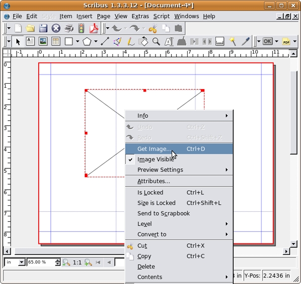
5. The image might not fit in the text frame you created, but don't worry. Right-click the image and select Adjust Frame to Image.
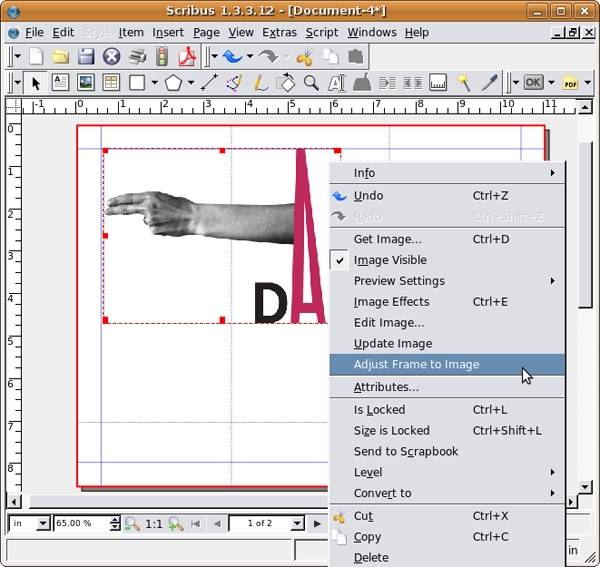
6. While the image is selected open the Image panel of the Properties dialog and select Scale to Fit Frame Size. Now you can resize and reposition the image with the Selection tool. Just make sure to press the Control key during any resizing to keep the image proportional.
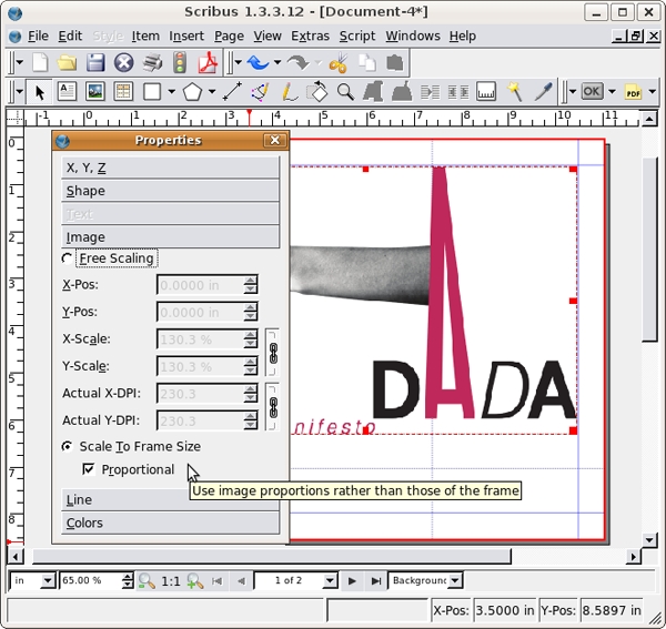
7. On page two, the baseline of the word, "Manifesto" should rest on the guide at seven inches. The "e" in Manifesto will barely touch the edge of the page.
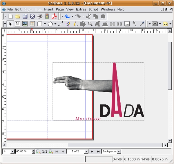
8.Create a text frame and type "Tristan Tzara’s". We used the type face Bitstream Vera Sans in the style Regular at 24 points and leading set at 28.0. For the rest of this chapter we will refer to the font face, style, point size and leading like this: Type face style size/leading. For example, we used Bitstream Vera Sans Regular 24/28.0. Right-click on the new text frame and select Level > Lower to Bottom from the contextual menu. Place the text just beneath the fingers as in the image below. Click on the Rotate tool in the Command Bar and click and drag to rotate the text frame. The rotated text is the only element on this folded part of the page that is not on a horizontal or vertical grid. The rotation creates contrast. Even though the letters are partially hidden beneath the fingers, the viewer is directed to the typography. Contrast is created due to the break in repetitive use of the grid.
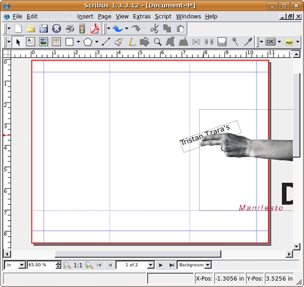
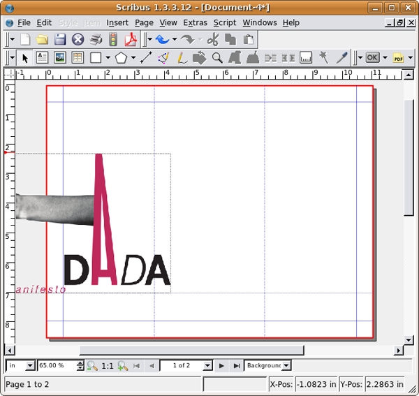
9. Click on the title graphic and press Control+C to copy it. Scroll to Page 1. Paste using Control+V. The graphic is now in the same position relative to both pages. On page one, press the Control key and use the Selection tool to move the graphic to the left margin. Notice where the letter "e" in "Manifesto" is in relation to the left margin.
10. Create a new text frame on the Canvas, outside of the right margin on page one. Right-click the text frame and select Append Text... from the contextual menu. Choose the OpenOffice document, "dada-manifesto.odt." The Open Document Importer Options dialog opens - leave the defaults in place and click OK. If the program prompts you to replace a missing font, simply select any of the fonts available on you computer. After that, all of the body copy is loaded into this text box.
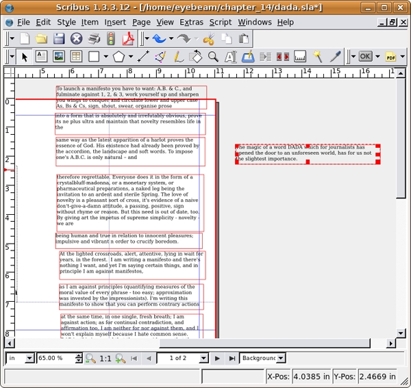
11. For this tri-fold, we will work within separate text frames. We will link the text frames just as we did in chapter 13, but this time we will set breaks in the frames so the amount of text in the frame does not change when the shape of the frame is modified. A frame break is like a page break in a word processor (such as OpenOffice.org).
Draw nine new text frames (the size and position can be adjusted later). Select the first text frame and click the linking tool, then click each frame to link them one by one. As you click each frame, the text will flow from box to box. When all ten boxes are linked, click the Linking tool button again to toggle linking mode off.
There are several line breaks in the source document. We need to place a frame break at each one to keep the text from slipping into other frames. Double-click on any of the text frames to select the text. Find the words "slightest importance" in the first paragraph. Place your cursor after the word importance and press Control+Return. This will add a frame break, and the next line will now jump to the top of the next text frame. Now repeat this process again after the words, "organise prose," "life in the," natural - and," "novelty - we are," "crucify boredom," "against manifestos," and "self-defining story." You may need to resize your frames as you go, so the text filling each subsequent frame is in plain view.
Select the last text frame (beginning with, "DADA MEANS NOTHING") and place it on page 2. Return to page one.

12. Right-click any of the text boxes and select Edit Text...from the contextual menu. This will open the entire text in the Story Editor. Select all of the text with Control+A and use the controls at the top of the Story Editor to change the face to Bitstreams Vera Sans Roman 12/14.
Then, select Edit > Edit Styles. Click New. Name your style dada_style_1. Select Bitstream Vera Sans from the Character pull-down menu. Set your text size to 12 pt. Press the OK button. Pess the OK button again on the Edit Styles dialog. Now press Control+A to select all of the text in the Story Editor and use the Style pull-down menu to apply the newly created dada_style_1. To close the Story Editor and return to the main document, select File > Update Text Frame and Exit.
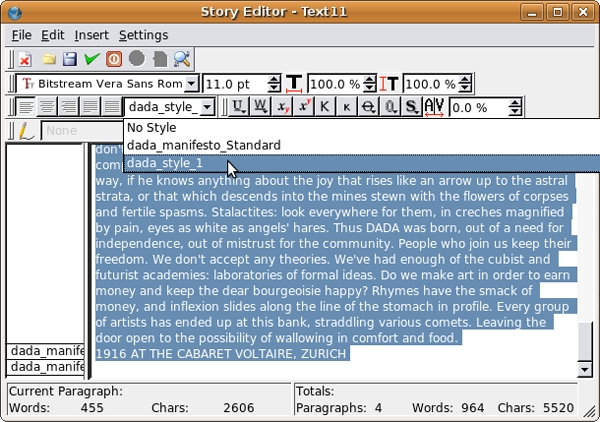
13. The rest of this exercise focuses on changing many characteristics of the text. At times we will open the Story Editor to assign new styles to entire paragraphs, and at other times we will simply select single words and change them using the Text panel of the Properties dialog. It won't always be immediately clear why we choose to do one or the other, but you will hopefully get a sense of how the two varieties of formatting interact.
Double-click the first frame to select the text inside. Right-click, and select Edit Text... from the contextual menu. In the Story Editor you'll need to add a carriage return after each frame break, so that you can create new styles for each section. After each vertical pipe (| signals a frame break) simply hit return. You'll notice that the panel to the left divides each time you hit return. This panel indicates the style for each paragraph.
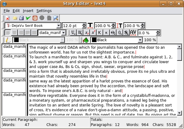
14. Right-click on the label dada_style_1 that appears to the left of the first paragraph. Select Edit Styles...in the contextual menu.

In the Edit Styles dialog that opens, select dada_manifesto_1 and click Duplicate. This will open the Edit Style dialogue for a new style. Change the name to dada_manifesto_2. Change the paragraph alignment so it is justified-right. Press the OK button when you are done.
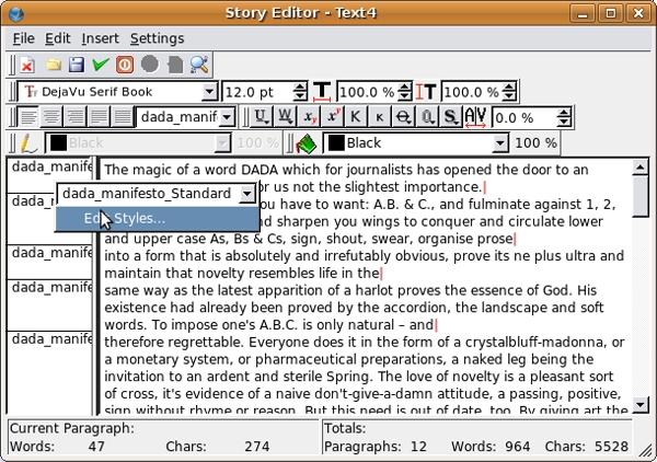
15. Now there is a second style in your Edit Styles dialog. Press the OK button to return to the Story Editor. Click on the label dada_manifesto_1 that appears to the left of the first paragraph. This time, select dada_manifesto_2 from the pull-down of the contextual menu that opens. Notice that the first paragraph is right-aligned. Press the green check mark in the top row of icons to confirm the change and close the Story Editor window.
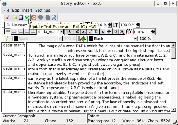
16. Double-click on this first text frame. Select "The magic of a word" and then select type size 9 and type style oblique from the Text panel of the Properties dialog.
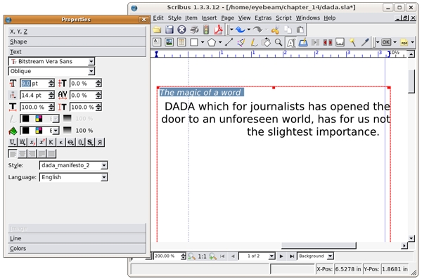
Now select "DADA" and set it to bold oblique 30. Add a number of carriage returns between slightest and importance. Tweak the text until it looks like the text in the image below. Once the text is ready, select Edit Shape... from the Shape Panel of the Properties dialog. In the Nodes dialog that opens click the Shear Path Horizontally Left Button a number of times to skew the shape of the text box. Click End Editing when you are done.
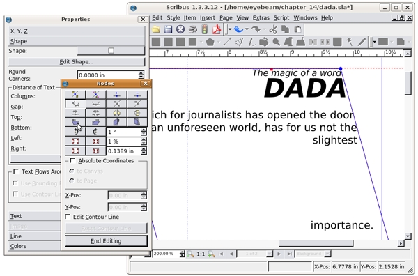
17. Position the text frame so the word "importance" is just over the top of the letter A. Also notice that the "h" in "has" (on the second line) is just barely on the page.
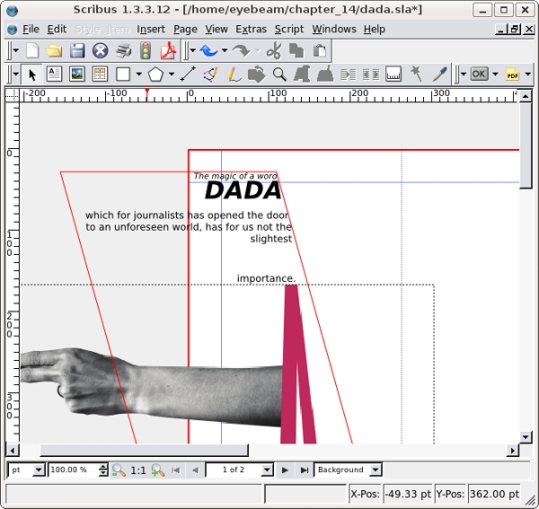
18. Double-click to select the text in the next text frame. Right-click and select Level > Lower to Bottom from the contextual menu. This will position the text "below" our title graphic. Change the word, "up" to bold oblique 30pt. Select "and sharpen your wings" and change it to 4pt. Then increase the letter spacing (or kerning) using the Text panel of the Properties dialog. See our illustration below for clarity.
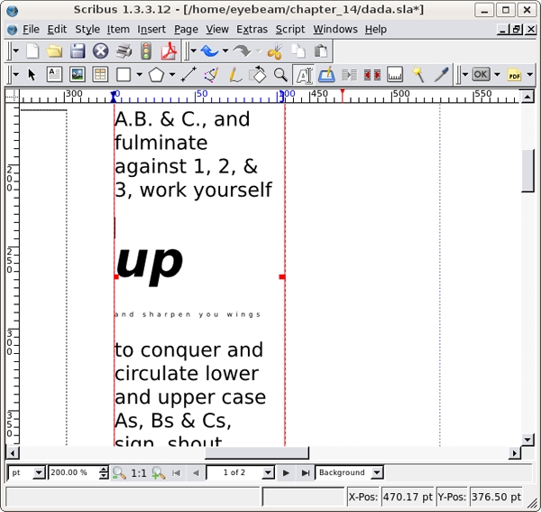
19. Use the Edit Shape window again to make the text box lean into the letter A.
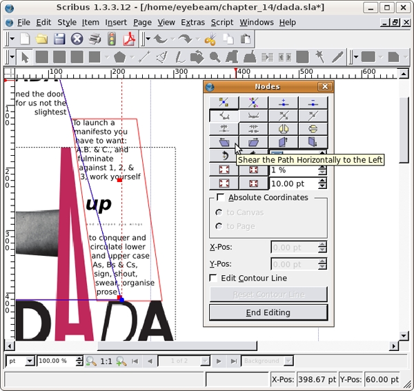
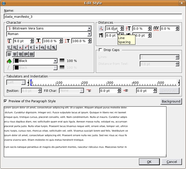
20. Right-click on the third text frame to open the Story Editor. Click on any of the styles to the left and Edit Styles. Duplicate dada_manifesto_1 and change the new style (dada_manifesto_3) to be Bitstreams Vera Sans Regular 9/18. Apply this style to the content of the third fourth and fifth text frames. Close the Story Editor.
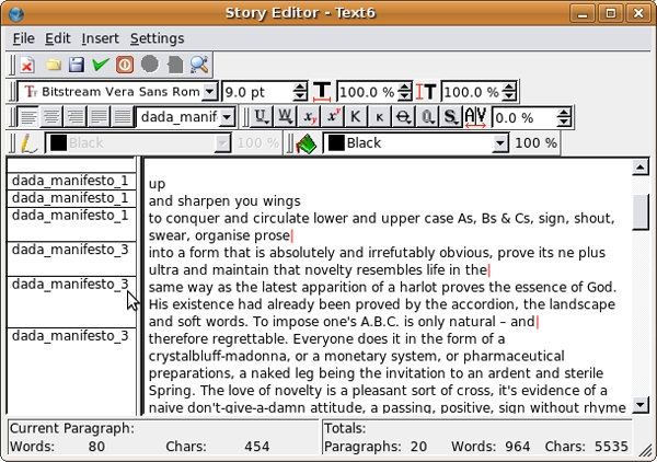
21. Position the three frames in the center column of the page, and resize them to look like our illustration..
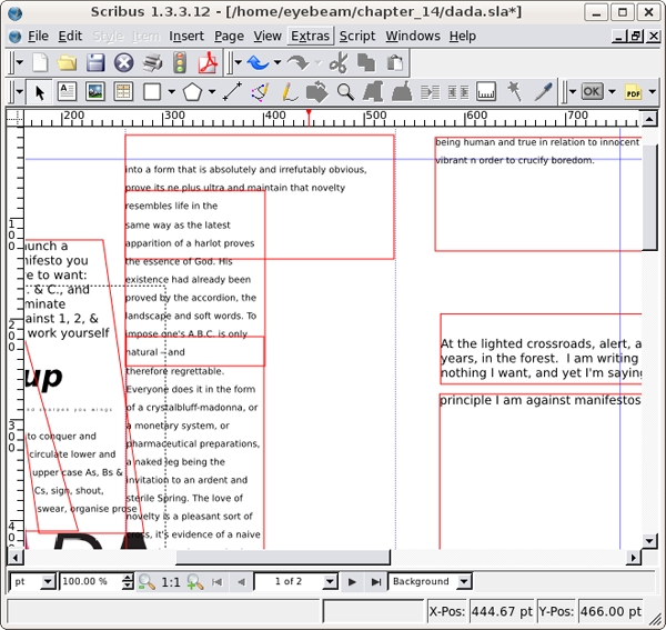
22. Create a new style just as we did above called dada_manifesto_4. Set the type to Bitstreams Vera Sans Bold 18/14, which tightens the leading and creates tension in the typography. The letters overlap because the space between the rows of letters is smaller than the size of the letters. This type treatment could be difficult to read. However, at a larger font size than body copy (typically 9 - 11 points), a small section of text with tight leading creates tension and remains legible. Insert a few carriage returns before, "boredom" at the bottom of the text frame. In the illustration below you can see the type settings we used, but try seeing this with your eyes and intuition.
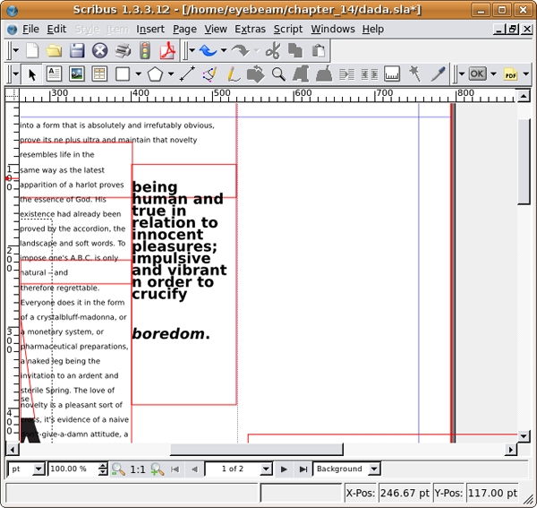
23. Select the next text box and position and resize it so that it fits in the bottom right half of the center column of the page. Duplicate dada_manifesto_3 to create a new style (dada_manifesto_5) and change this new style to align right. Assign this new style to the text. Close the Story Editor. Select the Eyedropper tool from the command bar and click on the pink "A" in the title graphic.
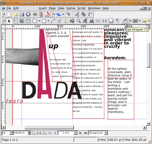
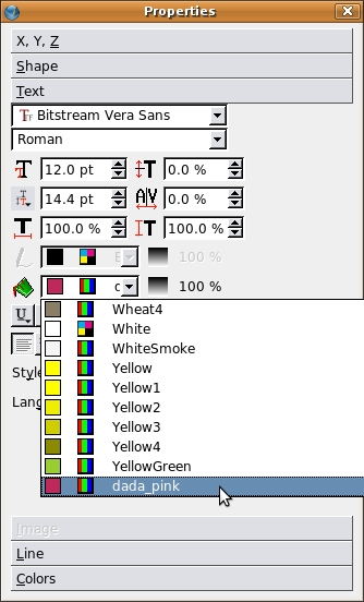
This will open Color Not Found dialog. Enter a name. We used "dada_pink". Click OK to add this color to the Colors panel of the Properties dialog. Double-click the text frame to select the text. Highlight "and in principle I am against manifestos." Select the Text panel of the Properties dialog and select dada_pink from the Text Fill pull-down menu.
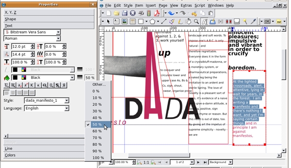
24. Highlight the rest of the text in the frame and open the Text panel of the Properties dialog. Beside the Text Fill pull-down menu there is an Opacity percentage button. Click this and select 50% to modify the text so it is gray.
25. Position the next frame on the page about 10 pts to the right of the guide (Control+Right Arrow) and assign it dada_style_1.
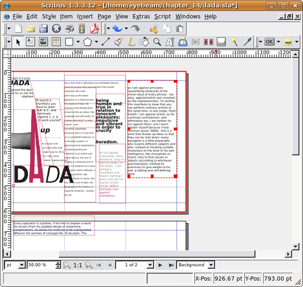
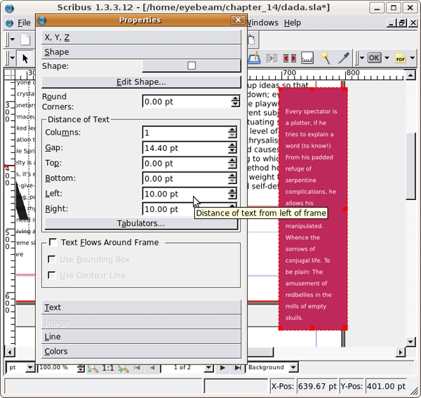
26. The next frame ("Every spectator...") will be placed slightly on top of the last one, so some of the words will be hidden. Assign the text dada_style_3. With the text frame selected, select the Colors panel of the Properties dialog. Choose dada_pink from the bottom of the colors list. This will put pink into the background color of the frame. Select the text and use the Text Fill pull-down menu in the Text panel of the Properties dialog to make the text white.
27. While the pink and white text frame is still selected, select the Shape panel of the Properties dialog. In the Distance of Text section, add 10.00 pt of space to the Left and Right fields. This adds padding to our text frame.
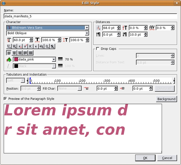
28. Create a new text frame. Type in it, "I'm writing this manifesto to show that you can perform contrary actions at the same time, in one single, fresh breath;". This is a pull-quote from Tzara's manifesto, which you can copy and paste if you can find it in the Open Office Document. Sometimes it is faster to type rather than copy and paste. Create a new style for this text, dada_manifesto_5 and set it to Bitstreams Vera Sans 60/68 bold oblique. Additionally, set the Text Fill Color to dada_pink, and the Text Fill Opacity to 70%.
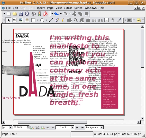
Position and resize the text frame so that it fills the right two thirds of the page, and then right-click and select Level > Lower to Bottom.
29. If you open the View menu, you will see that a bunch of view options are viewable. These views make it possible to edit the project as we have been for this exercise. For a preview of the product, turn off everything that is checked in the View Menu except Show Images. The following image illustrates what the first page should look like. Then turn all the options back on and you're done with this first exercise.
Exercise 2: Using text frame options, hue, and saturation to create contrast on page two
1. Start by repositioning the text frame on page two into the first column and link the remaining text into a new frame in the second column. Make a new style for this text (dada_manifesto_6) and set it to Bitstreams Vera Sans Regular 10/12.
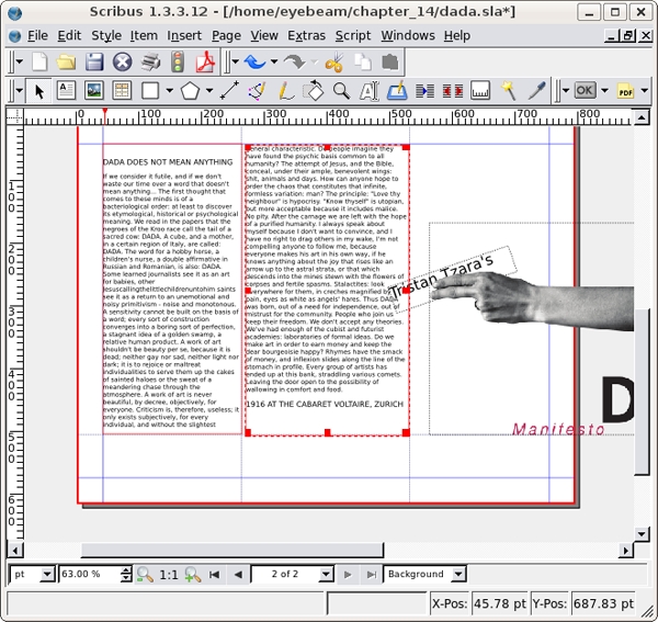
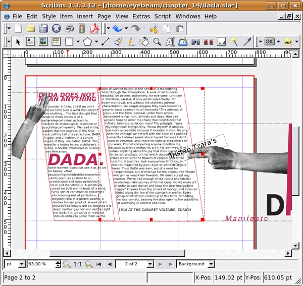
2. Select the headline "DADA DOES NOT MEAN ANYTHING" and change the typography to Bitstreams Bold Oblique 21/25.2. Set the Text Fill Color to dada_pink. Create a new Image Frame using the Image Frame tool.
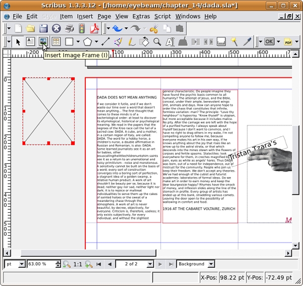
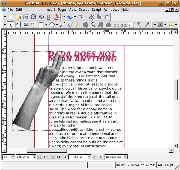
With the empty image frame selected, choose File > Import > Get Image. Select hand.png.jpg and press the Open button. With the new image selected, right-click and select Adjust Frame to Image. Place the hand graphic over the words as shown in our illustration.
3. Create a dynamic line on the page by shifting the shape of both text boxes using the Edit Shape button of the Shape panel in the Properties dialog.
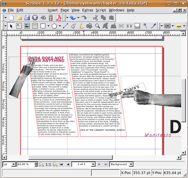
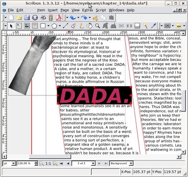
4. Adjust the typographic treatment of the third instance of the word, "DADA" in the first column. Make it larger, bold, oblique, and set it to the color defined as dada_pink. Look closely at the kerning or the space between individual letters. You can adjust the kerning in the Text panel.
6.Draw a rectangle with the Insert Shape tool on top of the word "DADA". By default it should be black, but you can set the shape color in the Colors panel of the Properties dialog if it is necessary. Right-click and send it below the text.
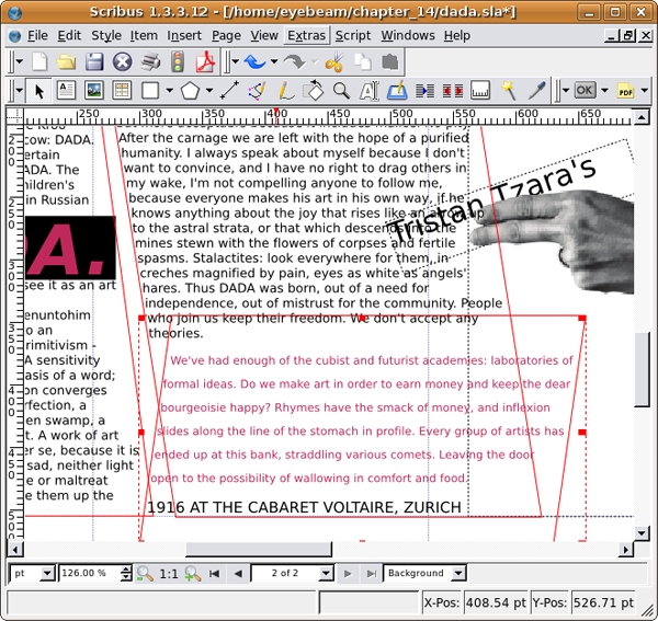
8.Create a frame break (Control+Enter) after the words, "We don't accept any theories." Create a new text frame, and link it to this last frame. Select the text, open the Story Editor, and create a new style for this frame called dada_manifesto_7. Make the text Bitstreams Vera Sans Regular 9/18, and set the color to dada_pink. Then, use Edit Shape in the Text Frame to position it in the opposite direction from the previous frame to make the section look like our illustration.
10.Cut the last line "IN 1916 AT THE CABARET VOLTAIRE, ZURICH" and paste it in a new text frame. Place the box so that the left edge covers the word, "inflexion" after "and" in the pink copy. Load dada_pink into the background of the text frame and vertically center the type using the Distance of Text section of the Properties dialog. Select the type to make it bold and white.
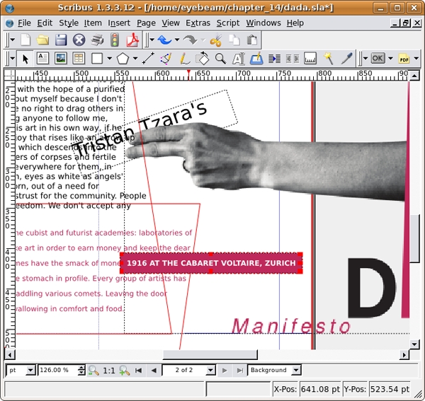
12. Create a new, final text frame. Type "How can anyone hope to order the chaos that constitutes that infinite, formless variation: man?" Select the type and change its formatting to Bitstreams Vera Sans Bold Oblique 64/74.8. Set the text to dada_pink with a 60% opacity. Place the text frame on top of page two. Place it below all other elements by right-clicking and selecting Levels > Send to Bottom. You're final page should look like our illustration.
