


Customising Potlatch 2
All that you need to run Potlatch 2 is a Flash-compatible browser and an Internet connection. To customize Potlatch 2, you simply need a basic web server and permissions to upload files to it. You do not need to know Flash or Actionscript. You do not have to build Potlatch 2.
Potlatch 2 has a feature that allows you to style and customise the editor to specific needs. You can take the Potlatch 2 editor and put it on your own website, making it easy for a user to add or edit OpenStreetMap data relevant to the specific interests of your website. For example, the CycleStreets website (http://www.cyclestreets.net/) provides journey planning for cyclists using OpenStreetMap data. CycleStreet provides a customised online editor making it easier for people to add data that is relevant to cyclists and help with the improvement of the journey planner. Another example is OpenEcoMaps (http://www.openecomaps.co.uk) by Tom Chance, which is about green spaces.
You can change the style of the map and the controls on the left hand side of the map without writing any Flash/ActionScript code or compiling Potlatch 2. It does require you to know the basics of running a webserver, however, as well as HTML and JavaScript.
Deploying Potlatch 2 to your own site
You can add Potlatch 2 to your own site without making any customisations. This approach is a good way to get started.
Getting the files
Download all the files from http://random.dev.openstreetmap.org/potlatch2/, including the full contents of the features/, icons/ and fills/ directories. These are the resource files that are required by Potlatch 2.
The actual application itself is the potlatch2.swf file. The potlatch2.html file is an example file of a webpage your users could visit to use the customized additions. The Potlatch 2 swf and resources are updated often, so update your files regularly to ensure you get the latest improvements!
Upload all the files in the potlatch2 directory to a directory on your web server. The potlatch2.swf and potlatch2.html should be in the potlatch2 directory, but you should overwrite the example files in the potlatch2 directory using the following example.
Setting up Potlatch 2
There are some settings that need to be modified from the potlatch2.swf file to have the application working on your own website.
First you need to specify the starting location and zoom level of the map. In order to do this you pass in the query parameters lat, lon and zoom at the end of the url. Remember that zoom levels go from 1 until 18 and that 1 is a worldview and 18 is very close. For example if your URL is http://mycustompotlatch2.com/potlatch2.html you will want to add the following to the end "?lat=53.293456&lon=-6.20537&zoom=17". You also can specify the default location for when the query parameter has not been passed in within the html file with the lines:
lat=53.2934;
lon=-6.2053;
zoom=16;
The default configuration of the potlatch2.html configuration file points to an OpenStreetMap development server. You can use this server for testing with no consequences if you make a mistake. When you are done testing and wish to use the main OpenStreetMap server replace "api06.dev" with "www".
args["api"] = "http://api06.dev.openstreetmap.org/api/0.6/";
args["policy"] = "http://api06.dev.openstreetmap.org/api/crossdomain.xml";
args["oauth_policy"] = "http://api06.dev.openstreetmap.org/oauth/crossdomain.xml";
args["oauth_request_url"] = "http://api06.dev.openstreetmap.org/oauth/request_token";
args["oauth_access_url"] = "http://api06.dev.openstreetmap.org/oauth/access_token";
args["oauth_auth_url"] = "http://api06.dev.openstreetmap.org/oauth/authorize";
args["serverName"] = "api06 Test On Dev";
You can use Potlatch 2 immediately to view map information from your own website. This works both on the development server and the main OpenStreetMap server. However, in order to actually edit the data you must register your website as a new application in OpenStreetMap. To do this you need an OpenStreetMap account and to be logged into the OpenStreetMap website.
Click on your username in the right corner of the webpage to go to your OpenStreetMap user page. Then click oauth settings, and Register your application at the very bottom of the page. Note that you must register the application for every website where you customise Potlatch 2. To be able to test against the testing server (api06.dev.openstreetmap.org), you must also register on that server.
Note: You can not open the page via the file system locally on your computer and talk to the OSM server since Flash security does not allow this.
When prompted, enter the name of your instance (e.g. "My Custom Potlatch 2") and its URL (e.g. "http://mycustompotlatch2.com/").
Under 'Callback URL', you can optionally enter a intermediary page that lets your users know they are logged in and can begin editing on your website. Under 'Support URL', you can optionally enter a help URL if you have additional documentation for your instance of Potlatch 2.
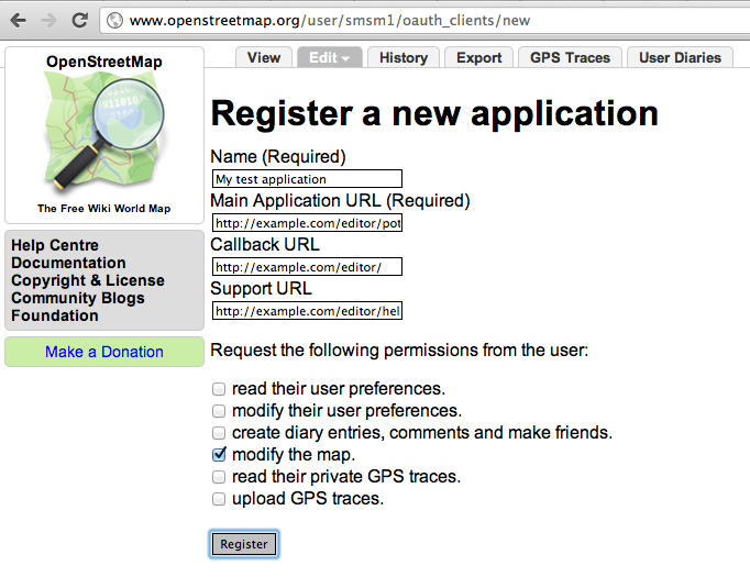
For your instance of Potlatch 2 to work you check the modify the map checkbox and click Register. You will be given an OAuth 'consumer key' and 'consumer secret'. Copy and paste them into the relevant lines in your html file as is shown in the example below.
args["oauth_consumer_key"] = "fiM1IoqnKJk4JCfcl63DA";
args["oauth_consumer_secret"] = "7fYgJK9M4vB1CvBZ6jEsPGxYK9UD1hEnI6NqTxNGs";
Your Potlatch 2 instance is now ready to go!
For more information about deploying Potlatch 2 please see: http://wiki.osm.org/wiki/Potlat2/Deploying_Potlat2
Editing controls
The icons on the left side of the Potlatch 2 editor are defined by the XML file resources/map_features.xml. This XML file is commonly called a presets file. There are links to other files within this file to group together some of the controls, rather than having a single very large file that is difficult to work with. To link an additional xml file to the map_features.xml file you use the "include" tag.
<include file="map_features/barriers.xml" />
Note: Nested files should also be valid XML, which means they should have a single root element - by convention, <featureGroup/>.
There are specific conventions for the types of XML tags you add to the presets files.
A feature is the distinct, recognizable type that will be presented to the user as "what this is". For example: trunk road, school, reservoir.
A feature category groups features together. For example: Roads, Paths, Accommodation, Sport and Leisure.
An input is a single editing control for a single tag. For example: a drop-down menu with yes/no options, or a free-text field for a name.
An input set is a group of inputs. It can be reused anywhere in the file, and nested in other input sets. For example: a bridge-type drop-down (bridge tag) and a layer slider (layer tag) could together form one input set.
To use these tags to create a simple tag editor, you should initially create the specific feature you are interested in, for example "school". Then define the category it belongs to, in this case "education". You then need to define what type of shape it applies to - for example can it be a point, a line or an area? In this case a school could either be a point or an area. Add the tags that define the feature and the inputs that the user can add or edit for this feature. An example snippet of XML for a school is below.
 <feature name="School">
        <category>eduction</category>
        <icon image="features/school.png">${name}</icon>
        <help>http://wiki.openstreetmap.org/wiki/Tag:amenity%3Dschool</help>
        <point/>
        <area/>
        <tag k="amenity" v="school"/>
        <inputSet ref="buildingInfo"/>
</feature>
In this particular example there are a couple specifics that bear mentioning. Both the "<point/>" and "<area/>" show that schools can be drawn as a point or an area. Additionally the "${name}" is the actual name of the feature.
The line, area, point and relation elements define what entity type this feature can be. For example, a trunk road could be <line/> or <area/> (for roundabouts); a supermarket could be <area/> or <point/>; a football pitch or baseball field could only be <area/>.
The tag elements define all the tags that identify this feature.
The name attribute defines the name displayed in drop-down menus from which the user can choose.
The category element defines the feature category (see below) in which this feature is be grouped.
The help element defines a URL providing more information about this feature.
The input elements define editing controls available for this feature (see below).
The inputSet elements reference input sets (groups of editing controls) available for this feature. Their ref attribute relates to the id of an inputSet defined elsewhere in the file (see below).
The icon element defines a feature's graphical appearance within the tag panel.
Tag element syntax
The tag elements define all the tags that identify this feature. Often this will just be a single tag (for example, highway=trunk) but you may also specify more than one element (e.g. amenity=public_building; building=yes).
For each one, its k attribute defines the key to match, and its v attribute defines the value to match. These tags will be applied to the object when the user chooses this feature from the drop-down menu.
The optional vmatch attribute allows you to specify values which are matched, but not applied. This is useful for compatibility with legacy or minority tagging schemes. The attribute is parsed as a regular expression (the special value "*" means "any value"). For example:
<tag k="route" v="hiking" vmatch="hiking|foot"/>
Icon element syntax
The icon element defines a feature's graphical appearance within the tag panel. It is usually found within a <feature/>, but the same format is also used for route relation inputs (see below).
Its image attribute is the URL of an image to be shown when the feature is selected, and when the drop-down menu is open.
Its dnd attribute is the URL of an image to be shown in the drag-and-drop icon panel (default: same as image attribute).
Its background and foreground attributes are the colours in which the HTML fragment will be displayed.
Its content is an HTML fragment displayed next to the image when the feature is selected. Tag values (such as name and ref) may be embedded by using the ${key} syntax.
Feature categories
A feature category groups features together. Example categories include roads, paths, accommodations, sports, and leisure. Specifics in these categories appear in the main drop-down feature menu for example in the roads category specific types of roads would show such as residential, primary, and secondary.
You define a feature category like this:
<category name="Roads" id="roads"/>
To assign a feature to that category, use the <category> tag within the <feature> element. For example:
<category>roads</category>
Inputs
An input is a single editing control for a single tag. It is usually an element within a <feature/>. To allow inputs to be shared between features, it can also form part of an <inputSet/> (see below).
The simplest form of input is a freetext input:
<input type="freetext" presence="always" category="Naming" name="Ref" key="ref" description="Reference number of the road"/>
The key attribute defines which OSM key will be edited (for example, "highway").
The name attribute defines a label shown by the control.
The description attribute defines a tooltip shown on mouse-over.
The layout attribute defines whether the control's layout will be 'horizontal' or 'vertical' (default).
The category attribute in the input tag defines the name of the tab that the input will be shown under (not related to feature categories).
The subcategory attribute (optional) defines a subgroup under that tab (intended for lesser-used tags).
The presence attribute defines whether this input should be shown on the 'Basic' tab:
- always - always show
- onTagMatch - only show if the tag is set
- withCategory - don't show on the Basic tab
The priority attribute controls ordering within the tab. The possible values going from the highest priority to the lowest are highest, high, normal, low and lowest.
The type attribute defines what control this is. The rest of this section defines these controls and their attributes.
type="choice"
A drop-down menu. <choice/> elements are used to define the options available (like <option/> in an HTML </select> element). For example:
<input type="choice" presence="always" category="" name="Religion" key="religion" description="The religion worshipped here.">
     <choice value="christian" text="Christianity (church)"/>
     <choice value="jewish" text="Judaism (synagogue)"/>
     <choice value="muslim" text="Islam (mosque)"/>
</input>
type="checkbox"
A checkbox used to set the tag value to 'yes' or 'no'. (Values of "1", "0", "true" and "false" are recognised but not set.)
type="freetext"
A simple text editor. You can use the absenceText attribute to define the value when not set.
type="number"
A numeric entry textfield with additional "up" and "down" nudge buttons beside it. For example:
 <input type="number" minimum="0" maximum="99999" stepSize="1"
         presence="always" category="Parking" name="Capacity" key="capacity" description="The number of cars that can be parked in the car park"/>
The minimum and maximum attributes define the range of values allowed by the nudge buttons (default 0, 100).
The stepSize attribute defines the increment of clicking on an up/down nudge button (default 1).
The absenceText attribute defines text to be shown if the value is not set.
The notValidText attribute defines text to be shown if the value is not a number, or outside the minimum/maximum values.
type="slider"
A slider allowing any numeric value to be chosen between two extremes. For example:
<input type="slider" presence="onTagMatch"
       name="Layer" category="Physical" description="Relative vertical positions (-5 lowest, +5 highest)"
       key="layer" minimum="-5" maximum="5" default="0" snapInterval="1" labels="Lowest,Ground,Highest"
       defaultName="Ground"/>
The minimum and maximum attributes define the range of values allowed (default 0,100).
The snapInterval attribute defines the minimum increment between these values (default 1).
The default attribute defines the default numeric value if not set (default 0).
The labels attribute is a comma-separated list of labels to be laid out at equal intervals from minimum to maximum values.
A numeric entry textfield with additional "up" and "down" nudge buttons beside it. For example:
<input type="number" minimum="0" maximum="99999" stepSize="1"
       presence="always" category="Parking" name="Capacity" key="capacity" description="The number of cars that can be parked in the car park"/>
The minimum and maximum attributes define the range of values allowed by the nudge buttons (default 0, 100).
The stepSize attribute defines the increment of clicking on an up/down nudge button (default 1).
The absenceText attribute defines text to be shown if the value is not set.
The notValidText attribute defines text to be shown if the value is not a number, or outside the minimum/maximum values.
type="speed"
A dedicated speed-limit editor.
type="route"
A dedicated route relation editor, showing route relations of which this entity is a member, and allowing the user to add it to other route relations. For example:
<input type="route" name="National Cycle Routes" description="A signposted route in a National Cycle Network, or nearest equivalent." category="Cycle" priority="low">
  <match k="type" v="route"/>
  <match k="route" v="bicycle"/>
  <match k="network" v="ncn"/>
  <icon image="features/route__ncn.png" background="#ff6f7a" foreground="white">${ref} ${name}</icon>
</input>
The match elements define the tags required for a parent relation to match.
The icon element defines the appearance of the control shown for a matching relation (same syntax as an <icon/> within a <feature/>).
type="turn"
A dedicated turn restriction editor, showing turn restrictions of which this entity is a member, and allowing the user to add it to other turn restrictions. For example:
<input type="turn" name="Turn restriction" description="Turn restriction" category="Turn" priority="normal" presence="onTagMatch">
   <match k="type" v="restriction"/>
   <role role="via"/>
 </input>
The match elements define the tags required for a parent relation to match.
The role element defines the member role required for a parent relation to match.
Input sets
An input set is a group of inputs. It can be reused by any feature.
It contains <input/> elements as per above. For example:
<inputSet id="roadRefs">
  <input type="freetext" presence="always" name="Reference" category="Naming" priority="high" key="ref" />
  <input type="freetext" presence="onTagMatch" name="International Reference" category="Naming" key="int_ref" />
  <input type="freetext" presence="onTagMatch" name="Old Reference" category="Naming" priority="low" key="old_ref" />
</inputSet>
An inputSet can also contain other, nested inputSet elements:
<inputSet id="common">
  <inputSet ref="source"/>
  <inputSet ref="designation"/>
</inputSet>
For the latest information about editing the controls for the simple editor of Potlatch 2 please see: http://wiki.osm.org/wiki/Potlat2/Developer_Documentation/Map_Features
Map style
You can also customise the style of the map displayed by Potlatch 2. This is defined using the MapCSS form, which is very similar to cascading style-sheets. If you are familiar with the basics of making webpages this part should not be too difficult for you.
The style of the map is defined by MapCSS, which is similar to the CSS format. For more information about the MapCSS specification please take a look at: http://wiki.openstreetmap.org/wiki/MapCSS/0.2