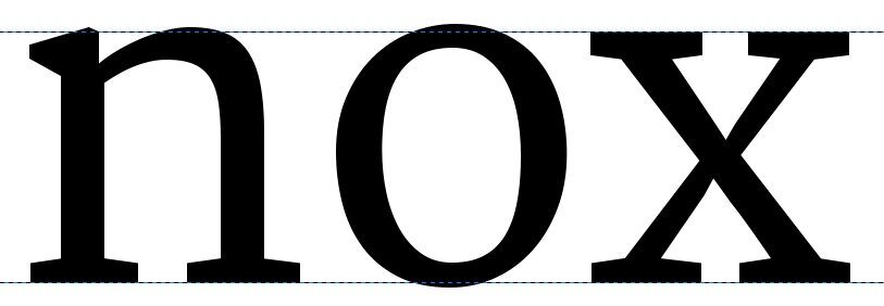
Bold
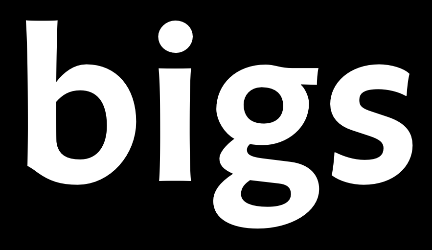
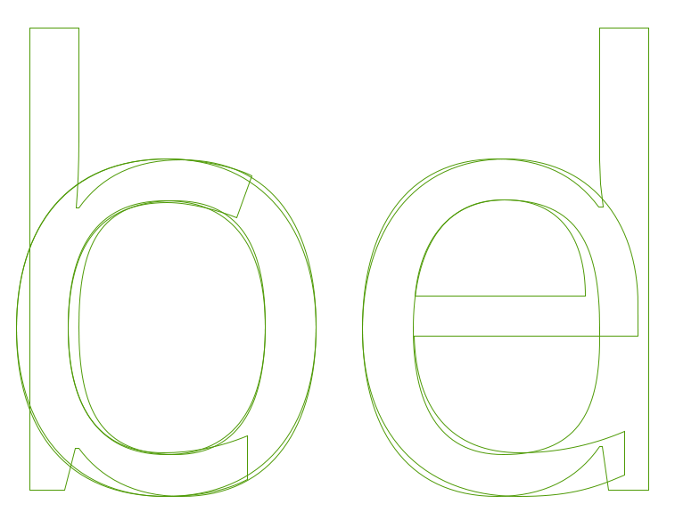
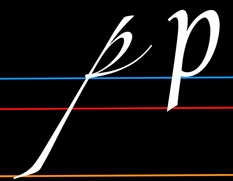
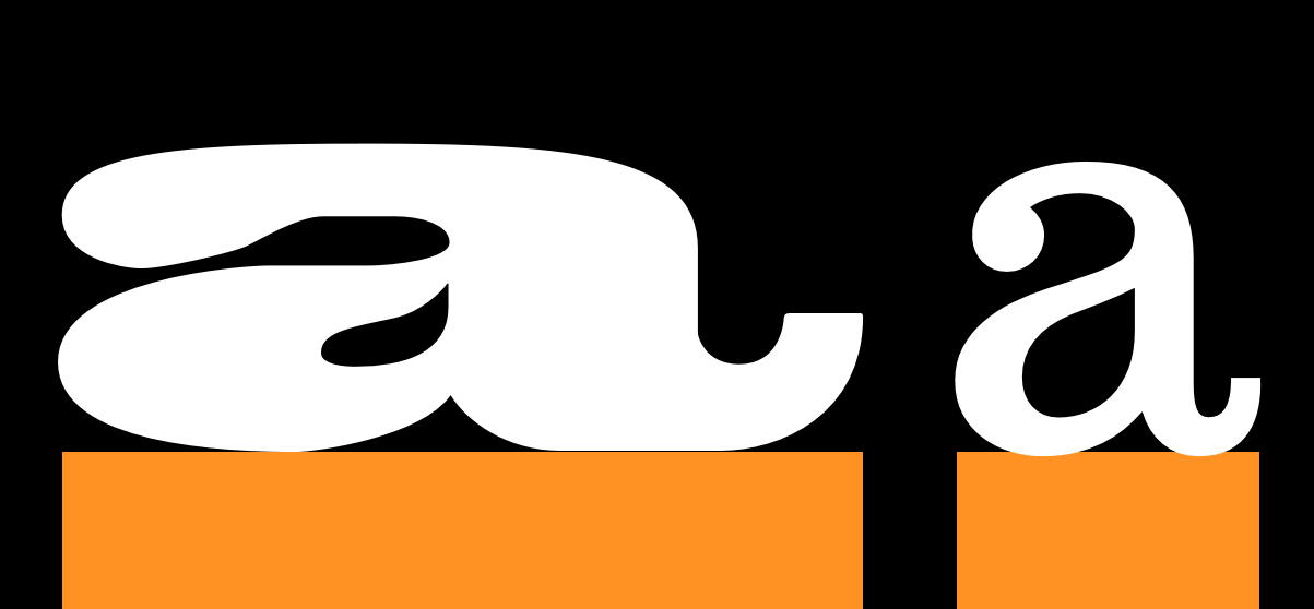
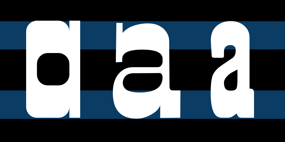
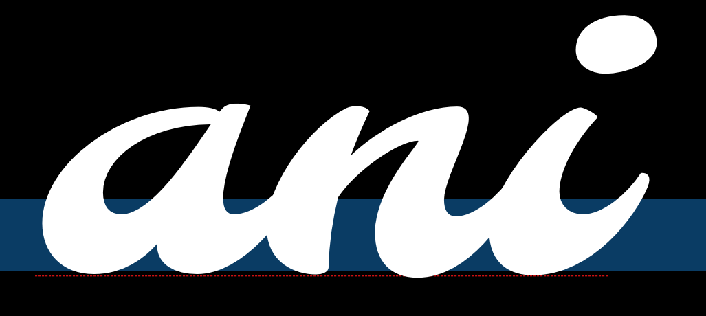
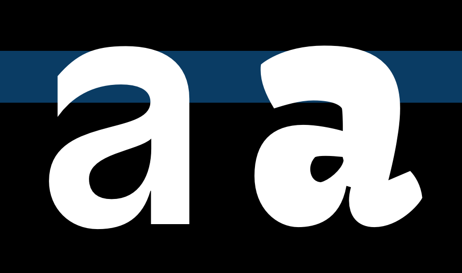
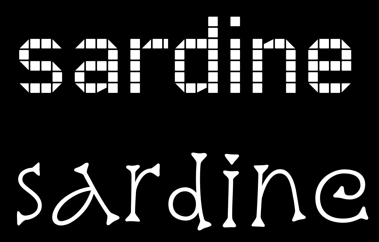
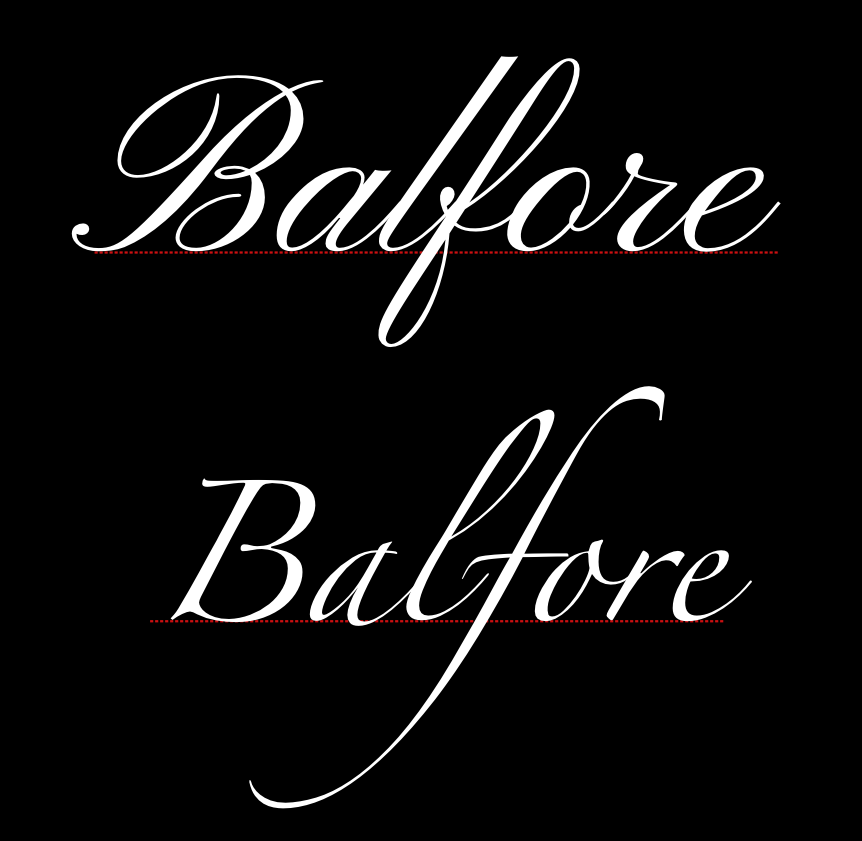
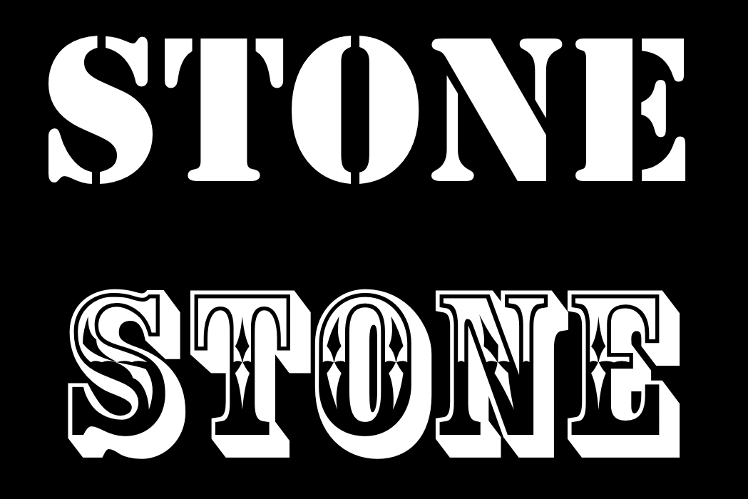
When we talk about the style "bold," we are really talking about a broader variable, which is weight. Weight can include anything from very very thin hairline letters to enormously heavy letters. This variable is used in text typography to create strong separation between bodies of text, and it is used in graphic design either to draw attention to a word or short texts, or to give text a specific feeling (rather than to contrast it with other text).
While you may want to do a wide range of things with weight it is likely that your first experience with adjusting weight will be to try to create a bold to accompany your regular text weight.
Because you are using FontForge you have a distinct advantage. Unlike many font editing programs, the results you get from FontForge style filter may actually be suitable for use -- moreso than the ones you would get in commercial type design software. This is because the algorithm it uses is exceptionally sophisticated.
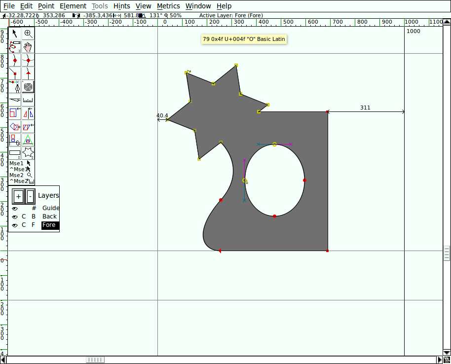
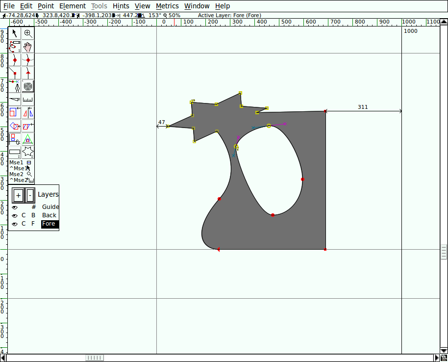
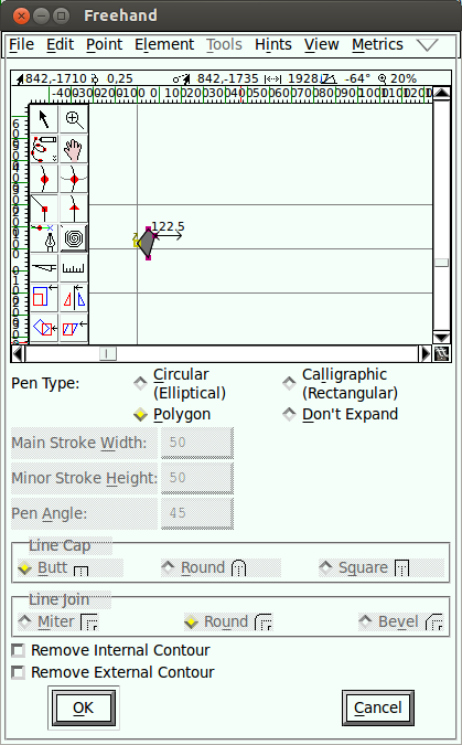
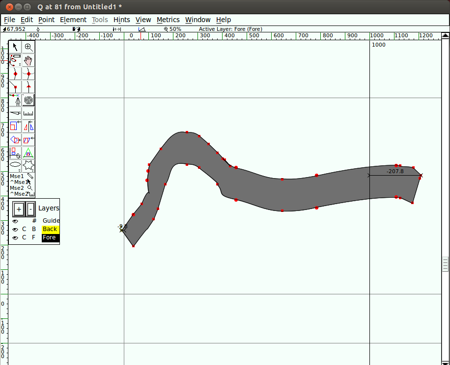
Creating a bold version of a font can be rapidly approximated by running a filter called Change weight (which you will find in he Element > Styles menu) to add weight to your glyphs.
The automatic nature and relatively high speed of this process makes it ideal for testing what weight you may want for your bold. You may want to try running this filter several times and save several versions to compare in text next to your regular. That said, you may still need to either alter the result further after running the filter, or manually adjust individual glyphs in order to get a result which is satisfactory.
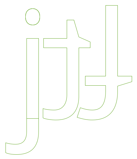
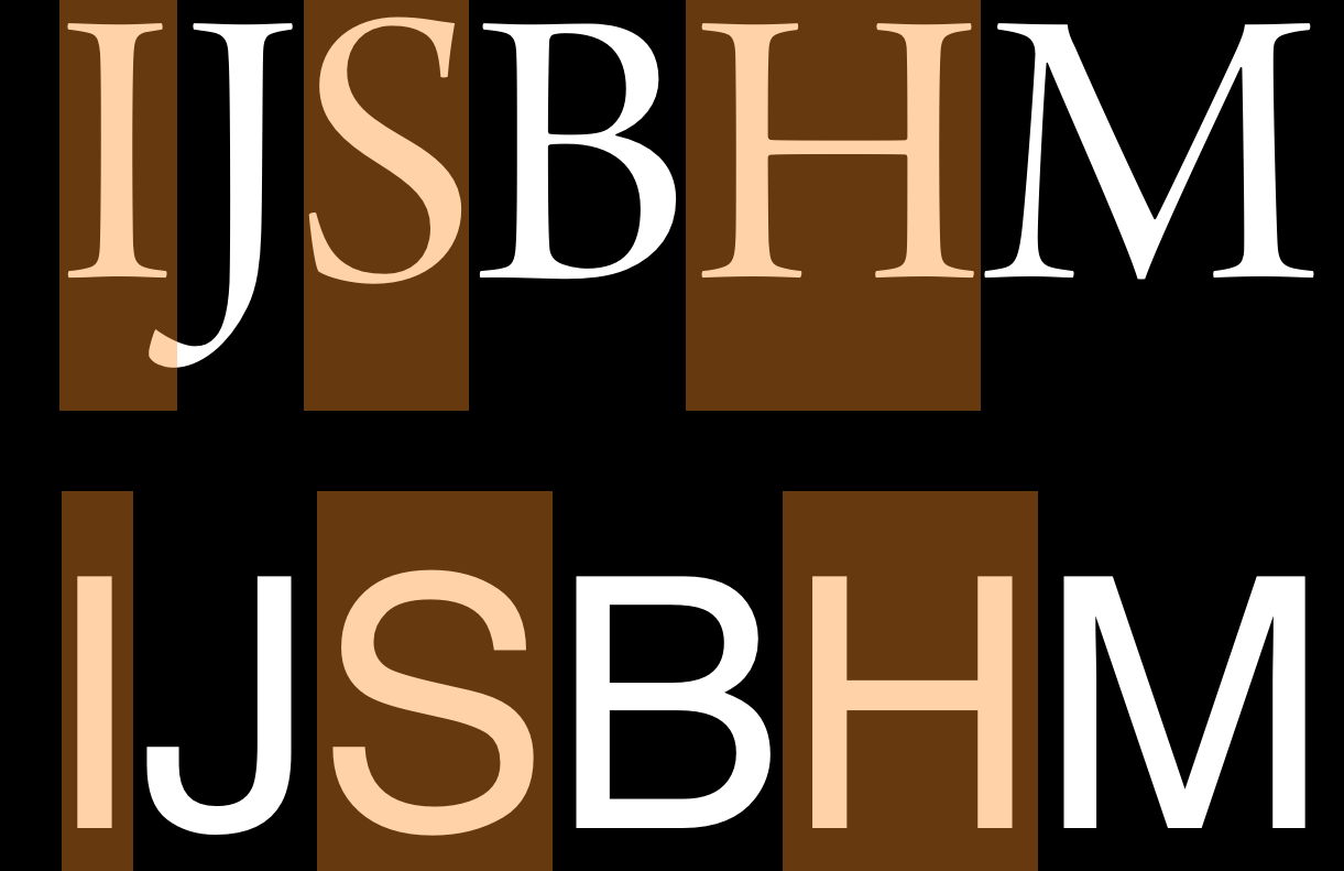
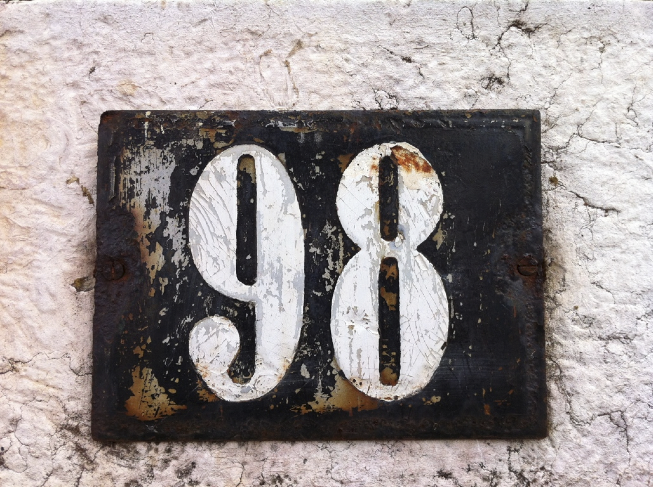
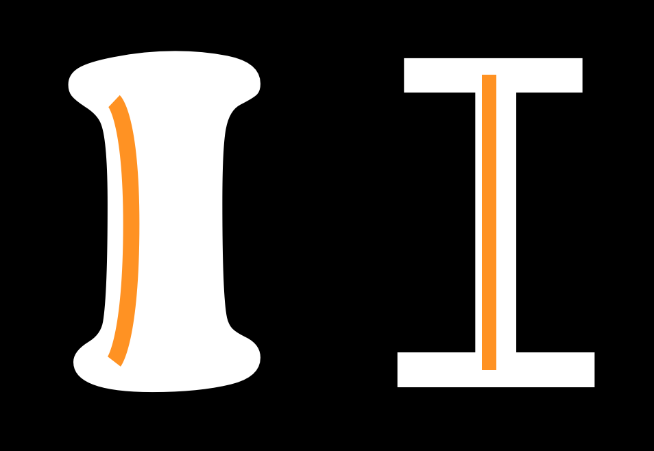
It is also worth remembering that glyphs which do not have a density of strokes (such as 1, i, l, I, L, j and J) may need to be heavier, while glyphs which do have a density of strokes (such as a, e, g, x, B, R, 8, and &) will need to be less heavy than the other glyphs.
Font interpolation
FontForge does have a function to interpolate between separate fonts (see the the Interpolate Fonts function from the Element menu). Font interpolation is a technique that can be used for creating intermediate weights from two other weights. Therefore one way of deciding about the weight of your bold is to create a bold which is definitely heavier than you need, then to interpolate several different weights between this overly bold design and your regular.
Using this technique you can more rapidly find the weight you feel is most appropriate for your project. The same technique can be applied to help decide about even heavier weights such as the "heavy" and "black," as well as lighter ones like "book" and "thin" styles.
By this logic, it may seem like the best and most efficient way of making a regular weight and all the other weights you may need, would be to make a very thin and a hyper-bold font, then generate everything you need from these. However, the result of that approach is likely to be excessively bland. Instead, it is often the case that each significant change in weight will require its own master design from which other middle weights can be made.
Capital letters
Making the capital letters should follow a pattern very similar to the making of the lower case letters. You begin by designing key letters whose shapes and characteristics lend themselves to the design of chararacters which share a common shape. Just like with lower case letters the frequency with which letters are used also remain an important factor in the choice of the letters.
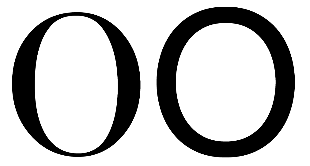
The first two letters to design are "H" and "O". The design these letters should not just be in relation to each other but should also relate to the existing lower case letters.
It is at this stage that you determining the proportion of the lower case to the upper case. You may want to adjust the ascenders and descenders of your lower case or adjust your capitals to the lower case to create the proportin that suit the purpose of your design.
The weight of strokes in the upper case often needs to be somewhat heavier than the strokes of the lower case. You may want to create an interpolation experiment to rapidly find how much heavier they should be.
The next set of letters to consider adding are A E S I N and either P or D and maybe V.
Depending on the style of the font you are making you may find that the capital letters require more variation in width than you have in the lower case letters. The width of the E S and P may be substantially narrower than the H or may be similar.
Generally the N and V are usually similar to H but a slightly wider.
The D may be similar to H or quite a bit wider.
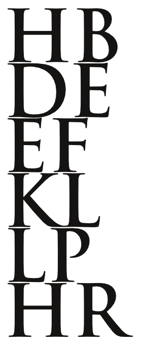
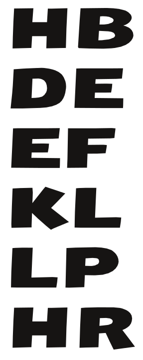
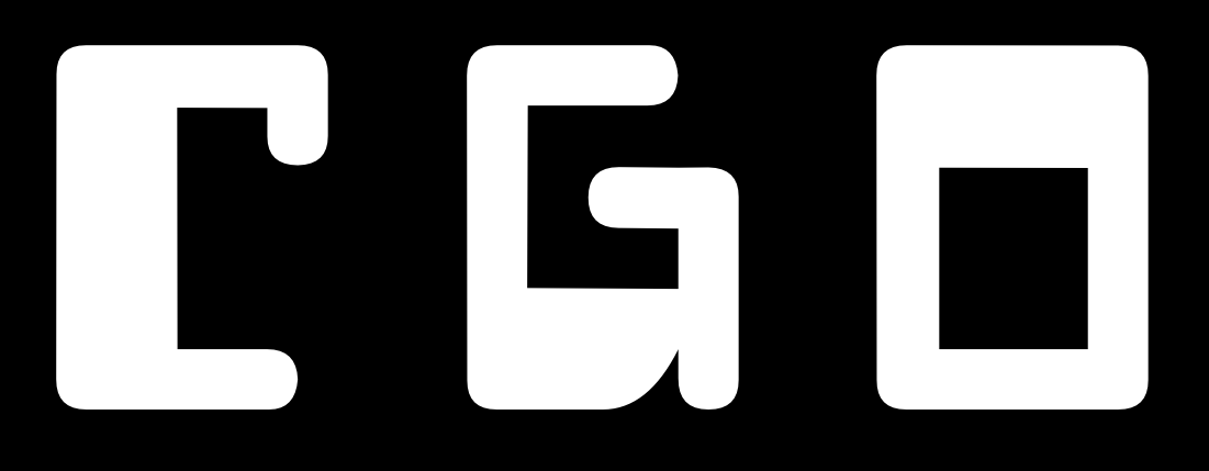
The shape of O can tell you quite a lot about the C, G and Q. The shape of H tells you a bit about about I and J and the left side of B D E F K L P R.
It also tells you a little about T and U. The shape of A can tell you quite a lot about the shape of V.
The shape and proportions of V tells you a little about how to design Y W X. The shape of the Z is distinctive.
Completing the lower case
You may have noticed in fonts you've seen before that, while each letter has its own shape, they all relate to each other. By carefully de-constructing a few glyphs, you gain the building blocks of nearly all the others.
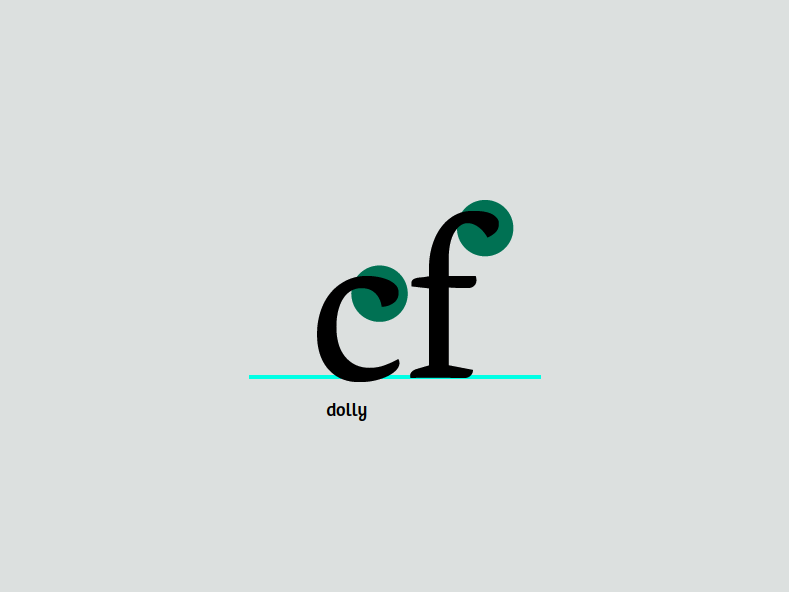
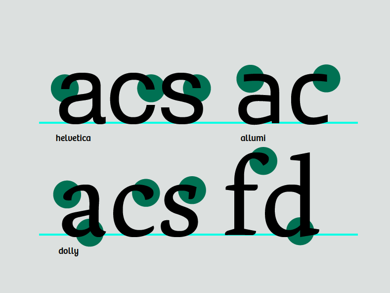
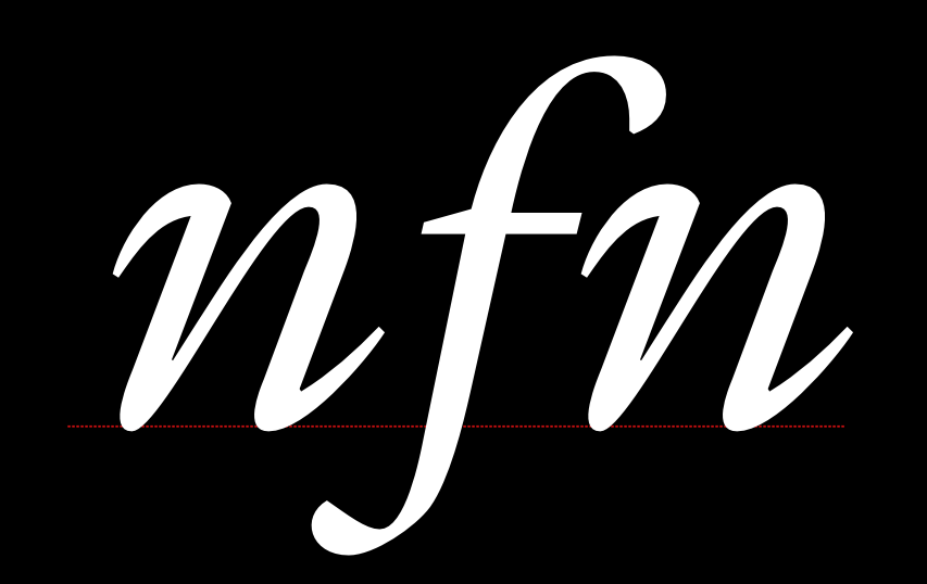
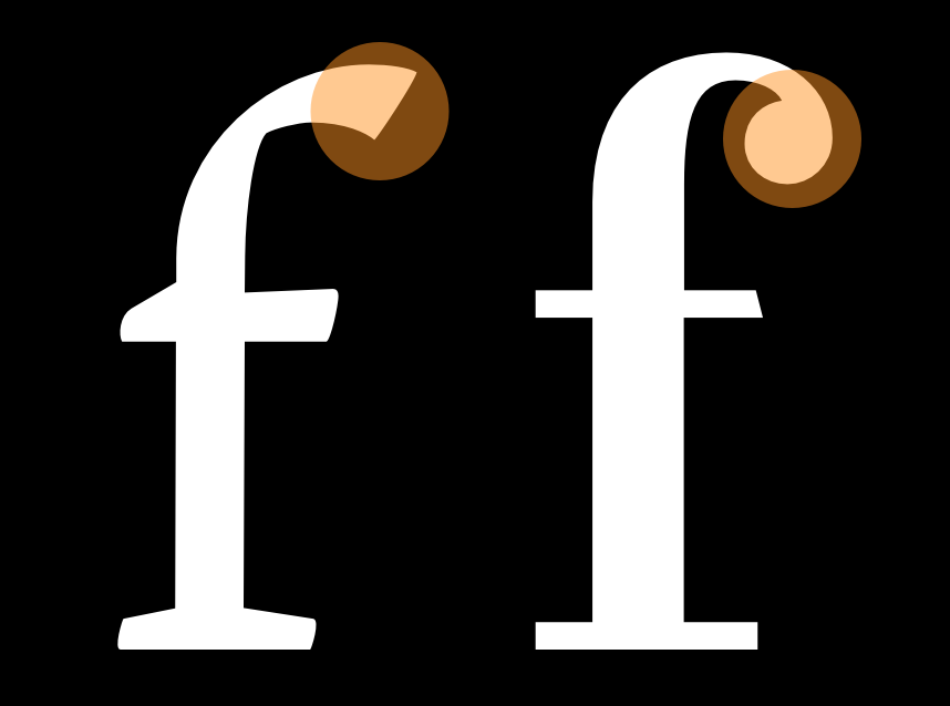
Note the similarity between the upper terminals on this c and f:

Their shapes indicate that they belong in the same group, even though they are subtly different. The terminals are one of the identifying traits of a font, and generally are repeated on many of the letter forms.
However, excessive dependence on modularity shows its own marks in a design, and therefore should be avoided -- unless that is a look you want.
Proceeding with the other lower case letters
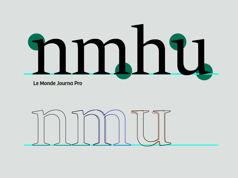
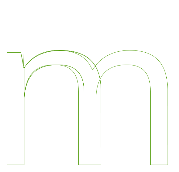
You already made your letter 'n.' From this, you can easily derive the m, h, and u by cloning, stretching, and rotating, respectively. There are subtle changes in the spacing of the stems in the m and the u. The 'u' has changed not only its spacing but its serifs. This doesn't happen automatically; it's up to you to get in there and push the points around.

The 'i' can be derived from the stem of the 'n.' The l'' can be made from the stem of the 'n' with some adjustments.
Making the d From the Stem of h and o
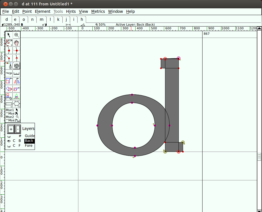
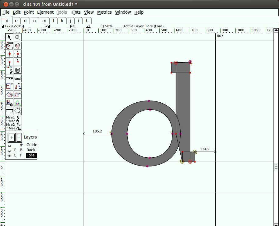
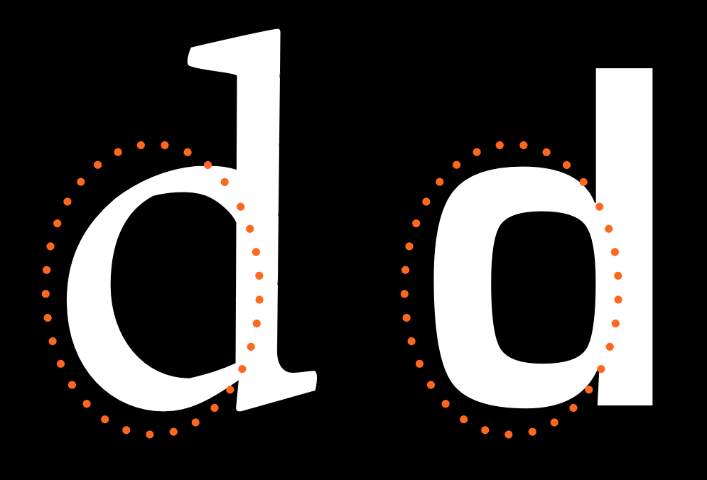
Open the letter 'd''s glyph window by double-clicking below the 'd' in the font view. From the font view, copy the 'o' and paste it into the letter 'd''s glyph window. Then do the same for the 'h'. At this point you can delete the part of the h that you're not going to use. Position the remaining pieces together so they resemble a 'd.'

Clearly, there's more work to be done here. We'll make some adjustments. Narrow the right side of the o where it meets the stem.

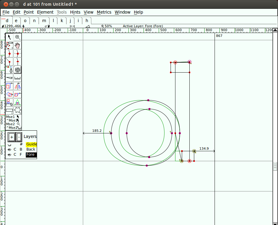
To improve the optical spacing and allow the shape to look more balanced, make a little room at the serif by adding a point to the stem and pushing the bottom points to the right.
Below is an overlay of the starting shape and the new shape.

Now that you know how to assemble from existing parts, you can make other similar letters. Keep in mind the subtleties that make each letter individual, yet still part of a family.
Deriving the b, p, and q
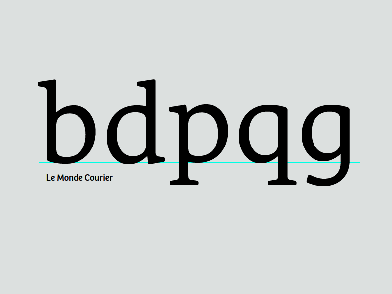
Now that you have the d, by flipping and rotating you can make a reasonable b, p, and q. Again, be aware of how the serifs and the contrast differ in each letter. Your font doesn't have to do this exactly the same way, but it's one of the things you should think about.

Make the g
You can start with the q, stretching and altering the tail, to make the single bowl g. No shapes closely resemble the binocular g. The binocular g usually needs to be noticbly lighter in oreder to look right when set with other letters.

On to f and t
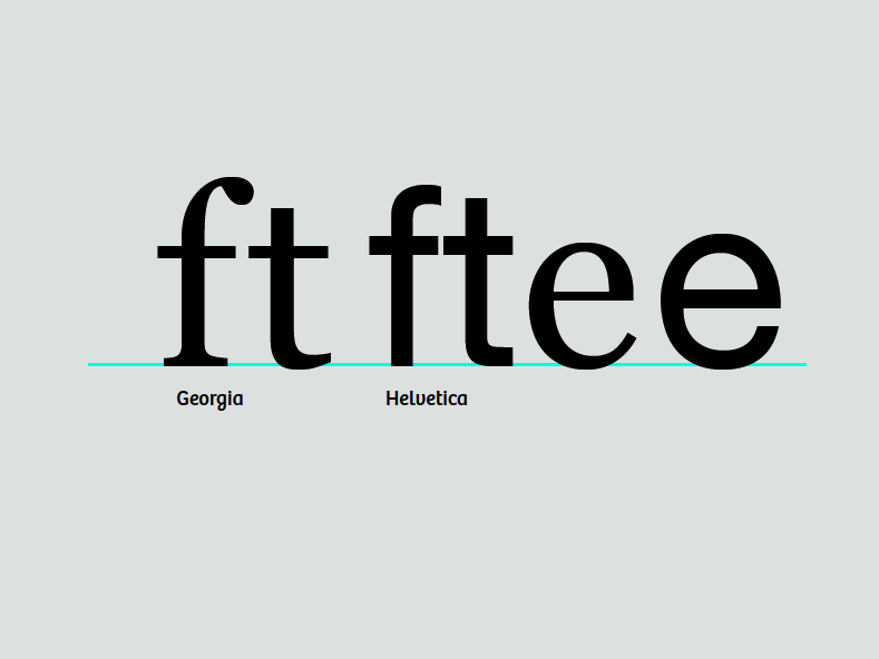
The t has an ascender, but it's generally shorter than the ascenders of the other lower case letters. By comparison, the f is much taller and usually encroaches on the space of the letter next to it. They both have crossbars which are generally at the same height, width, and thickness. Often you can copy from one to the other.

Now make the e
The e will be loosely based on the o. The crossbar of the e is lower than that of the t, but has the same thickness. The hook at the bottom of the e will be informed by the bottom of the t.
From the e comes c
Creating the c from the e involves deleting the crossbar and adding the terminal at the top. The upper terminal of the c can be similar to the upper terminals of other letters such as the a, and f, and r. The terminals of the c can also form the basis for the s. The e can also influence the proportions of your a.

v, w, x, y, and z
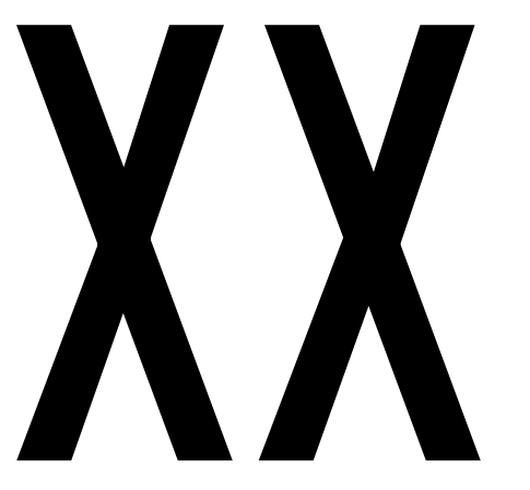
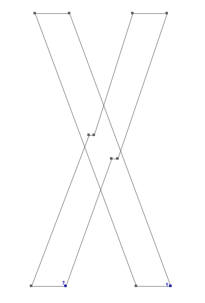
These letters are somewhat difficult because they don't have forms that are related to the other letters. This means you have to just jump in and draw the v. Make the down-stroke as thick as your thick stems, and make the upstroke as thin as the thinner strokes in your other letters. Once you have the v, you have a basic plan for the w and y. For x and y, focus on matching the contrast of the rest of the design while compensating for the illusions that occur in diagonal and crossing diagonal forms.
Creating 'o' and 'n'
There are many approaches to designing a font. It can be helpful to deconstruct the larger processes involved in order to get started quickly, and to provide a solid basis for a whole font's worth of characters. A popular and valuable approach to this is to design the 'o' and 'n' characters first, nailing down essential elements of form, space and balance, before bringing them together for the formation of other characters. Creating the lowercase 'o' and 'n' characters can provide us with some of the fundamental forms and structures that will underpin all other characters that are needed.
Although the design of the 'o' may seem like quite a simple thing, all the characteristics mentioned in the "What is a font?" chapter come into play. The choice you make about each characteristic should be a deliberate choice.
Underhangs and Overshoots
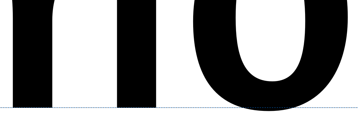
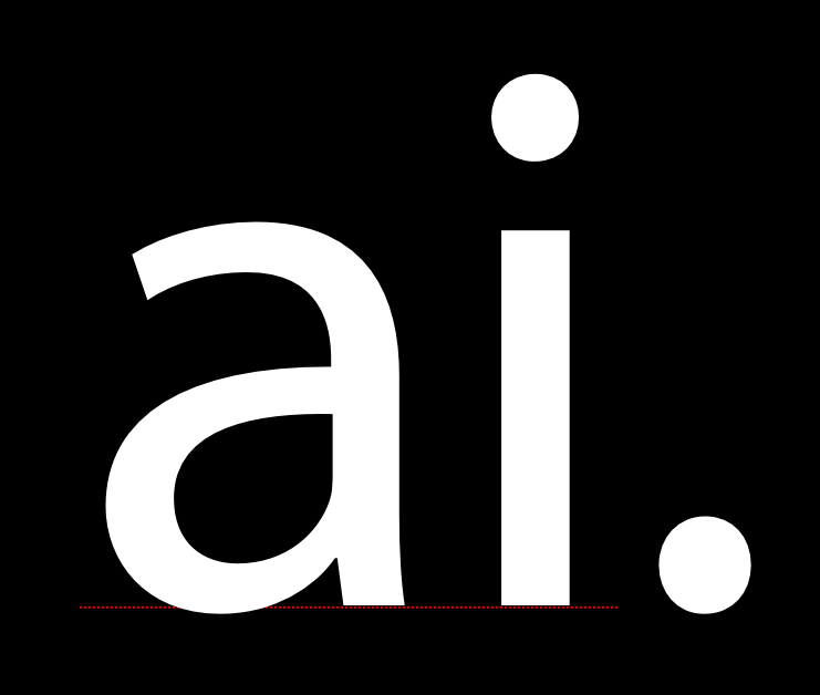
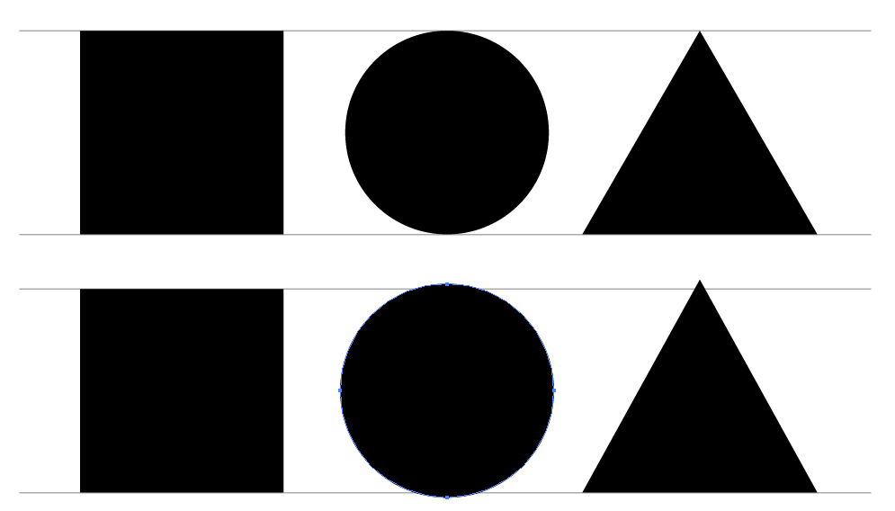
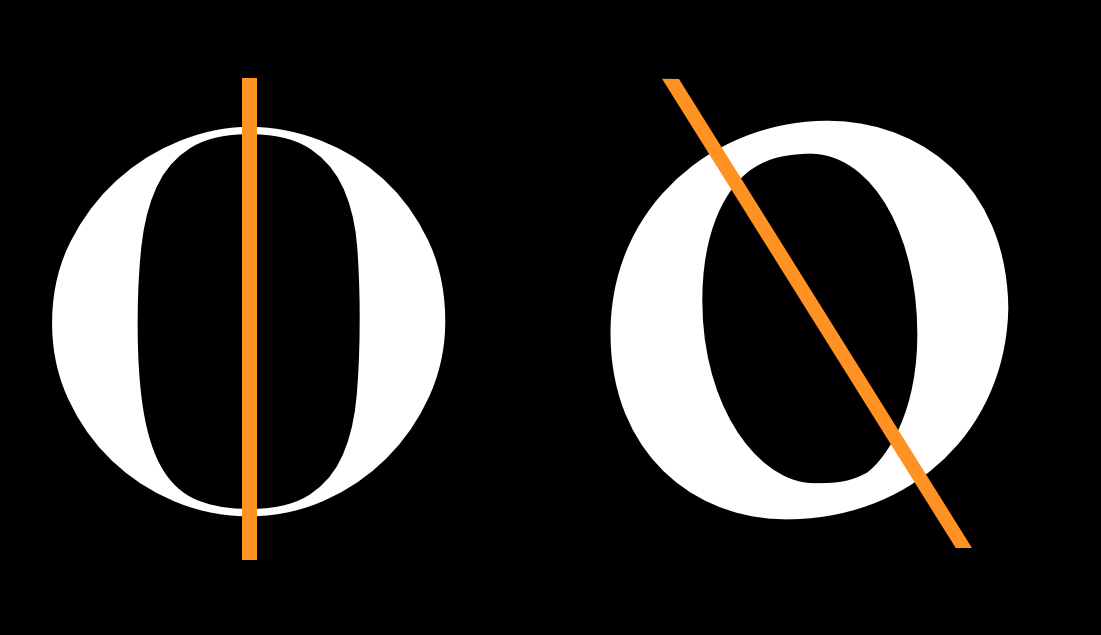
One way that optical effects impact type design is in the way that curves and straight edges appear to our eyes. For example, for a curve and a straight edge to look as though they are sitting correctly along a line, the curve must actually sit a little below the line. This is portion of a character that dips just below the baseline in order to appear sitting on the baseline is called the underhang, an example is seen below. Without underhang, characters with curves at the baseline will appear to not be sitting correctly within a line of text.

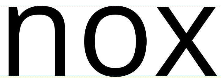
In the same way as the effect of the underhang has optical impact in a font design, an area of overshoot is needed to provide the illusion of alignment at the x-height and at the cap-height (see below).


Design the lowercase 'o'
The design of the 'o' is not just a question of the black part of the letter. While the 'o' provides the very basic bowl weight and shape, the white, or counter, provides the size and shape used by the rest of the font. In general terms, we can also observe that the round form of the 'o' will be echoed in other characters. These include the b, c, d, e, p, and q, and the form will also implicate the shaping and forms of curves within any other characters of the font, such as the O, C, D, and Q.
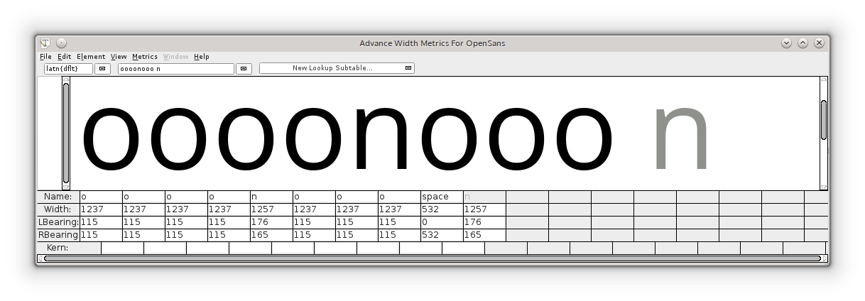
In addition, the white inside the 'o' should be utilized when designing the spacing of our font; the 'o' sets up the reference rhythm of spaces used between all other glyphs in the font too. These two values are very related, so essentially you will need to design the amount of white space that are the side bearings of your 'o' as well. As a general principle, with the exception of slanted or italic fonts, the 'o' should have the same amount of space on the left and right sides, and the white space between a string of 'o' characters should balance the white space inside the 'o's.
Here we encroach well into the territory of spacing and metrics, so even at this early stage you will need to study some of what is written in the chapter on Spacing, Metrics, and Kerning, which covers the whys and hows of designing spacing in a font. Then, returning back here, you will have a well spaced 'o' character to help you design your 'n' character.
Design the lowercase 'n'
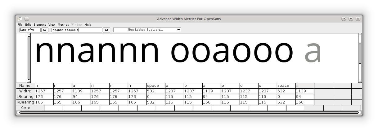
Once you are happy with the form and spacing of a string of your lowercase 'o' character, the next step of this approach is to create a suitably shaped, balanced, and well-spaced lowercase 'n,' then to inject it into your string of 'o' characters.
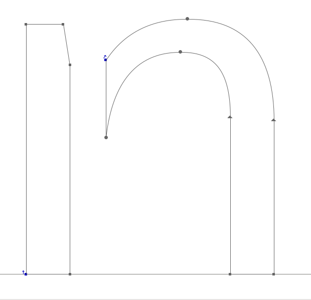
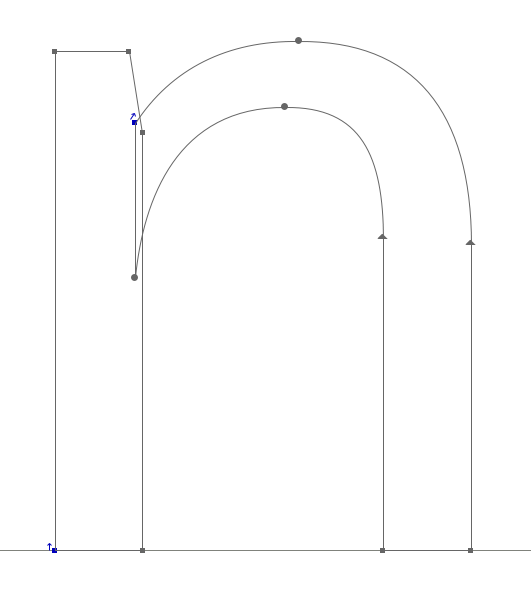
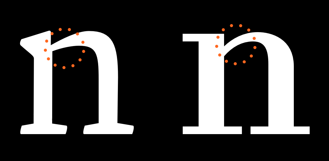
If we look at the anatomy of an 'n', we can break it apart into two or three components consisting of stem and curve. This approach can give us a shortcut to keeping balance and harmony within our characters as they are formed, and as our set of characters grows. Look at the example lowercase 'n' below; it is broken into two components. These separate components combine together to form an 'n', but the same components will be re-used later when forming other characters, e.g., the stem at the left of the 'n' can be used to form the left-sided stem of all other lowercase characters.
Taking yourself forward again to the chapter on spacing and metrics, the design of the 'n' character should keep pace within the process of spacing the 'n' and 'o' characters together.
Now, garnering the methods you have used to create an 'n' and 'o' character, you are ready to expand the lowercase character set. The qualities of the stem and curve components of the 'n' and 'o' will inform the way you may form other characters. If we study the characters below from Open Sans, we can see the relationships between the formal aspects of separate characters and how they can be repeated, with some adjustments, to form the components of our font.


Creating your type's DNA
After you have completed good solid design and spacing of the 'o' and 'n', the next thing to do is to begin populating the font with letters whose structural characteristics provide useful DNA for making many of the other letters in the font.
It may be tempting to rush to populate your font as rapidly as possible with all the letters. You should resist this urge! The reason is that while 'n' and 'o' provide an excellent beginning to the foundation of the design, we need to establish the rest of it. Rapid expansion before this is done will mean that the whole project is harder to manage -- and takes longer than it needs to.
What else do we need for the foundation of our design? First, let us look at what we have with our 'n' and 'o.'
Although the 'o' is especially useful for working out the basic spacing, it is not going to help us design other characters; not necessarily even the 'b' or 'd'.
The letter 'n', on the other hand, is very useful because it helps making the m, h, and u. The other factor that we need to concern ourselves with in choosing letters for our foundation is how frequently the letter is used. A letter that is used a lot will help us make test words. Some of the letters may be chosen almost exclusively for this second reason.
The letters you choose don't have to be the same ones we suggest. They should simply have the characteristics being discussed. So, for instance, you may want to use "a d h e s i o n" to start with. This set of letters is used in the type design MA course at the University of Reading. But an alternative you may want to use is "v i d e o s p a n." The foundry Type Together uses this set themselves ,and when they teach type design. Either set has enough DNA to be meaningful, and it is relatively small so it is very manageable.
While it may be easiest to simply use one of the above sets of letters, you can also build your own.
If you do the latter, what set of letters should you pick to add to "n" and "o"? Consider the following.
a - The letter 'a' is also a very common. The 'a' may also be useful in anticipating what the terminals of s may be like.
d - The shape of 'd' can let you know quite a lot about the design of b, p and q.
e - In English and many other languages, the letter 'e' is especially common -- which makes it especially valuable. The shape of 'e' can also be used to begin the design of 'c.'
h - While 'h' can be built fairly rapidly from the 'n,' it also provides variety to the texture you want to test by offering an ascender.
i - Like 'e' the letter 'i' is also fairly common, and it has the benefit of letting you know a little bit about what 'j' is like. The shape of 'i' is also partly inferable from the shape of 'n.'
s - The letter 's' is a good one to add early on because it adds visual variety to the texture of letters you will be testing. The letter 's' is also unusually hard to get right, so starting on it early makes it more likely that you will be able to spend enough time to get it right by the end of the project. The terminals of 's' may sometimes be useful for anticipating what the terminals of a, c, f, j and y could be like.
v - The letter 'v' is useful for anticipating what the 'y' and 'w' may be like.
One you have these letters, it will be useful to spend time refining them by testing words that are made from them. As before with the 'n' and 'o' a great deal of attention should be paid to the spacing of the letters and the relationships of the counters to these spaces.
Build a test text
There are many resources for rapidly building your test text;
There is a Libre software solution provided by Dave Crossland at http://libretext.org
"Adhesion Text" was the first resource of this kind. It was made by Miguel Sousa: http://www.adhesiontext.com/
The foundry "Just Another Type Foundry" also offers an excellent resource: http://justanotherfoundry.com/generator
Drawing with Spiro
Spiro is a toolkit for designing curves in an alternate method to the more traditional Bézier curves. Although it is optional, FontForge can be installed to include a Spiro mode that offers you tools to create these specific types of curves. See the chapter of Installing FontForge for more detail on how to install Spiro tool support.
Spiro drawing is different, but it can create curves in a way that Bézier tools cannot, and it can solve problems that other drawing methods cannot. Spiro can be a very cool tool to use. Please experiment!
The Spiro toolset
Many of the same drawing tools are available in Spiro mode as those described in the "Using the FontForge drawing tools" chapter, but some of them work very differently when you are in Spiro mode.

There are five different types of Spiro points:
- G4 points, used for a more gentle curve
- G2 points, used for a sharper curve
- Corner points, for abrupt corner joints
- Previous constraint points, used when the countour of the path changes from a curve to a straight line
- Next constraint points, used when the path changes from a straight line to a curve
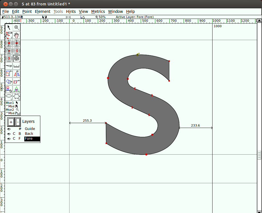
Draw an S with Spiro
Going through the exercise of drawing an 'S' with Spiro will make you comfortable with Spiro.
Tip: When drawing in Spiro mode, always start with a G4 or G2 point. Beginning with the other types of points doesn't really work in FontForge.
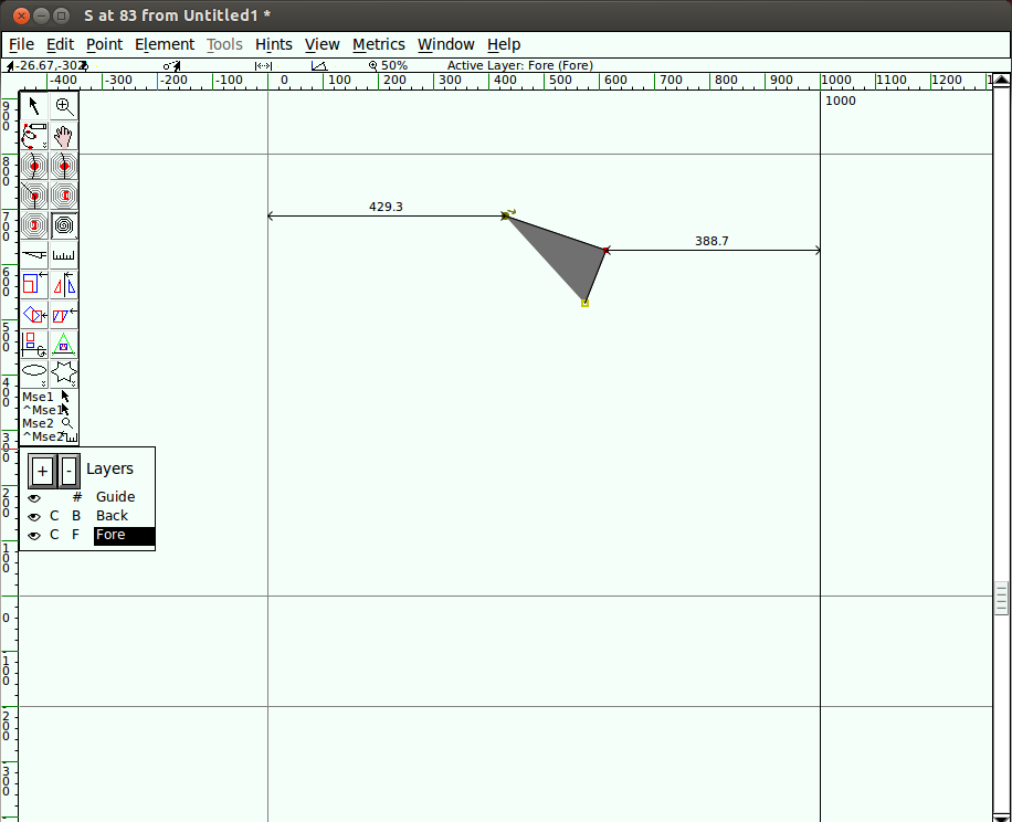
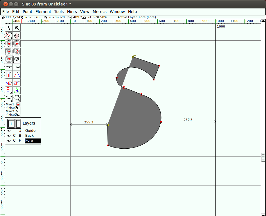
Start off with a G4 point at the topmost point of your 'S,' followed by a corner point, then another corner point. Work clockwise around the shape of the letter.

Follow this with a G4, a previous constraint point, and a next constraint point.

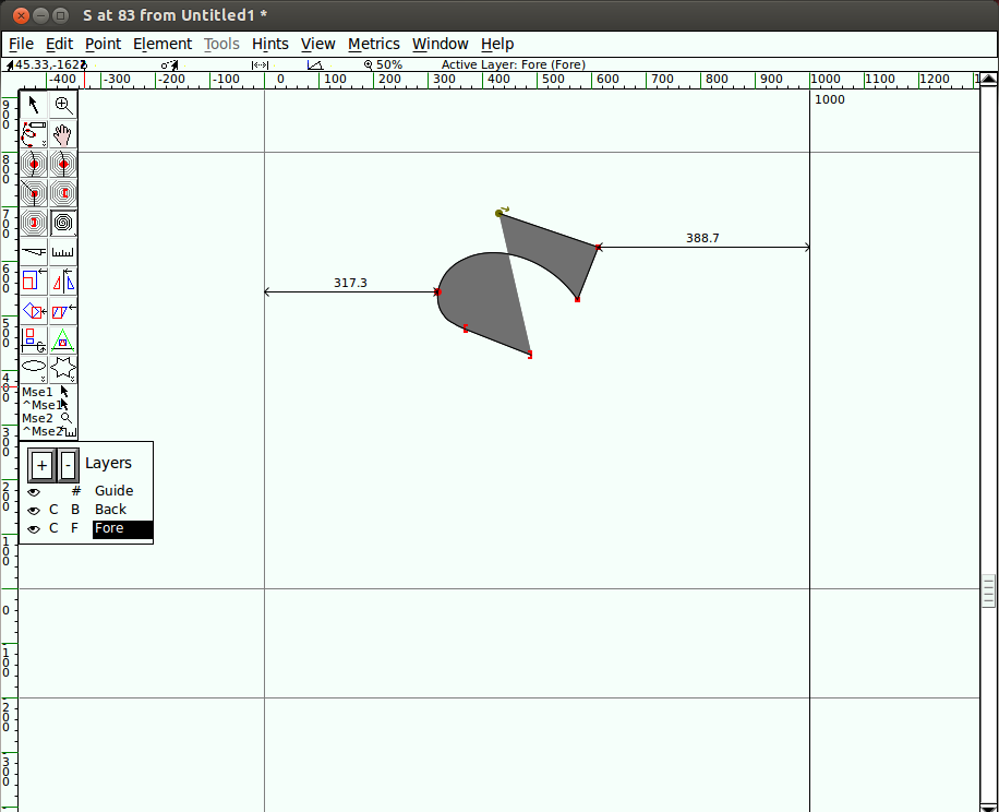
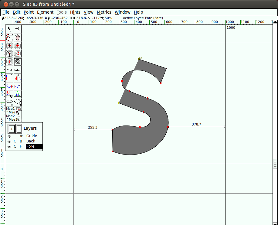
Next, add another G4 point, followed by two more corner points.

Then a G4, followed by a previous constraint, followed by a next constraint.

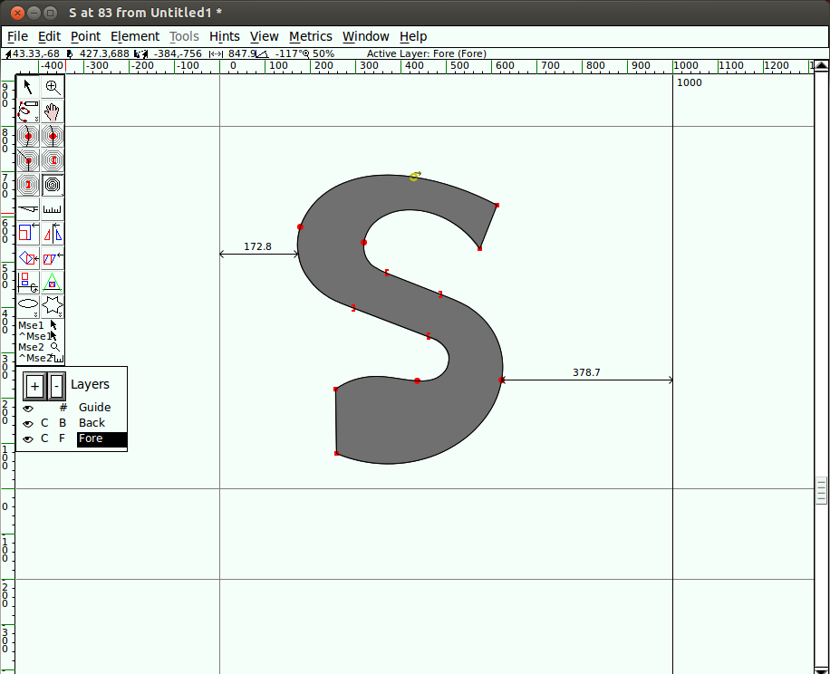
Then, add one more G4 point, and, finally, close the shape at the starting point by clicking on it using the G4 point tool. 
Now you almost have an 'S'! Begin nudging the points around to get your S to look the way you like it.
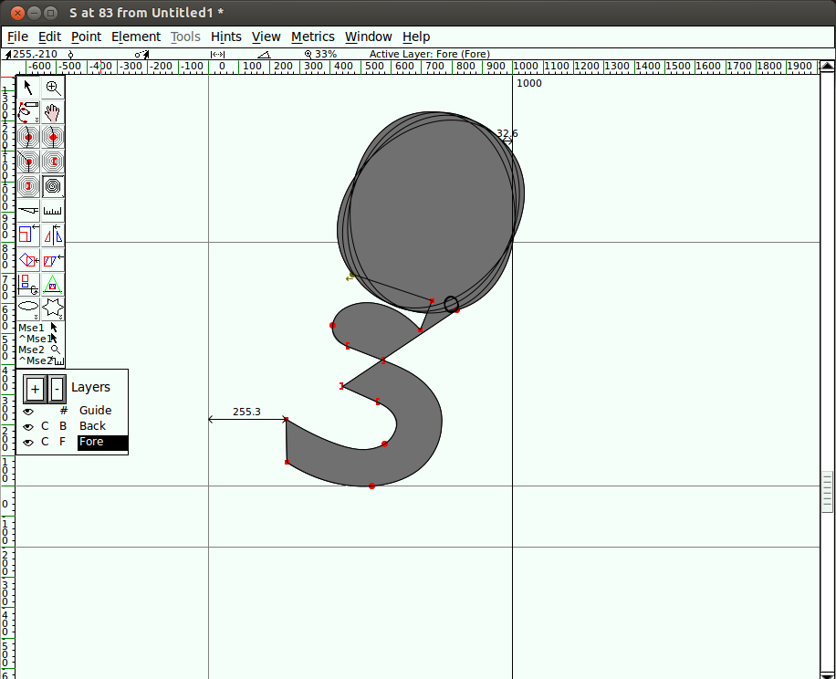
Oops, what happened?

Don't worry -- Spiro sometimes does some funny things. Just hit Undo, or keep nudging the points to get things back on track.
Now you should see something like this:

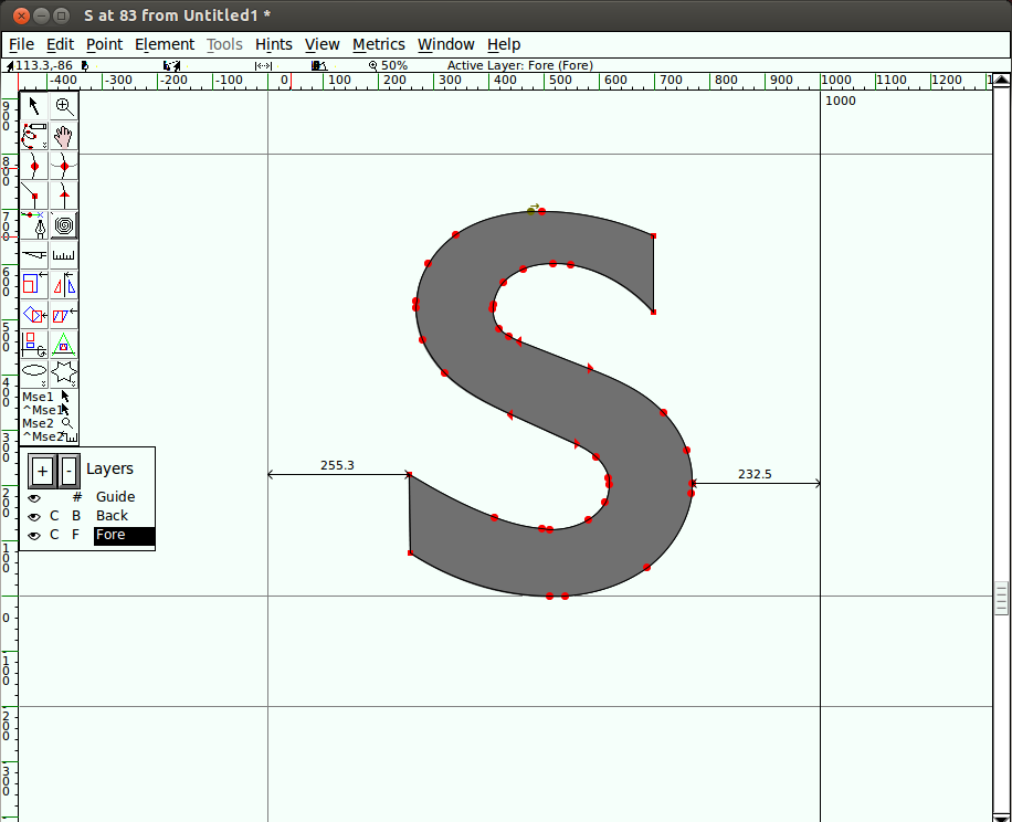
Toggle out of Spiro mode back into Bézier mode. You will notice there are a lot of points on the resulting curve - you -may want to clean some of them up.

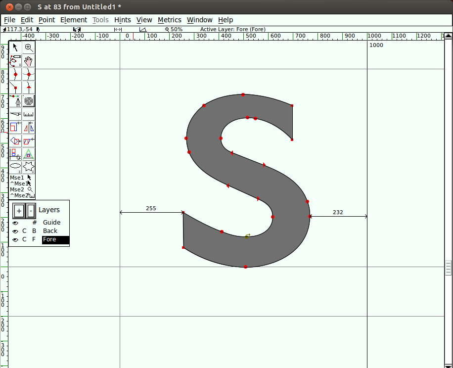
To clean up those extra points, go to the Element menu and select Simplify > Simplify. Then go to Element > Add Extrema. Finally, go to Element > Round > To Int. After these clean up operations, you will see something like this:

You can continue to experiment with Spiro mode to get a feel for how it differs from Bézier drawing. The terminology is different, but as is the case with FontForge's other drawing and adjustment tools, practice makes perfect.
Further reading
Detail in Typography (Paperback)
Jost Hochuli (Author)
ISBN: 9780907259343
Adrian Frutiger - Typefaces: The Complete Works
Heidrun Osterer, Philipp Stamm, Swiss Foundation Type and Typography (Authors)
ISBN: 9783764385811
Printing Types: Their History, Forms, and Use: A Study in Survivals (with ILLUSTRATIONS)
D. B Updike, Daniel Berkeley (Authors)
Creative Characters Format: Flexibound
Jan Middendorp (Editor)
ISBN: 9789063692247
Now Read This: The Microsoft Cleartype collection
John D. Berry (Author)
The Stroke: Theory of Writing (Paperback)
Gerrit Noordzij (Author)
ISBN: 9780907259305
Shaping Text: Type, Typography and the Reader
Jan Middendorp (Author)
ISBN: 9063692234
Thinking with Type: A Critical Guide for Designers, Writers, Editors, & Students (Design Briefs)
Ellen Lupton (Author)
ISBN: 9781568984483
LETTERS OF CREDIT: A view of type design
Tracy, Walter (Author)
ISBN: 0879236361 / 0-87923-636-1
The Elements Of Typographic Style: Version 3.1
Bringhurst, Robert (Author)
ISBN: 0881792063 / 0-88179-206-3
Type: The Secret History of Letters
Simon Loxley (Author)
ISBN: 1845110285
Type Designs
AF Johnson (Author)
Typography: Macro & Microaesthetics
Willy Kunz (Author)
ISBN: 3721203488
Fonts and encodings
Yannis Haralambous (Author), P Scott Horne (Translator)
ISBN-10: 0596102429 | ISBN-13: 978-0596102425
The Unicode Standard, Version 5.0
The Unicode Consortium (Author)
ISBN-10: 0321480910 | ISBN-13: 978-0321480910
Glossary
A
Abjad
Abjad is the technical term for the type of writing system used by Semitic languages (Hebrew, Arabic, etc.), where there are glyphs for all the consonants but the reader must be prepared to guess what vowel to add between two consonants.
Both Hebrew and Arabic have optional vowel marks and are called "impure" abjads. Ancient Phoenician had nothing but consonants and is a "pure" abjad.
See Also: alphabet, abugida, syllabary and the relevant Wikipedia article (http://en.wikipedia.org/wiki/Abjad).
Abugida
An abugida is somewhere in between an alphabet and a syllabary. The Indic writing systems are probably the best known abugidas.
In most abugidas there are independant glyphs for the consonants, and each consonant is implicitly followed by a default vowel sound. All vowels other than the default will be marked by either diacritics or some other modification to the base consonant.
An abugida differs from a syllabary in that there is a common theme to the the images representing a syllable beginning with a given consonant (that is, the glyph for the consonant), while in a syllabary each syllable is distinct even if two start with a common consonant.
An abugida differs from an abjad in that vowels (other than the default) must be marked in the abugida.
See Also: alphabet, abjad, syllabary and the relevant Wikipedia article (http://en.wikipedia.org/wiki/Abugida).
Accent
See Diacritics
Advance Width
The distance between the start of this glyph and the start of the next glyph. Sometimes called the glyph's width. See also Vertical Advance Width.
Alphabet
A writing system where there are glyphs for all phonemes -- consonants and vowels alike -- and (in theory anyway) all phonemes in a word will be marked by an appropriate glyph.
See Also: abjad, abugida, syllabary and the relevant Wikipedia article (http://en.wikipedia.org/wiki/Alphabet).
Apple Advanced Typography
Apple's extension to basic TrueType fonts. Includes contextual substitutions, ligatures, kerning, etc. Also includes distortable fonts.
Arm
The piece of the letter r that hangs off to the right.
Ascender
A stem on a lower case letter which extends above the x-height. "l" has an ascender.
See also X-height, Cap-height, Descender, Overshoot, Baseline
Anchor Class
Used to specify mark-to-base and cursive GPOS subtables.
Ascent
In traditional typography the ascent of a font was the distance from the top of a block of type to the baseline.
Its precise meaning in modern typography seems to vary with different definers.
ATSUI
Apple's advanced typographical system. Also called Apple Advanced Typography.
B
Baseline
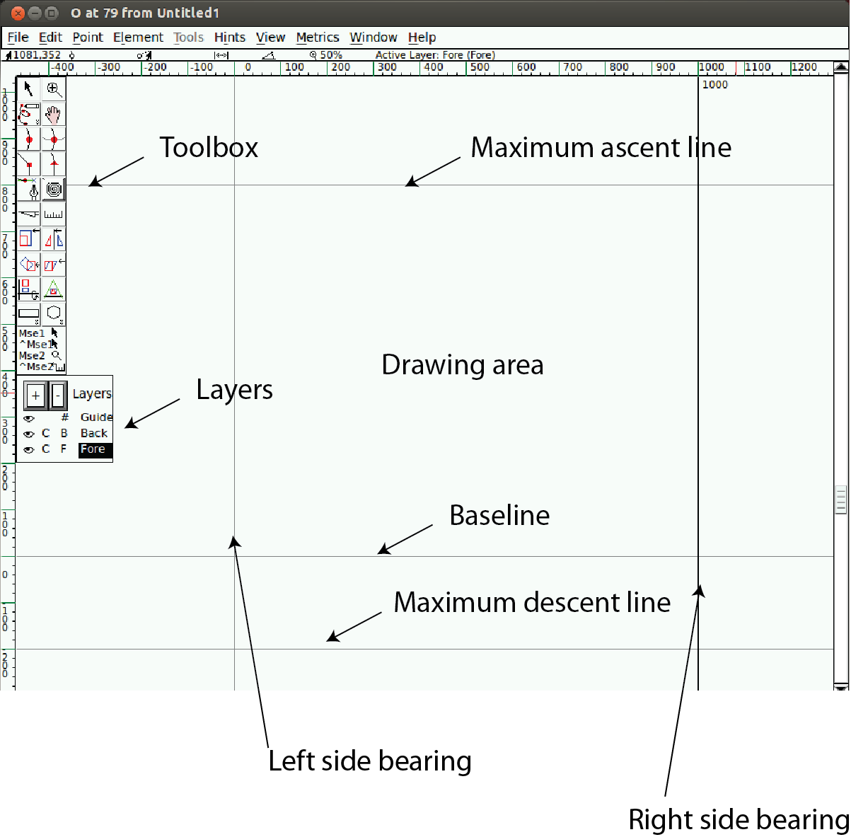
The baseline is the horizontal line on which the (latin, greek, cyrillic) letters sit. The baseline will probably be in a different place for different scripts. In Indic scripts most letters descend below the baseline. In CJK scripts there is also a vertical baseline usually in the middle of the glyph. The BASE and bsln tables allow you to specify how the baselines of different scripts should be aligned with respect to each other.
See also X-height, Cap-height, Ascender, Descender, Overshoot
Bézier curve or Bézier splines
Bézier curves are described in detail in the Bézier section of the main manual.
Bidi
Bi-Directional text. That is a section of text which contains both left-to-right and right-to-left scripts. English text quoting Arabic, for example. Things get even more complex with nested quotations. TheUnicode standard contains an algorithm for laying out Bidi text. See also: Boustrophedon.
Black letter
Any of various type families based on medieval handwriting.
See also gothic.
BMP (Basic Multilingual Plane)
The first 65536 code points of Unicode. These contain most of the ordinary characters in the modern world. See Also
- SMP: Supplementary Multilingual Plane (0x10000-0x1FFFF)
- SIP: Supplementary Ideographic Plane (0x20000-0x2FFFF)
- SSP: Supplementary Special-purpose Plane (0xE0000-0xEFFFF)
Bold
A common font style. The stems of the glyphs are wider than in the normal font, giving the letters a darker impression. Bold is one of the fewLGC styles that translate readily to other scripts.
Bowl
The round part of the letter.
Bopomofo
A (modern~1911) Chinese (Mandarin) alphabet used to provide phonetic transliteration of Han ideographs in dictionaries.
Boustrophedon
Writing "as the ox plows", that is alternating between left to right and right to left writing directions. Early alphabets (Old Canaanite, and the very early greek writings (and, surprisingly, fuþark)) used this. Often the right to left glyphs would be mirrors of the left to right ones. As far as I know, no modern writing system uses this method (nor does OpenType have any support for it). See Also Bidi.
C
Cap-height
The height of a capital letter above the baseline (a letter with a flat top like "I" as opposed to one with a curved one like "O").
See also X-height, Ascender, Descender, Overshoot, Baseline
CFF
Compact Font Format most commonly used within OpenType postscript fonts, but is a valid font format even without a SFNTwrapper. This is the native font format for fonts with PostScript Type2 charstrings.
Character
A character is a Platonic ideal reified into at least one glyph. For example the letter "s" is a character which is reified into several different glyphs: "S", "s", "s", long-s, etc. Note that these glyphs can look fairly different from each other, however although the glyph for an integral sign might be the same as the long-s glyph, these are in fact different characters.
Character set
A character set is an unordered set of characters.
CID
Character Identifier, a number. In some CJK PostScript fonts the glyphs are not named but are refered to by a CID number.
CID-keyed font
A PostScript font in which the glyphs are index by CID and not by name.
CJK
Chinese, Japanese, Korean. These three languages require fonts with a huge number of glyphs. All three share a writing system based on Chinese ideographs (though they have undergone separate evolution in each country, indeed mainland Chinese fonts are different from those used in Taiwan and Hong Kong).
Japanese and Korean also have phonetic syllabaries. The Japanese have two syllabaries, Hiragana and katakana which have about 60 syllables. The Koreans have one syllabary, hangul with tens of thousands of syllables.
CJKV
Chinese, Japanese, Korean, Vietnamese. These four languages require fonts with a huge number of glyphs.
Condensed
A condensed font is one where the space between the stems of the glyphs, and the distance between glyphs themselves has been reduced.
Conflicting hints
If a glyph contains two hints where the start or end point of one is within the range of the other then these hints conflict. They may not be active simultaneously.
Counter
The counter of a glyph is the white part which is either fully or partially enclosed. The o and n both have counters. The i and l do not. The e and both have counters. The B has two counters.
D
Descender
A stem on a lower case letter which extends below the baseline. "p" has a descender.
See also X-height, Cap-height, Ascender, Overshoot, Baseline
Descent
In traditional typography the descent of a font was the distance from the bottom of a block of type to the baseline.
Its meaning in modern typography has become less precise.
Device Table
A concept in OpenType which allows you to enter spacing adjustments geared to rasterization at particular pixel sizes. If a kerning value that works most of the time leads to an ugly juxtaposition of glyphs on a 12 pixel high font, then you can add a special tweak to the spacing that only is applicable at 12 pixels (and another one at 14 and 18, or whatever is needed). Similar functionality is needed for anchored marks.
Diacritics
Many lanaguges use letters which have have marks above or below them of even crossing the letters. These marks are called diacritics. Sometimes they are also caleed "accents" although this is a less precise term. Examples of these letters include À à å Å Ü ü Ø ø Ç ç.
Didot point
The European point. 62 2/3 points per 23.566mm ( 2.66pt/mm or 67.55pt/inch ). There is also a "metric" didiot point: .4mm.
Distortable font
See Multi-Master
E
em
A linear unit equal to the point size of the font. In a 10 point font, the em will be 10 points. An em-space is white-space that is as wide as the point size. An em-dash is a horizontal bar that is as wide as the point size.
An em-square is a square one em to each side. In traditional typography (when each letter was cast in metal) the glyph had to be drawn within the em-square.
em unit
In a scalable font the "em" is subdivided into units. In a postscript font there are usually 1000 units to the em. In a TrueType font there might be 512, 1024 or 2048 units to the em. In an Ikarus font there are 15,000 units. FontForge uses these units as the basis of its coordinate system.
en
One half of an "em"
Encoding
An encoding is a mapping from a set of bytes onto a character set. It is what determines which byte sequence represents which character. The words "encoding" and "character set" are often used synonymously. The specification for ASCII specifies both a character set and an encoding. But CJK character sets often have multiple encodings for the character set (and multiple character sets for some encodings).
In more complicated cases it is possible to have multiple glyphs associated with each character (as in arabic where most characters have at least 4 different glyphs) and the client program must pick the appropriate glyph for the character in the current context.
Eth -- Edh
The old germanic letter "ð" for the voiced (English) "th" sound (the sound in "this" -- most English speakers aren't even aware that "th" in English has two sounds associated with it, but it does, see also Thorn)
Even-Odd Fill rule
To determine if a pixel should be filled using this rule, draw a line from the pixel to infinity (in any direction) then count the number of times contours cross this line. If that number is odd then fill the point, if it is even then do not fill the point. This method is used for fonts by postscript rasterizers after level 2.0 of PostScript. See Also Non-Zero Winding Number Fill.
Extended
An extended font is one where the space between the stems of the glyphs, and the distance between glyphs themselves has been increased.
Extremum (plural: Extrema )
An extremum is the point on a mathematical curve where the curve attains its maximum or minimum value. On a continuous curve this can happen at the endpoints (which is dull) or where dx/dt=0 or dy/dt=0.
In font design, the extrema of a glyph are the top-most and bottom-most points of the outline, as well as its left-most and right-most points. Making sure that a glyph has on-curve points at all of its extrema is important, because it simplifies text rendering when the font is used.
F
Features (OpenType)
When creating fonts for complex scripts (and even for less complex scripts) various transformations (like ligatures) must be applied to the input glyphs before they are ready for display. These transformations are identified as font features and are tagged with (in OpenType) a 4 letter tag or (in Apple) a 2 number identfier. The meanings of these features are predefined by MicroSoft and Apple. FontForge allows you to tag each lookup with one or several features when you create it (or later).
Feature File
This is a text syntax designed by Adobe to describe OpenType features. It can be used to move feature and lookup information from one font to another.
Feature/Settings (Apple)
These are roughly equivalent to OpenType's Features above, they are defined by Apple.
Font
A collection of glyphs, generally with at least one glyph associated with each character in the font's character set, often with an encoding.
A font contains much of the information needed to turn a sequence of bytes into a set of pictures representing the characters specified by those bytes.
In traditional typesetting a font was a collection of little blocks of metal each with a graven image of a letter on it. Traditionally there was a different font for each point-size.
Font Family, or Family
A collection of related fonts. Often including plain, italic and bold styles.
FreeType
A library for rasterizing fonts. Used extensively in FontForge to understand the behavior of truetype fonts and to do better rasterization than FontForge could accomplish unaided.
Fuþark (Futhark)
The old germanic runic script.
G
Ghost Hint
Sometimes it is important to indicate that a horizontal edge is indeed horizontal. But the edge has no corresponding edge with which to make a normal stem. In this case a special hint is used with a width of -20 (or -21). A ghost hint must lie entirely within a glyph. If it is at the top of a contour use a width of -20, if at the bottom use -21. Ghost hints should also lie within BlueZones.
(The spec also mentions vertical ghost hints, but as there are no vertical bluezones it is not clear how these should be used).
Glyph
A glyph is an image, often associated with one or several characters. So the glyph used to draw "f" is associated with the character f, while the glyph for the "fi" ligature is associated with both f and i. In simple latin fonts the association is often one to one (there is exactly one glyph for each character), while in more complex fonts or scripts there may be several glyphs per character (In renaissance printing the letter "s" had two glyphs associated with it, one, the long-s, was used initially and medially, the other, the short-s, was used only at the end of words). And in the ligatures one glyph is associated with two or more characters.
Fonts are collections of glyphs with some form of mapping from character to glyph.
Grid Fitting
Before TrueType glyphs are rasterized they go through a process called grid fitting where a tiny program (associated with each glyph) is run which moves the points on the glyph's outlines around until they fit the pixel grid better.
Gothic
The German monks at the time of Gutenberg used a black-letter writing style, and he copied their handwriting in his typefaces for printing. Italian type designers (after printing spread south) sneered at the style, preferring the type designs left by the Romans. As a term of contempt they used the word gothic, the style of the goths who helped destroy the roman empire.
Graphite tables
Graphite is an extension to TrueType which embeds several tables into a font containing rules for contextual shaping, ligatures, reordering, split glyphs, bidirectionality, stacking diacritics, complex positioning, etc.
This sounds rather like OpenType -- except that OpenType depends on the text layout routines knowing a lot about the glyphs involved. This means that OpenType fonts cannot be designed for a new language or script without shipping a new version of the operating system. Whereas Graphite tables contain all that hidden information.
Apple's Advanced Typography provides a better comparison, but Graphite tables are supposed to be easier to build.
SIL International provides a free Graphite compiler .
Grotesque
See also sans-serif.
H
Han characters
The ideographic characters used in China, Japan and Korea (and, I believe, in various other asian countries as well (Vietnam?)), all based on the writing style that evolved in China.
Hangul
The Korean syllabary. The only syllabary (that I'm aware of anway) based on an alphabet -- the letters of the alphabet never appear alone, but only as groups of two or three making up a syllable.
Hanja
The Korean name for the Han characters
Hints
These are described in detail in the main manual. They help the rasterizer to draw a glyph well at small pointsizes.
Hint Masks
At any given point on a contour hints may not conflict. However different points in a glyph may need conflicting hints. So every now and then a contour will change which hints are active. Each list of active hints is called a hint mask.
Hiragana
One of the two Japanese syllabaries. Both Hiragana and Katakana have the same sounds.
I
Ideographic character
A single character which represents a concept without spelling it out. Generally used to mean Han (Chinese) characters.
Italic
A slanted style of a font, often used for emphasis.
Italic differs from Oblique in that the transformation from the plain to the slanted form involves more than just skewing the letterforms. Generally the lower-case a changes to a, the serifs on lower-case letters like i (i) change, and the font generally gains a more flowing feeling.
J
Jamo
The letters of the Korean alphabet. These are almost never seen alone, generally appearing in groups of three as part of a Hangul syllable. The Jamo are divided into three catagories (with considerable overlap between the first and third), the choseong -- initial consonants, the jungseong -- medial vowels, and the jongseong -- final consonants. A syllable is composed by placing a choseong glyph in the upper left of an em-square, a jungseong in the upper right, and optionally a jongseong in the lower portion of the square.
K
Kanji
The Japanese name for the Han characters.
Katakana
One of the two (modern) Japanese syllabaries. Both Hiragana and Katakana have the same sounds.
Kerning
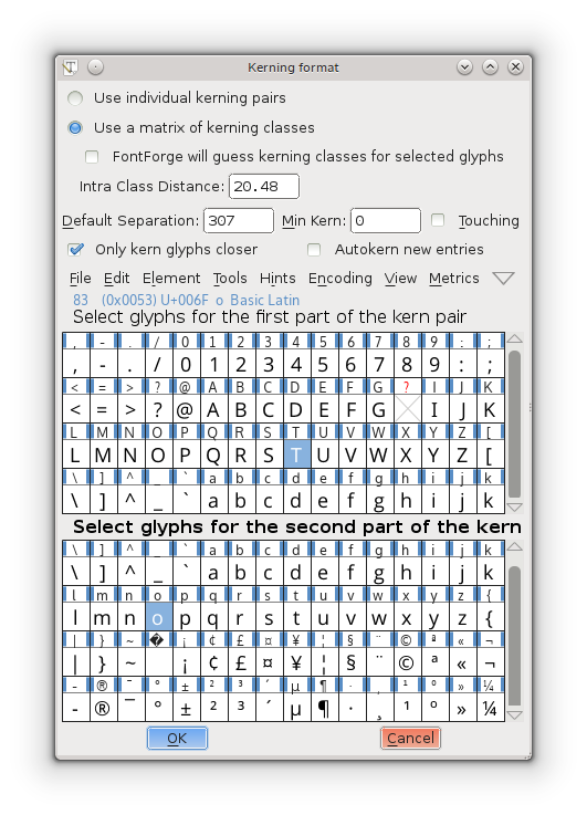
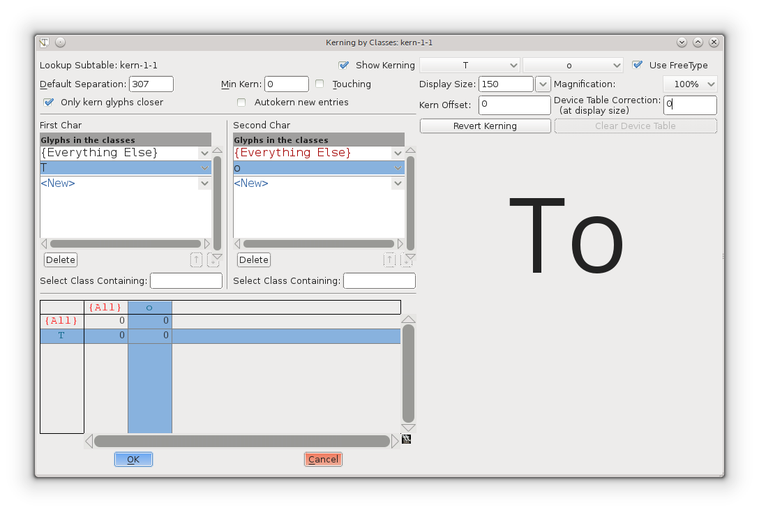
When the default spacing between two glyphs is inappropriate the font may include extra information to indicate that when a given glyph (say "T") is followed by another glyph (say "o") then the advance width of the "T" should be adjusted by a certain amount to make for a more pleasing display.
In the days of metal type, metal actually had to be shaved off the slug of type to provide a snugger fit. In the image on the side, the "F" on the left has had some metal removed so that a lower case letter could snuggle closer to it.
Kern pair
A pair of glyphs for which kerning information has been specified.
Kerning by classes
The glyphs of the font are divided into classes of glyphs and there is a large table which specifies kerning for every possible combination of classes. Generally this will be smaller than the equivalent set of kerning pairs because each class will usually contain several glyphs.
Knuth, Donald
A mathematician who got so fed up with bad typesetting back in the 1970 & 80s that he created his own font design system and typographical layout program called, respectively, MetaFont and TeX.
L
Left side bearing
The horizontal distance from a glyph's origin to its leftmost extent. This may be negative or positive.
Lemur
A monotypic genus of prosimian primates, now found only on Madagascar but formally (about 50 million years ago) members of this family were much more wide spread.
Ligature
A single glyph which is composed of two adjacent glyphs. A common example in the latin script is the "fi" ligature which has a nicer feel to it than the sequence.
Linespace
The distance between successive lines of type.
LGC
Latin, Greek, Cyrillic. These three alphabets have evolved side by side over the last few thousand years. The letter forms are very similar (and some letters are shared). Many concepts such as "lower case", "italic" are applicable to these three alphabets and not to any others. (OK, Armenian also has lower case letters).
M
Manyogana
An early Japanese script, ancestral to both hiragana and katakana. Manyogana used kanji for their phontic sounds, and over the years these kanji were simplified into hiragana and katahana.
Monospace
A font in which all glyphs have the same width. These are sometimes called typewriter fonts.
Multi-layered fonts
(FontForge's own term) PostScript type3 fonts and SVG fonts allow for more drawing possibilities than normal fonts. Normal fonts may only be filled with a single color inherited from the graphics environment. These two fonts may be filled with several different colors, stroked, include images, have gradient fills, etc.. FontForge can be configured to support these fonts (it does not do so by default because this takes up more memory).
$ configure --with-type3
$ make
$ make install
Multiple Master Font
A multiple master font is a PostScript font schema which defines an infinite number of related fonts. Multiple master fonts can vary along several axes, for example you might have a multiple master which defined both different weights and different widths of a font family, it could be used to generate: Thin, Normal, Semi-Bold, Bold, Condensed, Expanded, Bold-Condensed, etc.
Adobe is no longer developing this format. Apple has a format which acheives the same effect but has not produced many examples. FontForgesupports both.
N
Namelist
A mapping from unicode code point to glyph name.
Non-Zero Winding Number Fill rule
To determine if a pixel should be filled using this rule draw a line from here to infinity (in any direction) and count the number of times contours cross this line. If the contour crosses the line in a clockwise direction add 1, of the contour crosses in a counter clockwise direction subtract one. If the result is non-zero then fill the pixel. If it is zero leave it blank. This method is used for rasterizing fonts by truetype and older (before version 2) postscript.
See Also Even-Odd Fill Rule.
O
Ogham
The old Celtic inscription script.
OpenType
A type of font. It is an attempt to merge postscript and truetype fonts into one specification.
An opentype font may contain either a truetype or a postscript font inside it.
It contains many of the same data tables for information like encodings that were present in truetype fonts.
Confusingly it is also used to mean the advanced typographic tables that Adobe and MicroSoft (but not Apple) have added to TrueType. These include things like contextual ligatures, contextual kerning, glyph substitution, etc.
And MS Windows uses it to mean a font with a 'DSIG' (Digital Signature) table.
OpenType Tables
Each opentype font contains a collection of tables each of which contains a certain kind of information.
Oblique
A slanted style of a font, generally used for emphasis.
Oblique differs from Italic in that the transformation from the plain to the slanted form involves a mathematical or mechanical skewing the letterforms.
Overshoot
In order for the curved shape of the "O" to appear to be the same height as the flat top of the "I" it tends to "overshoot" the cap-height (or x-height), or undershoot the baseline by about 3% of the cap-height (or x-height). For a triangular shape (such as "A") the overshoot is even greater, perhaps 5%.
These guidelines are based on the way the eye works and the optical illusions it generates and are taken from Peter Karow's Digital Formats for Typefaces, p. 26).
The overshoot is also dependant on the point-size of a font, the larger the point-size the smaller the overshoot should be. Generally modern fonts will be used at multiple point-sizes, but in some font families there are multiple faces for the different point-sizes, and in such a case the overshoot will probably vary from face to face.
See also X-height, Cap-height, Ascender, Descender, Baseline
P
Panose
A system for describing fonts. See HP's PANOSE classification metrics guide (http://www.panose.com/ProductsServices/pan1.aspx). There is also an extension called Panose 2 (http://www.w3.org/Fonts/Panose/pan2.html).
FontForge only knows about the classification scheme for Latin fonts. Other schemes exist for other scripts.
PfaEdit
This was the early name for FontForge. The original conception was that it would only edit type1 ASCII fonts (hence the name), it quickly metamorphosed beyond that point, but it took me three years to rename it.
Phantom points
In a truetype font there are a few points added to each glyph which are not specified by the contours that make up the glyph. These are called phantom points. One of these points represents the left side bearing, and the other the advance width of the glyph. Truetype instructions (hints) are allowed to move these points around just as any other points may be moved -- thus changing the left-side-bearing or the advance width. Early versions of TrueType supplied just these two phantoms, more recent versions also supply a phantom for the top sidebearing and a phantom for the vertical advance width.
Pica
A unit of length defined (in the US at least) to be 35/83cm (or approximately 1/6th of an inch). This was used for measuring the length of lines of text (as "30 picas and 4 points long"), but not for measuring font heights.
In Renaissance typography, before there were points, sizes of type had names, and "pica" was used in this context. As: "Great Canon", "Double Pica", "Great Primer", "English", "Pica", "Primer", "Small Pica", "Brevier", "Nonpareil" and "Pearl" (each name representing a progressively smaller size of type) and See Caslon's type specimen sheet on Wikipedia (http://en.wikipedia.org/wiki/Alphabet).
Pica point
The Anglo-American point. With 72.27 points per inch ( 2.85pt /mm).
Point
A point is a unit of measurement. There were three (at least) different definitions for "point" in common usage before the advent of computers. The one in use in the Anglo-Saxon printing world was the "pica point" with 72.27 points per inch ( 2.85pt /mm ), while the one used in continental Europe was the didot point with 62 2/3 points per 23.566mm ( 2.66pt/mm or 67.54pt/inch ) and the French sometimes used the Mediaan point (72.78 points per inch, 2.86pt/mm).
The didiot and pica points were so arranged that text at a given point-size would have approximately the same cap-height in both systems, the didot point would have extra white-space above the capitals to contain the accents present in most non-English Latin based scripts.
This has the interesting side effect that a font designed for European usage should have a smaller proportion of the vertical em given over to the text body. I believe that computer fonts tend to ignore this, so presumably european printers now set with more leading.
As far as I can tell, computers tend to work in approximations to pica points (but this may be because I am in the US), PostScript uses a unit of 1/72nd of an inch.
Originally fonts were not described by point size, but by name. It was not until the 1730s that Pierre Fournier that created the point system for specifying font heights. This was later improved upon by François Didiot (whence the name of the point). In 1878 the Chicago Type Foundry first used a point system in the US. In 1886 the US point was standardized -- the pica was defined to be 35/83cm, and the pica point defined to be 1/12th of that.
Point Size
In traditional typography a 10pt font was one where the block of metal for each glyph was 10 points high. The point size of a font is the unleaded baseline to baseline distance.
Point of inflection
A point on a curve where it changes from being concave downwards to concave upwards (or vice versa). Or in mathematical terms (for continuous curves) where d2 y/dx2=0 or infinity.
Cubic splines may contain inflection points, quadratic splines may not.
PostScript
PostScript is a page-layout language used by many printers. The language contains the specifications of several different font formats. The main (FontForge) manual has a section describing how PostScript differs from TrueType.
- Type 1: This is the old standard for PostScript fonts. Such a font generally has the extension .pfb (or .pfa). A type 1 font is limited to a one byte encoding (ie. only 256 glyphs may be encoded).
- Type 2/CFF: This is the format used within OpenType fonts. It is almost the same as Type 1, but has a few extensions and a more compact format. It is usually inside a CFF wrapper, which is usually inside an OpenType font. The CFF font format again only allows a 1 byte encoding, but the OpenType wrapper extends this to provide more complex encoding types.
- Type 3: This format allows full postscript within the font, but it means that no hints are allowed, so these fonts will not look as nice at small point-sizes. Also most (screen) rasterizers are incapable of dealing with them. A type 3 font is limited to a one byte encoding (ie. only 256 glyphs may be encoded).
- Type 0: This format is used for collecting many sub-fonts (of Type 1, 2 or 3) into one big font with a multi-byte encoding, and was used for CJK or Unicode fonts.
- Type 42: A TrueType font wrapped up in PostScript. Sort of the opposite from OpenType.
- CID: This format is used for CJK fonts with large numbers of glyphs. The glyphs themselves are specified either as type1 or type2 glyph format. The CID font itself has no encoding, just a mapping from CID (a number) to glyph. An set of external CMAP files are used to provide appropriate encodings as needed.
Python
A computer programming language that emphasizes code readability.
R
Reference
A reference is a way of storing the outlines of one glyph in another (for example in accented glyphs). Sometimes called a component.
Right side bearing
The horizontal distance from a glyph's rightmost extent to the glyph's advance width. This may be positive or negative.
S
Sans Serif
See Serif.
Script
A script is a character set and associated rules for putting characters together. Latin, arabic, katakana and hanja are all scripts.
Serif
Back two thousand years ago when the Romans were carving their letters on stone monuments, they discovered that they could reduce the chance of the stone cracking by adding fine lines at the terminations of the main stems of a glyph.
These fine lines were called serifs, and came to have an esthetic appeal of their own. Early type designers added them to their fonts for esthetic rather than functional reasons.
At the end of the nineteenth and beginning of the twentieth centuries, type-designers started designing fonts without serifs. These were initially called grotesques because their form appeared so strange, they are now generally called sans-serif.
Other writing systems (Hebrew for one) have their own serifs. Hebrew serifs are rather different from latin (cyrillic, greek) serifs and I don't know their history. Hebrew serifs only occur at the top of a glyph.
SFD
SplineFont DataBase. These are FontForge's own personal font representation. The files are ASCII and vaguely readable, the format is described here. As of 14 May 2008 the format has been registered with IANA for a MIME type: application/vnd.font-fontforge-sfd.
Other people use sfd too. (Unfortunately)
- Tops-10, on the Digital PDP-10 used sfd to mean "Sub File Directory". Tops-10 made a distinction between top-level (home) directories, called "user file directories", and sub-directories.
- TeX uses it to mean "Sub Font Definition" where a TeX sfd file contains information on how to break a big CJK or Unicode font up into small sub-fonts, each with a 1 byte encoding which TeX (or older versions of TeX) needed.
SFNT
The name for the generic font format which contains TrueType, OpenType, Apple's bitmap only, X11's bitmap only, obsolete 'typ1' fonts and Adobe's SING fonts (and no doubt others). The SFNT format describes how font tables should be laid out within a file. Each of the above formats follow this general idea but include more specific requirements (such as what tables are needed, and the format of each table).
SIP
Supplementary Ideographic Plane (0x20000-0x2FFFF) of unicode. Used for rare Han characters (most are no longer in common use) See Also
- BMP: Basic Multilingual Plane (0x00000-0x0FFFF)
- SMP: Supplementary Multilingual Plane (0x10000-0x1FFFF)
- SSP: Supplementary Special-purpose Plane (0xE0000-0xEFFFF)
SMP
Supplementary Multilingual Plane (0x10000-0x1FFFF) of unicode. Used for ancient and artificial alphabets and syllabaries -- like Linear B, Gothic, and Shavian. See Also
- BMP: Basic Multilingual Plane (0x00000-0x0FFFF)
- SIP: Supplementary Ideographic Plane (0x20000-0x2FFFF)
- SSP: Supplementary Special-purpose Plane (0xE0000-0xEFFFF)
Spline
A curved line segment. The splines used in FontForge are all second or third order Bézier splines (quadratic or cubic), and Raph Levien's clothoid splines.
SSP
Supplementary Special-purpose Plane (0xE0000-0xEFFFF) of unicode. Not used for much of anything. See Also
- BMP: Basic Multilingual Plane (0x00000-0x0FFFF)
- SMP: Supplementary Multilingual Plane (0x10000-0x1FFFF)
- SIP: Supplementary Ideographic Plane (0x20000-0x2FFFF)
State machine
A state machine is like a very simple little program, they are used on the mac for performing contextual substitutions and kerning. The state machine dialog is reachable from Element->Font Info->Lookups.
The "state machine" consists of a table of states, each state in turn consists of a series of potential transitions (to the same or different states) depending on the input. In state machines within fonts, the machine starts out in a special state called the start state, and reads the glyph stream of the text. Each individual glyph will cause a state transition to occur. As these transitions occur the machine may also specify changes to the glyph stream (conditional substitutions or kerning).
Stem
A stem is the part of the letterwhich is verical. The I and l are all stem except for serifs. The H consists of two stems and a crossbar. Other glyphs with stems include B b F f k k P p R r 1 and 4.
Strike
A particular instance of a font. Most commonly a bitmap strike is a particular pixelsize of a font.
Style
There are various conventional variants of a font. In probably any writing system the thickness of the stems of the glyphs may be varied, this is called the weight of a font. Common weights are normal and bold.
In LGC alphabets an italic (or oblique) style has arisen and is used for emphasis.
Fonts are often compressed into a condensed style, or expanded out into an extended style.
Various other styles are in occasional use: underline, overstrike, outline, shadow.
SVG
Scalable Vector Graphics. An XML format used for drawing vector images. It includes a font format.
Syllabary
A syllabary is a phonetic writing system like an alphabet. Unlike an alphabet the sound-unit which is written is a syllable rather than a phoneme. In Japanese KataKana the sound "ka" is represented by one glyph. Syllabaries tend to be bigger than alphabets (Japanese KataKana requires about 60 different characters, while the Korean Hangul requires tens of thousands).
See Also: abjad, abugida, alphabet and the relevant Wikipedia article (http://en.wikipedia.org/wiki/S_yllabary).
T
Terminal
The terminal of a glyph is the part where the stroke ends. The Top of the f has a terminal. The s has two terminals. When a glyph has serifs the serifs are considered diffrent from the serifs. Because the bottom of the f would have a serif if it is in a serif style bottom is not considerered a terminal. The bottom of the j and y are however considered terminals. Similarly the 3 has two terminals one at the top and one the bottom. The middle is considered to be a join rather than a terminal. The clissification of thse parts is perhaps more determined by convention than by a strict logic.
TeX
A typesetting package.
Thorn
The germanic letter "þ" used for the unvoiced (English) "th" sound (as in the word "thorn"), I believe this is approximately the same sound value as Greek Theta. Currently a corrupt version of this glyph survives as "ye" for "the". See also Eth.
True Type
A type of font invented by Apple and shared with MicroSoft. It specifies outlines with second degree (quadratic) Bézier curves, contains innovative hinting controls, and an expandable series of tables for containing whatever additional information is deemed important to the font.
Apple and Adobe/MicroSoft have expanded these tables in different ways to include for advanced typographic features needed for non-latin scripts (or for complex latin scripts). See Apple Advanced Typography and OpenType.
TrueType Tables
Each truetype font contains a collection of tables each of which contains a certain kind of information.
Type 1
A type of PostScript font.
Type 2
A type of PostScript font, used within OpenType font wrappers.
Type 3
A very general type of PostScript font.
Type 0
A type of PostScript font.
Type High
In the days of metal type this was the height of the piece of metal -- the distance from the printing surface to the platform on which it rested.
Typewriter
See Monospace.
U
Unicode
A character set/encoding which tries to contain all the characters currently used in the world, and many historical ones as well. See the Unicode consortium (http://www.unicode.org/).
- BMP: Basic Multilingual Plane (0x00000-0x0FFFF)
- SMP: Supplementary Multilingual Plane (0x10000-0x1FFFF)
- SIP: Supplementary Ideographic Plane (0x20000-0x2FFFF)
- SSP: Supplementary Special-purpose Plane (0xE0000-0xEFFFF)
More info.
Undershoot
See Overshoot.
UniqueID
This is a field in a PostScript font, it was formerly used as a mechanism for identifying fonts uniquely, then Adobe decided it was not sufficient and created the XUID (extended Unique ID) field. Adobe has now decided that both are unneeded.
There is a very similar field in the TrueType 'name' table.
UseMyMetrics
This is a truetype concept which forces the width of an composite glyph (for example an accented letter) to be the same as the width of one of its components (for example the base letter being accented).
V
Vertical Advance Width
CJK text is often written vertically (and sometimes horizontally), so each CJK glyph has a vertical advance as well as a horizontal advance.
W
Weight
The weight of a font is how thick (dark) the stems of the glyphs are. Traditionally weight is named, but recently numbers have been applied to weights.
Thin
100
Extra-Light
200
Light
300
Normal
400
Medium
500
Demi-Bold
600
Bold
700
Heavy
800
Black
900
Nord
Ultra
White space
The white space of the type design includes the space between lines of text, the space between the letters, the word space and the spaces inside the letters. It is a broad and encompassing term.
Width
This is a slightly ambiguous term and is sometimes used to mean the advance width (the distance from the start of this glyph to the start of the next glyph), and sometimes used to mean the distance from the left side bearing to the right side bearing.
X
X-height
The height of a lower case letter above the base line (with a flat top like "x" or "z" or "v" as opposed to one with a curved top like "o" or one with an ascender like "l") .
See also Cap-height, Ascender, Descender, Overshoot, Baseline.
XUID
Extended Unique ID in a PostScript font. Now somewhat obsolete. See Unique ID.
Installing FontForge
FontForge is free and open source software. For you as the user, this means two important things. First, it means that you can download and install FontForge wherever you like, as many times as you like, and use it with no restrictions.
Second, and ultimately more importantly, it means that the application is written and maintained by a community of people whose only responsibility is to the project itself. If you run into a problem using FontForge, including those occasions when FontForge is missing a feature you would like, you can bring your problem directly to the programmers that maintain the application. Feel free to ask questions, request new features, or ask why things work the way they do. As a FontForge user, you are just as much a part of the community as everyone else, and your participation will only make FontForge better for everyone -- even if you are just getting started.
FontForge can be installed on Gnu/Linux (Linux), OSX, and Microsoft Windows computers. Installer packages are provided for OSX, Windows, and binaries for Linux. At the time of writing the Windows and OSX binaries are somewhat dated. Hopefully a new release of FontForge in early 2013 will bring updates to the binary packages offered for all platforms.
The focus of this section is on installation of FontForge on a Linux machine. As many of the developers of FontForge use Linux on a daily basis, building from source can be simplest on that platform. The easiest method to get FontForge on your Linux machine is to use your Linux distribution's package repository. A slightly more difficult method of installation is to download and install the binaries offered from the FontForge website. You might like to use the binaries offered on the FontForge website if they are more recent than those your Linux distribution offers.
To round out the installation methods, we'll see how to grab the very latest source code from github and compile and install it on your machine. You might like to compile from the github sources if there are some features or stability updates that you know are available or perhaps there are fixes to problems that you have reported which are not available in any release yet. This section also includes some additional information on how to report crashes to the FontForge mailing list so that you may help the software continue to improve for all of it's users.
If at some stage you find reproducible stability issues with fontforge you might like to install the debug information so that you can provide a backtrace to the FontForge team so that the issue may be rectified. If you have installed FontForge from your Linux distribution's package repository the method to install debugging information is different than the method to install debug information when building from source. In either case, you can use the nm command to check if debugging information is already available for your FontForge installation. Use the "type" command to find the location of your fontforge binary and if you see "no symbols" as shown below then you will need to update your installation to include debug information in order to provide good feedback to the FontForge developers.
$ type -all fontforge
fontforge is /usr/bin/fontforge
$ nm /usr/bin/fontforge
nm: /usr/bin/fontforge: no symbols
From your Linux distribution on Fedora
To install FontForge on your Fedora Linux desktop machine run the following yum command as the root user. This will require about 10Mb of download to complete.
# yum install fontforge
After issuing the yum install you should be able to run FontForge from your menu or directly from the konsole or gnome-terminal by issuing the fontforge command.
Use the command below if you also want to install the debugging information for FontForge from the Fedora repository. Note that this might require hundreds of megabytes of download if you do not already have many of the dependent debuginfo packages installed.
# debuginfo-install fontforge
Debian / Ubuntu
sudo apt get install fontforge
sudo apt-get install python-fontforge
From Supplied Binaries
Clicking on the Download button on the main menu of the FontForge website takes you to sourceforge.net. Under the fontforge-executables directory you will find Windows, OSX, and Linux binaries. For Linux you will see rpm files which can be installed.
From github
Github is a website which allows developers to quickly contribute to the source code of a project. Users can also connect to the source code from the github project to get the very latest code available for a project. While many folks think that contributing to an open source project requires you to have software development skills, you can also make major contributions by reporting back errors in the software.
Part of this book discusses the use of spiro curves in font design. If you do not wish to use that functionality you can skip the installation of libsprio and carry on with the subsequent steps to install FontForge itself from github.
Get libspiro from the download link on the spiro homepage (http://libspiro.sourceforge.net). Installation follows the standard procedure for an autotools buildable project as shown below:
$ tar xf libspiro_src-20071029.tar.bz2
$ cd ./libspiro-20071029/
$ ./configure
$ make
$ sudo make install
OK, so now you might have installed libspiro onto your machine and are ready to install FontForge from it's sources on github. The github download should be about 50Mb in size.
$ git clone https://github.com/fontforge/fontforge.git
$ cd ./fontforge
$ ./autogen.sh
Preparing the fontforge build system...please wait

Found GNU Autoconf version 2.68
Found GNU Automake version 1.11.6
Found GNU Libtool version 2.4

Automatically preparing build ... done

The fontforge build system is now prepared.  To build here, run:
  ./configure
  make

$ make
$ sudo make install
$ sudo ldconfig
Some Common Issues While Building
You might be tempted to use the --with-freetype-source configure option. This option should only be needed if you are debugging truetype font hints by stepping through them or other advanced functionality.
If you have not compiled software on your Fedora machine, after installing gcc, automake, autoconf and others then you might get an error during the execution of autogen.sh with libtoolize. If that is the case you might need to install the libtool-ltdl-devel package on Fedora or a similar development package on another Linux distribution.
Italic
Italics are probably the most misunderstood style in type design, but they are also the style with the greatest potential excitement and fun due to the large number of variables for you the designer to play with.
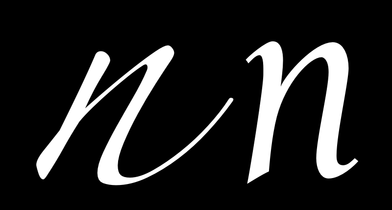
Italics are different from bolds in that they are not meant to appear to have a different weight than the regular. Instead, they are meant to offer a different texture than the regular. Greater intensity in this difference will mean that the italic is especially useful for creating a sense of contrast with the regular. This stronger effect is useful for highlighting single words or short passages of text. In contrast, a less-different texture is often useful in situations where you are setting multiple lines, whole paragraphs, or even even pages in an italic.
Slant
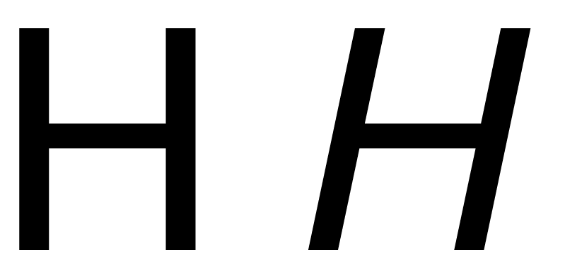
The variable most commonly associated with italics is slant. Indeed, when a web browser is asked for an italic in a CSS rule and there is no Italic, it will simply slant the regular to create a synthetic or faux italic. It is probably not surprising that when people first begin designing type they also consider this approach. The origins of this idea go back to the mid-20th Century and modernism as it was applied to design. This is why the first italics seen in typefaces such as Helvetica were also slanted versions of the regular.
How much slant?
Some italics have no slant. No, really! These italics are called upright italics. However it is likely that if your design has only one italic in it that you will choose for that italic to have some degree of slant. In general, italics tend to slant between 4-14 degrees. Most contemporary fonts slant between 6-9 degrees.
While slant can be important to the design of an italic, is easy to notice, and can even be done with some limited success using an automatic filter, it is not the only variable that you can use to help separate your italic from your regular. You may want to consider using one or more of the following variables in addition to slant.
Italic construction
The term "italic" does not in fact refer to the slant seen in in many italics designs but instead refers instead to a style of writing which became popular in 14th century Italy. This style of writing was a faster and a connected form of writing which uses a different construction for its letters than is seen in regular. This different construction or pattern of strokes is what type designers are referring to when they say they have designed a "real" or "true" italic. This construction has many sub characteristics that you may choose to include in an italic design.
Triangular counters
The most obvious of these characteristics is the triangular countershape created by letters with joins. These letters include a, b, d, g, h, m, n, p, q, and u. This variable is powerful, partly because countershape is a powerful variable, but also because of the great number of letters with the feature. That fact, combined with the high frequency of their usage in most languages, is also a very large (and probably the even greater) factor.
When designing your italic, you can very effectively tune the effect your italic gives by making relatively small adjustments to the height of the joins. Subtle changes can give surprisingly large results. Still, not all italic fonts take advantage of this variable.
In and out strokes
Many italic fonts make use of asymmetical serifs, in the form of in- or out-strokes, or both. When only one is used, it is more common to use the outstroke and to have an upright style applied where the instroke might have been. The intensity of the effect that instroke and outstroke has can be controlled by the weight of the strokes and by adjusting how long they are. Like triangular counters, a great part of their utility and power comes from the fact that so many letters use them.
Condensation
Italics are normally somewhat less wide or more condensed than the regular style. Because condensation is a feature seen across all of the letters in the italic, it is a very powerful variable. This variable can be employed in both a gross and subtle manner. If you choose to use this variable, it is necessary to adjust the weight of the strokes to make the italic appear to be the same or nearly the same weight as the regular design. The more condensed your italic is, the more you will need to make this adjustment.
Mixing variables
Most italics use all of the variables listed above in various proportions. You may find that it is useful to look at a range of italic designs and analyse which variables are being used and in what strength. When you do this, you will notice that none of the variables are used at full strength. Instead, one of the variables tends to lead, with some limited use of the others. The stronger the use of the variables the more contrast your italic will have from the regular.
In is also notable that in the last ten years we have seen an increasing number of type designers choose to offer not just one italic in their type families, but two or even more. It is also notable that dictionaries sometimes make use of more than one style of italic.
When they were first made for printing, italics were not thought of as part of the same type design or type family. This idea is one which became standard over the 19th and 20th Centuries. Even the idea of mixing italics with regular was not part of the original idea behind this script. The first italic fonts were used to set entire books, instead of the upright roman style. It is probably safe to assume that the role of the italic will continue to evolve.
Line spacing
When you have the word space and the n and o set you can begin to look at the line spacing. However, a full and final decision about line spacing isn't possible until you have Capital letters and some punctuation.
Think about line space intentionally
As is the case with letter and word spacing, having too much or too little line spacing can make your font look awkard in real-world usage. Above all else, finding the right line spacing balance is a matter of thinking about the question intentionally and of testing a range of options on the way to making a final decision.
As a general rule, most new font designers tend to err on the side of having too little line spacing in their font, so if you are unsure, adding additional space is usually a good idea.
You should also consider the scope of your project's language coverage when considering line spacing. If you test your font's line spacing only with unaccented characters, you are likely to settle on a line spacing value that leaves no room for accents. If you are certain your font will never be used with accented characters, this might be acceptable -- but the odds are that your font will be used to set accented text. In that case, too little line spacing will cause the accents on one line to run into the bottoms of the glyphs above, and leave the reader with difficult (if not impossible) to read text.
One strategy to test whether your font's line spacing is proper for accented characters is to employ sample text from several languages.


For languages heavy in diacritical marks (such as Czech), line spacing should be taller than for languages that use no diacriticals. The examples above show Czech (above) and English with the same fairly wide line spacing.
Experiment with your font's line spacing in FontForge
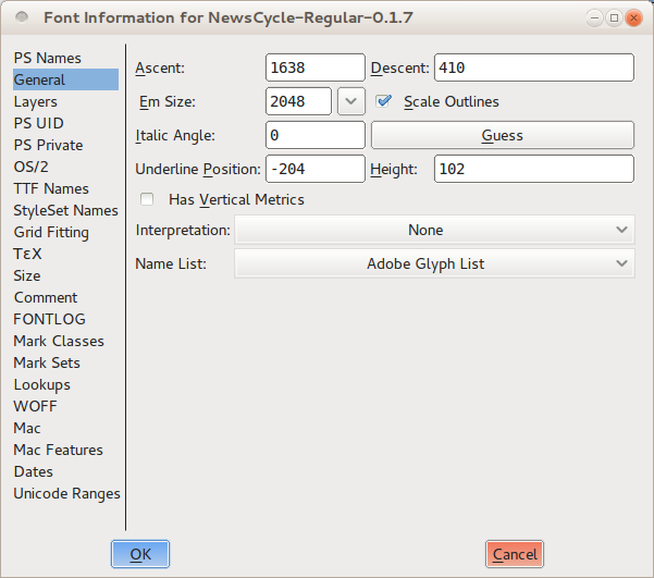
In FontForge, you can set and adjust our font project's line spacing from within the Font Info window. Open this window by choosing Font Info from the "Element" menu, then click on the General tab. Note the values that FontForge has listed for Ascent and Descent. Unless you have made manual changes already, these two numbers when added together should equal the value of Em Size listed on the line below.

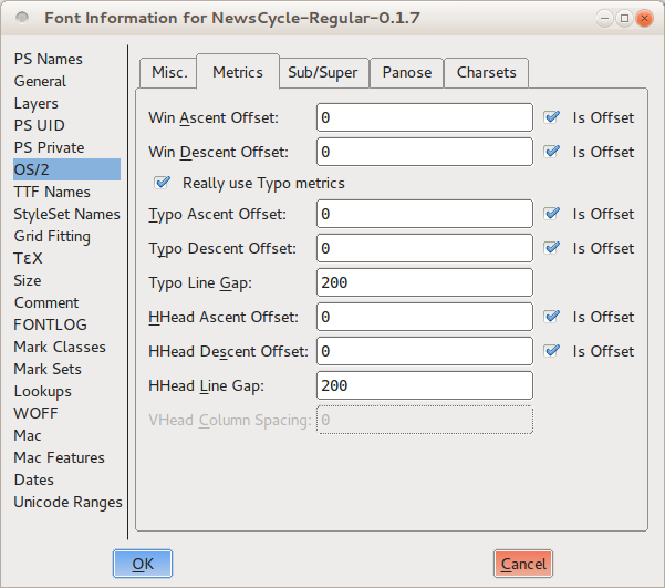
Now switch to the "OS/2" tab. On almost all computers, your font's line spacing will be determined by the Ascent and Descent values that you enter in this tab, under the Metrics heading.

There are three sets of values: Win Ascent and Descent, Typo Ascent and Descent, and HHead Ascent and Descent. You should set all the Ascents to be the same as the Ascent value you noted in the General tab. Next, you shold set all of the Descents to be the same as the Descent value you noted in the General tab, with one important exception: you must make the Typo Descent number negative. Leave the value the same, but put a minus sign in front of it. Finally, uncheck all of the "is offset" options.
These settings will give you a sensible starting point. You can now proceed to test your font with this line spacing and make incremental adjustments until you arrive at eye-pleasing result.
If you find your linespacing is too tight and you don't want to or can't make the verical metrics larger you can scale the glyphs down to gain more space for linespacing.
Making sure your font works: Validation
In a perfect world, your font would be ready to build and install on any modern computer without any special effort, but reality is messier -- particularly during the design process. Fonts can have technical errors that prevent them from working or displaying correctly. For example, curves that intersect themselves will not render correctly because they do not have a "inside" and "outside." The various font file formats also expect glyphs to adhere to certain rules that simplify placing the text on screen, and fonts that break the rules can cause unexpected problems. An example of this type of issue is that all of the points on a curve should have coordinates that are integers. Finally, there are stylistic errors that are not technically incorrect, but that you will still want to repair -- such as lines that are intended to be perfectly horizontal or vertical, but are accidentally slightly off-kilter.
FontForge offers tools that you can use to locate (and, in many cases, repair) all three categories of problem. Validating your font to eliminate these errors will thus not only ensure that it can be installed and enjoyed by users, but will ensure that finished project exhibits polish.
Find Problems
The first tool is called Find Problems, and is found under the Element menu. You must first select one or more glyphs -- either from in the font view, the outline view, or the metrics view -- then open the Find Problems tool. The tool presents you with an assortment of potential problems in eight separate tabs.

You can select which problems you are interested in looking for by checking the checkbox next to each, and in some cases providing a numeric value to check the font against. When you click the OK button, the tool will examine all of the selected glyphs, and report any problems it finds in a dialog box.
The problems that the Find Problems tool can look for are sorted into these eight groups:
- Problems related to points
- Problems with paths and curves
- Problems with references
- Problems with hinting
- Problems with ATT
- Problems specific to CID-keyed fonts
- Problems with bounding boxes
- Miscellaneous other problems
Not every check is necessary; some apply only to specific scripts or languages (such as those in the "CID" tab), while others apply only to specific, optional font features (such as the checks in the references tab). But you should check that your font passes those tests that examine the glyphs for required features, and several tests that look for optional but commonly-expected behavior. Several of the other tests provide feedback and guidance to you during the design process, and are worth exploring for that reason.
First things first: test for required features
In the "Points" tab, select the Non-Integral Coordinates test. This test makes sure that all of the points in each glyph (including both on-curve points and control points) have integer coordinates. Not every font output format requires this behaviour, but some do.
In the "Paths" tab, select the options Open paths and Check outermost paths clockwise. These are both mandatory features in all fonts; the first looks for any curves that are not closed shapes, and the second makes sure that the outer curves of every glyph are traced in clockwise order. It is a very good idea to check Intersecting paths as well; although modern font formats can support two intersecting paths, curves that insect with themselves are not allowed. In addition, if a glyph has any self-intersecting paths then FontForge cannot perform the Check outermost paths clockwise test.
In the "Refs" tab, select all six tests. These checks all relate to references, in which a glyph includes paths from another glyph. For example, an accented letter includes a reference to the original (unaccented) letter, plus a reference to the accent character. All of the tests in the "Refs" tab are mandatory for at least one common output format, and all are good ideas.
Similarly, select all of the tests in the "ATT" tab. These tests look for missing glyph names, substitution rules that refer to non-existent glyphs, and other problems related to glyph names or OpenType features. The problems they guard against are uncommon, but all will cause the font to be considered invalid by one or more computer system, so they are worth including.
Make life easier for your users: test for good behaviour
The tests listed above will ensure that your font installs and renders correctly according to the rules set out by the various font formats, but there are a handful of others tests you should consider adding -- especially at the end of the design process -- simply because they check for common conventions followed by most modern typography.
In the "Points" tab, select Control points beyond spline. This test will look for control points lying beyond the endpoints of the curve segment on which they reside. There is rarely a reason that a control point should lie outside of the curve, so these instances usually signify accidents. It is also a good idea to select Points too far apart, which will look for points that are more than 32767 units away from the next nearest point. That distance is larger than most computers can deal with internally, and a point that far away is almost certainly unintentional (for comparison, a single glyph tends to be drawn on a grid of about 1000 units), so removing such points is important.
In the "Paths" tab, both the Check Missing Extrema and More Points Than [val] tests can be valuable. The first looks for points at the extrema -- that is, the uppermost point, lowest point, and leftmost and rightmost points of the glyph. Modern font formats strongly suggest that each path have a point at each of its horizontal and vertical extrema; this makes life easier when the font is rendered on screen or on the page. check will look for missing extrema points. The second test is a sanity check on the number of points within any one glyph. FontForge's default value for this check is 1,500 points, which is the value suggested by the PostScript documentation, and it is good enough for almost all fonts.
As its name suggests, the "Random" tab lists miscellaneous tests that do not fit under the other categories. Of these, the final three are valuable: Check Multiple Unicode, Check Multiple Names, and Check Unicode/Name mismatch. They look for metadata errors in the mapping between glyph names and Unicode slots.
Help yourself: run tests that can aid design
Many of the other tests in the Find Problems tool can be useful to find and locate inconsistencies in your collection of glyphs; things that are not wrong or invalid, but that you as a designer will want to polish. For example, the Y near standard heights test in the "Points" tab compares glyphs to a set of useful vertical measurements: the baseline, the height of the "x" glyph, the lowest point of the descender on the letter "p", and so on. In a consistent typeface, most letters will adhere to at least a couple of these standard measurements, so the odds are that a glyph that is nowhere near any of them needs a lot of work.
The Edges near horizontal/vertical/italic test in the "Paths" tab looks for line segments that are almost exactly horizontal, vertical, or at the font's italic angle. Making your almost-vertical lines perfectly vertical means that shapes will render sharply when the font is used, and this test is a reliable way to track down the not-quite-right segments that might be hard to spot with the unaided eye.
You can use other tests to locate on-curve points that are too close to each other to be meaningful, to compare the side bearings of similarly-shaped glyphs, and to perform a range of other tests that reveal when you have glyphs with oddities. Part of the refinement process is taking your initial designs and making them more precise; like other aspects of font design, this is an iterative task, so using the built-in tools reduces some of the repetition.
Validate font
FontForge's other validation tool is the whole-font validator, which runs a battery of tests and checks on the entire font. Because the validator is used to examine a complete font, you can only start it up from the font view window; you will find it in the Element menu, under the Validation submenu. The validator is deigned to run just those tests that examine the font for technical correctness -- essentially the tests described in the "test for required features" section above. But it does execute the tests against the entire font, and it does so far more rapidly than you can step through the process yourself using the Find problems tool.

The first time you run the validator during a particular editing session, it will pop up a dialog box asking you whether or not it should flag non-integer point coordinates to be an error. The safe answer is to choose "Report as an error," since sticking with integral coordinates is good design practice. When the validator completes its scan of the font (which will be mere seconds later), it will open up a new dialog box named Validation of Whatever Your Font Name Is. This window will list every problem the validator found, presented in a list sorted by glyph.

But this window is not merely a list of errors: you can double-click on each item in the list, and FontForge will jump to the relevant glyph and highlight the exact problem, complete with a text explanation in its own window. You can then fix the problem in the glyph editor, and the associated error item will immediately disappear from the validator's error list. In many cases, the error will be something FontForge can automatically repair; in those cases the explanation window will have a "Fix" button at the bottom. You can click it and perform the repair without additional effort.

For some problems, there is no automatic fix, but seeing the issue on-screen will help you fix it immediately. For example, a self-intersecting curve has a specific place where the path crosses over itself -- it may have been too small for you to notice at a glance, but zooming in will allow you to reshape the path and eliminate the problem.
For other problems, there may not be one specific point at which the error is located. For example, if a curve is traced in the wrong direction (that is, counterclockwise when it should be clockwise), the entire curve is affected. In those instances where FontForge cannot automatically fix the problem and there is no specific point on the glyph for the validator to highlight, you may have to hunt around in order to manually correct the problem.
Finally, there are some tests performed by the validator that might not be a problem from the final output format you have in mind -- for example, the non-integral coordinates test mentioned earlier. In those cases, you can click on the "ignore this problem in the future" checkbox in the error explanation window, and suppress that particular error message in future validation runs.
Fix problems as you edit
Most of the errors that the Find problem tool and the whole font validator look for can be corrected during the editing process, so do not feel any need to defer troubleshooting while you work. For example, View > Show submenu has options that highlight problem areas during editing; the Element menu hold commands like Add Extrema that will add the extrema points expected in most output file formats, and checkboxes to indicate whether the selected path is oriented in the clockwise or counterclockwise direction. If you flip a shape (horizontally or vertically) in the glyph editor, you will notice that its direction is automatically reversed as well. If you click on the Correct Direction command in the Element menu, FontForge will fix the clockwise/counterclockwise orientation immediately. Getting in the habit of doing small fixes like this as you work will save you a bit of time during the validation stage later.
Numerals
Numerals are often difficult for font designers -- and for several reasons. One is that numerals have a very large number of curves. Another is that numerals often use conventions in their shapes that are different from (or are even in violation of) the visual conventions seen in the rest of the font design. Furthermore, numerals can have very large number of stokes (like 8 and 5 do), or they may have large white spaces (like 1, 7, and sometimes 2 and 4). Both situations can be hard to manage. Finally, there is the problem of how to make sure your zero looks different from the capital O.
It can be useful to look at the numerals found in a wide variety of fonts to become more familiar with the ways in which designers cope with these problems.
In those numerals with a dense number of strokes (such as 8), you may find that designers allow the stroke widths to become a little thinner than is typical of the letters in the font. A similar approach can be seen the design of the double story g.
Conversely, to compensate for numerals with large white space proportions, some strokes are likely to become heavier than would be typical.
In the case of distinguishing the zero from the capital O, there are a wide range of solutions -- such as making the zero narrower than the O, or a zero that is perfectly round, or perhaps (especially in a monospace font) having a slash through the zero.
Having the zero narrower than the capital O while sharing its height is the common approach. This approach is typical of lining numerals. Lining numerals are the most common style for numerals. Examples of fonts that use this approach include: many Garamonds, Futura, and the Google web font Open Sans. Below is Open Sans showing the zero, capital O, zero and then other numerals.

A perfectly round or nearly perfectly round circle is less common, but does exist. Examples of fonts that use this approach include the Google web font Volkhorn as well as other commercial types such as Mrs Eaves, Vendeta and Fleischman BT Pro. Fonts that use oldstyle proportional numerals are more likely to feature this aproach. Sometimes a zero at x-height but which is narrower will also be seen.
Numerals also come in up to 11 identfiable styles when you include fractions, superscripts and subscripts. We will look at the 5 most common ones.
Lining style numerals
The most common styles of number found in fonts are Tabular Lining and Proportional Lining. Lining refers to the heights that the numbers use. If it is a lining style the heights for all the numbers will be optically the same. The difference between Tabular Lining and Proportional Lining numbers is that in Tabular Lining all the numbers also share the same widths. This style is useful for speadsheets and any other purpose where it is helpful for numbers to stay stacked up in neat lines both horizontally an vertically.

Proportional lining numbers have the advantage of having the ability to looking more visually even because the forms and spacing of the numbers can vary to compensate for differing stroke density.

Ranging or Old style numerals

Tabular numbers are a relatively new invention In historical terms. Before they existed there were old style proportional numbers. Old style numbers are useful if you want the numbers to mix in and share the style of a text.

Tabular oldstyle numbers are fairly rare. They can be useful in an anual report where you want the feeling of an old style number but the tabular spacing typical of that kind of document. The image above is from a typewriter Library catalog card.
Hybrid style numerals
Hybrid numerals don't share the font's cap-height or x-height, but instead occupy their own height. The term "hybrid" refers to a mixing of the old-style and lining numerals. Examples of fonts that use hybrid style numerals include Georgia and the Google web fonts Merriweather and Donegal. The zero, capital O, zero, 1, 2, 3, etc glyphs from Merriweather are shown below.

Planning your project
Now that you have a sense of the variables that a font can have, you may want decide whether your project will have only one font, if it will be a collection of more than one related fonts, if it will be a (now traditional) four-style type family, or if it will be something even larger.
Common styles of type families include:
- regular and a bold
- regular, bold, italic, and a bold italic
- thin, light, book, regular, semi bold, bold, extra bold, heavy, black
- regular, condensed, bold and bold condensed
- narrow regular, condensed, wide and extra wide
- regular, semi flourished, flourished flourished very flourished, extreme flourished
While there are reasons that typical pattens in families exist, you may find you want a very different kind of grouping.
The scope of the project can be determined exclusively by your ambition and your amount of free time. But project scopes are often determined by the use you have for the collection or family of fonts, or, still further, by the needs of your client. Certainly for professional type designers, the latter two questions are usually the determining factors.
Glyph coverage
A font is still a font even if it has only one glyph in it. But a font can also have a few hundred or even thousands of glyphs. If your project is self-initiated, then this choice is ultimately arbitrary. You may decide you only want capitals, or that you want to include the glyphs found in the other fonts you use. If you are doing work for a client, you may want to clarify which language or languages the font is is meant to support. Your goal could also be to extend an existing font, adding a few glyphs to make it work in one or more additional languages.
Certainly it is a good idea to make this choice deliberately, and to err on the side of including less rather than more. Often as a typeface is being made, it can be tempting to include more and more glyphs. But it is frequently more valuable to continue to improve the core set of glyphs than to add new ones.
Multi-style family workflow
If you know from the start that you will have more than one font, you will save yourself time if you plan and build the font family systematically, and work on the styles somewhat in parallel, rather than completing one style at a time.
It is of course impossible to create every style in a completely parallel manner. But it is possible to complete a given design step for each style in order to check and be sure about the relationships between the styles, early in the process. You may find that it is useful to complete one full set of test letters (such as "adhesion") for a regular version, and then to make "adhesion"s for the other styles next. However, you can also make the process even more granular and make decisions about specific parts of the base letters (such as the 'n' and 'o') for all styles together.
Depending on the size and composition of the family you are planning, you may find that it saves time to make interpolatable instances of glyphs, not only so you can interpolate intermediate styles, but to aid making design choices about those typographic variables that shift across the members of a family. For a refresher on the variables you should be considering, see the chapter "What is a font?"
Punctuation and symbols
Punctuation and other typographics symbols have a history of their own, separate and apart from the development of the alphabet. But you will find that the same design process still applies, including reusing and adapting component elements, and iteratively testing your design choices.
Simple punctuation glyphs
The first thing to do when designing punctuation is to create the '.' character, which is known as the full stop or period.
The shape of this glyph is often taken from the dot over the 'i,' which is sometimes called the tittle. After you copy the dot, you may want to make it a little larger. Testing several different sizes in printed text or on screen is advisable.
Once you establish a size that you are happy with, this dot can be used as the basis for a wide variety of other punctation, including these glyphs: ; : ? ! ¡ ¿ · …

The next glyph to make is the comma. The shape of the comma can vary to an almost suprising degree. It may be valuable for you to look at a wide rage of comma designs before you design yours.
The image below shows two of the most common forms that the comma may take.

The top of the comma is often slightly lighter than the period, because if it is the same it can look too heavy. In the sample image, the comma on the right is a good example of this compensation being applied. Another common mistake to watch out for with this glyph is making it too short
When you have your comma it will be fairly easy to make the semi colon (;).
Exclamation mark and question mark
The exclamation mark can be be deciving in that it seems simple to make. If you look at a range of typefaces you will see that sometimes the design is indeed fairly simple.
However, this is a glyph which has a surprising amount of opportunity for expressing design. It often the case that even in a font which has very little contrast, the bar above the dot is somewhat heavier at the top than the bottom. The form of the exclamation mark usually relates to the design of the comma to some degree.

The question mark can also be quite difficult to make, because it requires you to balance an open curve over the dot below.
As with the exclamation mark it is advisable to look at and even test a range of different solutions before choosing one for your design.

The design of the c, C, G, s, and S glyphs may provide some basis for the design of this glyph, but you may decide to choose a form that is distinct as well.
Additional symbols

Simple or vertical quotes -- ' and " -- are distinct from typographic quotes: ‘ ’ and “ ” ‚ „ .
Simple quotes can follow the shape of the bar over the dot in the exclamation mark, but they can also be designed separately.
Usually typographic quotes are fairly closely related to the comma, however they should be longer than the comma and often curve more.

Brackets [ ] are relatively simple to make because they are so boxy in shape. Neverthess their design should reflect the choices you have made in the rest of the typeface.
The main question to decide is how tall and deep they will be. The convention is that they should exceed the height of the capitals very slightly and descend below the baseline to approximately 3/4 of the depth of your lower case descenders.
These choices will also be reflected in the design of the parentheses () and the braces {}. The weight of the stems on all three of these symbols should be less than the weight of the stems of both the capitals and the lower case letters.

Parentheses should draw on the design of related shapes, such as D, C, and G.
Braces are notable in that their design varies to a greater degree. Braces have this in common with the question mark. The distribution of weight in braces may be like weight distribution of the numbers, in that it may sometimes violate the rules you follow in the rest of the design.
Spacing, metrics, and kerning
The spaces between characters are an important, integral part of the design of a font. Designing a font's letter spacing should be carried out as an integral part of the whole process of designing a font. Good spacing is necessary for a font to function well.
In FontForge, the Metrics Window allows you to design the metrics of your font, alter the spacing between them, and test how glyphs look together. Metrics Windows can be opened from the 'Window' menu, or by using the Control-k command.
The space between any two glyph has two components; the space after the first glyph, and the space before the second glyph. These spaces between glyphs are composed of the 'side bearings' from each glyph pair. Each glyph has a left side bearing and a right side bearing, in the example below of the lowercase 'a' of 'Open Sans' the right sidebearing has a value of 166 units, and the left sidebearing has a value of 94 units.

Basic Functions of the Metrics Window
The side bearings of characters can be edited in FontForge's Metrics Window in 5 ways;
- manually dragging each side bearing boundary.
- manually dragging a character. Note though that dragging a character will only effect the value of the left side bearing.
- side bearing values can be altered by directly editing their value in the metrics tables of the Metrics Window.
- the value of side bearings can be incremented / decremented by using the keyboard.
- using commands in the Metrics Window's Metrics menu.
Adjusting Side Bearing Values with the keyboard.
One method of adjusting metric values quickly and accurately in FontForge is by using the 'up', 'down', 'left' and 'right' keys of a keyboard. The 'up and 'down' keys are used to incrememt / decrement values and 'alt+up', 'alt+down', 'alt+left' and 'alt+right' are used for navigating around the different value fields of the Metrics Window.
General Principles
As a general principle symmetric characters such as 'A' 'H' 'I' 'M' 'N' 'O' 'T' 'U' 'V' 'W' 'X' 'Y' 'o' 'v' 'w' 'x' will have symmetric side bearings, e.g. a the left and right side bearings of an 'H' will be the same value. Note though that this is not a hard and fast rule, but a general one.
As you space the characters that you design, you should trust your eyes. The bottom line is to 'design - look - adjust - look again'.
For the absolute beginner; do not assume that reliable results are achieved by relying on the measured space. For example, whilst the measurements between two characters may be unequal, the eye can see them as equal. An obvious example of this can be seen when attempting to space the characters 'H' and 'O'. So for the example below, the side bearings of the 'H' and 'O' are equal, but look unequal. In the lower line, the side bearings are not equal but the spacing appears balanced.


Metrics Menu Commands for editing metrics
'Center in Width' - This centers the current glyph within its current width.
'Window Type' - FontForge's Metrics Window can be set to behave in 2 ways for metrics adjustment;
- 'Advance Width Only' - in this mode metrics view may only be used to adjust the advance widths of glyphs.
- 'Both' - In this mode metrics view will adjust either the advance width or kerning values.
'Set Width' - this command allows you to change the width of the current glyph.
'Set LBearing' - allows you to change the left side bearing value.
'Set RBearing' - allows you to change the lright side bearing value.
A basic approach to spacing
The following method is designed to get you started effectively towards designing the metrics of your font.
Starting with a string of lowercase 'o' characters in the metrics window, the left and right sidebearings can be adjusted until the spacing of the characters looks and feels right. One way to look for this 'rightness' is to look for the whitespace between the 'o' characters to balance the whitespace inside the 'o' characters. In general, with the exception of slanted or italic fonts, the left and right side bearings of a lowercase 'o' should be of equal value. Once you are happy with the spacing of your string of 'o' characters, introduce the 'n' character from your font (see below) and then look to adjust the side bearings of the 'n' so that it's spacing fits into the balance of the string of 'o' characters (see below). Note that due to the nature of the way our eyes see, the right side bearing of an 'n' will allways be a smaller value than the left side bearing, and the side bearings of the 'o' will be smaller than the side bearings of the 'n'.

Once both the 'n' and 'o' are adequately spaced their sidebearings can be used to create the sidebearings for an array of other characters, for example;
- the right side bearing of the 'o' can be used for the right side bearing of the 'c', 'd', 'e', and 'q'.
- the left side bearing of the 'o' can be used for the left side bearing of the 'b' and 'p'.
- the right side bearing of the 'n' can be used for the left side bearing of the 'h' and 'm'.
- the left side bearing of the 'n' can be used for the left side bearing of the 'b', 'h', 'k', 'm', 'p' and 'r'.
Note - the above should be used as a guide only that can be used as a super effective starting point for finding correct values for these side bearings.

From here it makes sense to then space the rest of the side bearings of the lowercase characters against strings of 'n' and 'o' characters, as seen in the diagram above. Again, trust your eyes to reach correct balance of characters.
Uppercase characters
Uppercase characters can be spaced using the same principles as above. For example, start with the string 'Hooooo' and adjust the right side bearing of the 'H' untill it feels balanced against the string of 'o' characters. With the left side bearing of the 'H' being equal to the right side bearing, the uppercase 'O' can then be spaced against the 'H' (see below).

From here all other characters can be spaced against the characters which have already been spaced. It should be noted that this method can be used as a good starting point for spacing a font, but it is likely that more minute fine tuning of spacing will also be needed to achieve higher levels of good letter spacing. Other strings of characters that are usefull in this can be arrays such as 'naxna', 'auxua', 'noxno', 'Hxndo'.
Kerning
Kerning is the adjustment of the spacing between specific character pairs. Kerning enables individual spacing of character pairs that is applied in addition to the spacing provided by a character's side bearings. Common examples of character pairs where kerning is often needed to improve spacing would be 'WA', 'Wa', 'To', 'Av'. In the examples below, we can see that without kerning the spacing between the letter pairs 'T-o' and 'V-a' are too wide, whereas with kerning the space between these character pairs is much more balanced with the feel of the spacing of the rest of the font.


The Metrics Window in FontForge can be used to design both side bearings for and kerning values. Kerning values can be applied to a font in a number of ways in FontForge, 2 of these are shown below, kerning with classes and kerning with individual pairs;
FontForge's Metrics menu
'Window Type' - FontForge's Metrics window can be set to behave in 2 different ways to enable kerning adjustment;
- 'Kerning Only' - in this mode the metrics view may only be used to adjust kerning.
- 'Both' - In this mode metrics view will adjust either the advance width or kerning values.
'Kern By Classes' - This command provides the user with a dialog to manipulate kerning classes.
'Kern Pair Closeup' - This command provides the user with a dialog from which you can adjust already existing kerned pairs or create new pairs (see below).

Adjusting kerning values with the keyboard
Just like with adjusting side bearing values, kerning values can be quickly and accurately edited in FontForge by using the 'up', 'down', 'left' and 'right' keys of a keyboard. The 'up and 'down' keys are used to incrememt / decrement values and 'alt+up', 'alt+down', 'alt+left' and 'alt+right' are used for navigating around the different value fields of the metrics window.
Kerning individual pairs
This is the most basic level of creating kerning pairs in FontForge. In the Metrics Window the kerning value between 2 characters can be manually adjusted either by dragging the right-hand character to or from the left-hand character, or by editing the kerning value directly in the metrics table of the window. To change kerning values by dragging characters use the kern-tool handle that appears when the mouse cursor is hovered between 2 characters (see screeenshot below). The kerning value in the metrics table can be edited by manuallly entering values or by incrementing / decrementing the value using your keyboards up / down keys.

Kerning with classes
A 'kern class' in FontForge can be created to build groups of characters who will all have the same kerning value applied, so for example a class can be created, let's call it 'o_left_bowl' in which the characters 'o', 'c', 'd', 'e', 'q' will allways have the same kerning value when preceeded by, for example, the character 'T'. The 'T' could also itself be a member of another class that would likely include other characters such as Tcaron and Tbar. Effectively, class kerning can save you a lot of time.
The Element > Font Info > Lookups tab provides an interface to class kerning in FontForge. The same interface is also got at via the
It brings up a dialog showing all the GPOS lookups (of which kerning is one) and their subtables. See screenshot below;

To create a new kerning lookup click on 'Add Lookup' and choose 'Pair Position (kerning)' as the lookup type and give the lookup its own, unique name (see below).

Each set of kerning classes lives in its own subtable. To create a subtable, click on 'Add Subtable'. When you create a kerning subtable you will be asked whether you want a set of individual kerning pairs or a matrix based on classes. If you chose classes you will be presented with a following dialogue where you can create your classes. Note that you can choose to enable FontForge to 'guess' or 'autokern' the kerning values between the classes you are creating in the dialogue. If using FontForge to guess kerning values you will undoubtedly need an amount of trial and error and experimentation, but it can make sense to use the autokern function as a starting point to kerning your font.

For example in the screenshot above, 2 classes have been created; one class containing the 'T' character, and one class containing the 'o' character. On clicking 'ok' in the above dialog, you will be presented with the following window where you can fine tune the amount of kerning between these two 'T' and 'o' classes.

Manual kerning
If autokerned values need to be adjusted (and they will!) then this can be done in a number of ways.
- via the 'kerning by classes' dialog window.
- using the Metrics Window.
- using the 'Kern Pair Closeup' command from the Metrics menu.
The final output: generating font files
Although you can do a wide range of testing within FontForge itself, you will need to generate installable font files in order to perform real-world testing during the development process. In addition, your ultimate goal is of course to create font that you can make available in an output format for other people to install and use. You will use the Generate Fonts tool (found in the File menu) to build a usable output font regardless of whether you are making it for your own testing purposes or to publish it for consumption by others, but you will want to employ a few extra steps when building the finished product.
FontForge can export your font to a variety of different formats, but in practice only two are important: TrueType (which is found with the .ttf filename extension) and OpenType CFF (which is found with the .otf extension). Technically the OpenType format can encompass a range of other options, but the CFF type is the one in widespread use.
Quick and dirty generation for testing
To build a font file for testing purposes -- such as to examine the spacing in a web browser -- you need only to ensure that your font passes the required validation tests.
You can use the Validate Font tool found in the Element menu to do this (see the chapter on validating fonts for a more detailed explanation), or you can select all of the glyphs (hit Control-A or choose "Select" -> "Select All" from the "Edit" menu) then run a few commands to apply some basic changes in bulk. Be sure to save your work before you proceed any further, though: some of the changes required to validate your font for export will alter the shapes of your glyphs in subtle ways.
For OpenType fonts, first correct the direction of all of your paths. Hit Control-Shift-D or choose "Correct Direction" from the "Element" menu. Next, check to make sure that you have not left any unclosed paths. Choose "Find problems" from the "Element" menu, select the Open paths option in the "Paths" tab, and click OK to run the test. Once your font passes the test without errors, you are ready to generate OpenType output.
For TrueType fonts, a few additional steps are required. You should first correct the direction of all of your paths as described above. Next, adjust all points to have integer coordinates: either hit Control-Shift-_ (underscore), or choose To Int from the "Element" -> "Round" menu. Finally, open the "Find problems" tool, select the Open paths test as described above, and also select all of the tests in the "Refs" tab.
After you can run these tests without errors, you will then need to convert your paths to quadratic curves. Open the "Font Info" window from the "Element" menu. Click on the "Layers" tab, and check the All layers quadratic option. Click OK at the bottom of the window, and you are ready to generate TrueType output.
Building the font files
Open the Generate Fonts window by choosing it from the "File" menu. The top half of the window shows the familiar file-chooser options -- a list of the files found in the current directory, a text-entry box for you to enter a filename, and buttons to navigate to other folders and directories if necessary. This is strictly a means to help you quickly find the right place to save your output file, or to choose an existing font file if you intend to overwrite a previous save. All of the options you need to look at are found in the bottom half of the window.

On the left-hand side is a pull-down menu from which you select the format of the font you wish to generate. You should choose either TrueType or OpenType (CFF), as discussed earlier. On the right-hand side, make sure No Bitmap Fonts is selected. On the line below, make sure No Rename is selected for the "Force glyph names to:" option. You can check the "Validate Before Saving" option if you wish (to potentially catch additional errors), but this is optional. Leave the "Append a FONTLOG entry," "Prepend timestamp," and "Upload to the Open Font Library" options unchecked.
Click the "Generate" button, and FontForge will build your font file. You can load the font in other applications and run any tests, but when you are ready to return to editing, remember to re-open the saved version of your font that you created before generating your .ttf or .otf output.
Generating for final release
Designing your font is an iterative process, but eventually the day when come when you must declare your font finished -- or at least ready for public consumption. At that point, you will again generate a .ttf or .otf output file (perhaps even both), but before doing so you will need to work through a few additional steps to create the most standards-compliant and user-friendly version of your font file.
First, follow the same preparation steps outlined in the section on quick and dirty generation for testing purposes. In particular, remember to change your font to All layers quadratic if you are creating a TrueType file.
Remove overlaps
As you know, it is a good idea to keep your letter-forms as combinations of discrete components as you design: stems, bowls, serifs, and other pieces of each glyph. But although this technique is great for designing and refining forms,you want your final, published font to have simple outlines of each glyph instead. This reduces file size a bit, but more importantly it cuts down on rendering errors.
FontForge has a Remove Overlap command that will automatically combine the separate components of a glyph into a single outline. Select a glyph (or even select all glyphs with Control-A), then hit Control-Shift-O or choose Remove Overlap from the "Element" -> "Overlap" menu. One caveat is worth watching out for, however: FontForge cannot merge shapes if one of the shapes is traced in the wrong direction (that is, if the outermost path is counterclockwise). A path traced in the wrong direction is an error of its own, though, which you should fix anyway.
Simplify contours and add extrema points
You should also simplify your glyphs where possible -- not eliminating details, but eliminating redundant points. This reduces files size slightly for every glyph, which adds up considerably over the entire set of characters in the font.
From the "Element" menu, choose "Simplify" -> Simplify (or hit Control-Shift-M). This command will merge away redundant on-curve points in all of the selected glyphs. In some cases, there will be only a few points removed, in others there may be many. But it should perform the simplification without noticeably changing the shape of any glyphs. If you notice a particular glyph that is altered too much by Simplify, feel free to undo the operation. You can also experiment with the Simplify More command also located in the same menu; it offers tweakable parameters that could prove helpful.
In any event, after you have completed the simplification step, you will need to add any missing extrema points. Choose Add Extrema from the "Element" menu (or hit Control-Shift-X). As discussed earlier, it is a good idea to place on-curve points at the extrema of every glyph as you edit. Nevertheless, you must still perform this step when preparing for final output generation because the Simplify step will occasionally remove an extrema point.
Round everything to integer coordinates
The final preparation step to perform is to round all points (both on-curve points and control points) to integer coordinates. This is mandatory for generating TrueType output, but is highly recommended for OpenType output as well. It can result in sharper rendering and better grid-fitting when the fonts are displayed, without any additional design work.
To round all points to integer coordinates, choose "Element" -> "Round" -> To Int.
As soon as this operation is completed, you may notice something puzzling. Sometimes, simply due to the peculiarities of the curves involved, the processes of rounding to integer coordinates, simplifying glyphs, and adding missing extrema can work against each other. An example of when this might occur is when a curved outer edge has a control point that lies just past the horizontal or vertical; in this situation rounding it to integer coordinates can shift the curve slightly and change where the extrema lies.
There is not a one-shot solution to this conundrum; the only guaranteed fix is to repeat the cycle of steps for the affected glyphs until they stabilize at a point where the three operations no longer interfere with each other. This may take multiple cycles, but it is a rare occurrence.
Validate
Your font should pass the required validation tests before you generate your final output. As with the rounding-points-to-integer-coordinates step, though, sometimes the other preparatory operations can introduce errors, so it is always a good idea to run the whole-font validator at this stage before building the final output. The chapter on FontForge's validation tools will give you more detail on what to check.
A word about hinting
Hinting refers to the use of mathematical instructions to render the vector curves in a font in such a way that they line up nicely with the pixel grid of the rasterized output device (whether that grid is composed of dots of ink or toner on paper, or luminescent dots on a computer monitor).
FontForge allows you to hint your font (and even provides an Autohint function), but in practice this step is not strictly necessary. Modern operating systems often have better grid-fitting functionality built into their text rendering engines than you can create yourself without expending considerable time and effort. In fact, Mac OS X and Linux both ignore any hints embedded in the font file itself. If you do decide your font needs hinting for the benefit of Windows users, your best bet is to build the font without embedded hints, then use a specialized application such as ttfautohint to add hinting after the fact.
Check your metadata
Last but certainly not least, once your font has been thoroughly prepared technically for export, you should pause and update the font metadata, making sure that important metadata information is included, and that it is up to date.
First, if this is the initial release of your font, open the Font Info dialog from the "Element" window, and select the "PS Names" tab. Fill in the font's Family Name and Weight first, then copy that information into the "Name for Humans" box. Although using version numbers is not required, it is extremely helpful for you as a designer to differentiate between different revisions of your work. Enter "1.0" as the "Version" number if you are not sure. Next, visit the "TTF Names" tab and enter the same information.

As is the case with version numbers, it is helpful in the long run for you to make log entries for each revision. Go to the "FONTLOG" tab and write a brief sentence or two explaining what changes if any have gone into the revision that you are building for release. If this is your initial log entry, you should also describe your font and its purpose in a sentence or two.
Fonts, like all creative works, need to have a license, so users will know what they are and are not allowed to do. FontForge has a button in the "TTF Nmes" tab labeled "Add SIL Open Font License." The Open Font License (OFL) is a font license designed to allow you to share your font with the public with very few restrictions on how where it is used, while still protecting you as the designer from having others take credit for your work or creative derivatives of your font that wil be confused for the original. Clicking the button will add "License" and "License URL" strings to the TTF Names metadata. If you have another license you would prefer to use instead of the OFL, enter it in the "License" field instead.

If you have made significant changes to other features of your font, it is a good idea to double-check the other font-wide settings in the Font Info window, and make sure everything is still up to date. Line spacing information, for example, is found in the "OS/2" tab under "Metrics."
Building the font files
The process for generating the font output files is the same when you are building the final release as it is when you are building a quick-and-dirty copy for testing, but you will want to pay closer attention to some of the options.
Open the Generate Fonts window by choosing it from the "File" menu. Again, the top half of the window allows you to choose the directory and file name to give to your output file -- just be careful that you do not overwrite a previous save.
In the left-hand side pull-down menu, select the format of the font you are generating, either TrueType or OpenType (CFF), as discussed earlier. On the right-hand side, make sure No Bitmap Fonts is selected. On the line below, make sure No Rename is selected for the "Force glyph names to:" option. You can check the "Validate Before Saving" option if you wish (to potentially catch additional errors), but this is optional. Leave the "Append a FONTLOG entry," "Prepend timestamp," and "Upload to the Open Font Library" options unchecked.
Next, click on the "Options" button. Select the PS Glyph Names, OpenType, and Dummy DSIG options in the window that pops up, and deselect everything else.

Click the "Generate" button, and FontForge will build your font file. One final ord: it is important not to overwrite the saved version of your FontForge work with the modifications you made in this section solely to generate your .ttf or .otf output. For example, you lose a lot of individual glyph components when you perform the Remove overlaps operation. But the next time you resume work on your font, you will definitely want to pick up where you left off in the original, individual-glyph-component-filled version.
Consequently, if you decide to save the modified version of your FontForge file, be sure that you rename it in a memorable way, such as MyFont-TTF.sfd or MyFont-OTF.sfd. But you do not necessarily need to save these output-oriented variations of your file at all -- in practice, the next time you revise your original work in FontForge, you will work through the output preparation steps again anyway.
Congratulations are in order! You have now created your first font. All that remains now is for you to share your work: upload it to the web, post it to your blog, and go tell your friends.
Without doubt, you will be back and continue revising and refining your typeface -- after all, as you have seen, font design is an highly iterative process. But be sure that you pause and take this moment to enjoy what you have accomplished first.
Trusting your eyes
Font design is the process of iteratively testing the individual choices that collectively add up to a complete design. You will be testing your font to see if the combination of decisions you have made:
- allow you to read the font
- make the font feel right to you
- make the font useful for the the jobs you want the font to be able to do
As you test the design, trust your eyes. Much of type design requires that you make letters similar and that you repeat forms.
It is tempting to assume that if you measure the parts and the spaces between the glyphs, then you will get reliable results. While very useful, this approach has real limitations. You should expect to make adjustments if something looks wrong to you. Furthermore, you should feel confident that making changes until it "looks right" is the correct thing to do.
The reason this is true is that there are a number of natural optical illusions that all readers are subject to. These illusions must be accounted for by altering the shapes of letters until they look right to you.
Examples of illusions
Some illusions involve the perceived weight of lines, some involve the perceived length of lines, and others involve the eye's perception of shapes.
Horizontal versus vertical weight
The example on the left shows an H which is composed of bars which are precisely equal in in thickness. This looks wrong. This example on the right has a horizontal bar which has has been thinned to appear equal in thickness.

Glyphs in which this illusion is relevant are numerous and include A, E, F, L, H, f, t, and z.
Diagonal thickness
Similarly, if you have bars of the same width and one of them is set at a diagonal, the diagonal bar will seem slightly heavier than the vertical bar and slightly thinner than the horizontal. If you want it look right, you will have to adjust it to be lighter like the horizontal example, but just a little less.

Glyphs in which this illusion may be relevant are quite numerous but include k, K, N, Q, R, v, V, w, W, x, X, y, Y, 7, 2, &, ł, Ł, ø, Ø,√, ∕, ‹, ›, «, », ½,⅓,¼, ≤, ≥, and ×.
Length and perceived diagonal angle
Longer shapes need to slant less than short shapes in order to give the appearance of same slant.
The image below has diagonal lines that are all at the same angle. The long one appears to be at a different angle.

In this next example, the slant of the longer line has been adjusted:

Next, in this image of an actual italic, you can see this principle applied to real type.

Crossing diagonals
When a bar crosses another diagonal or a straight line, if it isn't adjusted then it will apear to be misaligned.

In the example above, the X on the left has two unadjusted bars crossing each other. The example on the right has been adjusted so that they appear to be aligned.

As you can see in this outline view, the X that appears visually aligned involves an offset.
Glyphs in which this illusion is relevant include x, X, k, K, ×, #, and the icelandic letter 'eth' (ð).
Perceived height
The shape of a glyph will contribute to how high it needs to be in order to look as if it is the same height as the other glyphs. Round glyphs need to overshoot the height of flat glyphs by a little bit. Glyphs which have pointier shapes will need to overshoot more. The sharper the shape, the more it will need to overshoot in order to look correct.

In the image above, the top three shapes are unadjusted -- that is, they have identical heights. The three shapes on the bottom have been adjusted so that appear more similar in height.
This illusion is relevant for any glyphs that have parts which are either round or pointy. Examples include O, Q, C, S, A, V, W, and so on.
You are fully qualified to correct for these illusions
Because you can see both the illusion and the effect of correcting for the illusion, you will be able to make these corrections for yourself. You just have to trust your eyes.
Test for fitness of purpose
Just as you are able to see illusions and correct for them, you are also able to see if a font is working for the specific use (or uses) you may have in mind. You should also trust that you are able to see if the font works well for these purposes.
Quite separately, it is worth noting that no font can be evaluated apart from the way it is used and what it is used for. This is why it is essential to begin testing from the very beginning of the design process, and to continue testing until you feel the project is done.
What will these tests be like? The tests will be simple at first, allowing you to test the first design choices. As your design becomes more complete, your tests will need to keep pace and let you evaluate the relative success or failure of the newest choices you have made -- or, even better, to compare two (or three, or more ... ) options you are considering.
Sometimes you will find you have to double back and change a design choice you thought was already working well. This is normal. Making a font requires balancing many variables, and surprises often occur. The more you design fonts, the less often you will be surprised but surprises cannot be eliminated.
Near the end of the process, if the font will be used in a simple way, the tests may also have stayed simple. However, if a font will be used in many ways or in a wide range of printing or screen environments, then it should be tested across that range of situations. Similarly, a font that will be used in complex documents should be tested in documents that simulate that use.
It can save you design time to have a well defined idea of the final use you intend. However, this is not always possible and your ideas may evolve. The key thing is to think about and define this use as completely as you can, then to ensure that your tests keep pace with the questions you are asking yourself in the design process.
Using the FontForge drawing tools
Designing a font in FontForge will involve using a number of tools and utilities, starting with the set of drawing tools that enable you to draw your glyphs on screen. They may feel familiar to users with experience in vector graphics, but there are enough differences that some orientation is a good idea for all new users.
From the Font Window, double-click one of the glyph boxes to launch the Glyph Window.

Note: The numbers along the top where the x and y axis intersect indicate the current (x,y) location of your cursor on the canvas, followed by the location of the most recently selected point. The third number is the relative position of your cursor to the selected point. The fourth number is the distance between your cursor and the selected point. Fifth is the angle from the selected point to the cursor (relative to the baseline). Next is the current magnification level, followed by the name of the active layer.
Caution: Sometimes it seems like FontForge is not responding when you are in the Glyph Window. What might be occurring is that there is an open dialog box hidden behind the Glyph Window. You will then have to move the Glyph Window to see the dialog, dismiss it, and return to the Glyph Window.
Familiarize yourself with the drawing tools
Now that you know your way around the canvas, it is time to get acquainted with the tools.
Point and zoom

Point and zoom behave similarly to the equivalent tools in any other application. The pointer is the main selection tool, used to select points, paths, and other objects on canvas. In addition to activating the pointer tool in the toolbox, you can also momentarily switch to the pointer tool while any other tool is active, simply by holding down the Control key.
The zoom tool easily lets you zoom in, but it is a bit more difficult to zoom out again. To zoom out, go to the View menu and select Zoom out or Fit.
The freehand tool
The freehand tool allows you to sketch out irregular paths. Select the freehand tool from the toolbox by clicking on this icon:

Move the freehand tool to the drawing area, hold your mouse button down, and move your mouse around to draw. Switch back to the pointer tool, and you can select points on the path you have drawn.
When you select one of the points on the path, it will turn into a yellow circle. If the selected point is on a curve, it will display its control points with a magenta handle and a cyan handle. You can grab either handle and drag it around to change the shape of the curve.
The point tools
Next, try using the point tools.

To add a point to a path, first select any of these tools, then click on the path and give it a little push. You will get a new point on the line. The Curve point tool is used to add a point in a curved segment. The HVCurve point tool constrains the new points that to add so that they have either horizontal or vertical control points. This is important for setting up extrema points. The Corner point tool allows you to make a sharp bend in the path. The Tangent point tool allows you to transition from a straight segment to a curved segment along the path.
The pen tool

The pen tool allows you to add a point on the curve and drag out its control points.
Spiro

Selecting the Spiro tool puts you into Spiro drawing mode. Spiro drawing allows you to draw curves that reflow as you reposition the nodes. Some people prefer this to the standard approach (known as Bézier editing), but if you are used to Bézier editing you might find it does some unexpected things.
Knife

The knife tool allows you to cut splines in two. This comes in handy if you have drawn a shape, but only need part of it.
Ruler

The ruler tool gives you measurement and coordinate information. When you use it, it displays a floating "tool tip" next to the cursor. If you hover your cursor over a point, the tool tip gives you even more detailed measurement and coordinate information. If you bring it next to a spline, it gives you information about the curvature and radius. Most usefully, if you click and drag the ruler tool, you will see the distance you have dragged the cursor, plus every intersection that you have stretched across.
The transform tools
There are six transform tools:

Note: For all of the Transform tools, if you double-click on the tool, you can enter numeric values.
The scale tool lets you freehand rescale an object. Holding down the Shift key allows you to scale an object while constraining it to the proportional ratio.
The rotate tool lets you free-rotate an object. It rotates the selected object around the position where you initially click the mouse.
The 3D rotate tool lets you rotate an object in the third dimension, and projects the result on the x-y plane.
The flip tool allows you to flip a selection either horizontally or vertically. The point at which you click the mouse is the point of origin of the transformation.
Note: After flipping a point you will probably want to apply Element > Correct Direction.
The skew tool lets you horizontally skew the selection either clockwise or counterclockwise (withershins is how the dialog refers to counterclockwise).
The perspective tool gives you another way to distort a shape in a nonlinear way.
Note: There is no numerical option for the perspective transformation.
The rectangle/ellipse and polygon/star tools
These tools allow you to draw primitive geometric shapes, which is faster than constructing those shapes out of separate line segments.

Clicking the chevron area on these tools will give you the option to switch to the alternate tool. If you double-click on either of the tools, you can open the shape type's options.
Rectangle options: corner style and bounding box (corner or center out).
Ellipse options: Bounding box or center out.
Polygon options: Number of vertices.
Star options: Number of star points and depth of points by percentage. The higher the percentage setting, the longer the arms of the star.
Mse1 and Mse2

Caution: This area of the toolbox seems to be broken in the most recent version of FontForge -- you may get a crash if you click in here.
Layers
The FontForge canvas has three layers by default: the Guide layer, the Background layer, and the Foreground layer. Guide layers are used to insert guides (such as x-height or cap-height guides). Foreground layers and background layers are both used for drawing, but only the topmost foreground layer will be rendered into your final font.

The eye icon indicates whether each layer is visible, and you can click to toggle the eye to make a layer invisible. The C (or Q) indicates whether you're using Bézier or Quadratic curves.
The #, B, or F refers to whether the type of each layer is a Guide layer, Background layer, or Foreground layer, which is significant if you add more layers of your own. You can create and delete additional layers using the plus (+) or minus (-) buttons in this section of the toolbar. Layer type and curve type can also be controlled by right-clicking (once you have additional layers).
Basic Drawing
Next you should walk through some of the basic drawing workflows you will use over and over.
Correct Direction
- Start by using the Rectangle tool to draw a rectangle within the drawing area of the Glyph window.
- Next, use the Ellipse tool to draw an ellipse within the rectangle you just drew.

- Go to the Element menu and choose Correct Direction. You will see that the two shapes merged, and that you essentially punched a hole in the center of the rectangle.

Remove Overlap
- Add a star that overlaps the corner of the rectangle.

- Select the star and the earlier shape. You only need to select one point of each overlapping shape, but it is okay to select extra points.
- Go to Element > Overlap > Remove overlap. You will see that your two shapes have become one.

Add a Point
Using the pen tool, click and hold in the middle of a line segment. Keeping the mouse button clicked, drag the mouse to change the shape.

Tangent points
Select the bottom-left corner point of your new shape (the intersection of the curve and the straight line). From the Point menu, you will see that Corner Point is checked. Select Tangent. This changes the square node to a triangle, but that is all it does until you do the next step: extending control points.
To do so, choose Element > Get Info, which opens the Point Info Window. From the Location tab in that window, go to the Next CP field set and set the Distance to a large number such as 75. Click OK. You will see that the curve now smoothly enters the straight line.

Transformation
Now select about a quarter of the shape -- the star and part of the ellipse in the middle.

Choose the 3D Rotate tool, mouse to the middle of the selected area, and slowly click and drag until you see something you like, then release. Here is an example of 3D Rotate used on the practice image:

Set stroke shape and width
So far you have used the Freehand drawing tool to draw a line. If you double-click the Freehand tool, you get the Freehand dialog shown here, which contains a drawing window. This is where you select pen shape and size. This dialog also appears when you choose the Expand Stroke option in the Element menu.

Using the corner tool, draw a polygon and click ok.
Now draw a line with the Freehand drawing tool. When you release the mouse button, the new path is automatically stroked with the shape you chose in the Freehand dialog, as shown here.

Keep drawing
You should continue to experiment with the drawing tools until you feel comfortable that you can use them to draw and transform whatever shapes you need. At this point, you are equipped to start constructing the components of glyphs, but you should also take time to look at FontForge's other set of tools, Spiro drawing mode. Spiro drawing is distinct enough from Bézier curve editing that it requires an explanation of its own.
What Is a Font?
What makes typefaces different from handwritting, calligraphy, lettering, and logos?
The single biggest issue that makes type design different is the need for every glyph in the typeface to work with every other glyph. This often means that the design and spacing of each part of the typeface ends up being a series of careful compromises. These compomises mean that we can best think about typeface design as the creation a wonderful collection of letters but not as a collection of wonderful letters. In other words we must think about the group and how it will perform together and prioritize this over any question of what is wonderful in a single letter.
This need to prioritize with the system rather than with any single part also leads to a need to analyse our design process on the level of the system. Characteristics which span letters become the things we want to focus on particularly at the begin of the design process.
The other oddity in type design is that to very large extent the forms we are designing are already significantly established. Our task as type designers is not so much to create an utterly new form but rather to create a new version of an existing form. This can perplex new type designers. Finding the just right amount to change in order to excite but not to alienate a reader is a tricky thing. Often designers get stuck in letter-specific thinking. This mistake can be easily avoided if you realize from the start that what is most meaningful in a typeface are the parts of it that repeat the most. This typeface design is mostly about designing the characteristics applied not just to the common forms we all recognize but to the characteristics that occur the most often.
It is also useful to recognize that these characteristics not only help to create a font’s voice or atmosphere, but also determine what the font will or will not be useful for, and they sometimes help detemine the technological contexts for which a font is suitable.
It may seem intimidating or excessively abstract to think about the design of a font in this way. However, getting used to these ideas is the key to a faster, more effective, and satisfying type design process.
Let's begin by identifying the main systemic characteristics in type design.
Construction

Construction refers to the underlying strokes that form a particular glyph. The kind of construction you use is arguably one of the most important questions to think about, because the construction implies so much about the remaining choices, particularly if your design is going to feel somewhat familiar to readers. In the example above, the white line inside the letters indicate the approximate construction suggested by the shape of the letters themselves.

Proportion of X-height to Cap-height

The letters on the left come from Playfair, which has a large x-height relative to its cap-height. The letters on the right are from EB Garamond, which has a smaller x-height. In the sample above, the size of the H has been adjusted so that they match.
Ascender Height

In example above, the x-heights have been matched in order to illustrate the relative difference in ascender heights.
Ascenders usually exceed the cap-height by at least a little, especiually in text designs. In some cases, however, they can match or even be lower than the cap-height. Longer ascenders can add elegance to the look of a typeface. They often go with smaller x-height.
Descender depth

Like ascenders, descenders that are long can feel elegant. Long ascenders and descenders can also be difficult to manage.
Width

The width of a type design will alter not just how it feels but also what it is useful for. The example on the right is from a text face. The example on the left is from a display design meant to be eye catching. Letters that are more narrow than the text face example are also possible and can be used to save space or to fit more text in a smaller space.
Width regularity versus variability
The letters in the top row of this example show a greater variety of width than do the letters in the bottom row.

Weight

Slant

Contrast
Contrast refers to how much variation in stroke width is found within a glyph. Notice in the below two O glyphs that the one on the left has much greater variability in line thinkness between the top and sides of the glyph. Both glyphs have some contrast, but the one on the left has much more than the one on the right.

Angle of contrast
In the below image, we see that the thin parts of the lower case letter o shapes are different. In the glyph on the left, the thin points lie on a perfectly vertical axis. In the glyph on the right the axis is diagonal.

Weight distribution
If your font uses very little or even no contrast, this question is not relevant. Most fonts, however, have at least some degree of contrast. In these cases, you have a wide variety of options to choose from when it comes to how to distribute the weight in your font.
Vertical

Vertical distribution of weight is very common. The 9 and 8 above are a particularly intense example.
Horizontal

Horizontal weight distribution is much less common, but is nonetheless seen in many fonts.
Bottom-heavy

Top-heavy

Irregular

Stems

It is easy to assume that your stems will simply be straight and that there are no real questions to to worry about. But both the weight and the shape of your stems are things you can and should make deliberate choices about.
Joins

Bowls

Terminals

Speed

The n on the left seems to be written much faster than the one on the right. Speed is discussed in more detail in the chapter on italics.
Regularity

The following characteristics are not present in all type designs, however they are variables that may be a part of your design. If this is the case, it is worth considering the degree to which they will play a role as a variable.
Flourish

Notice that in the font on top the flourish is more present in the capital letter and the second one the flourish is more in the lowercase.
Decoration

Dimension

When things go wrong with FontForge itself
If you find FontForge crashing whilst in use you might like to send information to the fontforge developer mailing list at https://lists.sourceforge.net/lists/listinfo/fontforge-devel. This way, a software developer might be able to work out where the code is going wrong and apply a fix. You can then either patch your local FontForge, or just grab the sources from github as detailed in the Installing chapter to get an updated FontForge free of the defect you reported.
To help developers find out what is going wrong, they will want a backtrace from your session. The backtrace includes a list of which program functions have called which other ones to get to where the program has stopped working. The backtrace is most useful if it also contains the line numbers of the functions. Because the backtrace will make reference to source files and line numbers, don't forget to also tell the developers which version of FontForge you are using. Optionally, you might also like to mention what you were doing leading up to the crash.
Using the GNU Debugger to report crashes
A backtrace is generated using the GNU Project Debugger (gdb). You can either attach gdb to an already running FontForge, or start fontforge inside the gdb session itself as shown below.
$ gdb fontforge
GNU gdb (GDB) Fedora (7.3.50.20110722-16.fc16)
Copyright (C) 2011 Free Software Foundation, Inc.
License GPLv3+: GNU GPL version 3 or later <http://gnu.org/licenses/gpl.html>
This is free software: you are free to change and redistribute it.
There is NO WARRANTY, to the extent permitted by law.  Type "show copying"
and "show warranty" for details.
This GDB was configured as "x86_64-redhat-linux-gnu".
For bug reporting instructions, please see:
<http://www.gnu.org/software/gdb/bugs/>...
Reading symbols from /usr/local/bin/fontforge...done.
Then once you issue the debugger the run command, FontForge will open on screen;
(gdb) run
Starting program: /usr/local/bin/fontforge
[Thread debugging using libthread_db enabled]
Using host libthread_db library "/lib64/libthread_db.so.1".
Copyright (c) 2000-2012 by George Williams.
 Executable based on sources from 14:57 GMT 31-Jul-2012-ML-TtfDb-D.
 Library based on sources from 14:57 GMT 31-Jul-2012.
From here you can use FontForge in the usual way, but with the advantage of being able to effectively capture and report any issues that FontForge may have.
One major difference that running FontForge inside gdb makes is how a crash is made apparent. Without gdb, when FontForge crashes it will disappear from your screen. When you are running FontForge inside gdb however, a crashed FontForge will remain open along with its windows and user interface.
If you find that your interface is unresponsive, switch back to the terminal where you ran gdb and you might see something like "SIGSEGV" in the text followed by the (gdb) prompt. If you see the (gdb) prompt then FontForge is no longer executing. At this stage, use the "bt" command to get a backtrace as shown in the example below.
As you can see in the example backtrace FontForge has crashed inside the copy() function. The copy() function was itself called from the KCD_AutoKernAClass function. The backtrace will tell a software developer the exact lines these calls were made, and also use the tip that the parameter passed to copy() was invalid (out of bounds) to work out what the code is doing wrong.
Program received signal SIGSEGV, Segmentation fault.
0x00007ffff74a7c01 in ?? () from /lib/x86_64-linux-gnu/libc.so.
 (gdb) bt
 #0  0x00007ffff74a7c01 in ?? () from /lib/x86_64-linux-gnu/libc.so.6
#1  0x00007ffff6389a80 in copy (str=0x900000008
) at memory.c:82
#2 0x00007ffff7a4aeb5 in KCD_AutoKernAClass (kcd=kcd@entry=0xe80c40, index=2, is_first=is_first@entry=1)
at kernclass.c:236
#3 0x00007ffff7a51405 in KCD_FinishEdit (g=0xeb0fe0, r=1, c=, wasnew=1) at kernclass.c:2020
#4 0x00007ffff5effe2d in GME_SetValue (gme=gme@entry=0xeb0fe0, g=0xe94760) at gmatrixedit.c:988
#5 0x00007ffff5f00554 in GME_FinishEdit (gme=0xeb0fe0) at gmatrixedit.c:997
#6 0x00007ffff5f01c1a in GMatrixEditGet (g=g@entry=0xeb0fe0, rows=rows@entry=0x7fffffffcf78)
at gmatrixedit.c:2214
#7 0x00007ffff7a4ea3c in KCD_Expose (event=0x7fffffffd1e0, pixmap=0x83ae00, kcd=0xe80c40)
at kernclass.c:1446
#8 kcd_e_h (gw=0x83ae00, event=0x7fffffffd1e0) at kernclass.c:1762
#9 0x00007ffff5eabe8f in _GWidget_Container_eh (gw=gw@entry=0xe7f040, event=event@entry=0x7fffffffd1e0)
at gcontainer.c:269
#10 0x00007ffff5eac385 in _GWidget_TopLevel_eh (event=0x7fffffffd1e0, gw=0xe7f040) at gcontainer.c:734
#11 _GWidget_TopLevel_eh (gw=0xe7f040, event=0x7fffffffd1e0) at gcontainer.c:606
#12 0x00007ffff5ef86ce in GXDrawRequestExpose (gw=0xe7f040, rect=0xef72b0, doclear=)
at gxdraw.c:2687
#13 0x00007ffff5eea075 in gtextfield_focus (g=0xef72a0, event=0x7fffffffd2e0) at gtextfield.c:1888
#14 0x00007ffff5eaa857 in _GWidget_IndicateFocusGadget (g=0xe94760, mf=mf@entry=mf_normal)
at gcontainer.c:143
#15 0x00007ffff5eaac97 in GWidgetIndicateFocusGadget (g=) at gcontainer.c:155
#16 0x00007ffff5f02b1e in GME_StrSmallEdit (event=0x7fffffffd670, str=0xe10e60 "A", gme=0xeb0fe0)
at gmatrixedit.c:890
#17 GMatrixEdit_StartSubGadgets (gme=gme@entry=0xeb0fe0, r=1, c=c@entry=0, event=event@entry=0x7fffffffd670)
at gmatrixedit.c:1472
#18 0x00007ffff5f03d69 in GMatrixEdit_MouseEvent (event=0x7fffffffd670, gme=0xeb0fe0) at gmatrixedit.c:1499
#19 matrixeditsub_e_h (gw=, event=0x7fffffffd670) at gmatrixedit.c:1735
#20 0x00007ffff5eabd98 in _GWidget_Container_eh (gw=0xeeb2e0, event=0x7fffffffd670) at gcontainer.c:393
#21 0x00007ffff5ef6555 in dispatchEvent (gdisp=gdisp@entry=0x769a50, event=event@entry=0x7fffffffd9b0)
at gxdraw.c:3475
#22 0x00007ffff5ef7d1e in GXDrawEventLoop (gd=0x769a50) at gxdraw.c:3574
#23 0x00007ffff7ad353a in fontforge_main (argc=, argv=) at startui.c:1196
#24 0x00007ffff736676d in __libc_start_main () from /lib/x86_64-linux-gnu/libc.so.6
#25 0x00000000004006e1 in _start ()
(gdb) quit
A debugging session is active.
Inferior 1 [process 19196] will be killed.
Quit anyway? (y or n) y
Use the quit gdb command to exit from gdb and to close the crashed FontForge. If you can send a good backtrace to the fontforge developers then you can help to improve the stability of the program for everybody! Don't feel shy about reporting these issues, a crash that doesn't get reported is a crash that is far less likely to be fixed.
Word space
It may sound funny to pay special attention to the word space. However it is one of the most commonly used parts of a type design. A word space that is too wide or too narrow can ruin the design of a font. It is not too soon to begin considering the words space as soon as you have the "n" and "o". The choice you make at this point should be returned to and potentially adjusted at each major section of the design process.


Above top is an example if a word space that is much too tight, and below that the word space is too wide.

Above is an example of a word space that is well balanced.
If your type is meant to be used at large sizes then the word space can be smaller. If the font is meant to be used at very small sizes you should make the width a wider than normal.
Research shows that a word space that is too big is more tollerable than one which is too small so If you are unsure you may want to err in that direction. Similarly well run scientific studies have shown that younger children in particular benefit a little from larger word spaces than would be seen as typographically normal for adult readers.
Linda Reynolds and Sue Walker (2004) 'You can't see what the words say': word spacing and letter spacing in children's reading books', Journal of Research in Reading, vol 27, no.1, pp. 87-98

