Punctuation and symbols
Punctuation and other typographics symbols have a history of their own, separate and apart from the development of the alphabet. But you will find that the same design process still applies, including reusing and adapting component elements, and iteratively testing your design choices.
Simple punctuation glyphs
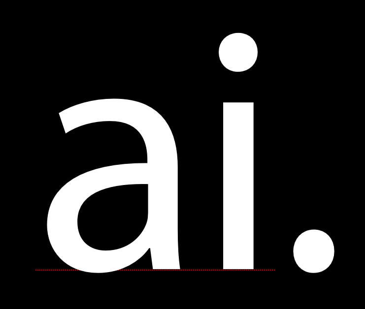
The first thing to do when designing punctuation is to create the '.' character, which is known as the full stop or period.
The shape of this glyph is often taken from the dot over the 'i,' which is sometimes called the tittle. After you copy the dot, you may want to make it a little larger. Testing several different sizes in printed text or on screen is advisable.
Once you establish a size that you are happy with, this dot can be used as the basis for a wide variety of other punctation, including these glyphs: ; : ? ! ¡ ¿ · …
The next glyph to make is the comma. The shape of the comma can vary to an almost suprising degree. It may be valuable for you to look at a wide rage of comma designs before you design yours.
The image below shows two of the most common forms that the comma may take.
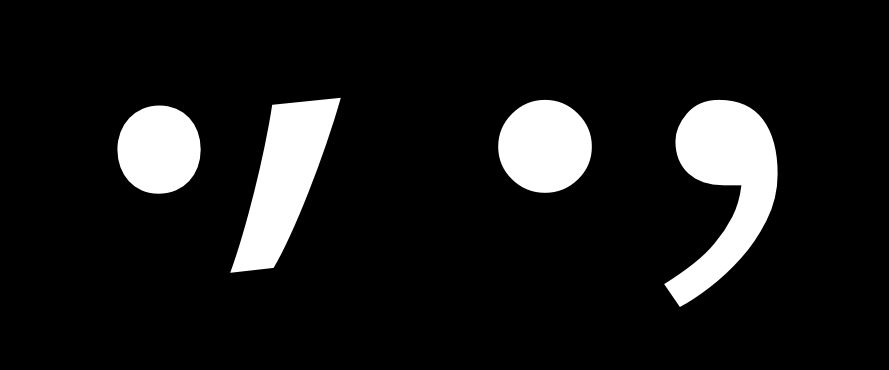
The top of the comma is often slightly lighter than the period, because if it is the same it can look too heavy. In the sample image, the comma on the right is a good example of this compensation being applied. Another common mistake to watch out for with this glyph is making it too short
When you have your comma it will be fairly easy to make the semi colon (;).
Exclamation mark and question mark
The exclamation mark can be be deciving in that it seems simple to make. If you look at a range of typefaces you will see that sometimes the design is indeed fairly simple.
However, this is a glyph which has a surprising amount of opportunity for expressing design. It often the case that even in a font which has very little contrast, the bar above the dot is somewhat heavier at the top than the bottom. The form of the exclamation mark usually relates to the design of the comma to some degree.
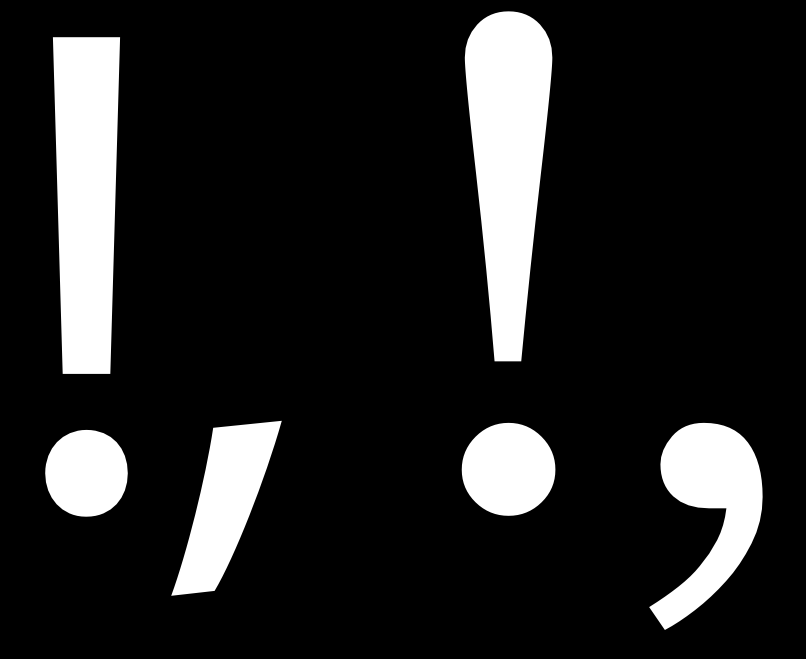
The question mark can also be quite difficult to make, because it requires you to balance an open curve over the dot below.
As with the exclamation mark it is advisable to look at and even test a range of different solutions before choosing one for your design.

The design of the c, C, G, s, and S glyphs may provide some basis for the design of this glyph, but you may decide to choose a form that is distinct as well.
Additional symbols

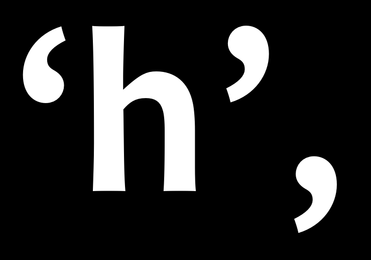
Simple or vertical quotes -- ' and " -- are distinct from typographic quotes: ‘ ’ and “ ” ‚ „ .
Simple quotes can follow the shape of the bar over the dot in the exclamation mark, but they can also be designed separately.
Usually typographic quotes are fairly closely related to the comma, however they should be longer than the comma and often curve more.
Brackets [ ] are relatively simple to make because they are so boxy in shape. Neverthess their design should reflect the choices you have made in the rest of the typeface.
The main question to decide is how tall and deep they will be. The convention is that they should exceed the height of the capitals very slightly and descend below the baseline to approximately 3/4 of the depth of your lower case descenders.
These choices will also be reflected in the design of the parentheses () and the braces {}. The weight of the stems on all three of these symbols should be less than the weight of the stems of both the capitals and the lower case letters.
Parentheses should draw on the design of related shapes, such as D, C, and G.
Braces are notable in that their design varies to a greater degree. Braces have this in common with the question mark. The distribution of weight in braces may be like weight distribution of the numbers, in that it may sometimes violate the rules you follow in the rest of the design.


