Word space
It may sound funny to pay special attention to the word space. However it is one of the most commonly used parts of a type design. A word space that is too wide or too narrow can ruin the design of a font. It is not too soon to begin considering the words space as soon as you have the "n" and "o". The choice you make at this point should be returned to and potentially adjusted at each major section of the design process.


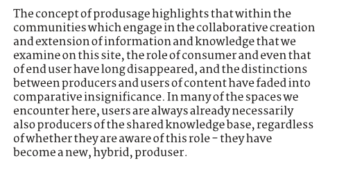
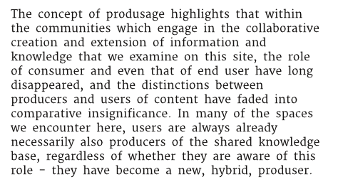
Above top is an example if a word space that is much too tight, and below that the word space is too wide.

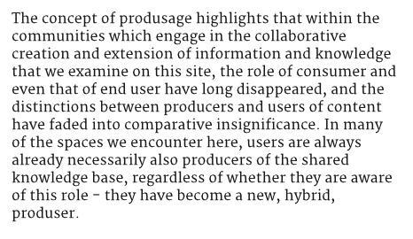
Above is an example of a word space that is well balanced.
If your type is meant to be used at large sizes then the word space can be smaller. If the font is meant to be used at very small sizes you should make the width a wider than normal.
Research shows that a word space that is too big is more tollerable than one which is too small so If you are unsure you may want to err in that direction. Similarly well run scientific studies have shown that younger children in particular benefit a little from larger word spaces than would be seen as typographically normal for adult readers.
Linda Reynolds and Sue Walker (2004) 'You can't see what the words say': word spacing and letter spacing in children's reading books', Journal of Research in Reading, vol 27, no.1, pp. 87-98


