Metaphor
Computer software interfaces are built on metaphors. These metaphors link the digital interface to real life tools and processes.
All software operates in an operating system such as Mac OS, Windows, or Linux. An operating system is the computer's software. It runs all additional software. Regardless of the operating system you are using, all of them share a few central metaphors such as Document, Folder, Hard Drive, File System, and the Desktop. Before today's so-called "paperless office," office workers created documents on paper, filed them in folders and organized the folders in cabinets near their desks. The most important or current project folders might have been sitting on their desktops. Of course the original paper system persists along side the computerized system, as well as in the computer's metaphorical structure.
The metaphors of design software are built around the tools of the artist and designer: pencils, brushes, palettes, artboards, and photographic equipment. These tools do what you would expect: pencils make hard edged lines, brushes make lines with pressure control, colors are "mixed" in the color palette.
These metaphors are consistent across the interfaces of operating systems and design applications. For example, the palettes and the toolbars look and behave in the same way, despite subtle application differences, in Illustrator, Inkscape, Gimp, Kompozer, Photoshop, InDesign, Dreamweaver, and Flash. Learning the metaphors and similarities among these application interfaces will be one of the fastest routes to mastering the tools.
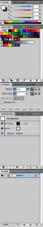


Illustrator panel Photoshop panel Gimp dialog
Exercise 1: Create a new folder
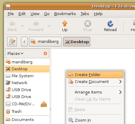
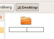
1. To create a new folder on your computer, navigate to the place where you want your new folder to reside. Most computer users typically store folders in the Documents folder or on the Desktop. You can do this by clicking on the Places menu on the Ubuntu task bar and selecting the preferred location. This will open a new window for that location, where you can create a new folder by pressing Shift+Control+N. As soon as you create a new folder, the operating system temporarily names it untitled folder. As long as you do not click outside of the folder name, the name area remains highlighted in orange, and is ready for you to type a new name. We named ours digital_foundations and pressed the Return key.


2. If you clicked somewhere on the Desktop after creating the new folder, it may seem like you are stuck with a folder named 'untitled folder'. All folders can be renamed.

To rename a folder, right-click once on the folder and select rename from the contextual menu that opens. The contextual menus appear by right-clicking the mouse.

This will highlight the name of the folder. Contextual menu options change depending on the context in which you click. If you right-click on a folder, you will see a list of actions that can be performed on that folder. This menu is different from the menu that would appear if you right-clicked on a file instead.
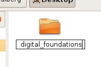
Simply rename it and press return. We renamed our folder digital_foundations.
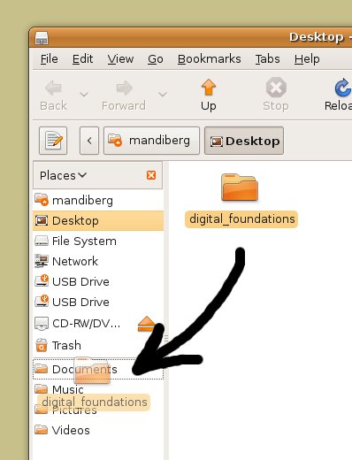
3. Move the new digital_foundations folder you just created to the Documents folder by clicking and dragging it from the Desktop into the Documents folder which will appear in the places submenu on the left on any open window.
Delete a file
4. Next we will review three ways to delete a file or folder. Choose one method and delete the new folder you just created. The metaphorical trash or recycle bin appears in the bottom right hand corner of the Ubuntu interface. To delete a document, drag it onto the Trash.

It is important to remember that there is almost always more than one way to complete any given task. The best method is usually the one that fits most efficiently within your personal work habits.
Another way to move an item to the trash is by selecting the item and pressing Delete. Contextual menus provide yet another way to delete a file. Right click on the file and select Move to Trash.

Vector vs. Bitmap
Computer graphics are created in one of two formats: vector and or bitmap. Computer files containing these graphics may contain vectors, bitmaps, or both.
Vector graphics are created by using mathematical algorithms: formulas that describe where points, lines, and planes exist and how these elements relate to one another. Vector graphics can be scaled up to any size and retain their smooth edges. Vector graphics look smooth and crisp at their edges, and they can be easily scaled to any size. Logos are nearly always developed as vector graphics, as a logo has to fit easily on a business card, a website, and possibly a billboard or bus wrapping.
Inkscape, Illustrator and Flash are applications most often used to create and modify vector images.
Bitmap or raster graphics are built from grids of pixels. Each tiny pixel contains a unit of color information. Bitmaps are used for digital photography and scanned images. Bitmap files are not as easily scalable as vector graphics.

In the top and bottom images we are "zoomed in" to 1600%. This means we are viewing the images at 16 times their actual sizes. If you enlarge a raster image too much, the pixel grid becomes visible to the human eye. The only possible compensation is to blur the edges. Either way, enlarging a pixel-based image results in loss of quality. Vector images don't have this limitation. On the other hand, extremely complex vector images take an excessive amount of computer processing power. The top image is a bitmap photograph of a hand. Here the individual pixels that comprise the digital photograph are noticeable as tiny squares of color. In the bottom image, the letter A has been created in a vector-based application such as Inkscape. Notice that the edges of the letter A are still rendered as a smooth line.
Exercise 2: Creating a new file in Inkscape
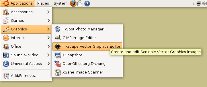
1. Select Applications from the top left dock, and select Graphics > Inkscape.
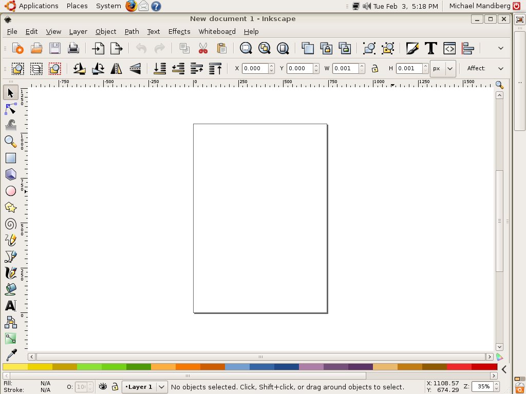
2. When Inkscape opens, a blank document opens.
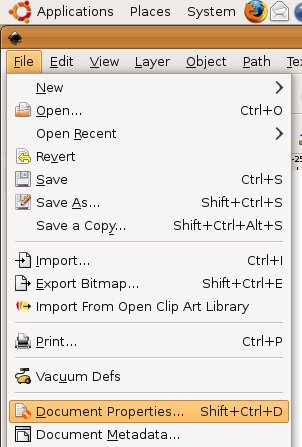
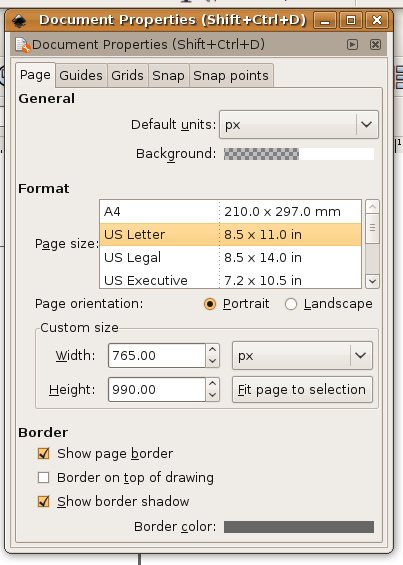
When defining a new file, several settings must be taken into consideration. By default, the document that Inskscape creates is the size of A4 paper with white background and a vertical orientation. You can change these options by choosing File > Document Properties, or pressing Shift+Control+D.
3. In the Document Properties dialog, choose "US Letter" under Format and click on the X in the top of right corner of the dialog.
A dialog is an interface that pops-up when the computer needs information in order to complete a task. To highlight the metaphor, the computer needs to have a conversation with you, hence the word "dialog."
Look around your new document and notice the interface elements. In the center is the Canvas. Analog design was created on paper (taped to board), which was referred to as the artboard. Inkscape reproduces the analog experience through metaphor.
On the left side of the Canvas are the tools. Like an artist's or designer's toolbox, the Toolbar holds pens, pencils, brushes, shape tools, and so on.
At the bottom of the Canvas is the Color palette. Painters mix together individual paint colors on a palette. In Inkscape colors are created by virtually mixing colors.
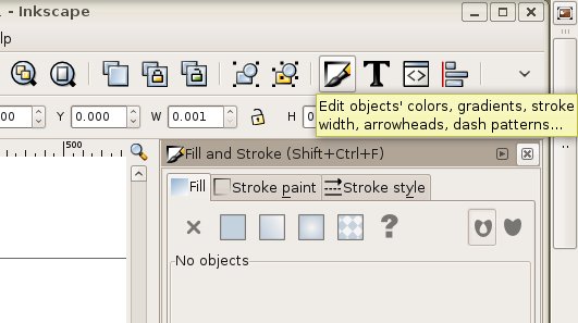
To the right of the Canvas any number of information dialogs are available. Take notice of the Fill and Stroke dialog (available from the Object menu in the toolbar). Painters mix together individual paint colors on a palette. In Inkscape colors are created by virtually mixing colors.
4. The tools can be moved around the screen, and they can be hidden or available based on the amount of workspace on the monitor. To hide any element of the screen, click View > Show/Hide >Tool Controls Bar.
Exercise 3: Creating a dynamic composition

Seated-Nude, 1909, Amedeo Modigliani, oil on canvas.

The Poet, 1911, Egon Schiele, oil on canvas.
Compositions can be static or dynamic. In this exercise, we will recreate the dynamic movement found within a painting. Dynamic compositions are full of energy or movement. Angles are used to create motion. While a flat horizon line is at rest, a triangle is in motion. The repetition of even spacing is easy on the eye as our minds predict the simple rhythm of an evenly spaced grid. Angles and uneven spacing between objects causes our eyes to move back and forth. This physical movement translates into the perception of movement within a composition. Use the Modigliani or Schiele painting as the guideline for your dynamic composition with rectangles. The final composition could be like the following image, if yours is based on the Schiele painting.

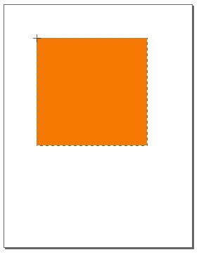
1. In Inkscape, click on the Rectangle tool from the Toolbar. Use this tool to click and drag a rectangle on the Canvas.
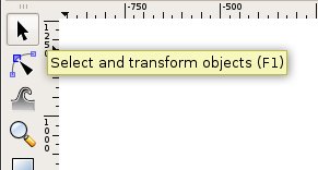
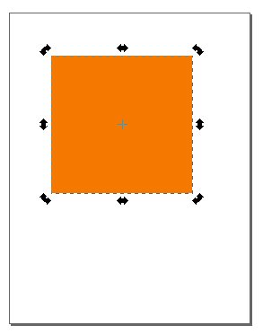
2. Once the rectangle is created, release the mouse and choose the Selector tool in the Toolbar. The Selector tool is used to select an object in order to move, scale, or copy it.
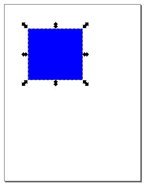
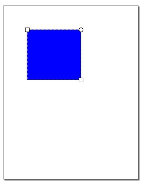
Click on the square with the Selector tool. The rectangle is selected when it becomes outlined and transformation arrows appear at the border of the object. Objects can only be modified when they are selected. To deselect the object click on the Canvas in any area outside the rectangle.
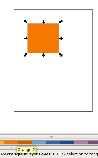
3. With the rectangle selected, notice how the shape is made. The rectangle is an area filled with color and there may or may not be a line surrounding the edges. The interior color is called the "fill." The outline is called the "stroke."
4. With the rectangle selected, look at the bottom left corner of the Inkscape interface and notice which colors appear beside Fill and Stroke.
5. With the rectangle selected, click on one of the swatches in the palette. It is assigned to the fill area of the rectangle and it also appears as the color in the fill icon. The rectangle will change because it was selected before a new color was applied.
6. Click on the Swatches palette, then click on any color. It is assigned to the fill area of the rectangle and it also appears as the color in the fill icon. The rectangle will change because it was selected before a new color was applied.
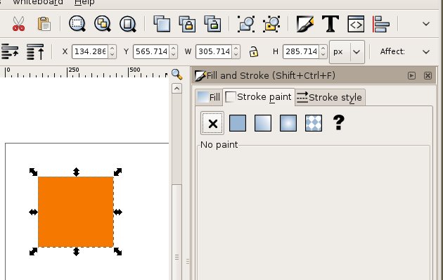
7. With the rectangle selected choose the Fill and Stroke dialog from the Object menu. This will open a new window on the right side of the screen. Click the Stroke paint tab. In the first row of icons, select the "X" on the left, indicating you do not want an outline. This will leave the rectangle with a solid color and no outline.
8. With the Selector tool, scale or rotate the rectangle. Scale the rectangle by clicking on one of the transform arrows at the border of the object and drag towards or away from the center.
To rotate the rectangle, click on the rectangle again and the transform arrows will change to rotate arrows. Click and drag on one of these arrows in order to rotate.
9. When the first rectangle is complete (with the color, scale, and rotation of your choosing), deselect the rectangle by clicking on the Canvas. Notice that the bounding box and transform and rotate arrows disappear.
10. Use the Rectangle tool to begin the process again. Once a rectangle is made and modified, use the Selector tool to reposition it to the right, left, or on top of the other rectangle. Recreate the composition with up to 15 shapes. You should feel comfortable creating a shape and changing its fill and stroke colors.
11. Arrange the rectangles so that they can be seen as one dynamic composition. Notice that as you create and position each rectangle, they appear stacked on top of each other. While you are creating this composition you may want a rectangle to be "sent behind" another rectangle. Select the rectangle that you would send backwards, then click "Lower selection one step" button on the Tool Controls bar. You can change the stacking order of every object on your Canvas by using the neighboring buttons: Lower to bottom, Lower one step, Raise one step, and Raise to top.


Exercise 4: Saving a file
Click File > Save As to open the Save dialog. Choose a location in which to save your file. It is common to save files in the Documents folder. To access the Documents folder from the Save As dialog, click on the Browse for other folders arrow and navigate to the Documents folder. Earlier we created a folder called "digital_foundations" in the Documents folder. We will save our work there.
Note : All actions that can be performed on your file are located in the File menu.
You must name your file when you save it. Follow these naming conventions:
- Avoid spaces. Instead, use_underscores_to_separate_words. Spaces are dangerous in web browsers. Any designer who plans to work with interactive media should form good habits by eliminating spaces from their file names.
- Use lowercase letters. This is also a convention of designers who name files that will be referenced in code. Spaces and upper case letters will not damage your files, but if you are just beginning to form good habits, you might as well learn all of the rules at once.
- Never use characters such as those in the nearby list, as these reserved characters mean special things to applications and operating systems and can disable websites and crash applications.
- The following are examples of reserved characters: ! @ # $ % ^ & * ( ) + = ~ [ ] ' " ? / \ , : ; > <
- Use a descriptive title, such as xtine_dynamiccomp.svg. Including your full name in a file name is especially important if you are submitting a file in a classroom or professional setting.
- Make sure the file includes an extension. In this exercise, the file is saved as an SVG (.svg) document. The extension is .svg. In other words, the very worst file name that you could use is something like this: "My best ever/first file!" Not only does the name include spaces and reserved characters, it also fails to describe the file or format. Other bad names include the likes of "FINAL edit.svg," "final.svg," "composition.svg," and other names that do not specify who made the file, or what is in the file. A better model for naming your files includes your individual or group name, a descriptive word about the contents of the file, and a date or versioning system. For example, when we sent a copy of our cover to the publisher on October 20th, we named it digitalfoundations_cover_1020.svg.
-
Native file format for master files
Most applications have a native file format for master files. This format can only be opened in the original program, and should be saved frequently throughout the working process. A copy of a master file is often created in a compressed, non-editable format when the author has finished editing the work. Compressing the file makes it smaller and easier to transfer. These compressed formats are readable by many applications, not just the original program. A .svg suffix indicates the file is an Inkscape master file. If a logo, for example, was created in Inkscape, it could be shared with a friend or collaborator as a PDF file, which is viewable in Document Viewer, Ghostview, xpdf, Adobe Acrobat or Preview. PDF readers such as this are installed on most computers. The exported files cannot be edited and are usually much smaller in file size. If the friend asks for revisions on the logo, the original SVG file would be modified. After modification, a new PDF file would be saved and sent to the friend.
File Formats
It is very important that file extensions, or suffixes, remain intact. The extension assists the computer operating system. It tells the system the type of file and the application to use when opening the file. This is especially important when bringing a file from one operating system to another (such as going from a Mac to a PC).
Some important file formats include:
.svg - Scalable Vector Graphics format, the native format for Inkscape
.doc or .docx - Microsoft Word document
.rtf - Rich Text Format, non-proprietary word processing format
.txt - Text only, no formatting
.ai - Adobe Illustrator file
.pdf - Portable Document Format
.psd - Photoshop document
.tif or .tiff - Tagged Image File - format for photographs, saved with lossless compression and used for scanning and printing. This format will be revisited in Chapter 7.
.jpg or .jpeg - Joint Photographic Experts Group - a compressed image file format often used for photographs on the web
.gif - Graphic Interchange Format - a compressed image file format often used on the web for logos, design elements, and other graphics with low numbers of colors.
.html - HyperText Markup Language - a text file written in the language used to create web pages.
.fla - Flash master file
.swf - Shock Wave Format - exported Flash file for the web
Symmetry and Gestalt
Symmetry is achieved when the weight of a composition is evenly balanced. Symmetrical forms are perceived as being stable. In order to achieve symmetry in any composition, the designer must create balance with the compositional objects in both their positive and negative spaces in relationship to the grid. The positive space often contains the active design elements while the negative space in a symmetrical composition is usually passive.
The opposite of symmetry is asymmetry. Asymmetric compositions can be balanced or imbalanced, but the overall weight distribution between the positive and negative space will be uneven. The negative space in an asymmetric composition may be more active than the positive space.
The designer chooses to create symmetry or asymmetry within the composition in order to reach the visual or psychological expectations of her audience. These decisions connect the concept of the presented material to the presentation. For example, a logo for a bank should feel secure and restful, connoting safety and trustworthiness, while a horror movie poster should feel emotionally charged, suspenseful and frightful. Logos for banks tend to be symmetric compositions, and asymmetric designs are used to convey unstable ideas.
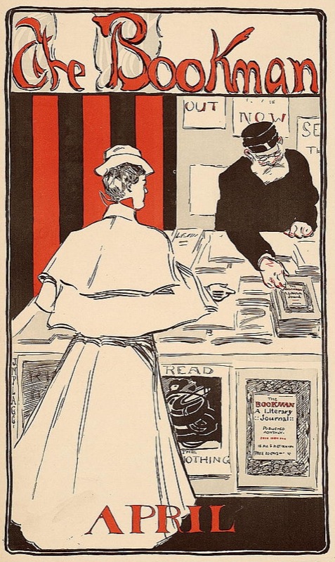
The Bookman, Advertisement for the New York literary journal, "The Bookman", April 1896. This advertisement is symmetric as the scale and lightness of the female figure in the foreground is counterbalanced by the scale and darkness of the male figure on the right side of the image. The symmetry is reflected over the y-axis in the center of the composition. The typography is centered at both the top and bottom portions of the advertisement.
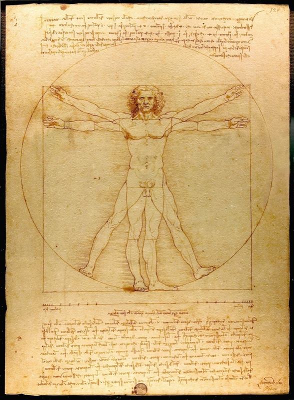
Vitruvian Man, Leonardo da Vinci, Drawing on paper, 1492. Photograph by Luc Viatore, 2007. Leonardo da Vinci's classic drawing of the human form demonstrates the principle of symmetry in the human body.
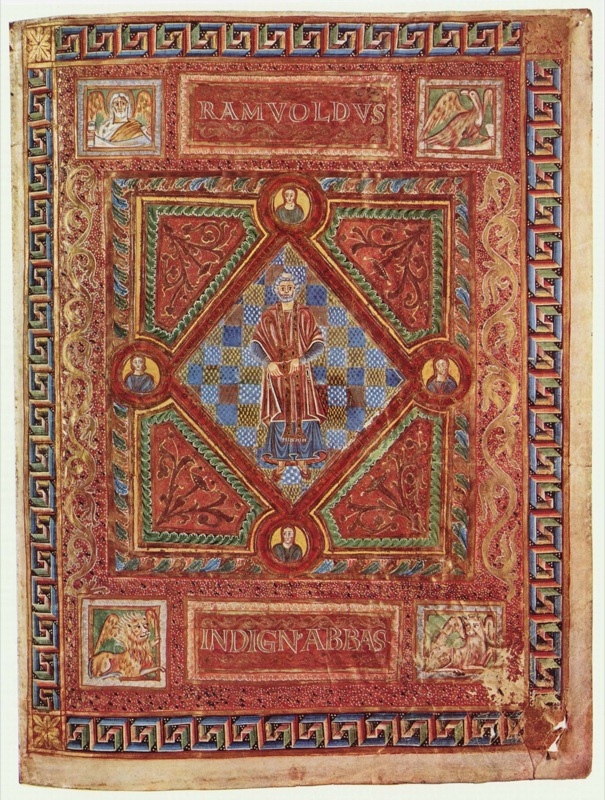
Codex Aureus of St. Emmeram, Scene: Portrait of Abbot Ramwoldus, Book painting on parchment by Adalpertus, 1000. Symmetry is achieved in Adalpertus' book painting across both the x and y axes.
Exercise 1: Creating symmetry and asymmetry with your body
Before touching the pencil or mouse, you can exercise these design principles as lessons in weight distribution.
The grid is created by the x-axis along the hips and the y-axis from the toes to the head.
- Standing straight, with perfect posture, and your body weight equally balanced on two feet (with legs hip-width apart and a slight bend in the knee, if we might be so specific), puts a body in a stable, symmetric position.
- Now that you have achieved symmetry, lift one foot off of the floor. Bend the lifted leg at the knee as much as possible without falling over. You will feel less stable and off-balance. Your body has achieved asymmetry.
Results of some arrangements made in Chapter 3 Exercises

In the following exercises (2 - 7) the compositions will each be created within individual squares (a few of which are illustrated here). All of the exercises are created in one single document, established in Exercise 2. For these compositions the grid is simple: the horizontal and vertical intersection at the middle of each square is the grid. See and "feel" the visual weight that is constructed between the four quadrants (upper left, right, lower left and right) in each composition.
Exercise 2: Symmetry with passive negative space
In this exercise, the black circle in the center of the composition is the positive space and the white surrounding area is the negative space. The negative space is not active, it is dictated by the active positive form. The circle is evenly distributed within the composition. It is perfectly symmetric in relation to both the x and y axes, from the left to the right and the top to the bottom.
1. Create a new document in Inkscape using File > New, then choose File > Document Properties to select the US Letter page size of 8.5 x 11 inches.
2. Choose the Rectangle tool. While pressing the Control key, click and drag your mouse across the Canvas to create a square. Ours is 1.5 x 1.5 inches (you can set the exact dimensions of the W(idth) and H(eight) in the Tool Controls bar above the Canvas).

3. Select the square by clicking on it with the Selector tool. Choose Object > Fill and Stroke to set the fill color to white, the stroke color to black, and the stroke style width to a value you choose - ours is 2px.
4. Select the square by clicking on it with the Selector tool if it is not still selected. Create a 4x4 tile of these squares by choosing Edit > Clone > Create Tiled Clones, then using the Symmetry tab to set the value for both Rows and Columns to 4. Click the Create button. There will be an extra duplicate tile in the top left corner. Select it with the Selector tool then delete it by pressing the Delete or Backspace key.

5. Select all 16 squares by marqueeing around them with the Selector tool. Create spacing between the squares by choosing Object > Rows and Columns and setting "Rows and Columns" to 4 x 4 and spacing to some value of your choosing - we used 30x30 px.

6. Group the 16 squares by selecting them all again, then choosing Object > Group. Grouped objects can be moved, transformed, and edited as one unit while their individual properties are maintained. Move the grid of squares to the center of the document.
7. Choose Layer Menu > Layers to view the Layers dialog. The default name for the layer you are working on is Layer 1, but you can double-click on the layer name to rename it to something more descriptive, like Grid.
8. Use the Layer Menu > Add Layer to add a new layer above the one you are working on. Assign it a descriptive title like Dots.
9. In the Layers dialog, click on the lock icon next to the eyeball at the left of the Grid layer. The lock icon will change from an open lock to a closed one, indicating that the layer is locked. Locked layers cannot be modified until they are unlocked. This is a protective measure that a designer often takes when part of a project is complete and she doesn't want to accidentally select or move objects that are already established.

10. Make sure that the Dots layer is selected before proceeding as you want to edit on the new layer, not the underlying grid of squares.
11. Create a black circle in the middle of the top left square with the Ellipse tool. Choose this tool then click and drag within the top left square. Press the Control key once you begin dragging the mouse so that the ellipse is constrained to a perfect circle. Choose Object > Fill and Stroke and set black as the fill color of the circle you just created.


Exercise 3: Symmetry with less passive negative space
In this exercise, the two new circles create a balanced, symmetric composition. The visual weight is the same in the four quadrants created by the intersection of the x and y axes; and the circles are reflective over a diagonal line. However, notice the tension between the two circles at the middle of the page. This tension is created when the two active forms are so near to each other that the eye cannot help but notice the negative space between them. The negative space fights for the viewer's attention. Therefore, the negative space is slightly less passive than it was in the first exercise.

1. Copy the black circle using the Selector tool to select it, then Edit > Copy followed by Edit > Paste to create a copy. Using the Selector tool, drag the new copy into place one square to the right of the original circle.
| Watch Out For This: If you are new to using the mouse and the keyboard together, practice using your non-mouse hand to activate hot-keys while keeping your mouse-hand on the mouse. It is ineffective to lift up the mouse hand |
2. The new circle should still be selected, and transformation arrows surround the edges of the selected area. Use the Selector tool to reduce the scale of the circle by clicking and dragging on one of the four transformation arrows at the corner of the circle while pressing the Control key.

3. Create another copy of this circle using the Selector tool and Edit > Copy followed by Edit > Paste. Nudge the circle into position by using the left, right, up, and down Arrow keys. The Arrow keys will move the selected object by just one unit. Pressing the Shift key while pressing the arrow keys moves the object in increments of 10.

Exercise 4: Balanced asymmetry
In this exercise the two circles create an asymmetric composition. The weight distribution between the four quadrants of the composition is not even, as most of the visual weight is felt in the upper left quadrant. The composition does remain balanced, as the negative space between the two circles activates the viewer's attention and becomes part of the visual weight on the page. The white area is still the negative space; however, the white area between the two circles is within the path of the viewer's eye movement from the top (larger) circle to the bottom (smaller) circle.
1. Copy the second circle from the previous exercise and drag it into position in the third square.
| Watch Out: Did your circle turn into an ellipse? Without holding the Ctrl key, the circles transforms into ellipses. Be sure to release the mouse before releasing the key when drawing forms that are modified by a keyboard command. |
2. Make another copy of this circle and drag it to the lower right of the composition.

3. Scale the circle down with the Selector tool while pressing the Control key.
Exercise 5: Asymmetry with imbalanced visual weight
In this exercise, the negative space is the white area surrounding the four black circles. The four black circles are asymmetric in regards to the overall composition. The negative space creates more mass than the positive space, and the four black circles pull the viewer's eye to the bottom of the composition. What is also noteworthy about this exercise is that the four black circles are read as a line by the gestalt law of similarity, where like elements (four circles) are read as a whole line before being perceived individually.
1. Copy the smaller circle in the fourth rectangle and move it to the empty composition to the right.
2. Create three copies of the small circle within the composition.

3. Select all four circles using the Selector tool by clicking and dragging around them, or by selecting the first circle and then pressing the Shift key while clicking on each one time with the mouse to add the remaining circles to the selection.
| In the lab, we call this "Shift-clicking". Since we will probably refer to "Shift-clicking" in future chapters, this always means pressing the Shift key while clicking on an object in order to add it to a selection. |
4. With the four circles selected, view the Align and Distribute dialog by choosing Object > Align and Distribute. This dialog will be used to distribute the four small circles evenly. Click on the Center on horizontal axis button (2nd row from the top, 3rd from left) and then the Distribute centers equidistantly horizontal button (3rd row from the top, 2nd from left) to line the circles up vertically and create even spacing between them.

Exercise 6: Symmetry with patterning
Gestalt psychology is important to visual creators because it provides a theory for the way humans perceive groups of shapes in a composition. While there are four distinct properties and six laws, one of the main themes is the understanding that viewers see a group of like objects as a whole unit before seeing the individual parts. Termed the law of similarity, the individual circles will be read only after the viewer sees the entire pattern presented here as a square. It's nearly magic: a group of circles becomes a square.
1. Select all four of the circles in the row in Exercise 5. Click on the Object Menu > Group. Grouping objects is convenient as the separate objects maintain their autonomy while acting as part of a set that moves, transforms, and receives color information together. Grouped objects can always be un-grouped by choosing Object > Ungroup.
| Hot key: Command+G is the hot key for grouping objects. Command+Shift+G is the hot key for ungrouping objects. |
2. Copy and paste the row of circles four times into the next composition, so that there are 16 small circles within the composition. Use the Align and Distribute dialog to fix the rows if they aren't organized (try selecting all four rows and using the button "Align left sides").
3. Select all four rows and click the Distribute centers equidistantly vertical button.


Exercise 7: A focal point is defined within symmetric patterning
In the last exercise, the repetition of the sixteen circles created a pattern. In this exercise, the repetition is broken by changing the value and hue of one circle (one part of the whole) in the lower right quadrant of the composition. A focal point is created by the contrast of value and hue. When the contrast between like and unlike forms is as extreme as it is in this exercise, the designer can direct the viewer's eye to a particular part of the composition. Utilizing contrast to create a focal point is an essential design skill.
1. Select all of the circles in Exercise 6 and copy-paste them to the next composition square.
2. Once the group of black circles is composed in the last composition space, change the fill color of one of the individual circles to create a focal point. All of the black circles are part of a group, so you will have to select the group of the individual circle you wish to modify and click (Object > Ungroup) first. You may have to ungroup twice to get to the level of individual circles.
3. Once you have selected just the individual circle whose color you want to change, choose the Fill and Stroke dialog (Object > Fill and Stroke) to alter the fill color. Notice that as the value lightens, the contrast increases.

Exercise 8: Free play
Use the remainder of the composition squares to make arrangements of your choosing.
Type on the Grid
For many students and educators, The Bauhaus has become a symbolic point of entry to art and design education. The precision of the grid in design and architecture was made relevant through studies at The Bauhaus. In Ellen Lupton's The ABCs of (triangle, square, circle) The Bauhaus and Design Theory, the movement is credited as being "the mythic origin of modernism" as founder Walter Gropius and László Moholy-Nagy were devoted to creating a "universal language" and embraced methods of mass production (Lupton and J. Abbott Miller, 2).
The grid is utilized in all areas of design as a structure upon which forms can be precisely placed, reflected, balanced or imbalanced. The grid is the invisible underlying structure that sustains the relationships between all formal elements in print design, interactive design, industrial design, architecture, fashion, and more. Its origins are established in the High Neolithic Era (4500 - 3500 BCE), according to Joseph Campbell who defines the grid as "a geometrical organization of an aesthetic field." While the origin of the grid as an organizational structure precedes the Bauhaus art movement and institution by more than 5,500 years, the Bauhaus movement perceived the grid as not only an organizational structure, but as a structure that could be easily multiplied and reproduced. By understanding the relationship between the grid and the organizational requirements of automation and mass replication, The Bauhaus is responsible for design solutions utilizing the grid that became popular in the 1920s and is still noticeable today.
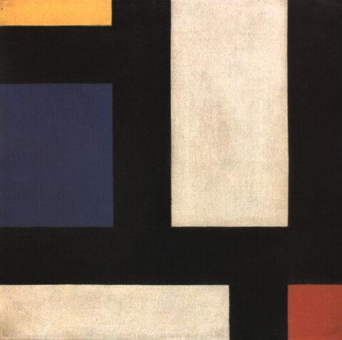
Image Caption: Counter-Composition IV, Theo van Doesburg, oil on canvas, 1924.
Piet Mondrian and Theo van Doesburg created oil paintings of grid structures that illustrate the foundations of Modernism. Mondrian was a Dutch painter who contributed to the De Stijl (in English, "The Style") movement founded by Theo van Doesburg. Although neither Mondrian nor van Doesburg were masters at The Bauhaus, Bauhaus members were aware of De Stijl and influenced by contemporary art movements. These grid-compositions have been an inspiration to artists and designers who rely upon the grid as an organizational design asset.
While the black and white paintings with brief areas of vibrant hues in primary colors appear to be simple horizontal and vertical intersections, the renderings might allude to a city map, an electrical circuit board, or an abstracted blueprint. The negative space in the composition can be perceived as the windows of tall buildings. The grid is understood as a layout or a supporting structure while these compositions are the essence of the often unnoticed foundations of modernity. Formulating an abstract concept from simple lines and planes is a practice in translating visual cues into language-based meanings. It is the goal of any visual communicator to learn to do this as both the reader of the message and the generator of visual content.
Preview: Here is what you will make in the following exercises

Exercise 1: Using guides to create a grid
1. Create a new document by choosing File > New. Use File > Document Properties to set the document size to 8.5 by 11 inches (US Letter).

Choose File > Save As and name the file the_grid. It will automatically be saved in SVG file format.

2. Rulers can be turned on or off. They appear at the top and left side of the document window. If the rulers are off, turn on the rulers by choosing View > Show/Hide > Rulers. If your rulers are not measured in inches, Choose File > Document Properties and select the Page Tab under General to change the unit of measurement.
3. In this step we will create guides by clicking the mouse within the rulers of the document and dragging the new guides onto the page. Guides are available in Inkscape. They are always dragged from the rulers onto the page. Guides are used to make the page into a visible grid, which is useful for aligning compositional elements such as text and graphics. The grid occurs when two guides (one horizontal and one vertical) intersect. The grid is used for assessing the relationship of the formal elements within the composition (images and text) to the positive and negative space (where other elements are and where there is nothing but empty space).
Click on the Selector tool, then place your cursor within the ruler area at the top of the document. Click on the ruler and drag the mouse in a downward motion. A guide will be set in place when you release the mouse. Release the first guide at 5 inches on the ruler against the left edge of the page.
| Watch Out! If you release the mouse too soon, guides will be made in places where you don't want them! |

4. Repeat this step for the vertical guide, by pulling from the vertical ruler from the left edge and releasing the mouse at 4 inches on the ruler against the top edge of the page.
Exercise 2: Lines
Lines can be thin or thick, bumpy or smooth, dotted or solid, or straight or curvy. A line is the result of connecting any two points on a plane. In this exercise we make a straight, thick, black line. In later chapter exercises, you will create lines by alluding to them with repetitious single forms or by the gaze of the photographically reproduced subjects within the composition. Lines can be used to provide direction, to separate parts of the page, or to support elements on which images or typography rests. Many of the typographic visual references from The Bauhaus (1919 - 33) include heavy lines that are used to separate areas of the page and provide direction for the viewer's gaze. Notice that while the line we will create does separate the headline from the body copy on the page, it does not cut the page into two distinct parts by running from edge to edge of the document. By leaving negative space at the left edge of the composition, this line creates negative space that pushes the viewer's gaze towards the body copy within the composition.
1. Click on the Bezier (Pen) tool. Click a point on the Canvas, release the mouse then move it to a new location and click again. You will have created a line. Press the Enter or Return key to finish drawing your line segment. Create a new straight line across the horizontal guide. Pressing the Control key will keep the line restricted to a horizontal or vertical movement.
2. If you want your line to be black, then select the Selector tool and click the line. You will know that it is selected by the transform arrows that appear on the corners of the line segment. Choose Object > Fill and Stroke, then select whatever fill and stroke colors you desire. Click on the Stroke Style tab and choose the width to set the weight of the stroke.


4. Adjust the line so that it begins at about an inch into the page from the left edge by using the Selector tool. The line may extend beyond the page edge on the right side. Anything that is outside of the page, represented by the black frame of the Canvas, will not be printed.

5. Deselect the line by clicking anywhere on the Canvas outside of the transform arrows surrounding the line with the Selector tool.

Exercise 3: Using the Type tool to create a headline
Headlines are typically larger than body copy and maintain a heavier weight on the page than most other elements. The scale of the headline often relates to the scale of an accompanying photograph or illustration (it may be the same width or half of the width, for example, as a photograph on the front page of a newspaper). System fonts (the fonts that are installed on all computers, such as Arial, Chicago, Times, New York, and so on) are usually reserved for the body copy on web pages; and they are not typically used as headlines. For print designers, it is a good idea to stay away from system fonts! Web designers have to rely on them for body copy. Display fonts (ornamental fonts, such as those that are free to download on http://chank.com/freefonts.php) are not legible enough to be used for body copy, but are often selected for headlines as they tend to be more ornate. Sans serif type was first invented by William Caslon IV (1816) and was reserved, as John Kane writes in his A Type Primer, "almost exclusively for headlines" (36). Using a sans-serif font for headlines is not a rule, but often commands attention as they are sleek and authoritative in comparison to serif fonts. In this exercise, Gill Sans was the typeface used for both the headline and the body copy. The ultra-bold font style creates a weighty headline, and the regular variation of the type face is very easy to read as body copy.
1. Select the Text tool in the Toolbox.
2. Click anywhere on the Canvas with the Text tool. Do not drag. Clicking just one time will change the tool into a flashing cursor. When you see the flashing cursor begin typing the headline, "Grid Systems." Inkscape is a smart program, but it doesn't know when you are finished using the Text tool. You have to tell it "I'm done." When you are finished typing your headline, click on the Selector tool. The type is automatically selected as an object and the flashing cursor is gone.
3. Once the type is created, it can be edited. If your type is not selected, click on it with the Selector tool.
4. While the type is selected, choose a font by choosing Text > Text and Font. Choose Bitstream Vera Sans or any other font of your choice under the Font tab.

5. The font size can be edited by typing a number into the font size box or by scaling the type with the Selector tool. To scale the type, click on any of the transform arrows at the corners of the selected type object and drag towards (decreases the scale) or away from (increases the scale) the center of the type while holding the Control key. In this exercise, the headline is 44 points.

6. Use the Selector tool to pick up the headline and move it so that the baseline is within the black line and the S in Systems is just to the right of the vertical guide.
7. Kerning is the space between the letters in a single word. When you set body copy you usually do not have to be concerned with kerning. The digital fonts are created to be well-kerned at smaller font choices (such as 10 - 12 points). However, when working with display text, such as a 44 point headline, the kerning should be studied. Traditionally, the amount of space between each letter should be even.
In this exercise, we will adjust the space between the i and r in Grid and the s and t as well as the t and e in Systems. Highlight the letter i in Grid. Click when you see that the cursor looks like a single line so that you are able to edit the word.
Watch Out: If you accidentally click when the Type tool looks like a T with a dotted-box around it, you will make a new type object. Use the Selector tool to select it and then press the Delete key.
|
Once the Text tool is between the i and the r in Grid, press the Option key + the right or left Arrow keys to nudge the letters to the left or right. This is the method of manually adjusting the kerning of the display text in Inkscape. Repeat this for the s/t and t/e in the word, "Systems".
Exercise 4: Creating body copy with the Text tool
Body copy is the content of an article, a book chapter, an essay on a web page, and so on. Body copy should be set within a text box in Inkscape. As body copy is usually set within rectangles, consider the overall shape of text to normally create a rectangular shape on the page. By utilizing a grid system, the production artist controls how many columns of text appear in the final layout.
The artist should be interested in creating legible body copy. Legible body copy is not too big, too small, too lengthy, too short, too light, or too dark. For a considerable amount of body copy (a full article, for example), the copy should be set in columns between 3.5 and 4 inches in length or 35 - 65 characters. This is the point at which many readers begin to read back over the words that they have already read. Instead of re-reading the same words, a 3.5 inch line of body copy encourages the reader to move to the next line of type at about the time that she is ready to move her eyes from right to left.
Assessing body copy is easy: squint your eyes while looking at the printed body copy. The overall grayscale value of the printed rectangle (body copy) should be about 40 - 50%. It should not read as stripes of black against the page. In this exercise we will consider adjustments that can be made if the copy is too light or dark.
| Watch Out: If the final product will be printed, the designer should always take time to assess the printed version of the composition. It is incredibly difficult to assess printed typography on the computer screen. |
1. Create a new vertical guide at the end of the last "s" in Systems.
2. The Text tool will create a type box when you click and drag with the Text tool instead of clicking one time and entering text. Create a type box at about 7.25 inches (vertically), between the two vertical guides. If you want to you can set a guide at 7.25 inches.
In the example we have used a paragraph of "dummy" (or placeholder) text that graphic designers have been using since the 1500s. The text begins with the two words, Lorem ipsum, and is often simply referred to as "Lorem ipsum" (ie. "Put some Lorem ipsum in there for now, we should be receiving the copy in a couple of days."). Lorem ipsum is used as placeholder body copy when the actual text is not available, as the letters within the Lorem ipsum text are more or less evenly distributed. Looking at "dummy text inserted here, dummy text inserted here" repeated enough times to create a block of body copy draws attention to itself as the repetition of such few amount of letters becomes a noticeable pattern. At the time of writing this book, lipsum.com offers Lorem ipsum by the word count, paragraph count, and byte count. Included on the disk is a text file with the Lorem ipsum place holding text used here, but if you have access to the internet and if lipsum.com is still active, you should generate two paragraphs of text.
3. Copy and paste several paragraphs of Lorem ipsum text generated on lipsum.com to your new text box. We used Bitstream Vera Sans at 11 points in this exercise.
4. The body copy pasted into the new text box should be left-justified by default; but if it is not, choose Text > Text and Font and click on the Alignment Left button. While the text is left justified, there is a sharp line created by the single letters in a column on the left side. This line extends to the headline, as it is aligned with the S in Systems. By the property of continuation, a line is made from the S to the body copy on the page. While this "line" created by the left margin is not as literal or heavy as the black line made in Exercise 2, it is just as relevant to the layout as it provides an intersection with the black line, further defining the grid on the page.
5. Leading is the space between lines of type. The body copy is set at 11 points, and the leading is set at 15.2 points. This is traditionally referred to as 11/15.2. Insert the Text tool into any area of the body copy and then press Control+A on the keyboard to select all of the type within this type box. With all of the type selected, choose Text > Text and Font. Under the Font tab, choose the line spacing percentage. In the following two images, the leading has been adjusted and the text box has been resized in consideration of the margin space at the right and bottom of the composition. Notice how opening or loosening the leading creates a slightly lighter grayscale value when you squint your eyes and look at the block of text.
| Although this did not occur in our exercise, two other typographic problems to look out for are orphans and widows. An orphan is a single word that dangles on the last line of body copy, and a widow is a single word at the top of a new column of text, before a paragraph break. These are undesirable type happenings that create imbalance and draw attention to a place on the page where you don't necessarily want the viewer to focus. |
Exercise 5: Using color to direct the viewer
In this exercise, the dot over the "i" will be replaced with a red square. A red square is also placed towards the bottom of the composition, near the start of the body copy. By repeating this form on two parts of the page, a relationship is made between the headline and the body copy. Red is used intentionally to push the viewer"s eye from the headline to the body copy.
1. To create a focal point in the headline, replace the dot over the i in "Grid" with a red square. Removing one part of a letter is easy, but the letter must first be transformed from a line of editable text to a group of shapes. Before we do this, it must be noted that creating outlines of the original type will annihilate editing possibilities on the text object. When creating outlines around a piece of text, it is a beneficial practice to duplicate the text and leave it in the white space outside of the Canvas for reference or later editing possibilities.
With the Selector tool, click on the "Grid Systems" type, then choose Edit > Copy followed by Edit > Paste. Drag the duplicate copy of the text off of the Canvas. Select the original "Grid Systems" type on the Canvas, then click Path > Object to Path.

After choosing "Object to Path" the type will be grouped together, so that each of the single letters would move or be transformed as one whole group.
3. Use the Node tool to delete the dot over the i. The nodes will show up as small gray diamonds or squares when you choose the Node tool; they will turn red when you hover over them and blue when you click to select them. Select the nodes of the dot and delete by pressing the Backspace or Delete key on your keyboard. Zooming in on the type will increase the likelihood of getting this the first time you try it, so don't be afraid to use the Zoom tool or the Plus (+) and Minus (-) keys.
4. Create a square in place of the dot over the eye with the Rectangle tool; hold down the Control key while dragging the Rectangle tool to constrain the rectangle so it creates a square. Change the fill color to a red hue of your choice.

5. Duplicate the square and move it to the bottom of the composition, just above the first word in the body copy, by using the Selector tool and holding the Control key while dragging.
6. While the copy of the square is still selected, go to the W(idth) and H(eight) fields in the Tool Controls bar and scale their values up by 300%.


7. Finally, position the red square in place above the copy at the bottom of the page, to the right of the guide.
Exercise 6: Adjusting shapes with the Node Editing Tool
1. Click on the top left node of the "d" in "Grid" with the Node tool. Notice that the anchor point turns red as you hover over it with the Node tool. Click the top left node of the "d" to select it; it will turn blue. Press the Shift key and click on the node on the top right of the "d" in "Grid" to add it to the selection.
2. With only the top two anchor points of the letter d selected, expand the size of the d's ascender by using the up Arrow key. In this exercise, we pressed the up Arrow while holding the Shift key six times.

Color Theory and Basic Shapes
Color has always been present in our natural environment and in art across the world. From the 30,000-year-old Chauvet-Pont-d'Arc cave drawings in southeastern France, where the creators used carbon black and ochre pigments to represent Paleolithic horses, to the Tournament of Roses Parade on January 1, 1954, which was the first national television broadcast in color, color has been a focus of artistic creation.
Artists, mathematicians, and scientists have developed theories of color since the 17th century. Color theories are usually encapsulated in what is referred to as a color model. German Bauhaus school educators Josef Albers and Johannes Itten helped define and expand upon the RYB (red-yellow-blue) color model during the years 1919 - 1923. Albers created a course in color theory that inspired the tutorial in this chapter. College-level art and design students typically complete these color studies using pigment and brushes or Color-Aid paper. However, formal color studies can be executed in the digital environment. In the following four exercises hue, value, and contrast are exploited to achieve various color relationships.
The traditional, analog color wheel utilizes the RYB (red-yellow-blue) color model. In this color model, red, yellow, and blue are the primary hues (what we think of as colors), which can be mixed together to create any other color on the color wheel. Complementary colors are opposite, while analogous colors sit side-by-side on the wheel. A surface appears colored because it reflects some light frequencies while absorbing others. When the pure primaries are mixed together in this subtractive system, the resulting product is black because all light shining on it is absorbed, leaving no light to reflect back to the eye and convey color.

Caption: Farbkreis, Johannes Itten, 1921

We usually encounter digital media as a projection of light or as a print made with ink. Art may be projected on a screen or uploaded to an electronic device such as an iPod, or it may be printed on an inkjet or a four-color press. There are different color models for various display purposes.
The CMYK (cyan, magenta, yellow, and black) color model is specific to the print industry. Artists and designers often create art for high-volume printing using the CMYK color model to synchronize the digital file with the four corresponding printing inks. Even though it is worked on with digital tools and examined via the projected light of a computer screen, this system is also subtractive, meaning overlapping inks create a darker hue.
Television screens and computer monitors do not use ink or paint - they use red, green, and blue light. RGB is an additive color model. Colored light is mixed to create hue and value with red, green, and blue as the primary colors. When the primary colors in the RGB model are mixed together, the result is white.

Caption: RGB Color Wheel
Vocabulary
- Hue is color (e.g. red, blue, green, yellow).
- Intensity, Saturation, Chroma and Brilliance all refer to how much pigment is in a color, which translates to how vivid a color appears.
- Value is measured by how much white or black is mixed with a hue, or, it can be registered as the grayscale equivalent of a color.
- Shades are a hue mixed with black.
- Tints are a hue mixed with white.
- Analogous colors are adjacent on the color wheel.

Homage to the Square, Joseph Albers, 1950 - 1975.
Stamp featuring Homage to the Square, Josef Albers, 1950 - 1975.
Analogous colors are demonstrated on this stamp. Albers began working on this series in 1950 and made over a thousand works addressing the square over the course of 25 years.
- Complementary colors directly oppose each other on the color wheel.

Portrait of Madame Manet On A Blue Sofa, Edouard Manet, 1880, oil on canvas.
Complementary colors are used in Manet's painting to create contrast between the blue couch and the orange wall in the background. Notice how Madame Manet's clothes are neutral, creating harmony between herself and the couch.
Preview

The results of Exercises 1, 2 (top row), 3 and 4 (bottom, left to right).
Exercise 1: Hue has value!
1. Create a new document (Shift+Control+D) in Inkscape in portrait orientation.

2. Using the Rectangle tool (F4), draw five squares on the Canvas. Press the Control key while dragging each square to keep the proportions equal.
3. For each square, choose a fill color of a different hue with different values. Drag the desired color from the Color palette at the bottom of the screen onto the shape. Do not use a stroke. View the Fill and Stroke dialog (Shift+Control+F). Click on the Stroke paint tab and make sure that X is selected so there is no outline.


4. Select all of the shapes by marqueeing over them with the Selector tool (F1) or hold Shift and click each shape with the Selector tool. Press Control+D to duplicate the set. The duplicate set is directly on top of the original. Hold down the Control key and begin to drag the group of shapes downwards. The duplicate copy will only move in a straight line because the Control key is pressed.

5. Select one of the duplicate squares with the Selector tool. Go to the menu at the top and click Effects > Color > Grayscale. This removes the hue from the square and results in demonstrating the value or lightness of the associated hue. Repeat this step for each of the squares in the duplicate set.

6. To observe how the lightness (L) of each shape has an associated value, view the Fill and Stroke (Shift+Control+F) dialog. Click on the Fill tab and the HSL tab below that. You will find a numerical value located to the right of Lightness (L). This is the Lightness value.

7. Rearrange the color-grayscale pair according to the grayscale value, with the closest to white on the right, and black on the left. Select each pair (either by marqueeing with the Selector tool, or by Shift+clicking on one square followed by the next) and drag it left or right in the grayscale order. Be sure to press the Control key once you begin dragging the mouse as this will keep the movement strictly vertical or horizontal.

Exercise 2: Top or bottom?
1. Create a new file in Inkscape in landscape orientation.
2. Use a guide to separate the page into two halves (top and bottom). Position your mouse in the top ruler, and create a new guide by clicking and dragging down from this mouse position. Guides are made by clicking on the ruler and dragging onto the Canvas area. Double-click on the guide to see a dialog box about the guide. Change the value of Y to 4.25. This should center the guide and divide the page in half, horizontally. Then create a new guide by clicking and dragging from the left ruler onto the page (it seems like you are pulling a guide from the left ruler to the right). Double-click on the guide to use the dialog box again. This time change the value of X to 5.5. Now the two guides divide the page into four equal quadrants.

3. Create a 2 x 2" horizontally centered square on the top half of the page by aligning the bottom of the square to the horizontal dividing line. To make the square exactly 2 by 2", draw any sized rectangle anywhere on the page using the Rectangle tool. When the square is created, the second row of tool bars at the top of the interface is used to alter objects numerically. Before you change the width and height, click on the arrow to the right before the "Fill" and "Stroke" properties. Change the units to inches. Then change both the width (W) and height (H) of the square to 2. Now choose the Selector tool and select the square. Move the square into position. It should snap into place.


Using the Fill and Stroke Dialog
4. Colors have three properties: Hue, Value and Saturation. Hue is the name used to define the color. For instance red, yellow, blue, and so on, are hues. Value refers to how much white or black is mixed into the color. Baby blue has white in it, while navy blue has a greater black value. Saturation is the level of intensity of the color. The color of pale winter tomatoes are less saturated than the color of ripe summer tomatoes.
Double-click on the fill color in the bottom of the Toolbox or press Shift+Control+F. The Fill and Stroke dialog appears - this is another way to choose colors. The Fill and Stroke dialog has controls for all three properties, hue, lightness and saturation. Choose a Hue (H) on the top most slider. Then choose a lightness by moving the arrows left or right on the Lightness (L) slider. The further right you move the arrow, the higher the value and the lighter the color appears. The more left the arrows are placed correlates to a lower value so the color becomes darker. Choose a Saturation (S) by moving the arrows left or right. The further to the left the arrows are moved, the lower the saturation. The color becomes more gray. The more right you move the arrows, the higher the saturation value, and the more intense the color becomes.
5. Make sure that the square is selected before choosing a color in this step. Use the Fill and Stroke dialog to choose a hue with a low value for the fill color of the square. Do not assign a stroke.

6. Press Click+Space and drag your square to the left to create a copy. Pressing the Control key after you start dragging will retain it to a movement along the x-axis.
7. Repeat this action to make a copy of the square to the right.

8. Select all three of the squares and Click-Space-Drag them down to the right so that 1 inch of the upper left corner of the new squares overlap with 1 inch of the bottom right corner of the original squares.

9. While all three new squares are selected, assign all of them a new hue with a higher value from the top three. Also choose a higher lightness value so the color has less black in it.

10. Select the left set of two squares (marquee over them with the Selector tool, or click on one then Shift+click the second with the Selector tool).
11. Duplicate the two selected objects using Control+D. While two overlapping squares are selected, choose Path > Intersection (Control+*). Intersecting the two duplicated objects creates a new shape at the intersection of the paths. The overlapping space is the one inch square.

12. Repeat steps 10 and 11 with the middle and right set of squares.
Creating foreground and background depth using hue and value
Now we will modify the color of the middle squares, starting with the left square. The purpose of this exercise is to see how hue and value can be used to create space or depth within a color field. You will set the middle colors to see how that middle square can be pulled forward or pushed back in space, in relationship to the other two squares.
13. For the left set of squares, modify the center square such that it is part of the top square, and both it and the top square are floating above the bottom square. Achieve this by choosing a hue and value that creates strong contrast with the bottom square (you will especially see this at the boundary between the two shapes), and little or no contrast in value with the top square.
14. For the center set of squares, modify the smaller middle square such that it is floating over both of the larger squares. This is achieved by choosing a hue and value that creates strong contrast with both of the other squares.
15. For the right set squares, modify the smaller middle square such that it is part of the bottom square, and both it and the bottom square are floating over the top square. This effect is achieved by choosing a hue and value that creates strong contrast with the top square, and little or no contrast with the bottom square.

Exercise 3: Interaction of values
1. Create a new document in landscape orientation.
2. Use the Rectangle tool to create a 20% gray rectangle that covers the whole page, by using the Fill and Stroke dialog color sliders to set the (K) value on the CMYK tab to 20% and all other sliders to 0%.
3. Open the Layer dialog by choosing Layer Menu > Layers or Shift+Control+L. The gray shape you just made should be located on Layer 1. Lock Layer 1 so that the gray shape does not move while completing the following steps.
4. Create a new layer by clicking on the "+" button in the Layer dialog. Name the new layer Layer 2.


4. With Layer 1 locked and Layer 2 selected or highlighted in the Layer dialog, the following steps will be accomplished on Layer 2.
5. Create Two 3" x 3" squares on top of the gray background. Fill one with white, eliminate any stroke color, and fill the other with black. Place the squares side by side, so that the left edge of one touches the right edge of the other in the middle of the gray background shape.

6. Create one .75" x .75" square in the center of the white square. Fill the square with middle gray, which is 50% black (K).
7. Click-Space-Drag a copy of this square to the middle of the black square with the Selector tool (F1).

Notice how the middle gray squares inside the black and white areas appear to have different values. When values are placed near or on top of each other, we perceive their values as interacting and affecting one another. It is important to keep this in mind when choosing hue and value combinations, as one value will always influence the appearance of another.
Exercise 4: Interaction of hues
And now for the magic trick: in the next exercise three colors appear as four colors.
1. Re-save your Exercise 3 file with a new name using File > Save As.
2. Shift+click to select the two smaller squares and use the Fill and Stroke dialog to assign them the same hue.

3. Select the larger square on the left (in this example, the white square is selected) and assign it a middle value and a complementary hue to the hue you just chose for the smaller square. You can use the Fill and Stroke dialog or the Color palette.
4. Select the larger square on the right (in our example, the black square) and assign it an analogous hue to the hue of the smaller square (ours is green) with a middle gray value. We used the Fill and Stroke dialog to choose an analogous hue, see the screen shot for clarification.

5. Notice that the two small squares look like they are different colors. They are, in fact, the same color, but the presence of the complementary and analogous colors influences our perception. The complementary color emphasizes the perception of the hues, and the analogous color subtracts the perception of the hues. The green square in the middle of the the larger square on the right appears less saturated than the one in the middle of the blue square on the left.

Line Art and Flat Graphics
No matter the weight of the line, from finely etched crosshatching to bold marker or brush strokes, line art is binary: the color is either on the paper or it is not. Line art uses solid colors, and does not include a continuous tonal scale. A newspaper headline is line art, but the photograph below the headline is not line art. Lines and shapes form a composition with a strong figure/ground and negative/positive space interplay.
Line art as has routinely been employed in the commercial arena (see the 1868 visual reference to the line drawing from Harper's Bazar). Andy Warhol blurred the border between the worlds of commercial and fine art by using line art and flat graphics on paintings to be shown in galleries and museums as a critique of the commercial world that this genre serves. Visible in Warhol's illustrations of Campbell's soup cans are thin, black lines that delineate the top edges of the can and a large, flat field of red-orange on the label.
Plakatstil is the original flat graphic style used in advertising and poster campaigns (see Jim Fitzpatrick's 1968 poster for Che Guevara). Plakatstil translates from German as "poster style." Plakatstil is the opposite of decoration. Flat graphics are bold and minimal; often type is large. Lucian Bernhard's 1906 poster design entry to a contest held in Berlin by the Priester Match Company is the first work to embrace this new graphic style. Bernhard was inspired by the industrialization of city life and a desire for rapid communication. In posters such as Bernhard's, or Jim Fitzpatrick's poster of Che Guevara, the color palette is minimal, the contrast between shapes, values, and intensity is extreme. As a result the message is bold and powerful.
Although line art and flat graphics are often seen in commercial logo and identity pieces, the outcome of drawing a single line is as personal as your signature. Artists such as Pablo Picasso and Egon Schiele (see Chapter 1) are often identified by their line quality. Revisit Schiele's work and notice that contrast can be achieved by juxtaposing solid and implied lines as well as lines of varying thicknesses.
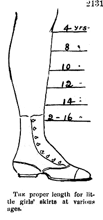
The proper length for little girls' skirts at various ages, a diagram from Harper's Bazar, 1868, "showing a mid-Victorian idea of how the hemline should descend from slightly longer than knee-length for a girl of 4 years old to almost ankle-length for a girl of 16."
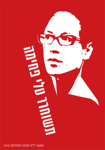

In these political posters of Tali Fahima by Ronen Eidelman, and Che Guevara by Jim Fitzpatrick (1968), the portrait is represented as a flat graphic. The contrast between the vibrant red, black and paper white is intense. The message is quickly understood through a design that is both minimal and powerful.
The Pen Tool
The Pen tool (Bezier) is prominently used for creating flat graphics or line art. It can be used to make complicated forms by tracing images and combining simple shapes. In addition to contouring and tracing, the Pen tool is often used to create shapes that are used for masking. The Pen tool can be a little difficult to learn, as the process of using this tool sometimes feels counter-intuitive. The artist has to know where her next point is before plotting it. Visualizing lines, shapes, and space before they exist can be challenging. In this exercise the paintbrush is used to create quick gesture drawings of the lines and shapes that will be recreated accurately with the Pen tool to eliminate the type of forethought that accompanies the use of this tool. With enough practice on top of template layers, newbies are sure to develop Pen tool intuition.
Exercise 1: Gesture drawings on a template layer
1. Start with a new document in Inkscape set to standard letter size dimensions.
2. To begin, we will set up a template layer with quick, gesture strokes using the Pencil tool. Select the Pencil tool and click and drag to draw a roughly straight line.
Key Command: Another way to deselect an object in Inkscape is to press the Escape key.
|
3. Draw a triangle with the Pencil tool. The results of the drawings are vector shapes.
4. Draw the remaining curves illustrated in our screen shot.

5. Open the Layer dailog (Layer > Layers). Click the lock icon to the left of the words "Layer 1" to lock the layer, so that you will not accidentally modify your freehand work. Set the opacity of Layer 1 to 30%.

6. Create a new layer called "Layer 2" in the Layer dialog by clicking the Create a new layer button, which looks like a plus (+) sign. We will use the Pen tool on Layer 2.
Exercise 2: Recreating straight lines with the Pen tool
1. Select the Pen tool from the Toolbox. Note that the mouse-over tool tip for the Pen tool says "Draw Bezier curves and straight lines." The Pen tool plots anchor points each time you click the mouse. To make a straight line, click one time at the beginning of the line, release the mouse, move the mouse to the end of the line, and click again. Press the Enter key to finish. In two clicks, the Pen tool creates two anchor points and joins the points with a straight line.
2. To make your Pen tool lines draw in red, select the line you just drew using the Selector tool. Open the Fill and Stroke dialog by choosing Object > Fill and Stroke and change the stroke color to red. Make sure the fill color is set to "No paint" (X).

3. Once the line is made, it can be modified by the Selector tool for moving, rotating, or transforming, or by the Node tool for modifying one node (or anchor point) at a time. Using the Node tool, click once on the line to see its nodes, then click on the node at the end of the line and drag it to increase the length of the line.

| Watch for this: In Inkscape, the nodes turn red as the mouse hovers near them, making it easier to find the nodes when nothing is selected. |
4. Use the Selector tool to select the line and change the weight of the stroke using the Fill and Stroke dialog. Notice how the line can be bold and aggressive with a larger stroke size or faint and slim with a stroke size that is less than 1 point.

Part A: Recreate the triangle with the Pen tool
1. Switch to the Pen tool. Click once at one corner of the triangle with the Pen tool. Release the mouse. Click on the next corner of the triangle. Release the mouse. Click on the third corner of the triangle. Release the mouse. The fourth click needs to be exactly where the first node was made.

Image Caption: Notice in this image that the Pen tool displays a small square where you first clicked, symbolizing that the path is closed and a whole object is made when the last click with the Pen tool is made directly on the first anchor point. This is referred to as "closing the path." When a path is closed, or a shape is whole, it is easy to fill the shape with a color using the Selector tool and the color palettes.
2. Select the triangle with the Selector tool if it isn't already selected. Right click on the Fill and Stroke dialog in the bottom left area of the page and select "Swap fill and stroke."

The stroke and fill colors switch places. In our example, the triangle becomes red with no stroke, as opposed to a triangle with no fill that is outlined in red.

Part B: Modify nodes using the Node tool
Just for practice, use the Node tool to modify two nodes at a time. Click on one node of the triangle. Hold the Shift key and click a second node. Now one whole side is selected. Begin dragging the mouse to move both nodes at one time. You can click and drag with the mouse to move these anchor points, or you can use the up, down, left, and right Arrow keys on the keypad. Pressing the Shift key while you press an arrow key moves the node 10 times as fast. You can also place your mouse on an edge of a shape (on a line between two nodes) and click and drag to change the curvature of that particular edge.
Part C: Create a second shape to add dimensionality
1. Begin by creating a parallelogram using the Pen tool. Plot the first node near the top of the first triangle.
2. Use the edge of the first triangle to help visualize the dimensionality of this new shape. Plot the second node to create a parallel line between the two shapes.
3. Set the third node so the area recedes in space, creating a unified perspective between the two shapes.
4. Close the path by using your fifth mouse click to return to the first anchor point. If the shape isn't perfect, you can always go back with the Node tool to modify individual nodes.

Part D: Atmospheric Perspective
Stand outside early in the morning or at twilight and look far down the street towards the horizon. Objects that are further away appear less saturated than those that are near. Atmospheric perspective accounts for the perceptual change that happens to the overall opacity of objects as they recede in space.
1. Select the parallelogram. Open the Fill and Stroke dialog and fill it with the same color you used in the triangle.
2. While the second triangle is still selected, change its opacity to 80% in the Fill and Stroke dialog.

Flat, basic shapes created with the Pen tool can be combined to imply complicated shapes and three-dimensional space.
Exercise 3: Curves
Part A: One curve
1. The first curve is created in two points. The first anchor point is made by clicking and dragging the mouse slightly upward, tangent to the curve, to imply the direction of the curve. Do not drag all the way over the curve like you are using a pencil or paintbrush, this tool does not work like a pencil or paintbrush. Release the mouse.
| Watch Out! If you set the Pen tool with a fill and no stroke, the path is filled with color as each point is plotted with the tool. This can be confusing, even to professionals, while initially setting anchor points. |


2. Click once at the end of the curve and drag slightly downward until the curve looks similar to the template. Don't worry if it's not perfect; we'll adjust it in a moment. Press the Enter key to finish.

3. Deselect the curve by pressing the Escape key.
Part B: Bezier Handles
Tip
- When you select the Node tool, a Node toolbar appears at the top of your work surface. By using the buttons in that toolbar to select various options, you can add, delete, join, corner, and perform other operations on curves and lines. To delete a node, you can use the "Delete selected nodes" option, or select the node and press the Delete or Backspace key.
|
1. Use the Node tool to click on the curve you just completed. You will have one curve with two nodes. Each node will also have bezier handles at each end.
2. Bezier handles are used to modify sections of the curved line by pulling on the midpoint of the curve so that the curve runs tangent to the handles. Pull the bezier handles until the curve matches the template.


Part C: Two curves in a row
1. Click and drag with the Pen tool in the direction of the first curve. Release the mouse.


2. Click at the end of the first curve; this tells the Pen tool the direction of the next curve. Release the mouse.

3. Click at the end point of the last curve and the final curve is made between the last two anchor points. Press the Enter key to finish.


When you are working with the Pen tool, you have to think ahead of the tool, towards the place where the line changes. The best places to click are called inflection points, where the curve changes direction.
Exercise 4: Curves and angles
The last sample on the template is an example of 3 curves joined together. In order to trace this, we will use two different types of nodes; smooth nodes (the default for the Pen tool and the type of nodes which we have been using so far) and corner nodes (which create sharp angles).
1. Using the Pen tool, click and hold down your mouse button at the beginning of the first curve and drag the mouse out to create a bezier handle in the curve's direction. The bezier handle is indicated by a black line.

2. Release the mouse button to reveal the first curve, indicated by a red line.
3. Move your mouse to the sharp corner where the first and second curves join. Click and hold your mouse button, dragging your mouse to finish modifying the shape of the first curve with another bezier handle. Continue to hold down your left mouse button.

4. To draw the second curve with a sharp change in direction from the first one, press and hold the Shift key, which puts the Pen tool in corner node mode. Drag the second half of the bezier handle in the direction of the second curve.

5. Release the left mouse button, followed by the Shift key to reveal the second curve. Always release the mouse before releasing keys.

6. Repeat steps 3-5 to create and reveal the start of the third curve.


7. Click and hold down your mouse button, dragging your mouse to finish modifying the shape of the final curve. Release the mouse button and press the Enter key to finish using the Pen tool.

8. Use the Node tool to fine-tune the bezier handles.


By understanding how to create straight lines and curves, and by converting anchor points from curves to angles or angles to curves, any image can be traced.
Exercise 5: Tracing an image and creating a clipping mask
Clipping Masks
The Pen tool is often used in combination with images or vector art to create clipping masks. A clipping mask is used to redefine which parts of an object are revealed to the viewer. They are commonly used on photographic images to "remove the background" from a figure in the image.
For this exercise, place any image onto the template layer and trace it with the Pen tool on Layer 2. An image of a human figure is a challenge as it always includes a combination of curves and straight lines. In this example we will use a public domain image of a Vulcan Salute.

First the Pen tool will be used to draw a path around the arm, then the resultant path is used as a clipping mask to hide the rest of the photograph.
1. Create a new layer (in our example the new layer is named Vulcan Hand) and turn off the eyeball icons on the other two layers to hide them while you are working on this new exercise.

2. Choose File > Import to place the image of the hand (or any other image) on the new layer.
| Watch Out: By default, Inkscape links files rather than embedding them within a document. This can be useful as the file size of the .svg document is not affected by large images. However, linked files must remain available on the hard disk in the same relative position as they were when the relationship between the linked image and .svg file was created in order to view and print the document. |
3. Set the opacity of the Vulcan Hand layer to 30% and create a new layer (in our example, called Vulcan Hand Tracing) above it.

4. Use the Pen tool to trace the hand. Remember to start and stop on the same anchor point. Also remember that the path doesn't have to be perfect, as the Node tool can be used to modify it once it has been created.

5. To transform the path into a clipping mask, you will select both the path and the image. Use the Selector tool to click on and select the path first, then press the Shift key and click on the photograph. You will see dotted lines around the path you just plotted and dotted lines and transformation arrows around the corners of the photograph. Choose Object > Clip > Set.

A clipping mask is used to define the areas that are revealed to the viewer, while any part of the image outside of the path is hidden.

In this image, the result of the clipping mask is noticeable on the Vulcan Hand layer.
|
Tip: If you are making a clipping mask, you should have a path that is placed inside the photographic image. That is, the photographic image should be larger than the path that will be used to mask it. If the path is larger than the entire image, the mask will simply reveal everything, in which case you don’t really need a mask.
Tip: Be sure to click on the path, then shift-click the photographic image someplace outside of the path. Shift-clicking inside an area that includes both the path and the image deselects everything.
|
6. When an image has a mask applied to it, the image and the mask are grouped together and can be manipulated by the Selector tool as a single unit.

Final notes about Clipping masks
We aren't doing this in the exercises, but you should know that you can release the image from its mask at any time by selecting the masked image and choosing Object > Clip > Release. This allows you to modify the image or the path of the mask separately. Repeat the process in step 5 to re-set the mask on the image. To delete a clipping mask, release it and you will see both the path that was used as the mask and the photographic. The two separate objects can be deleted or modified individually.
Searching and Sampling
The Internet is a treasure trove of photographic imagery. Artists and designers often combine media elements from this visual archive in inventive ways, or use downloaded images as research for their own creative work. While we admittedly live in a copy/paste culture, using a downloaded image from the web has legal ramifications.
Just because you can download an image doesn't mean you may use it! A downloaded image may be protected by copyright laws. Copyright is a legal tool for preserving control over the use of a creative work. Books, poems, music recordings and compositions, photographs, paintings, sculptures, radio and television broadcasts, films, and even dances can be copyrighted.
| England initiated what we think of as copyright laws in the early 1700s. The widespread use of the printing press and an increase in literacy rates had resulted in printers commonly reprinting texts without crediting their rightful authors, or paying them. Attribution of proprietary rights in intellectual material has had far-reaching legal and economic implications. Copyright durations vary by nation. In the United States, the length of a copyright used to be the life of an author plus 50 years; on the 50th year after the death of an author, their works would be released into the public domain. When a work is in the public domain, it is not owned or controlled by anyone. Any person can use the material, in any way, without owing anything to the creator. For works created by corporations, the length was 75 years from the date of publication. In 1998, Congress passed the Sonny Bono Copyright Term Extension Act, which extended copyright by 20 years. This law was authored by a musical-entertainer-turned-Congressman, and was heavily lobbied for by the media industry. The act was nicknamed the Mickey Mouse Protection Act, as Disney lobbied extensively to insure that the law reached back just far enough to protect their copyright over Mickey Mouse. The Act essentially suspended public domain advancement in the United States as covered by fixed term copyright regulations. |
Copyright law does allow certain types of use of copyrighted material. An image is protected by copyright unless:
1. the use qualifies as fair use.
2. the image is in the public domain because the author declares it is, or because it is old enough that the copyright has expired.
3. the author licenses it under an alternative model. Fair use is not piracy! Fair use is legitimate and legal use of copyrighted media, as protected by copyright law. Fair use is free speech. Fair use is not file sharing.
Fair use and appropriation
Understanding the key principles of fair use is helpful when thousands of protected images are only a mouse-click away.
Fair use
Reproducibility is a central trait of digital media. Unlike lithographs, vinyl records, cassette tapes, videotapes, books, or photographic prints, an exact replica of digital media can be made from a digital copy. This is true for digital photograph files, CDs, MP3s, DVDs, and web sites. From sampling to mashups, collage to subvertisements, contemporary artists and content creators use digital files as source material for the derivation of new works. These works are considered new and original, but they are sometimes built with bits and parts of copyrighted works. In the digital age, new works are often created when more than one existing work is recombined in a new way, providing new visual relationships and new ideas.
Copyrighted content can be used in a new work if permission is obtained from the copyright holder, or if the media use falls into the category of fair use. Under the fair use clause of copyright law, limited copyrighted material can be used for a transformative purpose, such as commenting upon, criticizing, or parodying the initial material. The four key factors are
1.The purpose of the derivative work
2.The nature of the derived content: copyright does not limit use of the facts or ideas conveyed by an original work, only the original creative expression
3.The amount of original work used
4.The effect that the new work has on the potential or actual market value of the original.
Weighing these four factors in a copyright case is not an easy task, which is why judges have been asked to do so. However, successful commercial media that takes advantage of the fair use clause include Saturday Night Live skits, The Simpsons cartoons, and Weird Al Yankovic songs. These works all make use of parody, one of the traditional protected purposes.
Another one of the traditional protected purposes is educational use in a classroom. Keep in mind that just because you cannot be sued for using appropriated work for assignments, you should be using it for reasons that advance your education, not just for convenience.
Know that the expectations increase for work done outside of a classroom. For commercial media, your transformation of the source material should be significant. We will talk more about this in Exercise 3. The fair use clause also does not mean you may plagiarize. Plagiarism, an ethical offense separate from copyright issues, hides the fact that ideas or content have been copied from somewhere else. Even in cases where no legal violation has occurred, plagiarism is a serious ethical violation that undermines the academic endeavor and destroys the plagiarist's credibility.
Fair use foregrounds that work has been copied and uses the original work as a springboard for further development, often citing the creator in an obvious way so as not to put its source into question.
Appropriation
Appropriation is a word that is used by media artists to describe the visual or rhetorical action of taking over the meaning of something that is already known, by way of visual reference. For example, Andy Warhol appropriated the Campbell's soup can visual identity to make large, iconic silkscreen prints. Warhol's soup cans are an interpretation of the physical object. The visual reference to the original soup can is important, as the viewer needs this information in order to understand the idea that the reference conveys (your personal translation of this could range from a feeling associated with something as simple as a popular American icon or comfort food to revulsion at the commodification of domestic life). By transforming not only the size and graphic palette for portraying the soup cans, but also the place where the viewer will encounter them (an art gallery as opposed to a grocery market), Warhol appropriates the original Campbell's soup cans to create art that relates to popular culture in its iconic form. Appropriation falls into the category of fair use.
| Ironically, we do not have copyright permissions to show Warhol's paintings or photographs of Campbell's soup cans in this book! Try an image search if you're curious about viewing this work. |

Fountain, Marcel Duchamp (a.k.a. R. Mutt), 1917, ready-made object photographed by Alfred Stieglitz.
Marcel Duchamp was the first known artist to appropriate a common object in his art. This challenged the art community in its definition of what is or is not labeled art. Duchamp believed that declaring an object a work of art was the artist's key role in creating art. In the case of Fountain, he took a urinal, turned it on its side, and signed it with his pseudonym, R. Mutt.
In this act of appropriation, the everyday object became something other than what it once was. Duchamp's transformations included the addition of the signature to the porcelain, the change of context from a bathroom to a gallery, and the change in purpose (the status of the urinal before it fell into Duchamp's hands is unknown, but after 1917 no one has used the urinal that R. Mutt signed for the purpose of waste containment). In these ways, Duchamp's use of the urinal foregrounded the viewer's understanding of the urinal as a concept and an object. This foregrounding is one of the central motifs in appropriation.
In addition to fair use, many works are in the public domain or are licensed under Creative Commons.
Determining what is protected, what is fair use, and what is free to use is part of the cultural producer's job. A few search techniques will make it easier to sort successfully through the vast online image archive.
Exercise 1: Advanced searching in Google
1. Open Google Image Search (http://images.google.com) in a web browser.

2. Type the word "Bauhaus" into the search field and click the Search Images button. The search engine will return all images related to the word "Bauhaus." The Bauhaus was a revolutionary arts and design school that operated in Germany from 1919 to 1933. The Bauhaus defined arts education for the 20th century and beyond.

3. Filter your results by file size. Click on the pull down menu next to the word "Showing:" near the top of the search results page. You can choose from a range of small to extra large images. Select "Large images," and release the menu. The page will reload only showing images larger than 600x800 pixels and smaller than 1200x1600 pixels.
4. Expect errors! Nearly every search result produces errors. Sometimes errors follow a pattern that can be identified and excluded from the search query. In this case, your results are likely to include images of the 1980's band "Bauhaus." To remove the results for the band, add the word 'band' preceded with a minus sign (e.g. "-band").
5. Results can be limited by searching for a specific phrase. To search by a phrase, enclose the words in quotes. Do a search for "Bauhaus Dessau." Make sure to reset your image size to "All Image Sizes." Your results should include images of the Bauhaus Dessau. Dessau, Germany was the location of the Bauhaus from 1925-1932.

| Advanced Image Search will give you control over additional parameters, such as filetype, color mode, and so on. |
6. Click on one of the images from your search to bring up the Image Results page.
7. Click on the link, "See Full-Size Image," to load the full resolution image in its own window.

8. Download the file by dragging it to your desktop, clicking File>Save, or right-clicking the image and choosing Save Image As. Save the file in a location on your Hard Drive that will be easy to locate (the desktop or documents folders are typical storage locations for short working sessions).

Exercise 2: Searching in the public domain
Just because you can download an image doesn't mean you can use it! An image may be protected by copyright laws. Similar to a patent, a copyright is a legal tool for preserving control over the use of a creative work. Books, poems, music recordings and compositions, photographs, paintings, sculptures, radio and television broadcasts, films and even dances can be copyrighted. The Artist Formerly Known As Prince even has his symbolic name, "Love Symbol #2", protected by copyright law. England initiated the copyright laws familiar to today's citizens as the Statute of Anne (1709). By the 1700s, the widespread use of the printing press and an increase in literacy rates resulted in printers commonly reprinting texts without crediting their rightful authors, or paying them. The Statute of Anne gave the author the exclusive right to a work for a fixed period of time.
Copyright durations vary by nation. In the United States the length of a copyright used to be the life of an author plus 50 years; on the 50th year after the death of an author, their works would be released into the public domain. For works created by corporations, the length was 75 years from the date of publication. In 1998 congress passed the Sonny Bono Copyright Term Extension Act, which extended copyright by 20 years. This law was authored by a musical-entertainer-turned-Congressman, and was heavily lobbied by the media industry. The act became known as the "Mickey Mouse Protection Act," as Disney lobbied extensively to ensure that the law reached back just far enough to protect their copyright over Mickey Mouse.
Public Domain images have no licensing restrictions. An image automatically enters the Public Domain when a copyright expires. Public domain is currently under attack, as media corporations struggle to control their monopolies. The irony is that copyright was introduced to protect authors from this type of monopolistic power.
| To find out more about Free Culture, Public Domain, and the Creative Commons, visit http://CreativeCommons.org, or http://lessig.org. Lawrence Lessig is one of the founders of Creative Commons and the Free Culture movement. |
An image is protected by copyright unless:
- the use qualifies as "fair use"
- the author declares it is part of the public domain
- the image is old enough that the copyright has expired
- the author licenses it under an alternative model
Several alternative licensing models exist, the most popular of which is a Creative Commons license. Creative Commons operates under the moniker "Some rights reserved" and offers a range of licenses with subtle degrees of control over whether derivative works and for-profit uses are allowed. Wikimedia Commons (http://commons.wikimedia.org), and Flickr (http://flickr.com/creativecommons) focus partially or exclusively on public domain or Creative Commons licensed images.
Wikimedia Commons is an archive of Public Domain and Creative Commons images. Much like Wikipedia, it is organized by historical subjects, and is collectively edited and maintained.
1. Go to the Wikimedia Commons (http://commons.wikimedia.org) and search for Walter Gropius, the founding director of the Bauhaus.

2. View several of the images, and notice that the images are either Public Domain or licensed under Creative Commons.


3. Flickr is a photo sharing site that encourages the culture of sharing through many of its features, and many Flickr users license their photographs under Creative Commons. Go to Flickr (http://flickr.com), click on Search and then click on Advanced Search.


4. Type in Bauhaus, and select "Only search within Creative Commons-licensed photos." Everything in your search will be CC licensed, though not all will allow derivative works (for example, using the image in a collage) or commercial use.

5. Notice that all of the images in the search are organized by tags. A tag is a one or two word phrase used to categorize images (as well as other web content). In this case, many of them are tagged "Bauhaus."

6. Clicking on a tag will reveal the tag's cluster page.

Licensing your work
Licensing work with a Creative Commons (CC) license is easy.
Upon setting a Creative Commons license, the creator of the work decides if both commercial and noncommercial uses are allowed (some are noncommercial only), if others are allowed to modify the work once it is licensed (called "derivative work"), and if derivative works are allowed, whether or not the newly modified work also has to be licensed with CC (called "share alike").

The six types of licenses and a very brief description of each follows. More information can be found on CreativeCommons.org. All CC licenses state that the original author will be given credit for her work, in addition to the following details:
1.  Attribution Non-commercial No Derivatives (by-nc-nd) This license provides the least freedom to others as the work cannot be used for commercial purposes and derivative works cannot be made (in other words, it would be illegal to use this work as part of a collage).
2.  Attribution Non-commercial Share Alike (by-nc-sa) This license allows others to build upon the original work (for instance, this work could be used, legally, in a collage) as long as the new work is also licensed in the same manner, with a CC by-nc-sa.
3.  Attribution Non-commercial (by-nc) This license allows others to build upon the original work (this work could be used, legally, in a collage) without having to license it as a CC by-nc. However, the resulting work cannot be used for commercial purposes and the original author, as with all CC licenses, must be credited.
4.  Attribution No Derivatives (by-nd) This license allows others to use the work as it is, without making derivative work, for any purpose (commercial or noncommercial).
5.  Attribution Share Alike (by-sa) This license allows others to use the work as it is or in derivative forms, for commercial and noncommercial purposes, as long as the new work is also licensed with the same CC by-sa license.
6.  Attribution (by) This license provides the most freedom to others who want to use the licensed work.
Exercise 3: Searching in stock photography websites
Other sources for imagery are stock photography websites such as GettyImages.com or iStockPhoto.com. These websites are full of photographs and vector graphics to be used in advertising, corporate media, brochures, campaigns, and other design applications.
The advantage of these sites is that they seem to have endless search detail. Here is the iStockphoto image acquired from a search for "writer, table":

http://www.istockphoto.com/file_closeup/object/3584537_writing.php?id=3584537
The disadvantage is that the photographs are generic, and have the impersonal feel of an advertisement. No one ever looks as happy as a model in an advertisement, and most people feel they are not as physically attractive as the models used in commercial photography. Stock images ned to work in a variety of situations to give the buyer flexibility and value. Therefore, it is not surprising to feel a lack of specificity, and overall generic quality, in a stock image.

http://www.istockphoto.com/file_closeup/object/4748268_businessman_talking_on_cellphone.php?id=4748268
No one walks around on his cell phone with such a big smile as this man! Stock photographs are staged. These images should be used carefully, as the level of authenticity of the action within the image is noticeably low.
1. Go to Getty Images (http://GettyImages.com) and search in Creative Images for an image of what you are doing right now. In our case, that is "person typing at computer indoors." You might type "person reading book on couch." Try adding specifics like your hair color or the types of clothes you are wearing.

2. Refine your search with their search phrases.

3. Ask yourself if anyone ever looks quite that content, pensive, or photogenic while reading a book unless they are acting for the camera.
One strategy for using stock photography is to radically alter the original image, either through extreme image adjustments in Gimp, or by tracing the image in Inkscape. As a transformation to the image, this kind of treatment usually results in using the image under the clause of fair use.
The following image was created from a collection of stock photographs. Notice how any photographic information has been modified and abstracted in an illustrative form. 
From the series, Wish You Were Here! Postcards From Our Awesome Future, Packard Jennings and Steve Lambert, 2007, 6' by 4' giclee prints.
Image Acquisition and Resolution
There are several ways to bring an image into the computer. The two most common are photographic in nature, that is, both methods involve exposing sensors to an item or scene in the real world. The camera or scanner then writes digital data to display that image on the screen. While the sensor technology is essentially the same, a camera is made to capture scenes with depth of field, while a scanner is made to focus on and capture just one flat plane.
Photograms are made by placing objects on sensitized paper, exposing the objects and paper to light, and then processing the paper to reveal the print. A camera is not necessary for the production of this type of graphic image. The first photograms were made by photographic pioneers William Henry Fox Talbot and Anna Atkins in the mid-1800s. This type of contact print can have an uncanny life-like presence that, like an x-ray, reduces three-dimensional information onto a two-dimensional plane without the perspective that a camera lens introduces. This overall focus and flattening of visual information results in a poetic and magical image.
A scanogram is the digital method of producing something like a photogram. It is the image made by placing objects directly on the scanner.
Photograms have been made by photographers, artists, and designers. Anna Atkins created early renderings of natural elements. The avant-garde formal experiments of Man Ray, El Lissitzky, and László Moholy-Nagy are central works of 1920s art and design. Commercial designers such as Paul Rand used the technique for package design and book jackets. The process is fun to explore, and the results are always surprising.
A photogram of algae, from the book British Algae, Anna Atkins, 1843. This is the first book composed entirely of photographic images.
A photogram of lemons, uploaded to Wikimedia Commons in August 2005 by user name Cormaggio.
Results of Chapter 7 Exercises

Actually, you will probably make something a bit different, provided you scan your own materials. This is a scanned image that we will use as a work file starting in Exercise 2.
Exercise 1: Creating a scanogram and understanding file resolution
Scanners are optical input devices that use software to send the captured image from the scanning bed to the computer. Though scanning software varies among brands, all scanners operate in the same manner, and all scanning software has the same essential functions. Typically, a scanner is used to create a digital image of something two-dimensional. In this exercise, you will scan a three-dimensional object.
1. Place your object on the scanning bed. If the lid does not close, put a dark piece of cloth around the scanner so ambient light doesn't leak in and interfere with the exposure during scanning (a jacket or dark sweater will work.) We are scanning a flower that fell to the ground - it lies flat, so it will be easy to close the lid on the scanner.
2. Open the scanning application. We will use XSane which can be accessed through GIMP. Choose File > Acquire > XSane > Device Dialog.

3. Choose your scanner from the listed options, then press the OK button. We chose the Epson scanner.

4. The scanner may automatically create a preview of whatever is placed on the scan bed. If it does not, a preview of the last item scanned may be visible. Click on the Acquire preview button to see the contents of your scanning bed in the scanning software.

5. If your object is smaller than the scan bed, you should select just the area that you intend to digitize by marqueeing over the image area. Click the Plus (+) button in the top left corner of XSane and then click and drag over the preview without changing to a tool. At this point, your selection marks the location of the object on the scan bed. If you lift the lid and move the object, you will have to re-preview and select the scan area again in order to tell the scanner where to locate your object.
6. Choose your resolution. This is the crucial step. Before scanning, the artist must decide upon the file's input resolution.
Different output devices require different resolutions to produce quality output. Resolution is the number of pixels displayed per inch (PPI), also called dots per inch (DPI). In 1984, when Apple pioneered consumer WYSIWYG text, a way was needed to translate font sizes on screen to printed output dimensioned in inches. The early Macintosh computer screen used a logical inch made of 72 pixels, or 72 dots per inch. Most modern Operating Systems assume a monitor displays 96 dots per inch. Printers can easily squeeze 300 dots into an inch, and some go much higher. Knowing what kinds of resolution the intended output device has will help you decide what input resolution to use.
Resolution for printed images Resolution is measured in dots or pixels per inch (dpi or ppi). The resolution of the scanned image is a necessary factor in the final print or on-screen output. In consumer or prosumer situations, such as personal ink jet printers or laser printers at stores like Kinkos or Costco, the print will look fine at a resolution of 200 to 300 dots per inch. In professional print environments, the rule is simple: ask the printer for the print specifications including file resolution and color space.
Resolution for screen presentations Any image that will be used on-screen, for instance on a website or in a video, will need to be saved only at screen resolution, or 72 dots per inch. The file size is directly connected to the amount of pixels saved in each inch of the bitmap or raster file. Image files saved at screen resolution are much smaller in file size than images that are saved for printing.
To determine the resolution to enter into the scanner software, simply acknowledge the size of the object on the flatbed, then decide how large you want the object to print on the page. If the object is, for example, 4 by 5 inches and the objective is to make a 4 by 5 inch print, scan the object at 200 - 300 dots per inch. If you want to make an 8 by 10 inch print, either scan the object at 300 dpi and increase the scale to 200 percent, or scan the object at 600 dpi at 100 percent scale.
7. Using the guidelines above, choose a resolution and be sure that the color mode is appropriate (black and white line art, grayscale, or color).

We are scanning at 600 dots per inch. We know that we can make a high quality print on an ink jet printer at 300 dots per inch. Since 300 multiplied by 2 is 600, we will be able to print this scan at twice the size of the scanning area. In this case, the scan area is a little less than 4 by 5 cm (or nearly 1.5 by 2 inches), so the resulting print could be made at nearly 8 by 10 cm (3 by 4 inches) at 300 DPI..
8. Once the image is scanned it will automatically open in GIMP. Choose File > Save. Create a name and add .tif to the end of the file name. Adding a file extension such as .tif forces GIMP to save the file as a TIFF file. File formats such as JPEG, PNG, and PDF compress the size of the file, and may result in a loss of digital information. File formats such as TIFF and PSD are not lossy, and are therefore better format choices for high quality scans. GIMP will then ask you for a compression option. Click the radio button None and press the Save button.

Exercise 2: A tour of tools and dialogs in Gimp
In this exercise, our screen shots show the image of a different scanogram we made at an earlier time of writing. It doesn't matter, though, because the tools and dialogs are the focus of these exercises.
1. Look at the image in Gimp. On the left is the Main Toolbox. The image opens in its own Image Window. Dialogs and palettes will be explored further throughout this exercise.

2. Click once on any of the Tool icons and notice the Tool Options dialog underneath the Main Toolbox. All tools have flexible options that can be used to determine how the tool functions. Click on a variety of Tool icons and watch the Tool Options dialog change according to the selected tool.
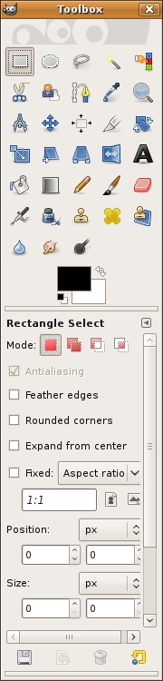
The Rectangle Select tool was active in the Main Toolbox. This is an image of the Tool Options. When a different tool is selected, its options are shown in this dialog.
3. The Navigation dialog can be used to explore various areas of an image. To view this dialog, choose View > Navigation menu. The larger the resolution or file size, the more likely it is that the whole image will not be viewable on the screen at 100 percent. The navigator can be used to move around within a large image, but you will soon learn short-cut keys to avoid this dialogue. This is worthwhile because the fewer palettes that you need to keep open on your screen results in more screen space for viewing image details! Push the slider on the bottom of the Navigator dialog all the way to the right to zoom all the way in to the image.

The small clear square with a white stroke in the Navigation dialog indicates which part of the image is viewable on screen. Notice the slider is pushed all the way to the right, and in the bottom left corner we are zoomed in to 25600 percent.
4. Enlarge the view of the image by zooming in and the individual pixels that comprise the image are in plain view.

A pixel is the most basic picture element, or a single color unit of the bitmapped digital image file. That last sentence was full of jargon, let's revisit those words:
Pixel
The word pixel is a combination of two words: picture and element. A pixel is the smallest unit of color information in a digital image. If the real world is captured digitally, it is converted into pixels.
Bitmap or Raster images
A digital file is considered bitmap or raster (two words used interchangeably) if it is composed of a grid of pixels. Raster is the German word for "grid." Inkscape is a vector-based application, while Gimp is primarily used to work on photographic images. Gimp is commonly thought of as a bitmap or raster application.
5. It is important to view digital images at 100% as this is the "true" representation of the file. This is as good as it gets on the screen.
| Hot key: Shift+ Control + E will change the viewing percentage so the image is as large as it can be on your screen. |

Notice that the Zoom Tool Options include a Zoom out button (Zoom tool with a minus sign). Click on the Zoom out button and then click anywhere within the image. Keep clicking and you will continue to zoom out of the image.
6. Press Shift+Control+E to see the image as large as it can be within your particular monitor settings. Now we'll try more key commands. Zoom in more than 100% by using Command+= and then use the Spacebar key to access the Hand tool. Press the Spacebar key and use the mouse to click and drag on the image. This moves the image around within the workspace, much like using the scroll bars at the edges of the document. In Gimp you will never use the scroll bars because you will always use the Hand tool.
Exercise 3: Image Size, file size, and resolution
1. When an image or object is scanned or input from a digital camera, it appears in the Layers dialog with the name of the file. Look in the Layers dialog (Windows > Dockable Dialogues > Layers) and notice that the layer is locked. Double-click on the name of the layer in the Layers dialog to use the Rename Layer dialog box. When you rename the layer it is automatically unlocked.
A layer is like a single sheet of transparency paper. A "blank" or empty layer is transparent. When a scan or digital photograph is first opened, it appears on the "Background" layer. Layers can be added and deleted using this dialog. Unlocking the background layer is a good habit, as it encourages the user to rename the layer (which is always a good idea) and enables the layer to be affected by tools and effects that can be "locked out" when the layer is locked.
| Tip: Double-clicking on the icon of the layer will open the Layer Attributes window. If this happens, press Cancel, then try again by double-clicking specifically on the name of the layer. |
2. The Status Bar runs along the bottom of the file. Click on the area of the Status Bar, followed by a number in kilobytes or megabytes. This area reports the file size. The page size is determined by the page size set in File > Page Set Up. By default it is A4 size or 8.26 by 11.69 inches.

3. Choose Image > Scale Image to view and modify the image resolution.

4. Our file is about 871 x 1136 pixels per inch at 600 dots (on the screen) or inches (on the print).
5. We changed our units of measurement to inches using the pull-down menu to the right of the Width and Height area then we set our height at 4 inches. This resulted in a width of 3.08 inches. A print made on a personal ink jet printer will look good, that is, it will not be blurry or pixelated, because our resolution is 600 DPI. This resolution is about twice as large as we need it to be in order to make a fine print on a personal ink jet printer.
Using the Scale Image dialog box enables the user to change the dimensions of the printed image or the resolution (dpi). This is a good thing - you would never want to change the amount of pixels within the image, unless you simply want to delete some pixels in order to make the file size smaller. Pixels are created during the scanning process, on a scan bed or within the digital camera. The only way to make "new" pixels is to rescan or re-capture the digital file using a higher resolution. It is not possible to create new pixels inside Gimp after the fact. OK, that's actually a lie. You can make new pixels, but you never want to. If Gimp resamples the image (or, makes new pixels based on the surrounding pixels) the result is a blurry or pixelated image.
6. Click OK. Notice the Scaling Bar on the Status Bar in our screen shot. This indicates that something is being changed in the file, a result of changing the size of the image.

7. Choose File > Save As to change the format of the file from Tiff to Gimp XCF file. The name of the file does not have to change, as a new format will create a new file. Always save using the native native or master format.
Exercise 4: From the camera to the computer
Digital cameras use memory cards to store file information within the camera. To send the images from the storage device within the camera to the computer, the camera is connected to the computer via a USB cable. Alternatively, a card reader can be used to connect the memory card to the computer and read it like a small hard drive (similar to a jump drive). When using a card reader, simply drag and drop the folder of image files from the card reader (it will appear on the desktop as an external hard drive) to the desktop or documents folder. Once images are copied to the desktop, it is safe to delete them from the card.
1. If you connect your camera to the computer through the USB cable, then you will use an application to read the images. On Ubuntu, F-Spot Photo Manager may automatically launch. To transfer files from the camera to the computer with F-Spot, connect your camera to the computer (USB or Firewire), the program will launch and display all the photos to be imported.

2. By default, images will be downloaded and saved to the "Pictures" folder on the hard drive. Press the Copy button to start the process.
Tonal Scale
The tonal range is the change in value from black to white. It is the set of grayscale information in an image. Sometimes tonal range must be adjusted so images have a full range of values in the shadows, midtones, and highlights. Adjusting the tonal range addresses these common problems.
| Watch Out: All monitors are different. If you consistently see a color cast in all your images and in an area you know to be a neutral gray use the buttons on your monitor to calibrate it until the monitor can display a neutral gray. |
1. The image is too light or too dark. There may be a lot of detail in the light areas or in the shadows that can be made visible or printable through an adjustment.
2. Contrast is too low or too high. A low-contrast image has a flat tonal range. A high-contrast image has very light highlights and very dark shadows, and very little detail in the midtones.
3. The image displays a color cast - evidence of a hue in areas that should be neutral gray or white.
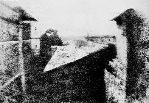
View from the Window at Le Gras, Nicéphore Niépce, 1826, Saint-Loup-de-Varennes, France. Captured on 20 x 25 cm oil-treated bitumen. In this first recorded photograph, the exposure time was 8 hours! Notice the limited tonal scale due to such high contrast among the dark and light values.
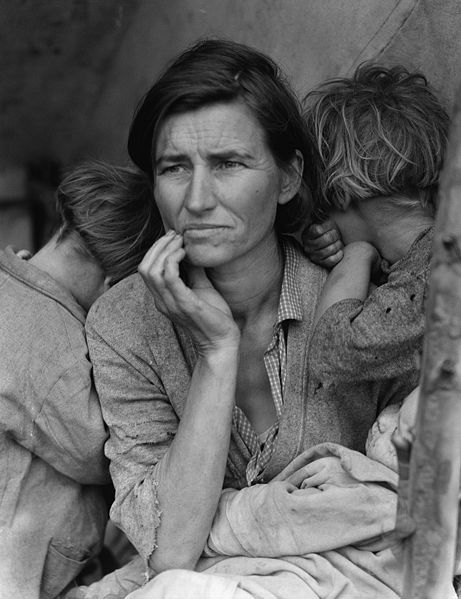
Migrant Mother, Dorothea Lange, 1936. Silver gelatin print.
This photograph was commissioned by the Farm Security Administration (FSA). Florence Owens Thompson looks towards the future with worry, as her children bury their heads into her shoulders. The FSA was part of The New Deal, a set of programs initiated by Franklin Delano Roosevelt to stimulate and revitalize weak economies from 1933 - 1938. The FSA hired photographers, such as Lange, Walker Evans and Marion Post Wolcott to document America after the Great Depression. Notice how the range of tonal values expresses the details in Florence's face and the blanket on her lap.
Results of Chapter 8 Exercises


On the left is the original image, on the right is the final image made in Chapter 8 Exercises. Notice minor differences in the contrast and value of the image tones. You should aim for minor image adjustments, not large changes in the tonal range or color intensity.
Before You Start:
You will need to download the following files from http://www.digital-foundations.net/downloads/floss:
rgb-trees.xcf and gray_trees.xcf.
Exercise 1: Minor adjustments to the original file
1. For this exercise, open any image from your digital camera or scanner in Gimp. You may also use the file in the downloads area called rgb-trees.psd.
2. If the image needs to be rotated or cropped, make this adjustment now. On our image, we cropped the original image so that it is exactly 3 by 4 inches. Click on the Crop tool icon in the Toolbox, and click and drag over the image. Then use the Crop Tool Options dialog to set the area at exactly 3 by 4 inches. When most of the image is selected, as in our illustration below, press the Return or Enter key on your keypad to finalize the selection size. From the Layer menu, choose Crop to Selection.

3. Use the Scale Image dialog box to review the changes you just made.

4. Choose Tools > Color Tools > Brightness-Contrast to adjust the contrast within the image file.
5. Press Control+Z on the keypad to undo the last step. Press Control+Z again and Gimp continuously undoes previous steps. You can also undo previous steps by using the History dialog. We'll explore the History dialog in the next few steps.
Tip: The menu item for "Undo" is Edit > Undo. It is almost not even worth mentioning as you will use this Gimp command so frequently that it should be one of the first hot keys you will memorize.
|
Exercise 2: Understanding the Histogram dialog
Now we will take a look at the tonal range within the image. This can be done in any color mode, but for the purpose of keeping this process easy for the first time, we'll change the image to grayscale color mode.
1. Click on Image > Mode > Grayscale to convert the image from RGB color mode to Grayscale. Save the file as gray_trees.xcf.
2. Click Colors > Info > Histogram.
The next part of this exercise is to be observant about the value of the light and dark tones in your image.
The Histogram dialog conveys information about the grayscale tones in the document. This is true regardless of whether the document is in color or grayscale, as color images are rendered digitally by compositing separate color channels (red, green, and blue, for example), each with corresponding grayscale values. So once again, the Histogram displays information about grayscale values, even if they correspond to color information. Here's the quick version of how to read a histogram:
The overall graph displays the amount of information within the image (y-axis) at the various levels of gray from black (on the left side of the x-axis) to white (the right side of the x-axis). There are 255 levels of gray in any 8-bit image. Consumer scanners and digital cameras capture 8-bit images. There are professional scanners and cameras that capture 16-bit images, yielding more options for adjusting the tonal range; but for the beginning digital media artist, we will remain focused on 8-bit images.
Look at the histogram below to make the following observations in parts A, B, and C:

Notice the histogram for this image is clipped on the shadow side.
A. Does the histogram start and end at the beginning (dark values) and end (light values) of the x-axis? This would mean that there actually exists image information in the darkest shadow areas and the lightest highlight areas. If the graph seems to end before the edges of the box containing the histogram, the graph is "clipped" and there is no information at one (or both) end(s) of the spectrum. There is probably a noticeable lack of contrast in the image if the graph is clipped.
B. Where on the x-axis of the graph is most of the image information stored? In other words, where are the spikes in the graph? This should make sense in terms of how dark or light the overall image appears.
Imagine in the image above of the histogram that the midway point is where 50% gray occurs in the image. In this image the highest spike appears somewhere between the blackest shadow and 50% gray.
C. Does the histogram have any gaps where information does not exist? This means that there is no image information in areas where gray values between black and white are expected. This is usually a result of "over-tweaking" an image with tonal adjustments, as opposed to something that will be noticeable from a scan or digital camera capture. Sometimes this is a reasonable result of increasing contrast in an image, especially when certain areas are particularly hot (bright or blown out highlights).
In this image, the histogram has no gaps. In the next exercise we will be making changes to the histogram and you will see gaps as a result.
Exercise 3: Adjusting the histogram in Levels
For this exercise we will complete the first step (Levels) on the grayscale image that was used in exercise two, trees_gray.xcf. Then we will use the color version of the file, rgb-trees.xcf.
1. Click Colors > Levels, which is used to control tonal adjustments specifically in the shadow and highlight areas. The Levels dialog box displays the histogram that we just viewed in the previous exercise. At the left side, tonal information is presented for shadow areas, then mid-tones, followed by highlights on the right side. Moving the input level sliders (the small triangles just beneath the graph) to correspond to image areas where there is information on the left and right sides of the histogram readjusts where 100% black and 100% white occur within the image. Tonal manipulations occur as a result of adjusting the numbers associated with each slider. If the objective is to make the image look abstract through high contrast, push the sliders towards each other. If the objective is to make the image seem true to life, the sliders should be used carefully. Adjust the sliders to your taste and click OK.

The image on the left with the Levels dialog box on top of it is the "before" version of the file. The image on the right is the "after" version. Notice that the shadows are considerably darker and it appears there is more contrast between the dark and light areas of image information.'
2. Open any image in RGB color mode (you can use your own color image or rgb-trees.xcf) for this step. Look at the Histogram dialog to see information about the grayscale values in the image.
3. Choose RGB from the Channel pull-down menu in the Histogram dialog to see the histogram for the composite RGB channel. Even though the image is seen in color, the overall scale of gray values should be evaluated. Notice the graphs in the Histogram dialog for each of the three separate channels (ask the same questions as we posed when evaluating a grayscale image in exercise two).

Look at the individual histograms for the red, green, and blue channels. Notice that there is more highlight information in the red channel, while all three channels peak around the same point in the shadow areas. Also notice that the red channel has the most color information across the x-axis while the other two channels have steeper slopes towards the start and ending points of the curves.
Exercise 4: Adjusting the image with the Curves dialog
1. Click Colors > Curves. Once again, the histogram is presented in the Curves dialog box. Curves, like Levels, can be used to adjust the tonal scale within the image.
2. This time, don't touch the RGB composite histogram. Instead, adjust each of the red, green, and blue graphs so that there is image information where the deepest shadows and lightest highlights appear. To do this, start by using the Channel pull-down menu from within the Curves dialog box to select Red. Click on the black endpoint of the line graph and drag it to the right until you reach a point where image information exists.


3. Choose Green from the Channel pull-down menu. Click and drag the black endpoint of the line graph to the point where image information exists.

4. Choose Blue from the Channel pull-down menu. Click and drag the black endpoint of the line graph to the point where image information exists.

5. Click OK. Adjusting the Curves (or Levels, either dialog could have been used for this last exercise) manually for each color channel produces a better result than simply doing this one time for the composite RGB channel.
Exercise 5: Targeting saturation levels
Colors > Hue-Saturation can be used to increase or decrease the saturation of specific hues within the image. This dialog is often used to make a dominant color appear more vibrant within an image, but it is hard to notice if the image is not being viewed at 100 percent. Even then, sometimes it is easier to see the results of this image adjustment in the final print. If you are using the file we provided at the download page you can follow the adjustments that we made on the file to demonstrate this concept. You can use any image for this exercise, but the primary color you select may differ from ours.
1. Click Colors > Hue-Saturation. In the Select Primary Color to Adjust area press the G radio button to work specifically on the green areas of the image.
2. Use the Saturation and Lightness sliders to modify the image. The image below demonstrates our settings, but remember that our monitors may be calibrated differently. It is best to eyeball these numbers, rather than follow our specific settings. Remember, be sure the image is showing at 100 percent (use the Zoom tool to zoom in or out) before making any adjustments.

Exercise 6: Sharpening the image
1. For this exercise, open any image from your digital camera or scanner or open the file called "rgb_trees.xcf" in Gimp. All of our files are available at digital-foundations.net/downloads/floss.
2. Whenever an image is scanned or captured digitally, the process of digitizing a three dimensional reality into a two dimensional file results in a loss of contrast. Unsharp Mask is a filter that is commonly used to compensate for this loss. Choose Filters > Enhance > Unsharp Mask.

This filter looks at edge areas where there is contrast and increases the contrast of those pixels. Be sure that the Preview button in the Unsharp Mask dialog box is checked. Look at the image while clicking on the Preview button. Un-checking the Preview button displays the "before state," checking it reveals what the image will look like after the filter is applied. There are no set rules, but the guiding relationship is between the settings in this dialog box and file size. The larger the file size, the larger you will set the threshold, radius and amount. With smaller file sizes (anything less than 30 megs) you will probably leave the threshold at 0, the radius lower than 1.0 and adjust the percentage by eye between .20 and 1.00. You will know when you've gone too far, the increased contrast will result in an image that looks pixilated and forced. Applying this filter should produce a minor modification.

Layering and Collage
In the middle of the 1800s, Hippolyte Bayard was one of the earliest photographers to create a combination print, where two separate images are juxtaposed in a single photographic print.
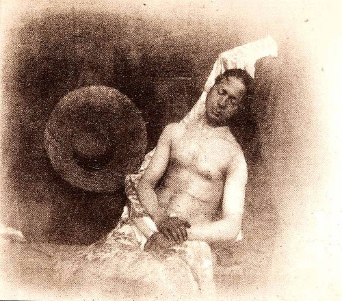
Self Portrait as a Drowned Man, 1840, Hippolyte Bayard, Combination Print.
Building on this tradition of combination prints, Cubists like Pablo Picasso and Georges Braque began adding found photographs, print materials, and other visual elements into their compositions. They called this technique collage, from the French word coller, "to paste."
In the 1920s, Dada and Constructivist artists explored this collage technique in their work. They cut and pasted found photographs, their own imagery, and various printed elements together to form "anti-aesthetic" collages that challenged the viewer to decipher multiple messages within the final composition. El Lissitzky's The Constructor is an example of this type of work. Lissitzky's self portrait combines his own head with fragments of machinery, along with a hand that has been interpreted as the Hand of God passing over his face.
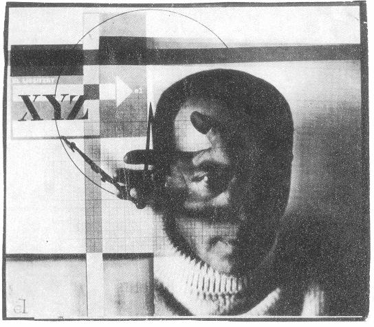
The Constructor, 1925, El Lissitzky, Self Portrait Photomontage.
The Lissitzky and Bayard prints employ different methods of artistic production. The combination print was made during the photographic printing process, while the photomontage combines various printed materials with adhesive. If Gimp had been invented in the early 1900s, Dada and Constructivist artists would have been using it as their adhesive material.
Before You Start:
You will need to download the following files from http://www.digital-foundations.net/downloads/floss:
hand01.jpg, hand02.jpg, arm.xcf, back.xcf, ear.xcf, head.xcf, shoes.xcf, and torso.xcf
Exercise 1: Using layers to create a double-exposure
In the camera, a double exposure requires releasing the shutter to create one photograph, then releasing the shutter again to create another photograph on top of the first one. An example of this process can be seen in Henry Van der Weyde's image of the actor Richard Mansfield as Dr. Jekyll and Mr. Hyde.
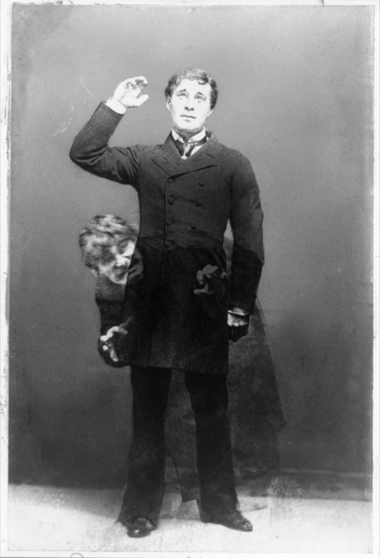
In Gimp, the double-exposure can be made by putting two images on separate layers, then adjusting the blending mode of the top layer. We've provided two images, but you might explore taking two pictures with a digital camera or scanning two images that address the subjects of time, dreams, paranoia, schizophrenia, otherworldliness, duality, etc. The double-exposure is often used to express duality or the passing of time (also see Duane Michaels' photographs).
1. Create a New Document using File > New. Set the width and height to 12 by 10 inches. Save it as double-exposure.

| 72 DPI is also known as "screen resolution." Working at 72 DPI is appropriate for any content that will appear on a screen and that will not be printed. |
2. Open hand01.jpg from http://www.digital-foundations.net/downloads/floss.
There are many ways to copy the hand into the new document we are using to assemble the double-exposure. One method is to drag the hand layer (in this case, the background layer is the hand layer) into a different document. Be careful! Don't click on the image of the hand in the main window. Look to the right at the Layers dialog. There is a tiny preview image of the hand and the word Background. This is the actual layer that the image of the hand is stored on. So click on the small preview image in the Layers dialog and drag it across to the blank window of the new document. When you depress the mouse button, the hand appears in the new window.

Tip: The hand could have been copied and pasted using Select > Select All, followed by Edit > Copy, and then by clicking on the new document before choosing Edit > Paste.
|
Notice that when the hand is dragged into the double-exposure document it appears very large. The hand file contains more pixels than the double-exposure file. We did this on purpose for two reasons: (1) to demonstrate that the number of pixels in a document has a noticeable affect on the way that the file is previewed in Gimp, and (2) to distinguish the hand, originally a digital photo (the camera we used stored a significant amount of information), from the working file that we generated from File > New. You can always create a new file with a higher resolution value, but for exercises that will not be printed it is faster to work in a file with resolution no greater than the screen. The larger the resolution, the larger the file size; and larger file sizes require greater computer processing power that tend to slow down the work process.
3. In the Layer dialog, double-click on the name Background Copy and rename it hand01. Notice the Background layer beneath the hand01 layer. The background layer is a white layer containing no images, placed underneath the image of the hand. The background layer is the first layer Gimp generates when a new document is created. By moving the hand into the new document, we created a new layer. Click once on Background layer in the Layers dialog and then click on the trash can icon in the bottom right corner of the Layers dialog. Now the background layer is gone and the hand01 layer is active (indicated by a yellow highlight). To scale the hand so that it fits into the document, click on the Scale tool icon in the Toolbox. With the Scale tool selected, you can click and drag on any corner of the hand layer to resize it. Before you start to scale the hand, take a look at the tool options that appear in the bottom half of the Toolbox. Click the box next to the last option Keep Aspect. No matter what size you make the hand, it will maintain its original proportions. Scale the hand until it fits in the frame and press the Return key.

4. Open hand02.jpg from http://www.digital-foundations.net/downloads/floss/ and move the image into the double-exposure document. Name the new layer hand02. Notice that this hand has already been scaled for you. While the second hand is still active in the Layer dialog, select the Flip tool from the Toolbox. In the Tool Options section of the Toolbox, you can choose how to flip the object. Check Horizontal, and click on the image. The hand flips. Notice that this does not modify the entire document. To see that the transformation only occurred on one layer, click on the eyeball icon next to the hand02 layer in the Layers dialog. The eyeball icon toggles the visibility of a layer, allowing you to see the layers beneath it. Toggle the eyeball off and on for each layer.

5. Select the hand02 layer. Use the Layer Blending Modes pull-down menu in the top left area of the Layer dialog to choose Multiply. Leave the hand01 layer in Normal mode. Now the two images appear as a single composite image. Use the Move tool to move each of the two layers and make the fingers and hands overlap in a way you find pleasing. You can only move the layer you have selected, so you will need to select whichever layer you want to move in the Layers dialog before clicking and dragging with the mouse. Blending modes such as Normal and Multiply define how layers interact. We will continue to explore these in the third exercise.

Exercise 2: Cropping and adjusting the hue

This illustration demonstrates the results of Exercises One and Two.
1. Click on the Crop tool in the Toolbox and notice the Tool Options for this tool. Check the box next to Fixed: Aspect Ratio. Enter "6 in" into the crop Width box and "9 in" into the Height box. Now, drag a crop box around the area of the document where the two layers overlap. As you drag, your crop selection area should constrain to the shape of a rectangle in the 6:9 proportion. Finalize the crop by pressing the Return or Enter key or by clicking the check-mark icon in the top right area of the Tool Options.

2. Select Colors > Hue-Saturation.

3. In the Hue-Saturation dialog box, use the Hue slider to create a cyan wash over the image. With each change you make, you will be able to see the effect in the image window. None of the changes will take effect until you press the OK button. The Hue-Saturation controls only effect a single layer. Press OK then select the next layer in the Layers dialog and repeat this process.

Exercises 3 and 4: Exquisite Corpse (in two parts)
"Exquisite corpse" is a parlor game that the Surrealists developed in 1925. In this game, each player submits images (drawings, paintings, photographs) of heads, torsos, and legs, and they are combined to produce surprising new bodies. We have played this game with students using images of each other that we captured in class on a digital camera, as well as by using images from pop culture, found on the web. Collaging celebrity and politician body parts can provoke thoughtful discussion. Images of body parts are available on our downloads page, but it's more fun to try this with pictures of your friends or family!
Exercise 3: Creating and manipulating layers
1. We'll work on top of the double-exposure file that we just created, so save the file as exquisite-corpse.xcf. Your file should look like the illustration.

2. Keep exquisite-corpse.xcf open and use File > Open in Gimp to open all of the documents used in this exercise (download the following files from http://www.digital-foundations.net/downloads/floss: arm.xcf, back.xcf, ear.xcf, head.xcf, shoes.xcf, and torso.xcf).

3. Move all of the body parts into the exquisite-corpse document, just as we moved the hands into the double-exposure document in Exercise 1. Once all of the parts are on separate layers in the exquisite-corpse document, rename all of the layers to indicate which body part is on the layer. Use the eyeball icon in the Layer dialog to hide and show the layer. This is a quick method of assessing which image is on the layer.

4. Click on a layer and drag it above or below another layer. The order of the layers in the Layer dialog is referred to as the stacking order. This determines which image appears in the foreground or closer to the viewer's eyes and which images fall to the background. Organize the layers so that they appear like the stacking order in the illustration above. Notice that our Layer dialog has a left and right arm! We named our first arm right arm then used the Layer Menu > Duplicate Layer... to name the duplicate layer left arm. Use the Flip tool as we did in the previous exercise.

5. Click on each layer to activate it, then use the Move tool to reposition the layer and the Scale tool in order to scale it. Some of the layers will need to be scaled if you want your image to look just like ours. Remember to keep the aspect ratio locked on all of the layers while you are scaling. It is safe to scale an image down in Gimp; however, it is never a good idea to scale an image up (or to make an image larger than it is) as this will add "bad pixel" information to the image.

Exercise 4: Adding an adjustment to some layers

This illustration demonstrates the results of exercises 3 and 4.
In this exercise we want to add all the layers of the corpse to the composition made earlier.
1. First, make the two hand layers from the first two exercises invisible by clicking their eyeball icons. Now, go to the Layers Menu in the Layers dialog and choose Merge Visible Layers.

2. Click on the merged layer to activate it. Assign it the Multiply blending mode from the Mode pull-down menu in the Layers dialog. Use the Hue-Saturation option from Colors to give it a different wash than the hand layers. Now make all the layers visible by clicking on the eyeball icons. The final image should look like the following illustration.

Repetition and Cloning
Digital tools empower content producers to parody graphic content both on and off of the screen. Media-makers have the ability to change the appearance of virtually anything with tools such as copy, paste, mask and clone. So the question is: given the opportunity to change any image, message, or text, where would you begin? Your answer depends upon your interests, but usually emerges from political tension. In other words, the oppressed can reclaim messages of the dominant paradigm by altering the symbolism embedded in words or images in the physical and/or digital world. These messages might appear in museums, on city streets or in cyberspace. The "subversive" part of the message-making is the way in which the aesthetics of the altered media rely upon the viewer's visual and intellectual understanding of the dominant culture prior to media confrontation. The Billboard Liberation Front and The Anti-Advertising Agency create work that illustrate this idea. Not too surprisingly, this counter-cultural, playful method of protest has already been co-opted by the advertising industry. In No Logo, Naomi Klein illustrates how advertisers are utilizing methods common to contemporary artists to create brand awareness. She writes, "Pepsi's on-going threat to project its logo onto the moon's surface hasn't yet materialized, but Mattel did paint an entire street in Salford, England, 'a shriekingly bright bubblegum hue' of pink - houses, porches, trees, road, sidewalk, dogs, and cars were all accessories in the televised celebrations of Barbie Pink Month. Barbie is but one small part of the ballooning $30 billion 'experiential communication' industry, the phrase now used to encompass the staging of such branded pieces of corporate performance art and other 'happenings.'" (See No Logo, Naomi Klein, New York: Picador 9-12.)
From The Billboard Liberation Front Manifesto: "And so we see, the Ad defines our world, creating both the focus on 'image' and the culture of consumption that ultimately attract and inspire all individuals desirous of communicating to their fellow man in a profound fashion. It is clear that He who controls the Ad speaks with the voice of our Age." (Jack Napier and John Thomas) Read the entire manifesto at: http://www.billboardliberation.com/manifesto.html
IMAGE: People Products 123, The Anti-Advertising Agency
http://peopleproducts123.com/
The Anti-Advertising Agency creates subversive media in opposition to the role of advertising in contemporary society. Many of their projects are participatory, which means that viewers become "doers" or art-makers. In People Products 123, participants download package designs that feature images and information about the workers responsible for producing the consumable product. The package designs are to be printed by the participant, repackaged around the product, and "shop-dropped" in the store where an unassuming shopper would purchase the product contained in the newly informative packaging.
Results of Chapter 10 Exercises

We begin with a group image of the first all female crew that NASA sent to space.

Also, we'll use a cropped image of Amelia Earhart.

em>In the final image, Amelia Earhart's head replaces the head on the center figure of the NASA crew and the image is rendered in black and white.
Before You Start:
Download the following files from Wikimedia Commons:
http://commons.wikimedia.org/wiki/File:C-130_-_First_all_female_crew.jpg
http://commons.wikimedia.org/wiki/File:Amelia_Earhart_1937_GPN-2002-000211.jpg
(We cropped the Amelia photo and used just her head shot.)
Exercise 1: Replace part of one image using the Clone tool
In this exercise, we will use two images in the public domain from the US government: a historic image of Amelia Earhart and a picture of the first all-female flight crew.
1. Open the file C-130_-_First_all_female_crew.jpg in Gimp. Zoom in on the central figure of the crew. We will start by replacing her head with a sample of the flag. Create a rectangular selection around her head with the Rectangle Selection tool.

2. As long as any selection tool is active, when you place the cursor inside the selected area the tool changes into a white arrow with a small rectangular selection icon. Click and drag the rectangular selection straight above the figure's head - you are only moving the selection. No part of the image is moving.

3. Copy the flag from the background layer and paste it to a new layer. Choose Edit > Copy followed by Edit > Paste to create a new layer. Name the new layer, "flag."

4. The head has been replaced by a sample of the flag on a new layer. The Clone tool is used to replace small areas of a layer with a sample of an image. The Clone tool is applied with a brush. Using a soft brush will make the cloned sample appear to blend into the original image, even though we will do all of our cloning on a new layer. Be careful with your application of the Clone tool. The soft brush creates a little bit of a blur on the image. A small amount of blur is necessary in order for the sample to blend in, but clicking with the soft brush repeatedly will result in a blurry area in your image. The purpose of cloning is to create an unidentifiable image hoax. Creating a blurry area on the image will be draw attention to that area. In order to achieve the hoax, the clone must be made in such a way that the viewer is deceived!
Choose the Clone tool from the Toolbox. Set the brush to about 10 to 20 pixels. Check the Image button in the Source area of the Options. Then create a new layer called clone.

5. Now for the most important part of this exercise - sample parts of the flag in order to blend the areas around the edges where the copy and pasted image is an obvious manipulation. The Clone tool requires that part of an image is sampled before it is applied to another part of the document. Sample part of the flag near the edge between white and red by pressing the Control key and clicking in that area (this could be referred to as Control-clicking). Then position the mouse on top of the corner where the pasted flag needs to be blended and click once to cover it with a soft, brushed sample. Pay close attention to the brush work. Determine if the first click is blended or not by looking at the surrounding values. Decide if your new sample is blending in. If it is not, move on to the next area. Always Control-click to create a new sample before brushing. If the first click did not blend perfectly (it probably did not - this takes some getting used to), use Control+Z to undo the last step and try it again.
Work around all of the edges by creating a new sample of the flag (Control-click) and then clicking with the brush to apply the clone. Control+Z will be used often in this process! We finished the clone in about 30 precise mouse clicks.

6. View the clone layer by turning the eyeball icons off of all of the other layers. Here is what ours looked like when we were finished:

Exercise 2: Add Amelia Earhart to the image of the crew
1. Since the image of Amelia Earhart was originally a black and white photograph, we should change the image of the Air Force crew into grayscale. Select the Background layer in the Layers dialog. Select Layers > Desaturate. Click OK in the dialog that opens. Then select the Flag and Clone layers and repeat this process.

2. Open the image of Amelia Earhart, select her head and neck with the Rectangle Select tool and choose Edit > Copy. Toggle back to the image of the soldiers and choose Edit > Paste. Use the Scale tool while pressing the Control key to resize Amelia Earhart's head so it is in proportion with the body. Name the new layer Amelia.

Exercise 3: Add a layer mask
Add a mask over an image to hide part of it. Masks do not delete or alter image data, they simply hide or show parts of images. Masks operate in black (hidden), white (revealed), and shades of gray (transparent, partially hidden). We will use a layer mask on the Amelia layer to blend her into the new background.
1. Create a layer mask on the Amelia layer. Right-click on the Amelia layer and select Add Layer Mask from the contextual menu that opens. This mask will be used to hide parts of the image around Amelia's head. Notice that the layer now holds an icon for the image and an icon for the mask. The mask is currently active - there is a frame around the mask icon.
2. Choose the Paintbrush tool in the Toolbox and make sure that the default colors are loaded into the foreground/background color chips (black is the foreground color and white is the background color) by clicking on the small black/white color chip icon at the center of the Toolbox.
3. Notice that the icon for the mask is white in the Layers dialog. Since everything on the layer is revealed, the entire mask is white. Use the Paintbrush tool with black paint on the mask in order to hide the background. If you make a mistake, switch to white paint to retrieve hidden parts of the image. Practice painting with black and white paint. Paint with different sized brushes and notice what happens with a soft or hard brush, or with the brush set at various levels of opacity.
We used a soft brush for the background area and kept it far away from Amelia's head. As we brushed closer to her hair, we reduced the opacity of the brush in the Toolbox Options to about 40%. At a reduced opacity, clicking a few times near her head with black paint removes the background while keeping her hair from being cut to an unnatural shape.

Exercise 4: Burning and dodging
The last step is to correct Amelia's skin tones. Before you can do that, you will have to click back on the content portion - leaving the mask - of the Amelia layer. GIMP indicates which part of the layer you are working on by outlining its icon in the Layers dialog. The document title bar also reflects the area that is currently active. If the mask is active, the Burn tool used in the next step will affect only the mask, so make sure Amelia's layer content is active!
1. Notice that Amelia's photograph was taken outdoors, while the Air Force crew was indoors at the time of the photograph. The harsh light on Amelia's face is noticeably different from the light on the Airmen’s faces. We will make a quick adjustment to Amelia's skin tone in order to create a more realistic collage with the Burn tool. Burning and dodging are photographic manipulations native to traditional darkroom practices. In the darkroom, additional exposure time increases the amount of light hitting the paper. This can be done selectively, resulting in a "burned" area of the image. Burning darkens the value of that portion of the print. Light can also be blocked during the exposure by dodging over image areas where the tonal values are too dark with a small tool, resulting in a lightened area of the print.
Use the Burn tool with a soft brush set at an exposure of about 10%. Quickly brush over Amelia's face with the Burn tool. Each time you click the mouse, the tones will darken.

2. Repeat Step 1 two times, once with the Tool Options set to shadows and once as the Burn tool works on the highlights.
Non-Destructive Editing
In Chapter 9 we referred to Hippolyte Bayard's Self Portrait as a Drowned Man from 1840 as the first combination print. The history of photographic manipulation extends almost as far back as the first photographic images. Digital tools such as Gimp are used for small and large image manipulations, such as the slightest adjustment to the tonal range or the creation of an alternative reality.
In certain situations, the digital artist must be ethically aware of the manipulation that occurs in such applications. The National Press Photographers Association maintains a code of ethics that journalism students and professionals should abide. Journalists and news photographers strive for accuracy in their image-based reporting. There are historical cases of digital manipulation which are often used to illustrate a violation of the NPPA code of ethics (see the National Geographic 1982 cover image of the pyramids).
The visual reference to Dada artist Kurt Schwitters' Dada Soiree demonstrates that typography can also be manipulated in the construction of a collage. While neither of these visual works were created in a digital environment (both were made before the advent of digital tools), alternate realities and manipulations are often created with computer software.
Within the exercises of this chapter, we will focus not only on manipulating an image, but also on working in a nondestructive method. To edit the digital file nondestructively is to work in such a way that the original image is preserved. Any edits or modifications to the original file are placed on separate layers or in alpha channels, which we will explore further in exercise 2.

Dali Atomicus, Philippe Halsman, 1948. This version of the photograph shows an element missing in the final print: the hands holding the chair. Also, the final print contains one of Dali's paintings ("Leda Atomica") in the frame on the easel.

Dada Soiree, Kurt Schwitters, 1922
Results of Chapter 11 Exercises

Each exercise in Chapter 11 builds on itself to make the final image at the end of exercise four.
Exercise 1: Using Quick Masks and alpha channels
1. In Gimp, use File > Open to open the file of Salvador Dali holding a cat.
2. Use the Free Selection tool to make a selection around the left part of Dali's mustache. The Free Selection tool can be used to draw selections as if you were drawing with a pencil. Click and drag with the Free Selection tool from the beginning of of the mustache all the way around its contour. The selection is made when you bring the mouse back to the point where you first pressed the mouse button. Your selection will not be a perfect tracing of the mustache. We will modify the selection in the next step. The Free Selection tool serves the purpose of making a fast draft of a selection which can be used as a starting point for masks and selection refinement.

3. Enter Quick Mask mode by pressing Shift+Q on the keypad or by clicking on the Quick Mask icon at the bottom left corner of the Image Window. Quick Mask will change all of the image areas that are not selected to white. The selected areas become obviously visible. Quick Mask is basically another way to modify a selection. Learning to use Quick Mask will help you to understand masking. Masks define which areas are visible and which image areas are invisible. Masks do not delete image areas (this is why we have classified this as "non-destructive"), they are simply used to hide or show parts of images. Since masks are either hiding or showing image areas (or partially showing), they operate in black and white and create transparency with shades of gray.

4. Choose the Paintbrush tool.
On any mask, the color black will hide part of the image and the color white will reveal part of the image. The white overlay in Quick Mask is used as a guide, so you can easily see where you have painted with black or white to add or remove the mask. Painting with white paint on the Quick Mask will take away white parts (masked parts). This will add parts of the image to the selection area. Painting with black paint on the Quick Mask will add white parts. In other words, it will add to the mask and subtract from the selection area.
Practice painting with black and white paint. Paint with different size brushes and notice what happens with a soft or hard brush, or with the brush set at a different opacity. As you are painting, use Shift+Q to exit Quick Mask Mode. You will see the resulting selection. Press Shift+Q again to re-enter Quick Mask Mode and continue painting to modify the mask.


The final brushwork in Quick Mask and the resulting selection in standard editing mode.
5. Exit Quick Mask and return to standard editing mode when you are finished modifying the selection in Quick Mask mode. Your selection should more closely fit the contour of the mustache.

Here is an image of our selection made with the Free Selection tool before Quick Mask and the final selection after making modifications with the Paintbrush tool in Quick Mask.
6. Choose Select > Save to Channel and name the new channel left mustache. Click OK.

7. When a selection is saved it becomes an alpha channel. An alpha channel is a grayscale channel that defines which parts of an image are visible. All channels can be viewed by clicking on their names in the Channels dialog. Click on the Channels tab in the Layers dialog, then click on the name, left mustache. The file now shows the left mustache alpha channel. Everything that is not included in the mask is black on a gray background.

8. Click back on the Gray channel to return to standard editing mode. Deselect the left side of the mustache by choosing Select Menu > Select none.
9. Use File > Save as to save the Gimp XCF file. We named ours daliwithcat.xcf.
Exercise 2: Saving a selection on a layer mask
1. Start with the selection of the left side of the mustache loaded.
2. Create a new Layer (Shift+Control+N). Copy and paste the half-mustache to the new layer by choosing Edit > Copy from the background layer and Edit > Paste Into on the new layer.
3. Rename your layers. We renamed the Background layer original file and the new layer left mustache.

4. Use the Move tool to position the mustache on the left side of the cat's face. Then use the Rotate tool or Shift+R to rotate the mustache to the left.
| Watch Out: If the left mustache layer was not active (highlighted) you may have moved the layer containing the original file. Make sure the layer that you want to edit is active before editing. |
We will add a final adjustment for contrast at the end of this exercise, but you can add an adjustment with Levels now to make the mustache darker.

5. Now we will add a mask to the left mustache layer to further control how the layer blends with the original image. Choose the Layer Menu > Mask > Add Layer Mask.
6. Zoom in to at least 100% before editing the mask. Notice that the icon for the mask is white in the Layers dialog. Since everything on the layer is revealed, the entire mask is white. The mask is currently active in the Layers dialog. You can tell which part of the layer is active - the content or the mask, because there is a frame around the icon for the active layer component.
| Tip: Click on the icon of the layer content or the layer mask to activate either layer component. |
Now we will blend the edges of the mustache using the Paintbrush tool on the layer mask. This will make the mustache appear more realistic on the cat's face. Click on the Paintbrush tool. Load black into the foreground color. Black will be used on the mask to hide parts of the layer content. Use the opacity slider in the Paintbrush Options to reduce the opacity to 70%. Use a big, soft brush. We set our brush at 30 pixels and 0% hardness. Trace just around the edges of the mustache with the edge of the Paintbrush tool while brushing against the edge of the mustache.

7. Zoom out to Fit on Screen viewing mode by pressing Shift+Control+E and then view the image with and without the layer mask. Right-click on the layer mask, go to the drop down menu and select Disable Layer Mask to disable it. Check the box again to enable it.


8. View the mask in the document window by Option-clicking on the mask icon. It is possible to edit the mask with black or white paint in this mode, too, although without seeing the affects of editing the mask on both layers you may be less likely to do so. Click on the icon of the layer content to return to standard editing mode.

9. Now for the true test: repeat all of the steps in both exercises with the other half of the mustache!

10. Once again, repeat these steps for the eyes. Use the Ellipse Selection tool to select one of Dali's eyes. Then press Shift while selecting the other eye with the same tool. Make the original file layer active by clicking on it. Copy and paste into a new layer.

11. Use the Move tool to position the eyes onto the cat's face. You will have to select each eye individually to move it into place and rotate it using the Rotate tool. Add a layer mask and use black paint to hide the edges of the eyes.

Exercise 3: Adding a shape layer
1. Choose the Rectangle Selection tool. Click the box next to Rounded corners.
2. Make a new layer. Click and drag to draw a rounded rectangle in the image near Dali's fingers. Then use the Bucket Fill tool with the foreground color set to red and click inside your selection. It fills with red.

3. Use the Text tool to type "Dali and his cat" on top of the rectangular box. We used News Gothic Italic in 62 points with 40 point letter spacing.

Graphics on the Web
The Internet emerged from a Cold War project initiated by the United States Department of Defense. The Advanced Research Projects Agency (ARPA) wanted to create a way to communicate and share information between networked computers. The objective of ARPANET was to maintain communication even if one part of the network was damaged due to disaster or nuclear war. As with many firsts, there are conflicting points of entry to this technology. For instance, before ARPANET came online in 1969, researchers in France and England separately developed packet switching, an essential component of routing data over a network.
Through the 1980s the number of hosts, users, and technological advancements expanded. Desktop computers and dial-up modems brought the Internet into the home. President Bill Clinton adopted the email address president@whitehouse.gov when the US White House created a web site (www.whitehouse.gov) in 1993. In that same year, the National Center for Supercomputing Applications (NCSA) released Mosaic, the first web browser to display images inline. In 1994 you could shop online and order pizza from Pizza Hut’s web site.
Despite its short history, the Internet has seen rises and falls in techno-utopianism, a made-for-technology depression known as the dot-com bubble burst, and a resurgence of interactivity on user-generated content sites such as MySpace, Facebook, LinkedIn, YouTube, and Flickr. Now that web surfers have become user-generated content creators, every Internet user's education should include the basics of image optimization, uploading, and publishing. In the following exercises, we will optimize an image for the web using Gimp, upload the image to flickr.com, and publish that image on a blog.
The Wayback Machine is an archive of web pages dating back to the early 1990s. We used the Wayback Machine to view web sites from the 1990s to compare them with the same sites in 2008. Notice how the aesthetics of web graphics has changed in the past two decades. These new aesthetics are possible due to increased network speed, changes in programming techniques, and the evolution of information design. Greater connection speeds result in the ability to upload and download larger files. Graphics are larger, more frequent, and more colorful on current web sites than the graphics made for the web in the 1990s.
| Note: The Wayback Machine contains an archive of over 85 billion web pages. You can use this search engine at http://www.archive.org. . |


From top to bottom: Whitehouse.gov on October 23, 1997; Whitehouse.gov on November 5, 2008; Pizzahut.com on February 14, 1997; Pizzahut.com on November 5, 2008.
Exercise 1: From digital input to web ready
1. Get any image from your digital camera or scanner and open it in Gimp.
2. Adjust the tonal range and color to your liking by creating adjustment layers.
| Tip: Monitors generally have display settings such as 1280 by 800 or 1024 by 768 pixels. A file whose longest side is 1600px is likely more than big enough to fill a web browser window on any monitor. The only measurement unit relevant to us in this exercise is pixels, as the image will be shown on a platform that also uses pixels. |
3. Save this file as a master copy by choosing File > Save As, add _master to the file name and then choose XCF as the file format. We saved ours as orbitz_master.xcf.
4. The image from the wiki is straight off a 7-megapixel digital camera, and is much larger than can be displayed on a web site. Choose Image > Scale Image and notice the size of your image in pixels. Notice the icon showing a chain. This indicates that Gimp will maintain the aspect ratio (or the proportions) between the height and width of your image. Change the pixel dimensions in the box marked 'Width' so the largest dimension is no larger than 1600px. If your image is less than 1600px on its long side, you can use the Cancel button to close this dialog box without making any changes.

5. Add an unsharp mask (Filter > Enhance > Unsharp Mask). Make sure you have the image layer selected, and not an adjustment layer. We used the following settings for the Orbitz ad photo: Amount: 0.25; Radius: 0.6px; Threshold: 0 levels. Your image may require different settings.


6. Choose File > Save As. As a general rule, photographic images and other images with more than 256 colors are saved as JPEG files. Graphic images - images with few colors such as logos and line art - are saved as GIF or PNG files. Since this image is a photograph, select JPEG from the Format pull-down menu. Give the file a name that ends in '.jpg' (we used orbitz_web.jpg).
| Note: The human eye cannot detect image compression artifacts if used with a light touch and when the image is viewed on a computer screen. Compression runs from 0 to 100. Zero is a very low quality, where you will definitely be able to notice the loss of quality in the image, while the maximum 100 level, although still having had image data thrown away, shows no visible decline in quality. The trade-off is that more compression creates a smaller file. Weigh your needs for file size against your perception of image quality to decide what level of compression to use. |
7. Press the Return key after entering a file name ending in '.jpg' and you will see the Save as JPEG dialog box. Click Advanced Options to reveal the options that will allow you to customize this image for display on the web.
8. Adjust the Quality slider to 60. Saving a file for the web compresses the saved image into a smaller file size by removing color information and pixel detail. This is referred to as lossy compression.

9. Choose File > Open, then click once on orbitzad1.jpg. Don't actually open the file, just notice that to the right of the file name you can see the file size is listed as 4.40 MB. Now click once on orbitz_web.jpg. The file size of the optimized image is 168 KB. The compressed image is 38% of the original file size. This is important because the smaller the file size is, the faster the image will download as part of a web page.
10. Reduce the quality to 5. Notice how much detail is lost. Visible compression artifacts are introduced into the image. Our file size is much smaller at 44.3 KB, but we have compromised too much image quality for the sake of the smaller file size.
| Tip: The Zoom (shaped like a magnifying class) and Move (a four-way arrow) tools allow you to get a closer look at the image and move to important details. |
11. Go back to orbitz_master.xcf, Save As, and name your file with an underscore and the word "web" like we did when we named ours orbitz_web.jpg. Set the Quality setting to 98, and save the image. Remember web standards when naming files: only use lowercase alphanumerics, underscores, and dashes.
| Watch Out: When you open a file and resize it, it is no longer the master file. This may seem confusing, but it is a situation you will commonly experience when maintaining master files and resized web ready files. There's nothing stopping you from using Save As to save your scaled-down master file as well, but it's probably overkill and could mislead you later into believing it's the largest version you have. |
14. Open the JPEG you just saved for the web (ours is orbitz_web.jpg) in Gimp, and notice that there are no adjustment layers. By saving for the web, the image is automatically flattened. Layers are collapsed onto one background layer.
Exercise 2: GIF vs JPEG
As stated in Exercise 1, photographic images with many colors are saved as JPEG files, and graphic images with few colors are saved as GIF files. Following these rules will produce better images and smaller file sizes.


The top two images demonstrate the master file on the left and a JPEG file on the right side. The bottom two images are of the master file on the left and a GIF file on the right side. It should be noted that these images were saved as PNG files in order to be visible on this web page, so this demonstration doesn't work as well on this platform as it does in print. Nevertheless, notice in the above images that the photograph saved as a JPEG (top right) has a higher visual quality than the same file saved in GIF format (the lower right image). The GIF file also happens to be a larger file size than the JPEG.
Exercise 3: Uploading to Flickr
We will upload this photo to Flickr, and then post it to a WordPress blog in the next exercise. Our example was a post to the blog maintained by the Anti Advertising Agency (http://antiadvertisingagency.com/). In their words, "The Anti-Advertising Agency co-opts the tools and structures used by the advertising and public relations industries... Through constructive parody and gentle humor our Agency’s campaigns will ask passers by to critically consider the role and strategies of today's marketing media as well as alternatives for the public arena." (http://antiadvertisingagency.com/our-mission).
Our post is critical of this Orbitz ad for its lack of imagination. Advertising is one of the places where a society imagines the future, embraces technology, and constructs reality from fantasy. In this ad, the models have a lot of technology and community at their fingertips, and Orbitz advocates that the traveler call someone to pick him up at the airport, rather than directing the traveler to a website that might advise the traveler on how to locate their final destination via public transportation, such as Google Maps. Technology and advertising can change habits and practices, but only when the advertisements imagines a new and better future. Our criticism is about putting another car on the road. We are not, however, criticizing the design!
1. Log in to your account on Flickr.com. If you do not have an account already, you will need to create one. Flickr is part of Yahoo!, so either use an existing Yahoo! ID for Flickr, or create a new one. Web services like Facebook, Picasa, and others also have integrated uploader programs for free that work well, too.

2. In the Flickr interface, click on You > Upload Photos and Videos.

3. Click on Choose photos and videos. In the window that comes up, locate your JPEG (ours is orbitzad_web.jpg), and click Select.


4. Click Upload Photos and Video.

5. Click on Add a description.

6. Change the title of your file, if you would like to. In this case, we changed the name to Lack of Imagination.

7. Give the file a description, when we posted it was "An unimaginative Orbitz ad about an unimaginative use of technology."
8. Give the file tags. Tags are what allow people to find your file in an image search. For this image, the tags are "Advertisement, Orbitz, Cell phone, suit, luggage, travel, traffic, JFK"
9. Save the image. The image is now at the front of your photostream.

10. Click on the image to navigate to the the image page.
11. Press the All Sizes button.

12. Select the 500 pixel wide Medium image.

13. Copy the code from the bottom of the page that allows you to link to your image. Navigate to your blog. We made our post at AntiAdvertisingAgency.com.

Exercise 4: Posting to a blog
While setting up and maintaining a blog is somewhat beyond the scope of this book, so many people have blogs these days, that we will assume that you either have a blog, or have used a blog. If this is not true, focus on learning how you can load an image from one web site onto another with simple, pre-written code. This is relevant for Chapters 15 - 17.
| Tip: If you don't already have a blog, you can get a free WordPress blog at WordPress.com. We like WordPress because there is a large community of users, great documentation, loads of themes and plug-ins, and it is open source (meaning, the source code is available for augmentation and manipulation.) Tumblr, Blogger, Moveable Type, and TypePad are also quality blog platforms. |
1. Every blog interface is slightly different, but all share certain procedures. First, log in.

2. Click on the Write a New Post button.
3. Give your post a title. We called ours "Orbitz Ad: Distinct Lack of Imagination."
4. Paste the image code that is in your clipboard into the post.

5. Write your post.
6. Add tags that will help a searcher land on the viewpoint you want to share. Tags are a way of categorizing and organizing the content on a site. Generally you want to use tags that you have previously used. So if you have initially used a tag "design" you probably would want to use that tag rather than introducing something like "designey" or "designed." Working within the existing tag categories on the Anti Advertising Agency blog, we tagged our post "billboard, branding, justfollowingorders, not creative, self-loathing, you don't need it" because we are blogging about it from a critical point of view. When you are applying tags, try to put yourself in the shoes of a person searching the web. Ask yourself what words they might use in hopes of finding the content you are creating.

7. Select a category, in this case "News."
8. Submit your post. If you are writing on your own blog, it is likely that you will click a button labeled Publish.
9. Click on the View Post link to view your post. The post we made is located at http://antiadvertisingagency.com/news/orbitz-ad-distinct-lack-of-imagination

Multiples: Creating Unity
The grid is the principal way of organizing page elements in multi-page documents. A grid divides a page into columns to follow strictly, or to use as a rough guide. The Gutenberg Bible visual example follows a very rigid grid structure: the two columns of text have the same line length, which is a measurement of how long a line of text is before it breaks to a new line. The two columns of text also have the same vertical length. When two pages are viewed together in an open book such as this, the pages read together as a spread. The pages in this spread follow the grid in exactly the same manner.
The grid can also adapt to flexible layouts. In the reference example of the New York Times layout from 1918, the grid is more complex and versatile. This grid divides the page into eight columns.
Counting the columns on the page is easy: find the smallest column and measure its width. Then divide the width of the page with the width of the smallest column. With eight columns, the designer has options. Instead of eight even columns of text flowing down the front page of the newspaper, some larger graphic elements like the headline at the top of the page expand across all eight columns. Other text blocks are given visual emphasis, or create visual hierarchy on the page, by spanning multiple columns. Also notice the distribution of negative space on the page. Since there is a lot of text on this front page, contrast is created by increasing the leading in some areas of the page and by allowing some of the text blocks to expand beyond one column.
A copy of the Gutenberg Bible by Johannes Gutenberg, owned by the U.S. Library of Congress. 180 copies of the Bible were printed in Mainz, Germany in the fifteenth century.
The front page of the NY Times, 1918.
Results of Chapter 13 Exercises
When you complete all of the Chapter 13 Exercises, you will save a PDF document. The two pages in the document are illustrated here.

Exercise 1: Unity through repetition - master pages
1. When you opening Scribus you will automatically open the New Document dialog. Notice that unlike other New Document dialogs we have seen before, Scribus allows us to specify a multiple number of pages. Set up the document with the following settings: select Single-Page from the Document Layout section, specify Letter from the Size pull-down in the Page Size section, leave your margins on the default settings, select 2 in the Number of Pages field in the Options section, and then press the OK button.

2. Once the new document opens, look to see if the Arrange Pages window is open. If it is not, choose Windows > Arrange Pages. In the Arrange Pages Window there is a section labeled Document Pages. In this section, each icon represents a page in the document. Double-click the page 2 icon to jump to that page and then double-click the page 1 icon to view the first page. Another way to navigate through the pages in a document is to click the Next Page or Previous Page arrows at the bottom of the document window. You can also use the Hand tool to drag the pages around within the document window. When nothing is selected, press the Spacebar key to toggle between the Selection tool and the Hand tool.
Before we start editing the content of our pages, we will create a Master Page. Master pages commonly contain a grid and any recurring design elements. They allow you to create a consistent layout throughout the pages in a publication and they make it possible to automate layout changes, because any modification you make to a master page is automatically reflected on all the pages to which it is applied. You can create multiple master pages, which can be applied to any page within the document.
3. To create your first Master Page, select the Arrange Pages window and double-click the word Normal in the Available Master Pages field. This will open the Edit Master Pages window. You may not be able to tell, but the pages of your document have disappeared, the blank page that now appears in the Main Window is the blank Master Page template for the Normal Master. This is the Master that gets applied to any new page you make by default. Whenever you have the Edit Master Pages window open, you will always be editing your master page or pages. To return to the document pages, close the Edit Master Pages window - but don't do that quite yet.
Click the first icon in the Edit Master Pages window (it looks like a single new document) to add a new master page. Name the new master page Master A in the dialog that opens. Anything you place on the page that now appears in the main window will be stored on Master A and will automatically appear on all the pages to which you apply it. Changes to master pages automatically update on the pages where they have been applied.

4. We will set up guides on the master page similar to the Inkscape exercises in Chapter Four. Guides are created by clicking in the horizontal or vertical ruler areas and dragging onto the page. The rulers are the numbered borders at the top and left of the Main window. If your rulers are not displaying in inches, you can change the units of measurement by clicking on the units pull-down menu at the bottom left of the main window.

| Key Command: Show or hide rulers from the View menu or press Control+Shift+R. |
5. Click inside the ruler and drag to create guides. Starting with the horizontal ruler at the top of the document window, click on the ruler and drag a guide to 3 inches, using the vertical ruler at the left of the Main window as a reference. Then drag a guide from the vertical ruler to 5 inches, using the horizontal ruler as a reference. If you need to reposition a guide, just click and drag.
Note
- If you need to place guides precisely, you can do so by selecting Page > Manage Guides.
|

6. Use the Line tool to draw a heavy line along the horizontal guide. Click on the Line tool in the Tools Command Bar (at the top of the Main window) to select it. Starting at the right edge of the page, Click and drag toward the left edge of the page to draw a straight line along the horizontal guide. While you are dragging, pressing the Control key will force the line to stay on orthogonal lines, and will result in a more precise horizontal drawing.
Notice that we didn't draw the line all of the way to the left edge, so the negative space remains active as it did in the Type on the Grid chapter. To make sure that this line goes all the way to the right-most edge of the document, you can "nudge" it using the right arrow key. Make sure you don't move any part of the line off of the page, or it will not appear when you apply the Master page to the Document pages. If you continue with this exercise and find that your line disappears, try coming back to this master page and nudging the line back onto the page.
| Tip: To position a line exactly on the edge of a page or guide, you can use Windows > Align and Distribute. |


7. Now that our line is drawn, we can hide our guides. To hide the guides, select View > Show Guides.
8. Open the Properties window by selecting Windows > Properties. Use the Selection tool to select the line if it isn't already selected. Select the Line panel of the Properties dialog and set the Line Width to 20 points (pts).

9. Select the Colors panel in the Properties dialog. Use the Selection tool to select the line if it isn't already selected. Click the Edit Line Color Properties icon to make it active and then click on the red color swatch from the list. After selecting any color, typing a letter will take you to the first color that begins with that letter. So a quick way to get to a red hue would be to press the letter "r" on the keypad.
If you pick a color and your line doesn't change, it's probably because you're changing the fill of the line and not the line (or what we might think of as the outline or stroke). Since the line does not create a closed shape, the fill color will not produce a color. Consult the image below to see that there are two icons above the list of colors. Make sure you click on the left icon (Line Color) before choosing a color.

10. Turn on the guides again using View > Show Guides.
11. Now we will apply the Master Page we have created to the blank pages in our document. Close the Edit Master Pages window by clicking the X icon in the top right of the dialog. The Main window shows your document pages. Choose Page > Apply Master Page. In the Apply Master Page dialog select Master A from the Master Page pull-down menu and answer the "Apply To" question by pressing the radio button next to All pages. Press the OK button.

12. Double-click the page 1 icon in the Arrange Pages window to view the first page of the document. Notice that the guides and thick, red line should be in place on page 1. Double-click the page 2 icon and notice that the guides and red line are also in place on the second page of the document. Objects on a master page automatically show up on any pages based on that master. It is important to understand that the items on a master page can only be modified or deleted from the master page they belong to. Try to select the red line or move the guides on pages 1 or 2 and you will see that they are not editable.
If you don't see the guides and red line on page 1 and 2, it's time to trouble shoot. Did you close the Edit Master Pages window? Did you draw the line off the edge of the page? Did you apply them correctly?
Exercise 2: Creating B-Master
The document we are creating contains only two pages, so only one master page is needed. However, in larger documents that have several layout variations, it is often necessary to use multiple master pages. We will make a second master page in this document to demonstrate the process.
1. Double click on any Master page in the Arrange Pages window. You should be careful - if the Edit Master Pages Window does not open, it may be because of a minor glitch. To get around this, simply de-select the Arrange Pages Window, and then re-select and attempt your double-click again. Once the Edit Master Pages Window opens, select Master A and click the Duplicate the Selected Master Page button (it's the second button, the one with two documents pictured) at the top of the Edit Master Pages window.
2. In the New Master dialog box, change the name to Master B.
3. In this document, Master B will be similar to Master A, but we will modify the color of the line so that it is cyan instead of red. Select the red line on Master B and then select Cyan from the Colors panel of the Properties window. You need to be careful, though. The Colors panel controls both the LINE color and the FILL color of objects on a page. For us to change the color of a single line we need to click the Edit LINE Color Properties icon before choosing our color. It's the left icon with the tiny drawing of a pencil drawing a line. See below:

4. Close the Edit Master Pages window by clicking the X icon in the top right area of the window. This should return you to your document pages. Choose Page > Apply Master Page. In the Apply Master Page dialog select Master B from the Master Page pull-down menu and select All pages. Now, check the Within Range box and enter from 2 to 2. This will apply Master B only to page 2, but could be used to apply a master page to a any number of additional pages.
5. Double-click the page 2 icon in the Arrange Pages window to view the second page. There is a field at the bottom of the main window that indicates what page you are currently viewing. It indicates 1 of 2 if you're on page one, and 2 of 2 if you are on page 2. Also, page 2 should now have a cyan line, while page 1 has a red one.
We will now create a typographic headline that will be copied to page 1. In theory, this is something that would normally be done on the Master A page, but we want to demonstrate the nature of Scribus' paste function.
Click and drag with the Insert Text Frame tool to draw a text frame, which is like a text box in Inkscape. Make sure you make it large; if it is smaller than the text you enter, the frame will appear blank. You can always resize the text frame later. After it's made, double click inside of it to get a cursor and type the words "Unity on the Grid" into the frame.
Now format the headline by selecting all the text and then specifying a font and type size. In the following example, we are using Bitstream Vera Sans at 40 points. Pay attention to the kerning, making sure that the spaces between the characters in the headline are visually equal. How do you apply all these features? All these options (text size, face, and kerning) are controlled in the Text panel of the Properties window.
Next, use the Selection tool to select the text frame and reposition it so that the left edge of the frame aligns with the left edge of the cyan line and the baseline of the text aligns with the top of the line.

7. Now we will copy this headline to page 1. With the text frame still selected, choose Edit > Copy. Double-click the page 1 icon in the Arrange Pages window to jump to page 1, and choose Edit > Paste. The headline appears in the same position on this page as it is on page 2. Scribus' Copy command copies both the type and its location on the page.

Exercise 3: Linking text frames
Scribus is often used to create multi-page documents for commercial printing or for viewing as a PDF file on a screen. In either case, long documents can contain a lot of text. Scribus allows you to place as much text as you want into one single text frame and then use the linking function to link multiple text frames together so that the text can flow from one frame to another. In this exercise, we will link two text frames on pages one and two with about five paragraphs of Lorem Ipsum dummy text. Scribus has Lorem Ipsum dummy text saved into the application so you can easily fill a text frame with dummy text without pasting it from someplace else.
1. On page 1, use the Text Frame tool to click and drag a large text frame on to the Canvas. We need to make it large so that we can load more dummy text into the frame than we intend to use in order to illustrate the linking feature.
2. Choose Insert > Sample Text. Select Standard Lorem Ipsum from the bottom of the list that opens. This will fill the frame with dummy text.

3. Use the Selection tool to move and resize the text frame so that left edge of the text frame is aligned with the vertical guide. Pull the top edge of the frame down so it starts at 6 inches. The right and bottom edges of the text frame align with the right and bottom margins on the page.

4. At the bottom of the resized text frame there now appears a small grey X in a box. This icon means that there is more text stored (but not visible) in the text frame. It's always good to take notice of this icon during the production of actual documents, as you would not want to accidentally leave textual content out of the document design.

5. Now navigate to page 2. Make an empty text frame in the same size and position as on page 1. Scroll back to page 1 and select the original text box. Click the Link Text Frames button in the command bar. Then scroll back to page 2 and click the empty text box to link the two. A line should appear, and the text should flow into the second frame. Click the Linking tool button again to turn off linking mode.

| Tip: View > Show Text Threads to see a visible line that indicates which frames are linked together. |
6. Double-click inside either of the two text frames and press Control+A to select all of the text. Make a change to the typeface using the Text panel in the Properties window. Our type is set in Bitstream Vera Sans at 12 points with the leading, or the space between the lines, set at 14.4 points. Notice that the typeface only changes in the text frame most recently highlighted. You need to select each one in turn to change the style across the whole document.

After you have changed the text style properties, you will notice that there is still text overflowing the second text frame. Since this is only sample text, delete some of the text so that there is space at the end of the text frame.
Exercise 4: Creating shapes
In "Type on the Grid" we created unity on the page through the repetition of shape and color. We will create unity in this chapter with the same technique, but this time we will place the colored square in the same location on sequential pages.
1. Use the Shape tool set to Rectangle and hold the Control key to draw a square on page 1. Then use the Colors panel of the Properties window to make it red by using the Edit Fill Color button.

| Tip: Pressing the Control key while nudging an object will move it ten units at a time. |
With the Selection tool, drag the red square to align its left side with the vertical guide, and position the bottom of the square against the top of the body copy. If necessary, you can use the arrow keys on your keypad to nudge the square into place. However, the arrow keys will nudge in increments of the units selected in the units pull-down of the main window. Since we set ours to inches in exercise one, a single tap of an arrow key moves our square an entire inch. Switch the units pull-down to points to nudge accordingly. Once the square is just touching the text, press Control+Up Arrow one time to move the square ten points higher than the text.

2. While the square is still selected, choose Edit > Copy then navigate to page 2 and choose Edit > Paste to create a second square in the same relative location on the page as the square on page 1. Use the Colors panel of the Properties window to change the color of this square to cyan.

Exercise 5: Exporting a PDF
It is important to always save a file as you are working on it. The Scribus file, designated by the file extension .sla, is the native file. A .pdf file is most commonly used for sharing a document to view or proof and it can also be used for printing. When an .sla file is exported as a .pdf file, the graphics and fonts can be embedded in the document, making it a portable package that is easy to share with others.
While a few printers can print SLA files, we suggest sending a PDF file to your printer. Sending a PDF ensures compatibility and is more efficient - you only have to send one file containing the whole package.
1. Save the Scribus file by choosing File > Save As. Notice that the file extension is .sla. Specify a name and location for the file and then click the Save button.
2. Now we'll export a copy of the file as a .pdf file for sharing, viewing, or printing purposes. Click the PDF Export button in the Command bar.

You may get the "PreFlight Verifier" Dialog at this point. If so, check any yellow or red warnings to make sure they are fixed. Clicking on each warning will take you to the offending object in the document with a brief description. We're not going to explain every possible error here, but they are generally intuitive to fix.

3. In the Save as PDF dialog box, there are many options. In the General category, notice the Export Range area, which contains two choices: All pages and Choose Pages. For this exercise, leave the All option selected so that all the pages are exported. Notice the Compatibility pull-down menu at the top right corner. If you know that the person you are sharing this PDF with has an older version of Acrobat, or if you need to comply with specifications from a commercial printer, choose an option from this pull-down menu to format the PDF document for a particular Acrobat version. Also be sure to check the setting of the Resolution for EPS Graphics. If you're exporting for an on-screen document or preview, you can select 72 dpi to reduce the file size. If you are making a document for print then you should set it to 300 dpi or more, depending on your printer.

4. Also check the Fonts tab. Every font listed under Available Fonts should be also listed under Fonts to Embed. You can click Embed All to be sure. Now click Save and create the PDF.

4. Open the PDF file in a PDF viewer. Notice that the file opens quickly, but is difficult or impossible to edit. To change the document you should open the native SLA file in Scribus.

Multiple Pages: Tension, Chaos, Disarray
A common exercise in print design is the tri-fold brochure. A tri-fold is one page of paper, folded twice at one-third of the length or height of the printed page. Typically this can be made on a standard letter size sheet of paper in landscape orientation (11 by 8.5 inches). The folded areas can be thought of as "gutters" where you would normally want to avoid placing text. Images can run across a fold, but only if they are much larger than the folded area.
For this chapter, we will use the tri-fold brochure as the platform for an approach to graphic design that resists the rules of the grid. Creating tension with a sense of chaos among type and images was part of the Futurist, Constructivist and Dadaist anti-art aesthetic in the early 20th Century. The urge to stray from the rigid surface of the grid resurfaced in the latter part of the 20th Century when designers took a vested interest in a more subjective interpretation of the content that they were designing. Neville Brody's work on Fuse Magazine and David Carson's Ray Gun Magazine are examples that cannot be left out of this paragraph. It is important to note that although the aesthetics in Brody and Carson's work feel as chaotic as a montage by Hannah Hoch or Raoul Haussmann, the Dadaists (especially the Germans) were motivated by their passionate feelings about World War I and the Industrial Revolution. The designers in the late 20th Century were responding in a visual manner to a sense of stagnation in graphic design.
Carson's work is often referred to as "deconstruction" in graphic design. In Hillman Curtis' documentary short film about David Carson (you can view it here at the time of this writing:http://www.hillmancurtis.com/index.php?/film/watch/david_carson/), Carson says, "When I started doing magazines I just did what made sense to me. I read an article and tried to interpret it...So as we get more computerized, I think it becomes more important than ever that the work become more subjective, more personal...so that you pull from who you are as a person and put that into the work."
Deconstruction is also a philosophical movement led by Jacques Derrida in the 1960s in which the structure of a linguistic system is revealed through a critical analysis of its application. Carson's interpretation of the essays he designed in Ray Gun attempted to expose the underlying meaning of the copy with graphic design. His method of using graphic design to reveal the meaning of a text is similar (albeit by using a different methodology) to Derrida's notion of deconstruction.
While the trifold is often considered anything but experimental, we will approach it with deconstruction in mind. The copy to design is part of Tristan Tzara's Dada Manifesto (included on the disk and available on the web). The first exercise is the front side of a single page. The second exercise is the layout for the back of the page. When you finish the exercises you can print out page one, turn the paper over, and print page two on the back. Fold the paper in thirds and you will create a trifold. As the design approach is chaotic, tense, and full of disarray, some of the text will be covered by other portions of the type. Images may cover words. Type will be set in narrow columns and hierarchy is established through contrast, scale, and value.
Results of Chapter 14 Exercises

When both exercises are complete, the Scribus file contains two pages. Print page one on a sheet of paper and page two on the back of the same page, then fold the single sheet in thirds to create a tri-fold.
Before You Start:
You will need to download the following files from http://www.digital-foundations.net/downloads/floss
dada-title.png.jpg, dada-manifesto.odt, and hand.png.jpg
Exercise 1: Using images, text boxes, and type to create tension
1.Create a new document with 2 pages. Do not check the facing pages or master text frame options. Use letter size set in landscape orientation.

2. Double-click on the Normal master page in the Arrange Pages dialog. Pull two guides on Normal master page from the left ruler with the Selection tool to divide the page into thirds. Add a horizontal guide at 7 inches by pulling from the top ruler.

3. Close the Edit Master Pages dialog. Using the Image Frame tool, draw a blank image frame anywhere on Page 2 (size does not matter).

4. Right-click the image frame, and select Get Image... from the contextual menu. Navigate to the directory where you saved dada-title.png.jpg and select it.

5. The image might not fit in the text frame you created, but don't worry. Right-click the image and select Adjust Frame to Image.

6. While the image is selected open the Image panel of the Properties dialog and select Scale to Fit Frame Size. Now you can resize and reposition the image with the Selection tool. Just make sure to press the Control key during any resizing to keep the image proportional.

7. On page two, the baseline of the word, "Manifesto" should rest on the guide at seven inches. The "e" in Manifesto will barely touch the edge of the page.

8.Create a text frame and type "Tristan Tzara’s". We used the type face Bitstream Vera Sans in the style Regular at 24 points and leading set at 28.0. For the rest of this chapter we will refer to the font face, style, point size and leading like this: Type face style size/leading. For example, we used Bitstream Vera Sans Regular 24/28.0. Right-click on the new text frame and select Level > Lower to Bottom from the contextual menu. Place the text just beneath the fingers as in the image below. Click on the Rotate tool in the Command Bar and click and drag to rotate the text frame. The rotated text is the only element on this folded part of the page that is not on a horizontal or vertical grid. The rotation creates contrast. Even though the letters are partially hidden beneath the fingers, the viewer is directed to the typography. Contrast is created due to the break in repetitive use of the grid.

9. Click on the title graphic and press Control+C to copy it. Scroll to Page 1. Paste using Control+V. The graphic is now in the same position relative to both pages. On page one, press the Control key and use the Selection tool to move the graphic to the left margin. Notice where the letter "e" in "Manifesto" is in relation to the left margin.

10. Create a new text frame on the Canvas, outside of the right margin on page one. Right-click the text frame and select Append Text... from the contextual menu. Choose the OpenOffice document, "dada-manifesto.odt." The Open Document Importer Options dialog opens - leave the defaults in place and click OK. If the program prompts you to replace a missing font, simply select any of the fonts available on you computer. After that, all of the body copy is loaded into this text box.

11. For this tri-fold, we will work within separate text frames. We will link the text frames just as we did in chapter 13, but this time we will set breaks in the frames so the amount of text in the frame does not change when the shape of the frame is modified. A frame break is like a page break in a word processor (such as OpenOffice.org).
Draw nine new text frames (the size and position can be adjusted later). Select the first text frame and click the linking tool, then click each frame to link them one by one. As you click each frame, the text will flow from box to box. When all ten boxes are linked, click the Linking tool button again to toggle linking mode off.
There are several line breaks in the source document. We need to place a frame break at each one to keep the text from slipping into other frames. Double-click on any of the text frames to select the text. Find the words "slightest importance" in the first paragraph. Place your cursor after the word importance and press Control+Return. This will add a frame break, and the next line will now jump to the top of the next text frame. Now repeat this process again after the words, "organise prose," "life in the," natural - and," "novelty - we are," "crucify boredom," "against manifestos," and "self-defining story." You may need to resize your frames as you go, so the text filling each subsequent frame is in plain view.
Select the last text frame (beginning with, "DADA MEANS NOTHING") and place it on page 2. Return to page one.
12. Right-click any of the text boxes and select Edit Text...from the contextual menu. This will open the entire text in the Story Editor. Select all of the text with Control+A and use the controls at the top of the Story Editor to change the face to Bitstreams Vera Sans Roman 12/14.
Then, select Edit > Edit Styles. Click New. Name your style dada_style_1. Select Bitstream Vera Sans from the Character pull-down menu. Set your text size to 12 pt. Press the OK button. Pess the OK button again on the Edit Styles dialog. Now press Control+A to select all of the text in the Story Editor and use the Style pull-down menu to apply the newly created dada_style_1. To close the Story Editor and return to the main document, select File > Update Text Frame and Exit.

13. The rest of this exercise focuses on changing many characteristics of the text. At times we will open the Story Editor to assign new styles to entire paragraphs, and at other times we will simply select single words and change them using the Text panel of the Properties dialog. It won't always be immediately clear why we choose to do one or the other, but you will hopefully get a sense of how the two varieties of formatting interact.
Double-click the first frame to select the text inside. Right-click, and select Edit Text... from the contextual menu. In the Story Editor you'll need to add a carriage return after each frame break, so that you can create new styles for each section. After each vertical pipe (| signals a frame break) simply hit return. You'll notice that the panel to the left divides each time you hit return. This panel indicates the style for each paragraph.

14. Right-click on the label dada_style_1 that appears to the left of the first paragraph. Select Edit Styles...in the contextual menu.

In the Edit Styles dialog that opens, select dada_manifesto_1 and click Duplicate. This will open the Edit Style dialogue for a new style. Change the name to dada_manifesto_2. Change the paragraph alignment so it is justified-right. Press the OK button when you are done.

15. Now there is a second style in your Edit Styles dialog. Press the OK button to return to the Story Editor. Click on the label dada_manifesto_1 that appears to the left of the first paragraph. This time, select dada_manifesto_2 from the pull-down of the contextual menu that opens. Notice that the first paragraph is right-aligned. Press the green check mark in the top row of icons to confirm the change and close the Story Editor window.

16. Double-click on this first text frame. Select "The magic of a word" and then select type size 9 and type style oblique from the Text panel of the Properties dialog.

Now select "DADA" and set it to bold oblique 30. Add a number of carriage returns between slightest and importance. Tweak the text until it looks like the text in the image below. Once the text is ready, select Edit Shape... from the Shape Panel of the Properties dialog. In the Nodes dialog that opens click the Shear Path Horizontally Left Button a number of times to skew the shape of the text box. Click End Editing when you are done.

17. Position the text frame so the word "importance" is just over the top of the letter A. Also notice that the "h" in "has" (on the second line) is just barely on the page.

18. Double-click to select the text in the next text frame. Right-click and select Level > Lower to Bottom from the contextual menu. This will position the text "below" our title graphic. Change the word, "up" to bold oblique 30pt. Select "and sharpen your wings" and change it to 4pt. Then increase the letter spacing (or kerning) using the Text panel of the Properties dialog. See our illustration below for clarity.

19. Use the Edit Shape window again to make the text box lean into the letter A.

20. Right-click on the third text frame to open the Story Editor. Click on any of the styles to the left and Edit Styles. Duplicate dada_manifesto_1 and change the new style (dada_manifesto_3) to be Bitstreams Vera Sans Regular 9/18. Apply this style to the content of the third fourth and fifth text frames. Close the Story Editor.


21. Position the three frames in the center column of the page, and resize them to look like our illustration..

22. Create a new style just as we did above called dada_manifesto_4. Set the type to Bitstreams Vera Sans Bold 18/14, which tightens the leading and creates tension in the typography. The letters overlap because the space between the rows of letters is smaller than the size of the letters. This type treatment could be difficult to read. However, at a larger font size than body copy (typically 9 - 11 points), a small section of text with tight leading creates tension and remains legible. Insert a few carriage returns before, "boredom" at the bottom of the text frame. In the illustration below you can see the type settings we used, but try seeing this with your eyes and intuition.

23. Select the next text box and position and resize it so that it fits in the bottom right half of the center column of the page. Duplicate dada_manifesto_3 to create a new style (dada_manifesto_5) and change this new style to align right. Assign this new style to the text. Close the Story Editor. Select the Eyedropper tool from the command bar and click on the pink "A" in the title graphic.

This will open Color Not Found dialog. Enter a name. We used "dada_pink". Click OK to add this color to the Colors panel of the Properties dialog. Double-click the text frame to select the text. Highlight "and in principle I am against manifestos." Select the Text panel of the Properties dialog and select dada_pink from the Text Fill pull-down menu.

24. Highlight the rest of the text in the frame and open the Text panel of the Properties dialog. Beside the Text Fill pull-down menu there is an Opacity percentage button. Click this and select 50% to modify the text so it is gray.

25. Position the next frame on the page about 10 pts to the right of the guide (Control+Right Arrow) and assign it dada_style_1.

26. The next frame ("Every spectator...") will be placed slightly on top of the last one, so some of the words will be hidden. Assign the text dada_style_3. With the text frame selected, select the Colors panel of the Properties dialog. Choose dada_pink from the bottom of the colors list. This will put pink into the background color of the frame. Select the text and use the Text Fill pull-down menu in the Text panel of the Properties dialog to make the text white.
27. While the pink and white text frame is still selected, select the Shape panel of the Properties dialog. In the Distance of Text section, add 10.00 pt of space to the Left and Right fields. This adds padding to our text frame.

28. Create a new text frame. Type in it, "I'm writing this manifesto to show that you can perform contrary actions at the same time, in one single, fresh breath;". This is a pull-quote from Tzara's manifesto, which you can copy and paste if you can find it in the Open Office Document. Sometimes it is faster to type rather than copy and paste. Create a new style for this text, dada_manifesto_5 and set it to Bitstreams Vera Sans 60/68 bold oblique. Additionally, set the Text Fill Color to dada_pink, and the Text Fill Opacity to 70%.

Position and resize the text frame so that it fills the right two thirds of the page, and then right-click and select Level > Lower to Bottom.
29. If you open the View menu, you will see that a bunch of view options are viewable. These views make it possible to edit the project as we have been for this exercise. For a preview of the product, turn off everything that is checked in the View Menu except Show Images. The following image illustrates what the first page should look like. Then turn all the options back on and you're done with this first exercise.

Exercise 2: Using text frame options, hue, and saturation to create contrast on page two
1. Start by repositioning the text frame on page two into the first column and link the remaining text into a new frame in the second column. Make a new style for this text (dada_manifesto_6) and set it to Bitstreams Vera Sans Regular 10/12.

2. Select the headline "DADA DOES NOT MEAN ANYTHING" and change the typography to Bitstreams Bold Oblique 21/25.2. Set the Text Fill Color to dada_pink. Create a new Image Frame using the Image Frame tool.

With the empty image frame selected, choose File > Import > Get Image. Select hand.png.jpg and press the Open button. With the new image selected, right-click and select Adjust Frame to Image. Place the hand graphic over the words as shown in our illustration.

3. Create a dynamic line on the page by shifting the shape of both text boxes using the Edit Shape button of the Shape panel in the Properties dialog.

4. Adjust the typographic treatment of the third instance of the word, "DADA" in the first column. Make it larger, bold, oblique, and set it to the color defined as dada_pink. Look closely at the kerning or the space between individual letters. You can adjust the kerning in the Text panel.

6.Draw a rectangle with the Insert Shape tool on top of the word "DADA". By default it should be black, but you can set the shape color in the Colors panel of the Properties dialog if it is necessary. Right-click and send it below the text.

8.Create a frame break (Control+Enter) after the words, "We don't accept any theories." Create a new text frame, and link it to this last frame. Select the text, open the Story Editor, and create a new style for this frame called dada_manifesto_7. Make the text Bitstreams Vera Sans Regular 9/18, and set the color to dada_pink. Then, use Edit Shape in the Text Frame to position it in the opposite direction from the previous frame to make the section look like our illustration.

10.Cut the last line "IN 1916 AT THE CABARET VOLTAIRE, ZURICH" and paste it in a new text frame. Place the box so that the left edge covers the word, "inflexion" after "and" in the pink copy. Load dada_pink into the background of the text frame and vertically center the type using the Distance of Text section of the Properties dialog. Select the type to make it bold and white.

12. Create a new, final text frame. Type "How can anyone hope to order the chaos that constitutes that infinite, formless variation: man?" Select the type and change its formatting to Bitstreams Vera Sans Bold Oblique 64/74.8. Set the text to dada_pink with a 60% opacity. Place the text frame on top of page two. Place it below all other elements by right-clicking and selecting Levels > Send to Bottom. You're final page should look like our illustration.

Hello World
Every web page is code made visual by the web browser. Open any page in a web browser and use the View menu (View > Page Source) to see the source code used to create that page. This code tells the browser how to render the layout, images, links, and interactivity of the page. Whereas in the previous applications we have clicked and dragged our way to good design, with web pages we design interface elements and then write the code that describes what we want our interface to look like in the browser.
While web sites are usually programmed to hide the presence of code in a seamless graphic facade, experimental artists often revel in exposing it. The artist group Jodi (Joan Heemskerk and Dirk Paesmans) works extensively with the materiality of code. In the early moments of the dot-com boom, when corporations began to stake out an aesthetic and functional claim online (1995, 1996), Jodi hosted a series of confrontational pages. Theirs responded to the corporate attempt to professionalize the aesthetics of online media and conceal the presence of code. The site wwwwwwwww.jodi.org looks like disorganized text in the browser, and viewing the source reveals a rough diagram of a nuclear bomb made with the letters of the source code.
| Note: Code is language. It can be thought of as a material that hides its own materiality. |
Jodi.org reversed the order of the medium. Where design elements are organized to create visual messages in the browser, Jodi appears random and frantic. In the source code Jodi reveals the message of the work in a simple illustration. Jodi throws a bomb at clean design. Web pages are written in Hypertext Markup Language (HTML), which ignores extra "white space" characters. Jodi took advantage of this feature to make a brilliant visual and conceptual argument for breaking the rules of web design.

wwwwwwwww.jodi.org, Jodi (Joan Heemskerk and Dirk Paesmans), 1995, website and HTML source code, used by permission of the artists.
In the early years of the World Wide Web, bandwidth was limited, so a large amount of communication took place on text-only listservs, chat rooms, multi-user dungeons (MUDs), and bulletin board servers (BBSs). Web pages were designed with few images because they took too long to download. Because of these limits on the use of high-resolution images, people found creative ways of drawing with text.
Loosely defined, ASCII art is art made by arranging the 128 glyphs that are part of the American Standard Code for Information Interchange, usually in the form of figurative drawings. The shapes and densities of the characters are treated purely as formal elements to construct line, form, and shading. As an example, Heath Bunting's 1998 portrait of Natalie Bookchin, an early net artist, can be seen here: http://www.irational.org/heath/imaging_natalie/

http://www.irational.org/heath/imaging_natalie/ Portrait of Natalie Bookchin, Heath Bunting, 1998.
Exercise 1: Hello World!
With the materiality of code in mind, we will construct our first web page.
For this chapter, create a folder on your desktop or hard drive and commit to saving everything that you make from or related to this chapter into that one folder. Do not make sub-folders. Do not make more than one folder. Our folder is named chapterfifteen.
1. Open a text editing application, such as TextEdit, Text Wrangler, TextMate, Smultron, or BBEdit. On a PC, use Notepad or WordPad. In the following examples we used the Ubuntu Operating System with Gedit installed, so our screen shots show the Ubuntu and Gedit interfaces. The first, very important step when writing HTML in any text editing application is to make sure that you are working in plain text format. Fortunately Gedit works in plain text by default, so for the following examples no extra setup is necessary.
2. Close any open documents in Gedit and click File > New to start a new document.
3. Type the opening and closing HTML tags.

The <html> opening tag tells the browser that we are writing in Hypertext Markup Language (HTML), and the same tag with a slash, as shown, tells the browser to stop rendering HTML. All HTML tags follow the same scheme. Other markup languages that a browser understands will have similar rules, with some variation.
4. Position your cursor after the opening HTML tag. Press the Enter key and then the Tab key. Tabbing is used to add visible structure to the code so that it is easier to read. (Tabs and other extra white space are ignored by the browser and do not affect the display or functionality of the code.) Then add the opening and closing body tags. All media placed inside the body tags (and only that media) will be displayed on the web page when it is viewed in a browser.

5. Inside the body tags type:
<p>Hello World!</p>

6. Save the file as helloworld.html. Make sure that you add the .html extension to the end of the file name. The file extension is important as it communicates to the browser that this is an HTML file.

Watch Out: When saving files for the web, do not use capital letters, spaces, or reserved characters. Only use a-z, 1-9, -, and _. Stay away from reserved characters like ( ) ! + @ & = ?
7. Open a web browser, click File > Open and find the helloworld.html file. We opened FireFox, clicked File > Open File... and browsed to Desktop > chapterfifteen> helloworld.html. Notice that the message "Hello World!" is the only part of the code that is displayed in the browser, because it is the only code inside the body tags of our HTML file.

In the browser, choose View > Page Source to see all of the code.

In Exercise 2 we will be returning to this file in the web browser, so leave it open if you are going to work on that exercise next.
Watch Out: Double-clicking on the HTML file in your folder may not open the file in a web browser. If your intent is to view the file in a web browser, be sure to launch the browser and choose File > Open File, or drag the HTML file to the browser.
Exercise 2: Hello KompoZer
In the previous exercise, we wrote the Hello World! code using a text editing program. A text editor is the most basic application required for writing code, but hand-typing lots of code can be very time-consuming. Most artists and designers prefer to use a WYSIWYG ("What You See Is What You Get") application such as the FLOSS program KompoZer to develop code. KompoZer actually writes the code for you, which makes creating the HTML file much easier.
In this exercise, we will modify and replace the file we just made, meaning we will use the Save command rather than Save As. At the end of this exercise you should still have only one file in your folder.
1. Open KompoZer from the Applications menu. In KompoZer choose File > Open and open the helloworld.html file. We will click File > Open then Desktop > chapterfifteen > helloworld.html.

2. Click the Source tab at the bottom of the screen, then click the Preview button. Preview displays the result of the code as it would appear in a browser, and Source displays the code itself. Another way to think about this is that the Source view is the set of instructions to the browser and the Preview view is what the browser displays when it follows those instructions.

3. Click the Source tab. Only the code is displayed. Note that your HTML commands are color-coded, with tags displayed in purple and text in black.
4. Click Preview (or you can also try the Normal view which is the view you generally use for creating HTML). Now we can see the result of the code, or what will be displayed in a browser when you load your file.
5. In Normal or Preview view, place your cursor at the end of "Hello World!" Press the Return key and type "This is my first HTML page." Save the document using File > Save. Switch to Source view and note how KompoZer has changed the code for you. A new line (with the paragraph tag <p>) has been added to the code to format the new paragraph we requested when we pressed the Return key in Normal or Preview view.
Note: KompoZer is a WYSIWYG editor because you can change the code by using KompoZer pull down menus and buttons in Normal view. It should be called a WYSIWYGMOTT, or "What You See Is What You Get Most Of The Time." The Normal/Preview view is going to be about 95% accurate. When designing for the web, always preview your work in the browser to confirm that the HTML code is correct.


The paragraph tag is opened and closed around the new line of text. This is an example of nesting. Nesting is when a set of open and closed tags are placed inside of another open and closed tag. The relationship between where each set opens and closes is important. One set of tags is structured around the other so that they never overlap.

6. Return to the browser where you viewed helloworld.html in Exercise 1. Refresh the browser page (Command+R in most browsers) and observe the changes we made to the file in KompoZer. If the file was closed, use File > Open and select the helloworld.html file. In this exercise we modified the helloworld.html file. We did not save a new file, but replaced the existing file. The browser displays changes to the file when changes have been made to the original file (File > Save) in KompoZer and the page is reloaded in the browser .

7. Go back to KompoZer and type a new paragraph in Normal view: "Hello World is the first exercise you learn in any code or markup language." Save the file and refresh the browser to see the new text display on the web page.

Exercise 3: Hyperlinks
Hyperlinks, or links as they are commonly called, are a one-click route from one HTML file to another. Links are the simplest form of interactivity on the web.
1. Open a new web browser tab or window and search for the phrase "Hello World! Collection." Click on the Hello World Collection which is at this URL at the time of writing: http://www.roesler-ac.de/wolfram/hello.htm.
This collection of Hello World! examples started in 1994, although "Hello World!" first appeared in a programming book in 1978. Copy the site's URL from the browser's address bar and return to the file we modified in Exercise 2 in KompoZer.
2. In Normal view, select the text "the first exercise you learn in any code or markup language" by highlighting it with your mouse. If it isn’t already active, click on the Link button on the center of the toolbar. Paste the URL you just copied into the field labeled Link Location.

3. Press the Return key and it will change the selected text from body copy to a hyperlink. This is important: save the file. If the file is not saved, the updated work will not load in the browser.
4. Go to the browser and refresh the helloworld.html page. The link should function in the browser. Return to KompoZer and inspect the code that was created.
In the code, the letter "a" stands for anchor and the string "href" tells the browser that this is a hypertext reference, while the URL surrounded by quote marks is the value that tells the browser where the hypertext reference points. The anchor tag can be read as "close a" or </a>. Notice that the tag starts just before the word "the" and closes just after the period at the end of the sentence. This part of the sentence becomes the link.
.
5. Move the closing anchor tag to just after the word "learn." When the web page is viewed in a browser, the link will be shortened to include only the text that is between the opening and closing tags.

Exercise 4: Images
To add an image to the HTML page, you need to have an image prepared for online viewing. For this exercise, we will search for an image on Flickr. Flickr is an online photo sharing website where viewers can search for images by tags. In this exercise we will use an image that has been placed in the public domain with a Creative Commons license.
1. Go to Flickr.com. If you are not signed in, the search field is vertically centered on the right half of the page. If you are signed in, use the search field in the top left corner. Search for "Hello World."
2. Click on the Advanced Search button on the results page.

3. Scroll down and check the box next to "only show Creative Commons licensed photos." Creative Commons is a licensing schema that presents an alternative to the standard US copyright laws. All photographs uploaded to Flickr are automatically copyrighted, preventing other people from using or building upon them. Creative Commons allows you to post your work online and license it openly, allowing others to use it in their work. Online culture is a culture of sharing, remixing, and collaboration. Creative Commons licensing enables and empowers this culture. Reference Chapter 2 for a more detailed synopsis of copyright laws, fair use, and alternative licensing with Creative Commons.

4. Click on an image that you found in the Creative Commons "Hello World" Flickr search. Now the image appears on the Flickr page maintained by its author.

5. Contol-click or right-click on the image and select Copy Image Address or Copy Image Location. This copies the URL. The URL is the path to the location where the image file is saved on the server. The next time you use Edit > Paste in any text field, this address will be pasted. We will use this in KompoZer in the next step.

6. Go back to KompoZer and view the helloworld.html file in Source view. Type a new paragraph tag. Note that KompoZer automatically closes the tag. Now add an image tag like this, <img src="../url" />. Replace the letters "url" with the URL that you copied from flickr.com by pasting it into that area. Leave the quote marks in the tag, and the space before the closing bracket.


The image tag closes itself. The combination of space, slash, and bracket at the end of the tag signifies a closing tag.
7. Save the file and refresh the page in your browser. The image appears on the page, with a paragraph break between it and the link we made in Exercise 3.
Exercise 5: Formatting type
If you have printed documents from OpenOffice.org to a laser printer, you have used a markup language. The difference between working in KompoZer and printing from OpenOffice.org is that you are aware that you are creating the markup language in the HTML code. In essence, the B button in almost any word processor (for example, Microsoft Word or OpenOffice.org) is a user interface component that marks up the selected type so it displays and prints as bold. The printer reads the file sent by the program and formats the typography. In KompoZer, you use the interface to add formatting, and you see the code that is being written for the browser. Thinking of the browser as a printer (and the web as the page to be printed) can be helpful for understanding markup language. You will discover that it is not always the perfect analogy, as user interaction varies from the printed page to the web browser. The media environment always affects the audience.
1. The h1 tag will transform the words "Hello World!" into a headline. Insert the tag as demonstrated.

2. Formatting type in KompoZer is like formatting type in other text processing programs. Bold and italic styles are one click away, but notice that when you press the I or B button tags are added to the HTML so that the styles will be displayed properly in a browser.
Click on Normal view. Make the word "first" bold by selecting it and clicking the B button in the Toolbar. KompoZer will surround the word with the span tag and bold style so it will be displayed as bold when your page is viewed in a browser.
3. Select the word "any" and click the I button in the Toolbar. KompoZer uses the span tag and italic style to italicize the word.

In this final image, you can see the code used to create the page in the browser.
Files and Servers
A web page is an HTML file that is stored on a web server.
A server is a computer with software installed on it that allows it to send and receive requests for web pages.
A client is a computer running software, such as a web browser, that sends requests to the server. When you click a link on the web, your computer sends a request to the server through the web browser and the server returns the requested web page.
Each web page has its own unique address, called a Universal Resource Locator, or URL. A properly formed URL has a domain name, such as www.digital-foundations.net. URLs may also include folders and file names. Folders are denoted by forward slashes, and HTML files end in .html. For example, www.digital-foundations.net/folder/file.html is a URL pointing to a file named file.html stored in a folder named folder on the server that hosts the domain digital-foundations.net. Files and folders on a server are like folders on your own computer. The difference is that anyone on the Internet can view them! One way of thinking about URLs and servers is through the metaphor of the postal mail system. A mailing address specifies the exact location of the addressee using a name, street name and number, city, state, postal code, and country. Likewise, a URL is the exact location of the file you are requesting. The domain name is like the city, state, zip and sometimes the nation, the folder is like the street address, and the file name is the addressee's name. All of these need to be included, or the right file will not be requested.
Artists experiment with their materials, whether they are paint, marble, photographic paper, or, for Internet artists, the communication between clients and servers. In an attempt to describe their Internet artworks, MTAA (M. River & T. Whid Art Associates) created The Simple Net Art Diagram (1997).
http://www.mteww.com/nad.html
The concept of the diagram is that Net Art is about communication. The art is not just the code on the server, or the aesthetic results of the code when displayed in the browser. The art happens through communication.
The artist Abe Linkoln took MTAA's work one step further, with the Complex Net Art Diagram, located at:
http://www.linkoln.net/complex/
For Linkoln, the web is a repository of found images and massive quantities of information. Notice the appropriation of Jodi's code bomb in this work. A server is just a computer loaded with software that delivers files requested by web browsers. The artist duo Eva and Franco Mattes, who work as 0100101110101101.org, created a project called Life Sharing, where they turned their own computer into a web server, exposing their entire computer and all of its contents.
Results of Chapter 16 Exercises

The following exercises will result in two web pages that link to each other where one is saved in the root directory and the other is saved in a subdirectory.
Exercise 1: Defining a site in KompoZer
1. Choose Edit from the top menu when Kompozer launches, then select Publish Site Settings.

2. Click on New Site.

3. Enter the name of your site and its URL. The name of the site can be anything, but we tend to keep it simple. If you don't have a URL, you can leave this field blank.
4. Enter the Publishing Server details. This is the "ftp" information that you will use to transfer the files from your computer to the server. The required information includes:
- ftp URL
- username
- password
The ftp URL is usually the host name (www.your-domain.com), but that is not always the case. Your FTP login (sometimes referred to as username) and FTP password are also necessary. Usually all of this information will be given to you by the person or organization that provides your web hosting services.
5. Click Save Password (otherwise you will be prompted for the password every time you transfer data).
6 . Click OK.
7. To confirm that the details work, you must double-click on the name you gave the site in step 3 from the front interface of Kompozer.

If all is well, KompoZer will make a connection to the server, and the name of the Server in the KompoZer window will change color. If there are any files and folders already on the server you will see them displayed.

Exercise 2: File and folder management
1. View the HTML document in Normal view.
2. Use File > Save As to save the page as index.html in a folder on your computer. You will first be asked to give the page a title.

Then you will be asked to name the file and choose where to save it.

The folder that you choose will become the "local directory" where you will build your site. We will end up transferring this entire directory to the server so the contents of the server will mirror your local directory. To make the mirroring process easy, keep all of your web files in one folder. This way you will know which files to transfer to the server.
Name your file index.html. It is essential to have a file named index.html (or index.htm) in your website at the root (top) directory. The HTML home page is always called index.html because the browser will automatically load index.html from any root directory. Any other page that you intend to display in the browser will have to be accessed by a hyperlink either from index.html, or from a page that came from that one.
3. Now we will create a new page. Choose New > Page in New Tab from the tool bar.

6. Type "This is not the index" on this page in Normal view.

7. Save your new page by choosing File > Save As. Since this new page has not been saved before, you will be asked for the title of the page. Name the page two.html and press OK. Then you will see the File Browser window. Before saving the file use the folder icon with the green '+' on it to create a new subdirectory. A subdirectory is a folder within your root folder. On the server, it is a directory within your root directory.

Type the name of the directory you wish to create. We called ours subdirectory. Press OK. The new directory will be created and you will automatically see the contents of this directory in the File Browser. Since the new directory is empty there are no contents. We will now save the new file here by simply clicking Save.
8. Go back to the first file, index.html. If it is still open then it is one click away from the top left tab in the document area. Otherwise, choose File > Open. We will create a link from this page to the new page. Type "This is my first HTML page" then press the Enter key and type "Click to see the new page".

Now highlight the text, "Click to see the new page" and click the Link button in the tool bar. In the Link Properties dialog, click on the folder icon on the right in the Link Location section.

Choose the file to link to, in this case the file is two.html. As you can see, it is already displayed in the File Browser. Click once on two.html and press the Open button.

The Link Location field now displays the path to the file you just selected. That is, you will see the directory where the file is saved followed by a slash and then the name of the file. In our illustration the path is subdirectory/two.html.

Press the OK button. The link will be displayed in Normal view.

9. Repeat the directions in the previous step on page two.html to create a link back to index. Make the link read, "Click to see the index" instead of "Click to see the new page." Notice the URL for the new link is ../index.html. The syntax ../ informs the browser to move up one directory in order to find the file. On your hard drive, this means look inside the previous folder.
10. Remember to save all of your changes in KompoZer in order to see the links working in the browser. You can click to each page individually and use File > Save. Save everything and test your work in a browser. Open index.html in a browser. Use File > Open File or drag the index.html file to the page area of a web browser. Notice as you click between the two pages, the location area of the Navigation Bar (where you type or read a URL) displays the names of each file.
11. Finally, let's transfer the files to the server. We need to transfer each file individually, and to recreate the directory structure. First lets transfer our index.html file. Make sure that page is open in the Normal view and choose File > Publish As...

Make sure the Site Name is the same as the one we set earlier. Now click Publish. A window will appear showing the progress. When the transfer has completed we need to check to see if it was successful. To refresh the server view double-click on the name of the site from the Site Manager on the right. KompoZer will reconnect to the server and display the current contents.

Finally, repeat this process for the second page we created. To do this you first have to create a new directory with the same name as we gave our local directory ("subdirectory"). Click on the icon in the Site Manager that looks like a folder with a little star. Then name the directory and follow the same process to transfer the second HTML file. You will need to transfer the second file to the subdirectory.
Stylesheets: Separating Form and Content
In the last two chapters, we left many aesthetic design choices out of the exercises and focused on the tools for building code. However, aesthetics must not be left out of the conversation. As American architect Louis Sullivan (1856 - 1924) once said, "form ever follows function." Sullivan's use of steel instead of masonry to create the structure of a building allowed it to be separate from the building's external elements of appearance. Sullivan is known for solving the problem architects faced when designing for these new buildings, which were no longer constrained by the technical limits of weight-bearing masonry. He embraced the changes that came with the steel frame and created a way to stylize the exterior appearance of the building. His call to allow form to derive from function has profoundly influenced design and art. In constructing web pages, we too have a way to keep the structure separate from the appearance through the use of one or more style sheets. When you can make a web page look so many wildly different ways, you need to remember your site's function. Even the most experimental or conceptual art site has a function. In this chapter, we focus on relating to form and function: keeping the structural markup of the HTML document separate from the code that controls the aesthetics.
There are several reasons for keeping the content and form of a web page separated, including:
1. Web users display code on different browsers. Each browser follows different styling rules.
2. There are web standards that rely on the separation of content and form to make web content accessible for the greatest amount of users.
3. A web page can easily take on a whole new design, look and feel with the switch of a style sheet.
4. It creates an efficient, productive work-flow.
In the following exercises, we will write a new type of file called a Cascading Style Sheet (CSS) to contain our style information. This file will be attached to our HTML page. Our HTML page will contain all of our content, in structural tags, and the CSS page will contain all of the style information for each of those labeled tags.
Visual Examples
The maxim "form follows function" dictates that the visual appearance of an object is derived from its use. Sometimes this visual appearance will necessarily be highly designed, and other times it will look like the bare-bones HTML in the previous chapter. Each function dictates a different form.
A List Apart
http://alistapart.com/about
A List Apart Magazine "explores the design, development, and meaning of web content, with a special focus on web standards and best practices." A List Apart was one of the first web sites to advocate an exclusively CSS-centric design strategy. This web site is an excellent resource for developing web designers and information architects.
In addition to the wealth of articles, the site teaches by demonstration. It is written in well-crafted structural HTML code, fronted with easy to navigate typography written in CSS.
Craigslist
http://www.craigslist.com
Notice the contrast in typographic hierarchies from the search area to the body content of the page, in the headers and links.
Compare AListApart.com with Craigslist.com, a popular web site that facilitates an exchange of information between people looking for buyers/sellers/traders and every other possible relationship to commodity, personals, or idea exchange. When you are thinking about web design, Craigslist may not be the first web site on your mind. However, as a work of information design, it is successful: the type is easy to read and even easier to navigate. The hierarchy among the various types of exchanges and locations world-wide is intuitive.
Exercise 1: Applying a style
So far we have modified the HTML page properties and placed links and images on the web page using KompoZer.
Until now, these page elements have all followed the default settings for font, font size, text color, and so on. By using CSS, we can control these and other design settings. We will separate the content of the page from its style properties, which will be stored in the CSS file.
Note: Remember, certain aesthetic options are limited on the web. For instance, in order for a web page to load a specific font, the font must be installed on the user's computer. If the font is missing, the browser will load a different font. Therefore, most web pages are designed using "system" fonts (those installed on the computer at the time of purchase), including Helvetica, Arial, Times, Georgia, Verdana, Courier, and Geneva.
1. Open KompoZer and create a new page by choosing File > New, click the radio button to make a new blank document then click the Create button.

2. Before adding content to the HTML file, choose File > Save As. You will be asked to enter a title for the page and then save the file as index.html into a folder you will use for this chapter. We saved our file in a folder on the Desktop called chapter17.
3. Add some text on the page. We typed "Hello Word".
4. Evaluate the code of the HTML file. You can do this in Code view or you can open the saved HTML file in a web browser and use the View menu to see the source code. So far the code only contains HTML.
5. We will use CSS to define the font style of the body text. Click on the Cascades (CSS) button (it looks like a paint palette) on the tool bar.

To set the style for the body text choose "body (Body Text)" from the drop down menu.

Then click on Create Style rule. In the left pane of the dialog, noticed the words "internal stylesheet" with a dotted line connected to the word "body". This means you are about to define the style for the body which will be applied through CSS, embedded in the web page. We can apply styles for anything that occurs within the body of the HTML, that is, for any element that appears between the <BODY> and </BODY> tags. In our case we are only effecting the body copy, so we will click on the Text tab in the CSS dialog. Check the Use custom font family radio button and select a font from the drop down menu. We chose the Arial font family. When you choose the font you will see the font applied instantly to the text on the HTML page. Click OK when you are finished.

Exercise 2: Evaluating the code
KompoZer adds the code for styles in style tags within the <head> section of the document. You can see this if you look at the Source view of the page. Styles are written in declaration blocks. Declaration blocks contain properties and values. Here we have a declaration block for the body of the HTML page. Inside the style tag, you will see:
body {
font-family: Arial;
}
In this code, font-family is the property. "Arial" is the value.
Exercise 3: Creating a new rule
Styles can be created, modified, and deleted using the CSS Styles dialog. You can redefine a default HTML tag (which we did in Exercise 1) or create a custom style called a class. We will work with classes throughout the remaining exercises. A class is a modifier that can be applied to an HTML tag in order to add a style.
1. Open the CSS dialog. The style for the font-family property that we just made is saved in this panel. We will ignore this and choose 'Style rule' from the CSS pull-down menu.

2. Check 'style applied to all elements of class'. A CSS rule is made of two parts, a selector and a declaration. The selector names the part of the HTML document that will be affected by the style. The declaration tells the HTML code how the selector is affected in the rule.

3. Our rule will format text that could be used as a headline. Name the selector .headline.

4. Click 'Create Style' rule.

| Tip: Class names must begin with a period. KompoZer will add this automatically. |
5. Give the new rule values for the declaration. We formatted our headline type with the following: Font-family: Georgia, Times New Roman, Times, serif; Font Size: 36 pixels; Font-weight: bold; Font-style: italic; and Color: #F00. Click OK to exit the dialog.

6. Now we will apply the new rule. View the HTML document in Normal view and type the phrase "CSS Separates Form from Content" in the design area of the HTML page.
7. Select the phrase in Normal view and apply the new rule using the Class pull-down menu.

The phrase takes on the attributes that we defined in the .headline rule. Save the HTML file (Command+S).

8. Evaluate the style in the Source view. You will see the headline class defined with this code:
.headline {
font-family: Georgia,Times New Roman,Times,serif;
font-weight: bold;
font-style: italic;
color: #ff0000;
Notice the headline class applied to the text further down the page:
<span class="headline">CSS Separates Form from Content</span>
Exercise 4: Creating an external style sheet
So far the CSS that we have created has been saved in the head area of the HTML page index.html and applied in the body area of the same page. CSS code can also be saved in an external style sheet. Saving the CSS externally has three implications:
1. The HTML document will rely upon a second document with a .css extension for any formatting that has been applied with CSS code.
2. The external style sheet can be applied to multiple HTML documents.
3. The CSS code saved in an external sheet is easily modified in one location (as opposed to opening multiple HTML files).
In this exercise we will create an external style sheet, a CSS file that is applied by being linked to an HTML document.
1. In the CSS panel choose 'Linked Stylesheet' from the pull-down menu on the left.

2. Give the CSS file a name. You may also wish to give it a title although it is not necessary.

3. Click on 'Create Stylesheet'. The CSS file will be saved in the same directory as the HTML page that is displayed in Normal View.

4. Add a new class called .highlight (leave the rest of the settings as we did in Exercise 3, Step 3). In the CSS Rule definition for .highlight, type Background-color: #FFFF00. Click OK to exit the dialog.

5. In the source view of your page you will see the CSS linked with code that looks like this:
<link rel="stylesheet" href="mycss.css" type="text/css">
6. Now modify index.html in Normal view. Select the word "specific" and use the CSS pull-down menu to choose the class .highlight.
7. Choose File > Save. The Save All command saves all open documents.
8. Open the index.html file in a web browser to see the document with the styles applied.
To see that the style.css document is affecting your index.html file, move the style.css file to a new location on your hard drive. For instance, we had both files saved in a folder named chapter17 on our Desktop. Move style.css out of the folder, to the Desktop. Refresh the index.html file in the web browser.
The style will not affect the HTML page if the page cannot find it. The linked file is pointing to the folder where the HTML file was stored. By moving the file, you are breaking the link between the CSS and HTML files. Move the CSS file back to the same location where the HTML file is stored and refresh the browser again. The link should be fixed.
Drawing With Code
"Art is created by artists so that the viewer has the opportunity to create something." - Brian Eno
We are now about to take the first steps of what has the potential to become a long and illustrious journey as we learn how to program. In the remaining chapters we will learn that programming, or coding, is another environment in which to produce creative works. At this point the reader may ask, "Why? What is the reason to delve into this large and complicated topic when there are so many fantastic tools available for creating digital art."
To answer that, we'll begin with a short definition. Tools like Photoshop and Illustrator are great, and the metaphors for the media they produce are clear: one may think of a photograph, a drawing, or a painting. With Processing - the coding environment detailed in Chapters 18, 19 and 20, and tools like it, the medium is the computer program. So what is the metaphor for understanding the essence of a program? A program is kind of like a little machine. It consists of a set of instructions that a computer can understand, that need to be executed in a specific order to run properly. Creating these machines is called programming or coding. We can create programs that produce the digital artifacts we are already familiar with - images, moving or still, by using the computer interface that is already available on your desktop or laptop machine.
So why bother to create a program in order to make an image when we already have so many great tools to do so ourselves? The answer: because a program is dynamic. A program can make an image or a video, or it can respond to user input, or execute huge amounts of repetition, or process a large data set. It can even be a tool that others use to make images. As a programmer, you have the power to create a system that allows other people to express their creativity.
See:
Results of Chapter 18 Exercises

Exercise 1: Hello World
Drawing a circle in Processing is essentially the "Hello World" practiced in the Processing Development Environment.
1. Type or copy and paste the following code snippet into the Processing Development Environment:
size(400, 400);
ellipse(200,200,100,100);
2. Run the code.
In Processing parlance, this is called playing the sketch. Play the sketch by clicking on the play button at the top left of the Processing Development Environment. An image of a white circle on a gray background will appear.

3. Analyze the code.
Just like selecting paper size when drawing, or specifying your document size in graphic design, we have to initialize our drawing space with a fixed size. The first line of code does just that, instructing Processing to create a window of a fixed size. Ours is 400 pixels tall and 400 pixels wide.
The next line of code is what draws the circle on the screen. Processing (like most computer-based drawing programs) is based on a grid system, similar to the (x,y) coordinate system you learned in algebra class. The x variable specifies the horizontal position and y specifies the vertical position. Unlike algebra, (0,0) is the set of coordinates that express the top left position in your window. The y variable increases as you move down the window. The first two numbers after the ellipse command indicate the (x,y) position of the center of the shape, and the next two indicate the shape width and height.
Notice that the command is called ellipse, even though a circle is drawn. Since we specified the same value (100) for the ellipse width and height, the resulting shape is a circle.
4. Place comments in your code.
Most programmers borrow snippets of code from online references or resources. It is nearly impossible to remember what all of the commands you type or paste into the PDE do or why you included each snippet of code within your document. Fortunately, we can leave notes to ourselves in the middle of the code explaining the code we are using to ourselves or anyone else who might work on the code. These notes are called comments.
Type the following into your sketch:
/*
Creators: Rory Solomon and Becky Heritage
Date: Feb. 8, 2009
License: CC-BY-SA
*/

size(400, 400);  // the size of the sketch
// draw a circle
ellipse(200,200,100,100);
The syntax, slash-star (/*) in the beginning and star-slash (*/) at the end of the comments tell Processing that the enclosed text is a comment. So in this example, the first five lines of code between /* and */ are comments. Processing ignores all comments when it is playing the sketch. In other words, comments are not executed. This type of comment is called a block comment.
If you are new to coding, you should develop good habits and practice leaving comments by putting your name, the date, and the license you will release your code under in a block comment at the beginning of your sketch. Since Processing is an open-source project supported by a large, like-minded community, you will often build your applications from things other people have produced. When you do this, you must give them attribution for their work.
Review Chapter 2 for more information about types of licenses and the sharing nature of digital culture.
Inline comments are controlled by another syntax for commenting. You can comment one line at a time, or in just parts of a line, by using slash-slash (//). Everything that follows // becomes a comment, but only to the end of a line.
If you run the sketch again, you will see the same image. Even though we added more lines to our code, they do not affect the output of the sketch.
Exercise 2: Debugging
Sometimes your code will not result in the playback you expect to see. This is a fact of life. In this exercise we will deliberately introduce an error in the code and see what this looks like.
1. Remove the semicolon from line 9 so that your code looks like ours:
/*
Creators: Rory Solomon and Becky Heritage
Date: Feb. 8, 2009
License: CC-BY-SA
*/

size(400, 400);  // the size of your sketch
// draw a circle
ellipse(200,200,100,100)
2. Play the sketch. The sketch will refuse to run. Instead, you will get error messages at the bottom of your environment.

3. Analyze the code.
When your sketch does not play and you get an error message, there is an error in the code. It could be that your code is not abiding by the rules of the Processing syntax, or it could be as simple as a mistyped command name.
Fixing errors in your code is called debugging. There is a great resource on common errors and debugging in Processing at the Processing reference page: http://www.processing.org/reference/⁞
In this case, the error is the missing semicolon. For now, assume that every line of Processing code requires a semi-colon at the end. (We will learn a couple of exceptions to this rule soon.) Fix your code by re-typing the semicolon to line 9 and play the sketch again.
Exercise 3: Color and drawing styles
For now we can think of Processing commands as being one of two types: those that draw things on the screen, and those that determine the appearance of those things. For example, ellipse() is a command with direct visual output -- we specify its location and size. In this exercise we will add commands that change its color and visual style.
1. Type or copy and paste the new code we introduced here:
/*
Creators: Rory Solomon and Becky Heritage
Date: Feb. 8, 2009
License: CC-BY-SA
*/

size(400, 400);  // the size of your sketch

smooth();
noStroke();
fill(100,100,250);

// draw a circle
ellipse(200,200,100,100);
2. Play the sketch or run the code.

3. Analyze the code.
We used three new commands as follows:
noStroke() is an instruction to use no outline when drawing the circle.smooth() is an instruction to use aliasing to make the stepped lines smoother.fill(100,100,250) declares what color will be used to fill the shape.
The numbers in parenthesis after a command are called "parameters" or "arguments". Not all commands require arguments. The fill() command requires an argument for color, and all colors in Processing are specified with 3 numbers corresponding to the RGB values of the color you want to use. Each number must be between 0 and 255. (Colors can also be specified in HSB mode, see http://processing.org/reference/colorMode_.html for details.)
Try modifying the RGB numbers to produce different colors when you play the sketch. If you need a specific color, Processing also offers a color selector at Tools > Color Selector that you can use to find an RGB value from a visual reference.

Exercise 4: Understanding draw order
Processing commands are executed in a top-down fashion, so any command that changes the appearance of drawn objects, like noStroke() or fill() applies to all subsequent commands until another command overrides it. (There are ways to modify this top-down behavior by using "control structures." We will learn about some of them in later chapters.)
Add the following line to the end of your sketch, and click run:
rect(150,225,100,100);
Like the ellipse command, rect() (shortened from "rectangle") draws a new shape in our window. As with ellipse(), the first two numbers specify the location, but in this case they specify the top-left corner of our shape, not the center. Also as with ellipse(), we specify 100 for both the width and the height, so the result is a square.
5. Play the sketch. Notice that we have a blue blob on the screen.

That is because the previous fill() command is still in effect. Try adding another fill() before rect() and specify a red color. Your code should now look something like this:
/*
Creators: Rory Solomon and Becky Heritage
Date: Feb. 8, 2009
License: CC-BY-SA
*/

size(400, 400);  // the size of your sketch

smooth();
noStroke();
fill(100,100,250);

// draw a circle
ellipse(200,200,100,100);

fill(250,100,100);

// draw a square
rect(150,225,100,100);

Notice how the red square appears layered on top of the blue circle. Due to the top-down nature of Processing's execution, shapes drawn first appear beneath shapes drawn later.
Exercise 5: Add transparency
Processing allows any RGB color to be given an optional 4th numerical argument representing the degree of opacity. This fourth number is called alpha. This number should be set between 0 and 255, where zero (0) indicates complete transparency and 255 indicates completely opaque.
1. Add a 4th number to your red fill() to create transparency for your square.
2. Play the sketch.

Exercise 6: Add a background an a triangle
We'll finish our composition by adding a yellow triangle.
1. At the end of your code, add the following command:
fill(250,250,100,100);
triangle(125,200, 275,200, 200,100);
Unlike ellipse() and rect(), a triangle is specified with three points. The above code draws a translucent yellow triangle (notice our fourth RGB alpha value of 100) with vertices at (125, 200), (275,200), and (200,100).
2. Add a white background to the window with the background() command. Color in Processing can also be specified with a single number (between 0 and 255) that represents a shade of gray -- with 0 being black and 255 being white. Note that because of draw order, background() has to come before any other shape or it will lay on top of the shape. Add this command right after size(). Your code should now look like the below.
/*
Creators: Rory Solomon and Becky Heritage
Date: Feb. 8, 2009
License: CC-BY-SA
*/

size(400,400); // the size of the sketch

background(255);

smooth();
noStroke();
fill(100,100,250);

// draw a circle
ellipse(200,200,100,100);

fill(250,100,100,150);

// draw a square
rect(150,225,100,100);

fill(250,250,100,100);
triangle(125,200, 275,200, 200,100);
Exercise 7: Find more instructions to try on your own
The reference section of the Processing website, http://processing.org/reference/index_ext.html contains a definitive list of all Processing instructions. This is often called an API which stands for "application program interface". You can refer to the Processing reference for details about the commands we have used here, and to find new commands for your own projects. For example, in addition to the shapes we've drawn here, Processing has a quad() command for quadrilaterals, and beginShape() and endShape() for arbitrary forms.
Movement and Frame Rate
Rhythm is an essential consideration in the production of motion graphics. One of the most common and simple time signatures is 4/4, where four beats are evenly heard over one bar of music and each note is one beat. House Music has a 4/4 beat. This method of counting time can be applied to animation. In House music, the beat is counted in cycles of eight. The rhythm is established and peaks at the fourth beat. It reduces in the next four beats, in preparation for the next set of eight beats. One of the key concepts in understanding animation is visualizing time. Whether you are keeping track of the musical score or graphic frames on a timeline, counting time is important and "seeing" the count is necessary.
Early experimental animation can be drawn upon as an example of seeing time kept with abstract, basic shapes. Consider formal design properties of balance and movement while watching early Oscar Fischinger animations (see YouTube). The work we will be doing is more like his later work, "Early Abstractions" (1946 - 57).
Harry Smith's homage to Fischinger remains abstract, though it is even more layered and complicated. Notice the color harmonies and formal balance. Balance changes over time, shapes change in size and transparency. Rhythm is used to create a sense of predictability within the abstraction.
Formal design relationships we have created in still compositions are also active in animations. Repetition, symmetry, asymmetry, balance, and rhythm become enveloped in a new formal element: time. In the visual examples, forms are reused to create unity between different moments in the animation. At the same time, transformations of scale, color, and value create contrast, which helps differentiate moments in the animation. Early experimental animation kept time visually with abstract shapes. Pacing is key to Hans Richter's film, Rhytmus 21 (1921). With the most simple forms Richter was able to explore the transformations of shapes over time through size. Everything is understood through an even, consistent pace, which leads to a contemplation of the purity of form.
See Hans Richter's film here: http://www.ubu.com/film/richter_rhythmus.html
In the 1970s, Lillian Schwartz made cutting edge experimental computer animations at Bell Labs. Her work may look like the earlier Richter animation, but the video was programmed using a computer. Her process was similar to our exercises. In her 1971 animation UFO's the introduction of the computer results in faster edits and elemental shapes. The psychedelic aesthetics fit the topic.
See Lillian Schwartz's video here: http://www.youtube.com/watch?v=kic8YlHbhvI
Exercise 1: Introducing the draw loop
Start with the below code. This looks exactly like the sketch we left off with in chapter 18, but now all the code is arranged in blocks.
/*
Creators: Rory Solomon and Becky Heritage
Date: Feb. 8, 2009
License: CC-BY-SA
*/

void setup() {
  size(400,400); // the size of the sketch
}

void draw() {
  background(255);

  smooth();
  noStroke();
  fill(100,100,250);

  // draw a circle
  ellipse(200,200,100,100);

  fill(250,100,100,150);

  // draw a square
  rect(150,225,100,100);

  fill(250,250,100,100);
  triangle(125,200, 275,200, 200,100);
}
A block is a group of commands between curly braces, { }. Here we have two blocks: setup() and draw().
void setup(){
// setup block code
}

void draw(){
// draw block code
}
These two blocks are special parts of a Processing sketch. The commands in setup() are executed once when you start running your sketch, and the commands in draw() are executed repeatedly as long as your sketch is running.
So now when you press run, even though the image looks static, it is actually getting erased and re-drawn, once per frame. The default frame rate for a processing sketch is 60 frames per second.
Now that we have our code inside the "draw loop" we can create animations. By modifying the commands within the draw() block, the drawn images will differ slightly on each iteration. Keep this in mind as we work through the next exercise on variables.
Exercise 2: Variables
In this exercise we will add a variable to describe the vertical position of the circle. A variable is kind of like a locker at the gym. It's a place where you can store something. And like your gym locker number, a variable has a name so you can reference it later. You can give your variable a name that is intuitive and helpful to read. The following code snippet is a variable declaration:
int circleYPosition = 200;
The letters "int" define the variable as an integer, which means the variable can only store whole numbers. The name of the variable is "circleYPosition." You can name a variable with any name as long as it is made of letters, numbers, dashes, and underscores (a-z, A-Z, 0-9, - and _). In this case, we called our variable "circleYPosition" because it is going to store the y position of our circle. Finally, we assign the value 200 to our variable. To use the gym locker metaphor, our gym locker is called circleYposition, it only stores whole numbers and right now we have stored the whole number with the value "200" in our locker.
With this variable declared and a value assigned to it, we can substitute the word "circleYPosition" for the value 200 throughout, instead of manually entering the value stored in our variable.
1. Copy and paste the new code to your PDE:
/*
Creators: Rory Solomon and Becky Heritage
Date: Feb. 8, 2009
License: CC-BY-SA
*/

// variable declaration
int circleYPosition = 200;

void setup() {
  size(400,400); // the size of the sketch
}

void draw() {
  background(255);

  smooth();
  noStroke();
  fill(100,100,250);

  // draw a circle
  ellipse(200,circleYPosition,100,100);

  fill(250,100,100,150);

  // draw a square
  rect(150,225,100,100);

  fill(250,250,100,100);
  triangle(125,200, 275,200, 200,100);
}
2. Play the sketch and analyze the code. Running this code should give you exactly the same results as before. All we've done is replace the value 200 in the ellipse() command with the circleYPosition variable, which is assigned a value of 200.
Exercise 3: Animation
The variable circleYPosition is being used to set the vertical position of the circle. So if we change the value of circleYPosition, the circle will move up and down. In this exercise, our variable is going to be used to create animation. By changing the value of circleYPosition a little bit each time we draw the sketch - that is, every time the draw block executes - and displaying those images one after the next, we'll produce an animated circle.
Take a look at this line of code:
circleYPosition = circleYPosition + 1;
This is doing two things. It's doing some basic arithmetic, in this case adding 1 to circleYposition. It is also doing an assignment by setting circleYposition to a value. Together what this means is, "take the value of circleYposition, add 1 to it, and assign it back to circleYposition". So when you run this code, the value of the variable will increase by 1 on each frame.
2. Add this new line to the end of your draw() block. Your code should now look like this:
/*
Creators: Rory Solomon and Becky Heritage
Date: Feb. 8, 2009
License: CC-BY-SA
*/

// variable declaration
int circleYPosition = 200;

void setup() {
  size(400,400); // the size of the sketch
}

void draw() {
  background(255);

  smooth();
  noStroke();
  fill(100,100,250);

  // draw a circle
  ellipse(200,circleYPosition,100,100);

  fill(250,100,100,150);

  // draw a square
  rect(150,225,100,100);

  fill(250,250,100,100);
  triangle(125,200, 275,200, 200,100);

  // move the circle
  circleYPosition = circleYPosition + 1;
}
3. Play the sketch. Your circle will move down and out of the window.
Exercise 4: Bouncing Circle
That was nice, but after a couple seconds, the circle disappears. Let's change our code so the circle bounces between the bottom of the red box and the top of the sketch window. If the circle reaches either of these locations, it should change direction. Right now, the movement of the circle is created by a single + 1.
circleYPosition = circleYPosition + 1;
To make the circle change direction, we need to modify the value of that + 1. We want this value to vary between + 1 (moving down) and - 1 (moving up). To make any value vary, we need to replace it with a variable. So we'll make a new variable and add it to the variable declaration section of our sketch.
// variable declaration
int circleYPosition = 200;
int circleVelocity = 1;
Now that we have our variable in place, we're going to learn a new technique: pseudo-code. Pseudo-code is writing out what you want to happen in straight forward language, and then translating each part into real code. For example, we want to add this:
If the circle reaches the top of the sketch or the bottom of the red box,
then it changes direction.
First, how do we know when the circle is at either of those two locations? We can compare its position (circleYPosition) with the position numbers for these locations, which are 0 and 325 respectively. Since the circle is 100 pixels in diameter, it will touch an edge when its center is 50 pixels from that edge.
This means that the y position of our circle should be between 50 and 275 at all times. If the circle is within that range, it should keep moving in the same direction. If it is outside that range, it should change direction. So our sentence becomes the following:
If the circle's position is less than 50 or greater than 275, then it changes direction.
Translated into Processing, this is called an "if statement," written like this:
  if ( circleYPosition < 50 || circleYPosition > 275 ) {
    then it changes direction.
  }
Now we need it to actually change direction. This is where our new variable comes in handy. Our circleVelocity variable is initialized with a value of 1, which moves the circle down. When it hits one of our boundaries, we want it to reverse. To change + 1 into - 1, all we have to do is multiply by - 1. This is convenient, because to switch back, we do the exact same thing. We will only need one if statement in our code.
  if ( circleYPosition < 50 || circleYPosition > 275 ) {
    circleVelocity = circleVelocity * -1;
  }
We've arrived at the actual code.
1. Put the above code into the end of your draw block. Change your previous command to move the circle. Instead of + 1, it is now + circleVelocity :
/*
Creators: Rory Solomon and Becky Heritage
Date: Feb. 8, 2009
License: CC-BY-SA
*/

// variable declaration
int circleYPosition = 200;
int circleVelocity = 1;

void setup() {
  size(400,400); // the size of the sketch
}

void draw() {
  background(255);

  smooth();
  noStroke();
  fill(100,100,250);

  // draw a circle
  ellipse(200,circleYPosition,100,100);

  fill(250,100,100,150);

  // draw a square
  rect(150,225,100,100);

  fill(250,250,100,100);
  triangle(125,200, 275,200, 200,100);

  // move the circle
  circleYPosition = circleYPosition + circleVelocity;

  if ( circleYPosition < 50 || circleYPosition > 275 ) {
    circleVelocity = circleVelocity * -1;
  }
}


Exercise 5: Modify the frame rate
We mentioned before that Processing executes everything inside of a draw loop with every frame, and that the frames display at a frame rate of 60 per second. You can modify the frame rate at which the sketch runs by adding the following line to the setup block:
frameRate(120);
The circle should now move twice as fast because there are twice as many frames being displayed in the same amount of time. You can experiment with this number to see its effects. The lower you set the frame rate, the slower and choppier your animation; and the higher the frame rate, the animation will appear to run faster and smoother.
Interactivity
Interactivity is a much ballyhooed concept of the late 20th and early 21st century. We walk around listening to iPods while texting on our cell phones, drive according to directions from a satellite spoken to us live in a calm computerized voice, and are constantly reviewing our blogs, Flickr pages, Google Alerts, and email.
Interactivity is not new. The archaeologist Alexander Marschak has argued that the caves at Lascaux was an interactive site; it was a place where people visited to leave reactive marks. From chess to basketball, mahjong to tennis, games are ancient interactive forms of entertainment, intellectual diversion, and fun. Though interactivity is not new, its is increasingly pervasive as a mode of relating to information, people, and entertainment. Building up from the most basic set of logical arguments, early computer programmers created games. Spacewar, Pong, and Space Invaders all share more or less the same basic set of interactivity: Move left; move right; shoot a missle; did it hit?; if it hit, then the alien explodes; if it didn't hit, nothing happens.
Spacewar, 1961, Martin Graetz, Stephen Russell, and Wayne Wiitanen, computer program for DEC PDP-1 computer. (Photo CC-BY Joi Ito)
In 1961, at the height of the Cold War US/Soviet space race, three MIT graduate students (Martin Graetz, Stephen Russell, and Wayne Wiitanen) programmed Spacewar, the first video game. In the game two spaceships shoot at each other. The creators added moving stars and changing brightness, a technological feat at the time. If we break the game down into its core interactions, you and your opponent can turn your spaceship right or left, go forward, and shoot. Lastly, the program registers whether your ship has been hit by your opponent's missile. This is pretty simple, but it forms the basis for much game based interactivity. Put simply: Move your avatar around and shoot things.
Trigger Happy, 1998, Jon Thomson and Alison Craighead, computer program written in Macromedia Director, the predecessor to Flash. (http://www.thomson-craighead.net/docs/thap.html)
In 1998 the artist duo Jon Thomson and Alison Craighead created a Space Invaders inspired game and gallery installation called "Trigger Happy". While the player is playing a game that is very similar to Space Invaders, the content is quite different. The player reads and shoots at snippets of text that create a theoretical argument for the death of individual authoring. The trigger-happy viewer becomes a collaborator in the authoring of the text in the installation. From the players point of view, playing Trigger Happy is like playing Space Invaders where the controller moves the avatar left and right and shoots.
Exercise 1: Introducing true and false
In this chapter we are going to introduce basic interactivity. We want to create user controls that enable and disable our animation. When certain conditions are met, the program should continue to update our circle's position, but otherwise, we will keep it's position fixed. In programming, conditions like this are called state. We want to keep track of the state of our sketch. To do this, we will introduce a new variable. It will keep track of whether or not our circle is moving. Let's call it moving.
1. Add the following line below your other variable declarations created in Chapter 19:
boolean moving = true;
The keyword "boolean" introduces a new "data type". The previous data type we've seen was "int", which stored a whole number. "boolean" indicates that our variable will only store two values: true or false. Let's set our variable to true for now. We will change it later.
2. Use the new variable. Add the if statement shown below around the line of code that updates the circle position:
  if ( moving ) {
    circleYPosition = circleYPosition + circleVelocity;
  }
Since the moving variable is of type "boolean", we can use it directly as the condition of an if statement. When moving is true, the if statement will execute all code inside it; when moving is false, it will not.
Run that sketch and you shouldn't see any change in behavior. Our moving variable is set to true, so our position variable gets updated every frame. Your code should look like this:
/*
Creators: Rory Solomon and Becky Heritage
 Date: Feb. 8, 2009
 License: CC-BY-SA
 */

// variable declaration
int circleYPosition = 200;
int circleVelocity = 1;
boolean moving = true;

void setup() {
  size(400,400); // the size of the sketch
}

void draw() {
  background(255);

  smooth();
  noStroke();
  fill(100,100,250);

  // draw a circle
  ellipse(200,circleYPosition,100,100);

  fill(250,100,100,150);

  // draw a square
  rect(150,225,100,100);

  fill(250,250,100,100);
  triangle(125,200, 275,200, 200,100);

  // move the circle
  if ( moving ) {
    circleYPosition = circleYPosition + circleVelocity;
  }

  if ( circleYPosition < 50 || circleYPosition > 275 ) {
    circleVelocity = circleVelocity * -1;
  }
}
Exercise 2: Responding to the mouse and keyboard
Now let's explore how to change that boolean value. In this exercise we are going to respond to user input to change the value of our variable, called moving.
1. Add two new blocks: keyPressed and mousePressed. Inside the new blocks, modify the value of moving. The code should look like the following:
/*
Creators: Rory Solomon and Becky Heritage
 Date: Feb. 8, 2009
 License: CC-BY-SA
 */

// variable declaration
int circleYPosition = 200;
int circleVelocity = 1;
boolean moving = true;

void setup() {
  size(400,400); // the size of the sketch
}

void draw() {
  background(255);

  smooth();
  noStroke();
  fill(100,100,250);

  // draw a circle
  ellipse(200,circleYPosition,100,100);

  fill(250,100,100,150);

  // draw a square
  rect(150,225,100,100);

  fill(250,250,100,100);
  triangle(125,200, 275,200, 200,100);

  // move the circle
  if ( moving ) {
    circleYPosition = circleYPosition + circleVelocity;
  }

  if ( circleYPosition < 50 || circleYPosition > 275 ) {
    circleVelocity = circleVelocity * -1;
  }
}

void keyPressed(){
  moving = false;
}

void mousePressed(){
  moving = true;
}
2. Analyze the code. We have two new blocks. We already know that a setup() block will be run at the beginning of the sketch, and a draw() block will be repeated at the rate set by framerate(). A keyPressed() block will activate whenever a user presses any key, and a mousePressed() block will activate whenever the mouse is clicked.
In our example, pressing a key will change our variable to false, and should stop the circle. With moving switched off, the program no longer changes the position of our circle.
Clicking the mouse will change moving to true. The circle will begin moving again from the position where it stopped. Run the sketch, use your keyboard and mouse, and see what happens.
License
All chapters except BASIC INTERACTION, DRAWING WITH CODE, and MOTION AND FRAMERATE are the CC-BY-SA-NC license and not the GPL. We are awaiting clearance for the content of this wonderful material to be GPL
All chapters copyright of the authors (see below). Unless otherwise stated all chapters in this manual licensed with GNU General Public License version 2
This documentation is free documentation; you can redistribute it and/or modify it under the terms of the GNU General Public License as published by the Free Software Foundation; either version 2 of the License, or (at your option) any later version.
This documentation is distributed in the hope that it will be useful, but WITHOUT ANY WARRANTY; without even the implied warranty of MERCHANTABILITY or FITNESS FOR A PARTICULAR PURPOSE. See the GNU General Public License for more details.
You should have received a copy of the GNU General Public License along with this documentation; if not, write to the Free Software Foundation, Inc., 51 Franklin Street, Fifth Floor, Boston, MA 02110-1301, USA.
Authors
ActionScript
© Patrick Davison 2009
Modifications:
adam hyde 2009
COLOR THEORY
© Xtine Burrough And Michael Mandiberg 2009
Modifications:
adam hyde 2009
Christopher Blount 2009
Marisa Olson 2009
Patrick Davison 2009
xtine burrough 2009
BASIC INTERACTION
© Rory Solomon 2009
Modifications:
adam hyde 2009
Marisa Olson 2009
Mel Chua 2009
Patrick Davison 2009
xtine burrough 2009
CREDITS
© adam hyde 2006, 2007, 2009
Modifications:
Patrick Davison 2009
GRAPHICS FOR THE WEB
© Xtine Burrough And Michael Mandiberg 2009
Modifications:
adam hyde 2009
Devendra Laulkar 2009
James Vasile 2009
Michael Mandiberg 2009
Patrick Davison 2009
Simon Jolly 2009
xtine burrough 2009
DRAWING WITH CODE
© Rory Solomon 2009
Modifications:
adam hyde 2009
Mel Chua 2009
Patrick Davison 2009
xtine burrough 2009
FILES AND SERVERS
© Xtine Burrough And Michael Mandiberg 2009
Modifications:
adam hyde 2009
Dave Mandl 2009
Marisa Olson 2009
Patrick Davison 2009
xtine burrough 2009
SEPARATING FORM AND CONTENT
© Xtine Burrough And Michael Mandiberg 2009
Modifications:
adam hyde 2009
Marisa Olson 2009
Patrick Davison 2009
Simon Jolly 2009
xtine burrough 2009
HELLO WORLD
© Xtine Burrough And Michael Mandiberg 2009
Modifications:
adam hyde 2009
Dave Mandl 2009
Patrick Davison 2009
Simon Jolly 2009
xtine burrough 2009
INTRODUCTION
© Xtine Burrough And Michael Mandiberg 2006
Modifications:
adam hyde 2006, 2007, 2009
Patrick Davison 2009
xtine burrough 2009
LAYERING AND COLLAGE
© Xtine Burrough And Michael Mandiberg 2009
Modifications:
adam hyde 2009
Clara Jo 2009
Dave Mandl 2009
Jennifer Dopazo 2009
Marisa Olson 2009
Mel Chua 2009
Patrick Davison 2009
xtine burrough 2009
LINE ART & FLAT GRAPHICS
© Xtine Burrough And Michael Mandiberg 2009
Modifications:
adam hyde 2009
Clara Jo 2009
Marisa Olson 2009
Mel Chua 2009
Patrick Davison 2009
xtine burrough 2009
MULTIPLES: CREATING TENSION
© Xtine Burrough And Michael Mandiberg 2009
Modifications:
adam hyde 2009
Clara Jo 2009
Joshua Facemyer 2009
Patrick Davison 2009
Vieri Tucci 2009
xtine burrough 2009
MULTIPLES: CREATING OF UNITY
© Xtine Burrough And Michael Mandiberg 2009
Modifications:
adam hyde 2009
Clara Jo 2009
Marisa Olson 2009
Patrick Davison 2009
Vieri Tucci 2009
xtine burrough 2009
NON-DESTRUCTIVE EDITING
© Xtine Burrough And Michael Mandiberg 2009
Modifications:
adam hyde 2009
Jennifer Dopazo 2009
Patrick Davison 2009
Simon Jolly 2009
xtine burrough 2009
MOTION AND FRAMERATE
© Rory Solomon 2009
Modifications:
adam hyde 2009
Mel Chua 2009
Patrick Davison 2009
xtine burrough 2009
REPETITION AND CLONING
© Xtine Burrough And Michael Mandiberg 2009
Modifications:
adam hyde 2009
Jennifer Dopazo 2009
Marisa Olson 2009
Michael Mandiberg 2009
Patrick Davison 2009
Simon Jolly 2009
xtine burrough 2009
SCANNING
© Xtine Burrough And Michael Mandiberg 2009
Modifications:
adam hyde 2009
Jennifer Dopazo 2009
Marisa Olson 2009
Patrick Davison 2009
xtine burrough 2009
SEARCHING AND SAMPLING
© Xtine Burrough And Michael Mandiberg 2009
Modifications:
adam hyde 2009
Clara Jo 2009
Devendra Laulkar 2009
Marisa Olson 2009
Michael Mandiberg 2009
Patrick Davison 2009
Vieri Tucci 2009
xtine burrough 2009
SYMMETRY
© Xtine Burrough And Michael Mandiberg 2009
Modifications:
adam hyde 2009
John Curwood 2009
Marisa Olson 2009
Mel Chua 2009
Patrick Davison 2009
xtine burrough 2009
THE METAPHOR OF GRAPHICS APPLICATIONS
© Xtine Burrough And Michael Mandiberg 2009
Modifications:
adam hyde 2009
Clara Jo 2009
Elisa de Castro Guerra 2009
Marisa Olson 2009
Patrick Davison 2009
xtine burrough 2009
TONAL SCALE
© Xtine Burrough And Michael Mandiberg 2009
Modifications:
adam hyde 2009
Christopher Blount 2009
Clara Jo 2009
Marisa Olson 2009
Patrick Davison 2009
xtine burrough 2009
TYPE ON THE GRID
© Xtine Burrough And Michael Mandiberg 2009
Modifications:
adam hyde 2009
Clara Jo 2009
Marisa Olson 2009
Michael Mandiberg 2009
Patrick Davison 2009
xtine burrough 2009

Free manuals for free software
General Public License
Version 2, June 1991
Copyright (C) 1989, 1991 Free Software Foundation, Inc.
51 Franklin Street, Fifth Floor, Boston, MA 02110-1301, USA
Everyone is permitted to copy and distribute verbatim copies
of this license document, but changing it is not allowed.
Preamble
The licenses for most software are designed to take away your freedom to share and change it. By contrast, the GNU General Public License is intended to guarantee your freedom to share and change free software--to make sure the software is free for all its users. This General Public License applies to most of the Free Software Foundation's software and to any other program whose authors commit to using it. (Some other Free Software Foundation software is covered by the GNU Lesser General Public License instead.) You can apply it to your programs, too.
When we speak of free software, we are referring to freedom, not price. Our General Public Licenses are designed to make sure that you have the freedom to distribute copies of free software (and charge for this service if you wish), that you receive source code or can get it if you want it, that you can change the software or use pieces of it in new free programs; and that you know you can do these things.
To protect your rights, we need to make restrictions that forbid anyone to deny you these rights or to ask you to surrender the rights. These restrictions translate to certain responsibilities for you if you distribute copies of the software, or if you modify it.
For example, if you distribute copies of such a program, whether gratis or for a fee, you must give the recipients all the rights that you have. You must make sure that they, too, receive or can get the source code. And you must show them these terms so they know their rights.
We protect your rights with two steps: (1) copyright the software, and (2) offer you this license which gives you legal permission to copy, distribute and/or modify the software.
Also, for each author's protection and ours, we want to make certain that everyone understands that there is no warranty for this free software. If the software is modified by someone else and passed on, we want its recipients to know that what they have is not the original, so that any problems introduced by others will not reflect on the original authors' reputations.
Finally, any free program is threatened constantly by software patents. We wish to avoid the danger that redistributors of a free program will individually obtain patent licenses, in effect making the program proprietary. To prevent this, we have made it clear that any patent must be licensed for everyone's free use or not licensed at all.
The precise terms and conditions for copying, distribution and modification follow.
TERMS AND CONDITIONS FOR COPYING, DISTRIBUTION AND MODIFICATION
0. This License applies to any program or other work which contains a notice placed by the copyright holder saying it may be distributed under the terms of this General Public License. The "Program", below, refers to any such program or work, and a "work based on the Program" means either the Program or any derivative work under copyright law: that is to say, a work containing the Program or a portion of it, either verbatim or with modifications and/or translated into another language. (Hereinafter, translation is included without limitation in the term "modification".) Each licensee is addressed as "you".
Activities other than copying, distribution and modification are not covered by this License; they are outside its scope. The act of running the Program is not restricted, and the output from the Program is covered only if its contents constitute a work based on the Program (independent of having been made by running the Program). Whether that is true depends on what the Program does.
1. You may copy and distribute verbatim copies of the Program's source code as you receive it, in any medium, provided that you conspicuously and appropriately publish on each copy an appropriate copyright notice and disclaimer of warranty; keep intact all the notices that refer to this License and to the absence of any warranty; and give any other recipients of the Program a copy of this License along with the Program.
You may charge a fee for the physical act of transferring a copy, and you may at your option offer warranty protection in exchange for a fee.
2. You may modify your copy or copies of the Program or any portion of it, thus forming a work based on the Program, and copy and distribute such modifications or work under the terms of Section 1 above, provided that you also meet all of these conditions:
- a) You must cause the modified files to carry prominent notices stating that you changed the files and the date of any change.
- b) You must cause any work that you distribute or publish, that in whole or in part contains or is derived from the Program or any part thereof, to be licensed as a whole at no charge to all third parties under the terms of this License.
- c) If the modified program normally reads commands interactively when run, you must cause it, when started running for such interactive use in the most ordinary way, to print or display an announcement including an appropriate copyright notice and a notice that there is no warranty (or else, saying that you provide a warranty) and that users may redistribute the program under these conditions, and telling the user how to view a copy of this License. (Exception: if the Program itself is interactive but does not normally print such an announcement, your work based on the Program is not required to print an announcement.)
These requirements apply to the modified work as a whole. If identifiable sections of that work are not derived from the Program, and can be reasonably considered independent and separate works in themselves, then this License, and its terms, do not apply to those sections when you distribute them as separate works. But when you distribute the same sections as part of a whole which is a work based on the Program, the distribution of the whole must be on the terms of this License, whose permissions for other licensees extend to the entire whole, and thus to each and every part regardless of who wrote it.
Thus, it is not the intent of this section to claim rights or contest your rights to work written entirely by you; rather, the intent is to exercise the right to control the distribution of derivative or collective works based on the Program.
In addition, mere aggregation of another work not based on the Program with the Program (or with a work based on the Program) on a volume of a storage or distribution medium does not bring the other work under the scope of this License.
3. You may copy and distribute the Program (or a work based on it, under Section 2) in object code or executable form under the terms of Sections 1 and 2 above provided that you also do one of the following:
- a) Accompany it with the complete corresponding machine-readable source code, which must be distributed under the terms of Sections 1 and 2 above on a medium customarily used for software interchange; or,
- b) Accompany it with a written offer, valid for at least three years, to give any third party, for a charge no more than your cost of physically performing source distribution, a complete machine-readable copy of the corresponding source code, to be distributed under the terms of Sections 1 and 2 above on a medium customarily used for software interchange; or,
- c) Accompany it with the information you received as to the offer to distribute corresponding source code. (This alternative is allowed only for noncommercial distribution and only if you received the program in object code or executable form with such an offer, in accord with Subsection b above.)
The source code for a work means the preferred form of the work for making modifications to it. For an executable work, complete source code means all the source code for all modules it contains, plus any associated interface definition files, plus the scripts used to control compilation and installation of the executable. However, as a special exception, the source code distributed need not include anything that is normally distributed (in either source or binary form) with the major components (compiler, kernel, and so on) of the operating system on which the executable runs, unless that component itself accompanies the executable.
If distribution of executable or object code is made by offering access to copy from a designated place, then offering equivalent access to copy the source code from the same place counts as distribution of the source code, even though third parties are not compelled to copy the source along with the object code.
4. You may not copy, modify, sublicense, or distribute the Program except as expressly provided under this License. Any attempt otherwise to copy, modify, sublicense or distribute the Program is void, and will automatically terminate your rights under this License. However, parties who have received copies, or rights, from you under this License will not have their licenses terminated so long as such parties remain in full compliance.
5. You are not required to accept this License, since you have not signed it. However, nothing else grants you permission to modify or distribute the Program or its derivative works. These actions are prohibited by law if you do not accept this License. Therefore, by modifying or distributing the Program (or any work based on the Program), you indicate your acceptance of this License to do so, and all its terms and conditions for copying, distributing or modifying the Program or works based on it.
6. Each time you redistribute the Program (or any work based on the Program), the recipient automatically receives a license from the original licensor to copy, distribute or modify the Program subject to these terms and conditions. You may not impose any further restrictions on the recipients' exercise of the rights granted herein. You are not responsible for enforcing compliance by third parties to this License.
7. If, as a consequence of a court judgment or allegation of patent infringement or for any other reason (not limited to patent issues), conditions are imposed on you (whether by court order, agreement or otherwise) that contradict the conditions of this License, they do not excuse you from the conditions of this License. If you cannot distribute so as to satisfy simultaneously your obligations under this License and any other pertinent obligations, then as a consequence you may not distribute the Program at all. For example, if a patent license would not permit royalty-free redistribution of the Program by all those who receive copies directly or indirectly through you, then the only way you could satisfy both it and this License would be to refrain entirely from distribution of the Program.
If any portion of this section is held invalid or unenforceable under any particular circumstance, the balance of the section is intended to apply and the section as a whole is intended to apply in other circumstances.
It is not the purpose of this section to induce you to infringe any patents or other property right claims or to contest validity of any such claims; this section has the sole purpose of protecting the integrity of the free software distribution system, which is implemented by public license practices. Many people have made generous contributions to the wide range of software distributed through that system in reliance on consistent application of that system; it is up to the author/donor to decide if he or she is willing to distribute software through any other system and a licensee cannot impose that choice.
This section is intended to make thoroughly clear what is believed to be a consequence of the rest of this License.
8. If the distribution and/or use of the Program is restricted in certain countries either by patents or by copyrighted interfaces, the original copyright holder who places the Program under this License may add an explicit geographical distribution limitation excluding those countries, so that distribution is permitted only in or among countries not thus excluded. In such case, this License incorporates the limitation as if written in the body of this License.
9. The Free Software Foundation may publish revised and/or new versions of the General Public License from time to time. Such new versions will be similar in spirit to the present version, but may differ in detail to address new problems or concerns.
Each version is given a distinguishing version number. If the Program specifies a version number of this License which applies to it and "any later version", you have the option of following the terms and conditions either of that version or of any later version published by the Free Software Foundation. If the Program does not specify a version number of this License, you may choose any version ever published by the Free Software Foundation.
10. If you wish to incorporate parts of the Program into other free programs whose distribution conditions are different, write to the author to ask for permission. For software which is copyrighted by the Free Software Foundation, write to the Free Software Foundation; we sometimes make exceptions for this. Our decision will be guided by the two goals of preserving the free status of all derivatives of our free software and of promoting the sharing and reuse of software generally.
NO WARRANTY
11. BECAUSE THE PROGRAM IS LICENSED FREE OF CHARGE, THERE IS NO WARRANTY FOR THE PROGRAM, TO THE EXTENT PERMITTED BY APPLICABLE LAW. EXCEPT WHEN OTHERWISE STATED IN WRITING THE COPYRIGHT HOLDERS AND/OR OTHER PARTIES PROVIDE THE PROGRAM "AS IS" WITHOUT WARRANTY OF ANY KIND, EITHER EXPRESSED OR IMPLIED, INCLUDING, BUT NOT LIMITED TO, THE IMPLIED WARRANTIES OF MERCHANTABILITY AND FITNESS FOR A PARTICULAR PURPOSE. THE ENTIRE RISK AS TO THE QUALITY AND PERFORMANCE OF THE PROGRAM IS WITH YOU. SHOULD THE PROGRAM PROVE DEFECTIVE, YOU ASSUME THE COST OF ALL NECESSARY SERVICING, REPAIR OR CORRECTION.
12. IN NO EVENT UNLESS REQUIRED BY APPLICABLE LAW OR AGREED TO IN WRITING WILL ANY COPYRIGHT HOLDER, OR ANY OTHER PARTY WHO MAY MODIFY AND/OR REDISTRIBUTE THE PROGRAM AS PERMITTED ABOVE, BE LIABLE TO YOU FOR DAMAGES, INCLUDING ANY GENERAL, SPECIAL, INCIDENTAL OR CONSEQUENTIAL DAMAGES ARISING OUT OF THE USE OR INABILITY TO USE THE PROGRAM (INCLUDING BUT NOT LIMITED TO LOSS OF DATA OR DATA BEING RENDERED INACCURATE OR LOSSES SUSTAINED BY YOU OR THIRD PARTIES OR A FAILURE OF THE PROGRAM TO OPERATE WITH ANY OTHER PROGRAMS), EVEN IF SUCH HOLDER OR OTHER PARTY HAS BEEN ADVISED OF THE POSSIBILITY OF SUCH DAMAGES.
END OF TERMS AND CONDITIONS


