Line Art and Flat Graphics
No matter the weight of the line, from finely etched crosshatching to bold marker or brush strokes, line art is binary: the color is either on the paper or it is not. Line art uses solid colors, and does not include a continuous tonal scale. A newspaper headline is line art, but the photograph below the headline is not line art. Lines and shapes form a composition with a strong figure/ground and negative/positive space interplay.
Line art as has routinely been employed in the commercial arena (see the 1868 visual reference to the line drawing from Harper's Bazar). Andy Warhol blurred the border between the worlds of commercial and fine art by using line art and flat graphics on paintings to be shown in galleries and museums as a critique of the commercial world that this genre serves. Visible in Warhol's illustrations of Campbell's soup cans are thin, black lines that delineate the top edges of the can and a large, flat field of red-orange on the label.
Plakatstil is the original flat graphic style used in advertising and poster campaigns (see Jim Fitzpatrick's 1968 poster for Che Guevara). Plakatstil translates from German as "poster style." Plakatstil is the opposite of decoration. Flat graphics are bold and minimal; often type is large. Lucian Bernhard's 1906 poster design entry to a contest held in Berlin by the Priester Match Company is the first work to embrace this new graphic style. Bernhard was inspired by the industrialization of city life and a desire for rapid communication. In posters such as Bernhard's, or Jim Fitzpatrick's poster of Che Guevara, the color palette is minimal, the contrast between shapes, values, and intensity is extreme. As a result the message is bold and powerful.
Although line art and flat graphics are often seen in commercial logo and identity pieces, the outcome of drawing a single line is as personal as your signature. Artists such as Pablo Picasso and Egon Schiele (see Chapter 1) are often identified by their line quality. Revisit Schiele's work and notice that contrast can be achieved by juxtaposing solid and implied lines as well as lines of varying thicknesses.
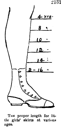
The proper length for little girls' skirts at various ages, a diagram from Harper's Bazar, 1868, "showing a mid-Victorian idea of how the hemline should descend from slightly longer than knee-length for a girl of 4 years old to almost ankle-length for a girl of 16."
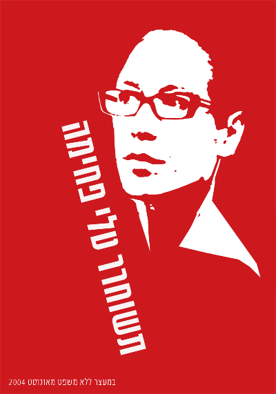
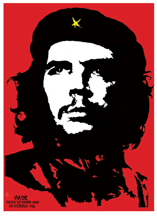
In these political posters of Tali Fahima by Ronen Eidelman, and Che Guevara by Jim Fitzpatrick (1968), the portrait is represented as a flat graphic. The contrast between the vibrant red, black and paper white is intense. The message is quickly understood through a design that is both minimal and powerful.
The Pen Tool
The Pen tool (Bezier) is prominently used for creating flat graphics or line art. It can be used to make complicated forms by tracing images and combining simple shapes. In addition to contouring and tracing, the Pen tool is often used to create shapes that are used for masking. The Pen tool can be a little difficult to learn, as the process of using this tool sometimes feels counter-intuitive. The artist has to know where her next point is before plotting it. Visualizing lines, shapes, and space before they exist can be challenging. In this exercise the paintbrush is used to create quick gesture drawings of the lines and shapes that will be recreated accurately with the Pen tool to eliminate the type of forethought that accompanies the use of this tool. With enough practice on top of template layers, newbies are sure to develop Pen tool intuition.
Exercise 1: Gesture drawings on a template layer
1. Start with a new document in Inkscape set to standard letter size dimensions.
2. To begin, we will set up a template layer with quick, gesture strokes using the Pencil tool. Select the Pencil tool and click and drag to draw a roughly straight line.
| Key Command: Another way to deselect an object in Inkscape is to press the Escape key. |
3. Draw a triangle with the Pencil tool. The results of the drawings are vector shapes.
4. Draw the remaining curves illustrated in our screen shot.
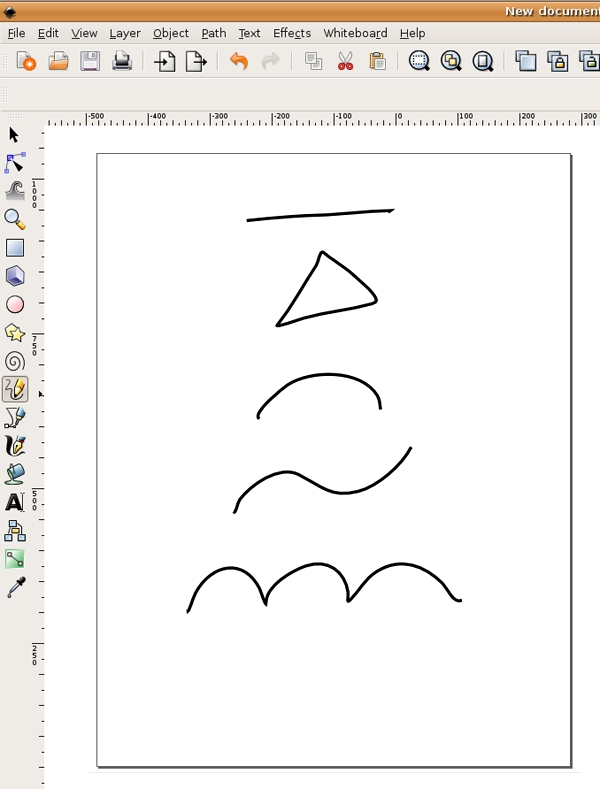
5. Open the Layer dailog (Layer > Layers). Click the lock icon to the left of the words "Layer 1" to lock the layer, so that you will not accidentally modify your freehand work. Set the opacity of Layer 1 to 30%.
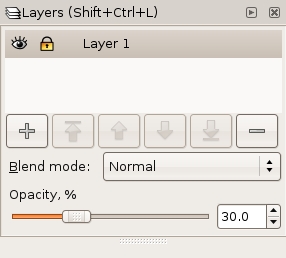
6. Create a new layer called "Layer 2" in the Layer dialog by clicking the Create a new layer button, which looks like a plus (+) sign. We will use the Pen tool on Layer 2.
Exercise 2: Recreating straight lines with the Pen tool
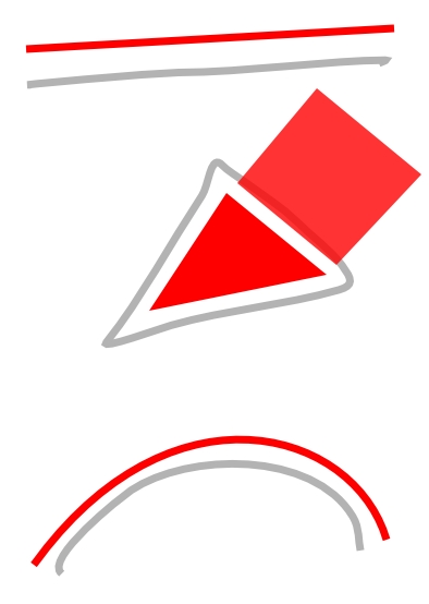
1. Select the Pen tool from the Toolbox. Note that the mouse-over tool tip for the Pen tool says "Draw Bezier curves and straight lines." The Pen tool plots anchor points each time you click the mouse. To make a straight line, click one time at the beginning of the line, release the mouse, move the mouse to the end of the line, and click again. Press the Enter key to finish. In two clicks, the Pen tool creates two anchor points and joins the points with a straight line.
2. To make your Pen tool lines draw in red, select the line you just drew using the Selector tool. Open the Fill and Stroke dialog by choosing Object > Fill and Stroke and change the stroke color to red. Make sure the fill color is set to "No paint" (X).

3. Once the line is made, it can be modified by the Selector tool for moving, rotating, or transforming, or by the Node tool for modifying one node (or anchor point) at a time. Using the Node tool, click once on the line to see its nodes, then click on the node at the end of the line and drag it to increase the length of the line.

| Watch for this: In Inkscape, the nodes turn red as the mouse hovers near them, making it easier to find the nodes when nothing is selected. |
4. Use the Selector tool to select the line and change the weight of the stroke using the Fill and Stroke dialog. Notice how the line can be bold and aggressive with a larger stroke size or faint and slim with a stroke size that is less than 1 point.

Part A: Recreate the triangle with the Pen tool
1. Switch to the Pen tool. Click once at one corner of the triangle with the Pen tool. Release the mouse. Click on the next corner of the triangle. Release the mouse. Click on the third corner of the triangle. Release the mouse. The fourth click needs to be exactly where the first node was made.
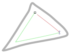
Image Caption: Notice in this image that the Pen tool displays a small square where you first clicked, symbolizing that the path is closed and a whole object is made when the last click with the Pen tool is made directly on the first anchor point. This is referred to as "closing the path." When a path is closed, or a shape is whole, it is easy to fill the shape with a color using the Selector tool and the color palettes.
2. Select the triangle with the Selector tool if it isn't already selected. Right click on the Fill and Stroke dialog in the bottom left area of the page and select "Swap fill and stroke."
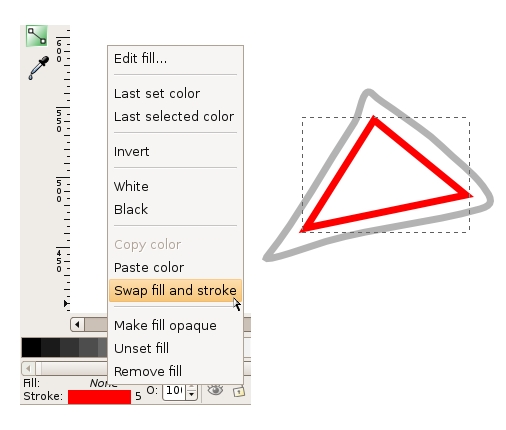
The stroke and fill colors switch places. In our example, the triangle becomes red with no stroke, as opposed to a triangle with no fill that is outlined in red.
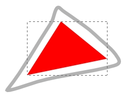
Part B: Modify nodes using the Node tool
Just for practice, use the Node tool to modify two nodes at a time. Click on one node of the triangle. Hold the Shift key and click a second node. Now one whole side is selected. Begin dragging the mouse to move both nodes at one time. You can click and drag with the mouse to move these anchor points, or you can use the up, down, left, and right Arrow keys on the keypad. Pressing the Shift key while you press an arrow key moves the node 10 times as fast. You can also place your mouse on an edge of a shape (on a line between two nodes) and click and drag to change the curvature of that particular edge.
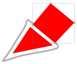
Part C: Create a second shape to add dimensionality
1. Begin by creating a parallelogram using the Pen tool. Plot the first node near the top of the first triangle.
2. Use the edge of the first triangle to help visualize the dimensionality of this new shape. Plot the second node to create a parallel line between the two shapes.
3. Set the third node so the area recedes in space, creating a unified perspective between the two shapes.
4. Close the path by using your fifth mouse click to return to the first anchor point. If the shape isn't perfect, you can always go back with the Node tool to modify individual nodes.
Part D: Atmospheric Perspective
Stand outside early in the morning or at twilight and look far down the street towards the horizon. Objects that are further away appear less saturated than those that are near. Atmospheric perspective accounts for the perceptual change that happens to the overall opacity of objects as they recede in space.
1. Select the parallelogram. Open the Fill and Stroke dialog and fill it with the same color you used in the triangle.
2. While the second triangle is still selected, change its opacity to 80% in the Fill and Stroke dialog.
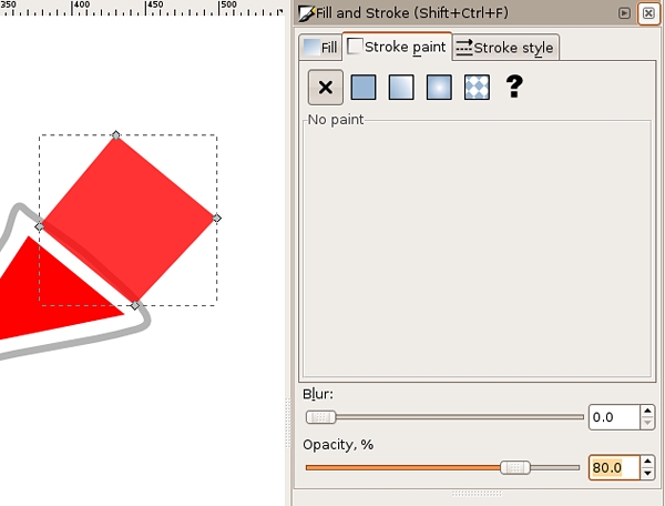
Flat, basic shapes created with the Pen tool can be combined to imply complicated shapes and three-dimensional space.
Exercise 3: Curves
Part A: One curve
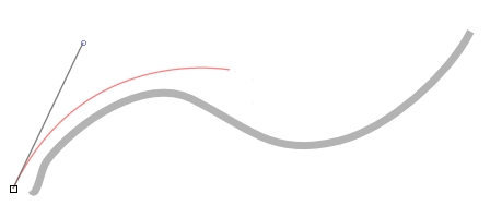
1. The first curve is created in two points. The first anchor point is made by clicking and dragging the mouse slightly upward, tangent to the curve, to imply the direction of the curve. Do not drag all the way over the curve like you are using a pencil or paintbrush, this tool does not work like a pencil or paintbrush. Release the mouse.
| Watch Out! If you set the Pen tool with a fill and no stroke, the path is filled with color as each point is plotted with the tool. This can be confusing, even to professionals, while initially setting anchor points. |
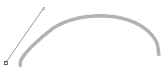
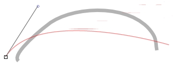
2. Click once at the end of the curve and drag slightly downward until the curve looks similar to the template. Don't worry if it's not perfect; we'll adjust it in a moment. Press the Enter key to finish.
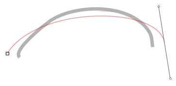
3. Deselect the curve by pressing the Escape key.
Part B: Bezier Handles
Tip
|
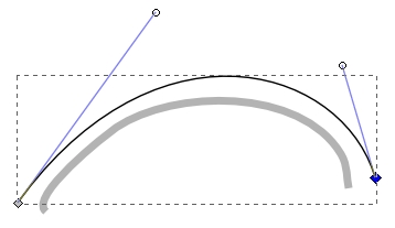
1. Use the Node tool to click on the curve you just completed. You will have one curve with two nodes. Each node will also have bezier handles at each end.
2. Bezier handles are used to modify sections of the curved line by pulling on the midpoint of the curve so that the curve runs tangent to the handles. Pull the bezier handles until the curve matches the template.
Part C: Two curves in a row
1. Click and drag with the Pen tool in the direction of the first curve. Release the mouse.
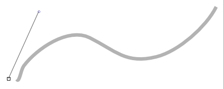
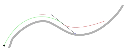
2. Click at the end of the first curve; this tells the Pen tool the direction of the next curve. Release the mouse.
3. Click at the end point of the last curve and the final curve is made between the last two anchor points. Press the Enter key to finish.
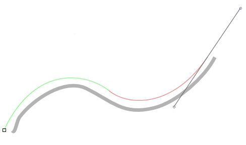
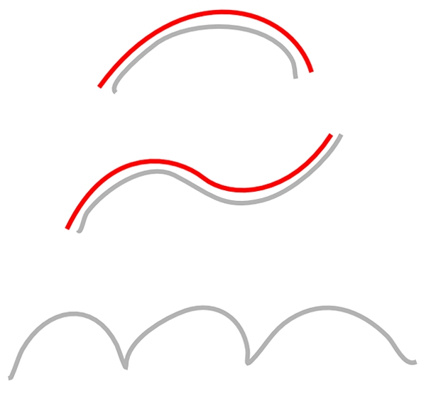
When you are working with the Pen tool, you have to think ahead of the tool, towards the place where the line changes. The best places to click are called inflection points, where the curve changes direction.
Exercise 4: Curves and angles
The last sample on the template is an example of 3 curves joined together. In order to trace this, we will use two different types of nodes; smooth nodes (the default for the Pen tool and the type of nodes which we have been using so far) and corner nodes (which create sharp angles).
1. Using the Pen tool, click and hold down your mouse button at the beginning of the first curve and drag the mouse out to create a bezier handle in the curve's direction. The bezier handle is indicated by a black line.

2. Release the mouse button to reveal the first curve, indicated by a red line.
3. Move your mouse to the sharp corner where the first and second curves join. Click and hold your mouse button, dragging your mouse to finish modifying the shape of the first curve with another bezier handle. Continue to hold down your left mouse button.

4. To draw the second curve with a sharp change in direction from the first one, press and hold the Shift key, which puts the Pen tool in corner node mode. Drag the second half of the bezier handle in the direction of the second curve.

5. Release the left mouse button, followed by the Shift key to reveal the second curve. Always release the mouse before releasing keys.

6. Repeat steps 3-5 to create and reveal the start of the third curve.


7. Click and hold down your mouse button, dragging your mouse to finish modifying the shape of the final curve. Release the mouse button and press the Enter key to finish using the Pen tool.

8. Use the Node tool to fine-tune the bezier handles.


By understanding how to create straight lines and curves, and by converting anchor points from curves to angles or angles to curves, any image can be traced.
Exercise 5: Tracing an image and creating a clipping mask
Clipping Masks
The Pen tool is often used in combination with images or vector art to create clipping masks. A clipping mask is used to redefine which parts of an object are revealed to the viewer. They are commonly used on photographic images to "remove the background" from a figure in the image.
For this exercise, place any image onto the template layer and trace it with the Pen tool on Layer 2. An image of a human figure is a challenge as it always includes a combination of curves and straight lines. In this example we will use a public domain image of a Vulcan Salute.
First the Pen tool will be used to draw a path around the arm, then the resultant path is used as a clipping mask to hide the rest of the photograph.
1. Create a new layer (in our example the new layer is named Vulcan Hand) and turn off the eyeball icons on the other two layers to hide them while you are working on this new exercise.
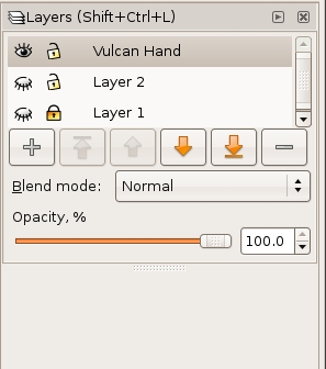
2. Choose File > Import to place the image of the hand (or any other image) on the new layer.
| Watch Out: By default, Inkscape links files rather than embedding them within a document. This can be useful as the file size of the .svg document is not affected by large images. However, linked files must remain available on the hard disk in the same relative position as they were when the relationship between the linked image and .svg file was created in order to view and print the document. |
3. Set the opacity of the Vulcan Hand layer to 30% and create a new layer (in our example, called Vulcan Hand Tracing) above it.
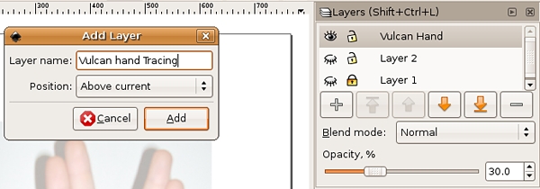
4. Use the Pen tool to trace the hand. Remember to start and stop on the same anchor point. Also remember that the path doesn't have to be perfect, as the Node tool can be used to modify it once it has been created.
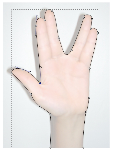
5. To transform the path into a clipping mask, you will select both the path and the image. Use the Selector tool to click on and select the path first, then press the Shift key and click on the photograph. You will see dotted lines around the path you just plotted and dotted lines and transformation arrows around the corners of the photograph. Choose Object > Clip > Set.
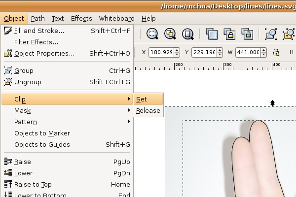
A clipping mask is used to define the areas that are revealed to the viewer, while any part of the image outside of the path is hidden.
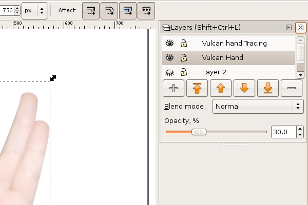
In this image, the result of the clipping mask is noticeable on the Vulcan Hand layer.
|
Tip: If you are making a clipping mask, you should have a path that is placed inside the photographic image. That is, the photographic image should be larger than the path that will be used to mask it. If the path is larger than the entire image, the mask will simply reveal everything, in which case you don’t really need a mask. Tip: Be sure to click on the path, then shift-click the photographic image someplace outside of the path. Shift-clicking inside an area that includes both the path and the image deselects everything. |
6. When an image has a mask applied to it, the image and the mask are grouped together and can be manipulated by the Selector tool as a single unit.
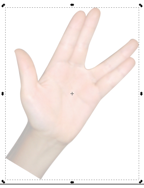
Final notes about Clipping masks
We aren't doing this in the exercises, but you should know that you can release the image from its mask at any time by selecting the masked image and choosing Object > Clip > Release. This allows you to modify the image or the path of the mask separately. Repeat the process in step 5 to re-set the mask on the image. To delete a clipping mask, release it and you will see both the path that was used as the mask and the photographic. The two separate objects can be deleted or modified individually.


