


Symmetry and Gestalt
Symmetry is achieved when the weight of a composition is evenly balanced. Symmetrical forms are perceived as being stable. In order to achieve symmetry in any composition, the designer must create balance with the compositional objects in both their positive and negative spaces in relationship to the grid. The positive space often contains the active design elements while the negative space in a symmetrical composition is usually passive.
The opposite of symmetry is asymmetry. Asymmetric compositions can be balanced or imbalanced, but the overall weight distribution between the positive and negative space will be uneven. The negative space in an asymmetric composition may be more active than the positive space.
The designer chooses to create symmetry or asymmetry within the composition in order to reach the visual or psychological expectations of her audience. These decisions connect the concept of the presented material to the presentation. For example, a logo for a bank should feel secure and restful, connoting safety and trustworthiness, while a horror movie poster should feel emotionally charged, suspenseful and frightful. Logos for banks tend to be symmetric compositions, and asymmetric designs are used to convey unstable ideas.
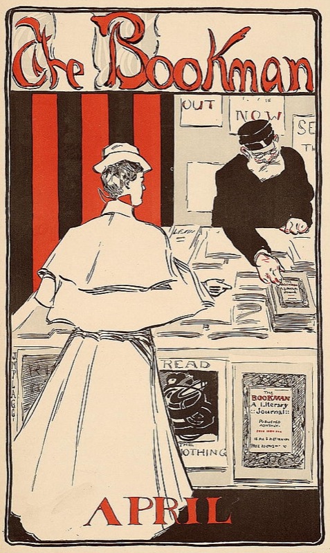
The Bookman, Advertisement for the New York literary journal, "The Bookman", April 1896. This advertisement is symmetric as the scale and lightness of the female figure in the foreground is counterbalanced by the scale and darkness of the male figure on the right side of the image. The symmetry is reflected over the y-axis in the center of the composition. The typography is centered at both the top and bottom portions of the advertisement.
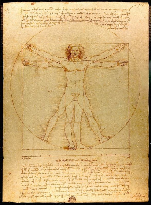
Vitruvian Man, Leonardo da Vinci, Drawing on paper, 1492. Photograph by Luc Viatore, 2007. Leonardo da Vinci's classic drawing of the human form demonstrates the principle of symmetry in the human body.
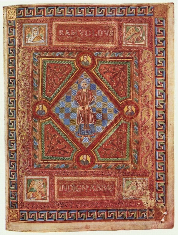
Codex Aureus of St. Emmeram, Scene: Portrait of Abbot Ramwoldus, Book painting on parchment by Adalpertus, 1000. Symmetry is achieved in Adalpertus' book painting across both the x and y axes.
Exercise 1: Creating symmetry and asymmetry with your body
Before touching the pencil or mouse, you can exercise these design principles as lessons in weight distribution.
The grid is created by the x-axis along the hips and the y-axis from the toes to the head.
- Standing straight, with perfect posture, and your body weight equally balanced on two feet (with legs hip-width apart and a slight bend in the knee, if we might be so specific), puts a body in a stable, symmetric position.
- Now that you have achieved symmetry, lift one foot off of the floor. Bend the lifted leg at the knee as much as possible without falling over. You will feel less stable and off-balance. Your body has achieved asymmetry.
Results of some arrangements made in Chapter 3 Exercises

In the following exercises (2 - 7) the compositions will each be created within individual squares (a few of which are illustrated here). All of the exercises are created in one single document, established in Exercise 2. For these compositions the grid is simple: the horizontal and vertical intersection at the middle of each square is the grid. See and "feel" the visual weight that is constructed between the four quadrants (upper left, right, lower left and right) in each composition.
Exercise 2: Symmetry with passive negative space
In this exercise, the black circle in the center of the composition is the positive space and the white surrounding area is the negative space. The negative space is not active, it is dictated by the active positive form. The circle is evenly distributed within the composition. It is perfectly symmetric in relation to both the x and y axes, from the left to the right and the top to the bottom.
1. Create a new document in Inkscape using File > New, then choose File > Document Properties to select the US Letter page size of 8.5 x 11 inches.
2. Choose the Rectangle tool. While pressing the Control key, click and drag your mouse across the Canvas to create a square. Ours is 1.5 x 1.5 inches (you can set the exact dimensions of the W(idth) and H(eight) in the Tool Controls bar above the Canvas).

3. Select the square by clicking on it with the Selector tool. Choose Object > Fill and Stroke to set the fill color to white, the stroke color to black, and the stroke style width to a value you choose - ours is 2px.
4. Select the square by clicking on it with the Selector tool if it is not still selected. Create a 4x4 tile of these squares by choosing Edit > Clone > Create Tiled Clones, then using the Symmetry tab to set the value for both Rows and Columns to 4. Click the Create button. There will be an extra duplicate tile in the top left corner. Select it with the Selector tool then delete it by pressing the Delete or Backspace key.

5. Select all 16 squares by marqueeing around them with the Selector tool. Create spacing between the squares by choosing Object > Rows and Columns and setting "Rows and Columns" to 4 x 4 and spacing to some value of your choosing - we used 30x30 px.

6. Group the 16 squares by selecting them all again, then choosing Object > Group. Grouped objects can be moved, transformed, and edited as one unit while their individual properties are maintained. Move the grid of squares to the center of the document.
7. Choose Layer Menu > Layers to view the Layers dialog. The default name for the layer you are working on is Layer 1, but you can double-click on the layer name to rename it to something more descriptive, like Grid.
8. Use the Layer Menu > Add Layer to add a new layer above the one you are working on. Assign it a descriptive title like Dots.
9. In the Layers dialog, click on the lock icon next to the eyeball at the left of the Grid layer. The lock icon will change from an open lock to a closed one, indicating that the layer is locked. Locked layers cannot be modified until they are unlocked. This is a protective measure that a designer often takes when part of a project is complete and she doesn't want to accidentally select or move objects that are already established.

10. Make sure that the Dots layer is selected before proceeding as you want to edit on the new layer, not the underlying grid of squares.
11. Create a black circle in the middle of the top left square with the Ellipse tool. Choose this tool then click and drag within the top left square. Press the Control key once you begin dragging the mouse so that the ellipse is constrained to a perfect circle. Choose Object > Fill and Stroke and set black as the fill color of the circle you just created.


Exercise 3: Symmetry with less passive negative space
In this exercise, the two new circles create a balanced, symmetric composition. The visual weight is the same in the four quadrants created by the intersection of the x and y axes; and the circles are reflective over a diagonal line. However, notice the tension between the two circles at the middle of the page. This tension is created when the two active forms are so near to each other that the eye cannot help but notice the negative space between them. The negative space fights for the viewer's attention. Therefore, the negative space is slightly less passive than it was in the first exercise.

1. Copy the black circle using the Selector tool to select it, then Edit > Copy followed by Edit > Paste to create a copy. Using the Selector tool, drag the new copy into place one square to the right of the original circle.
| Watch Out For This: If you are new to using the mouse and the keyboard together, practice using your non-mouse hand to activate hot-keys while keeping your mouse-hand on the mouse. It is ineffective to lift up the mouse hand |
2. The new circle should still be selected, and transformation arrows surround the edges of the selected area. Use the Selector tool to reduce the scale of the circle by clicking and dragging on one of the four transformation arrows at the corner of the circle while pressing the Control key.

3. Create another copy of this circle using the Selector tool and Edit > Copy followed by Edit > Paste. Nudge the circle into position by using the left, right, up, and down Arrow keys. The Arrow keys will move the selected object by just one unit. Pressing the Shift key while pressing the arrow keys moves the object in increments of 10.

Exercise 4: Balanced asymmetry
In this exercise the two circles create an asymmetric composition. The weight distribution between the four quadrants of the composition is not even, as most of the visual weight is felt in the upper left quadrant. The composition does remain balanced, as the negative space between the two circles activates the viewer's attention and becomes part of the visual weight on the page. The white area is still the negative space; however, the white area between the two circles is within the path of the viewer's eye movement from the top (larger) circle to the bottom (smaller) circle.
1. Copy the second circle from the previous exercise and drag it into position in the third square.
| Watch Out: Did your circle turn into an ellipse? Without holding the Ctrl key, the circles transforms into ellipses. Be sure to release the mouse before releasing the key when drawing forms that are modified by a keyboard command. |
2. Make another copy of this circle and drag it to the lower right of the composition.

3. Scale the circle down with the Selector tool while pressing the Control key.
Exercise 5: Asymmetry with imbalanced visual weight
In this exercise, the negative space is the white area surrounding the four black circles. The four black circles are asymmetric in regards to the overall composition. The negative space creates more mass than the positive space, and the four black circles pull the viewer's eye to the bottom of the composition. What is also noteworthy about this exercise is that the four black circles are read as a line by the gestalt law of similarity, where like elements (four circles) are read as a whole line before being perceived individually.
1. Copy the smaller circle in the fourth rectangle and move it to the empty composition to the right.
2. Create three copies of the small circle within the composition.

3. Select all four circles using the Selector tool by clicking and dragging around them, or by selecting the first circle and then pressing the Shift key while clicking on each one time with the mouse to add the remaining circles to the selection.
| In the lab, we call this "Shift-clicking". Since we will probably refer to "Shift-clicking" in future chapters, this always means pressing the Shift key while clicking on an object in order to add it to a selection. |
4. With the four circles selected, view the Align and Distribute dialog by choosing Object > Align and Distribute. This dialog will be used to distribute the four small circles evenly. Click on the Center on horizontal axis button (2nd row from the top, 3rd from left) and then the Distribute centers equidistantly horizontal button (3rd row from the top, 2nd from left) to line the circles up vertically and create even spacing between them.

Exercise 6: Symmetry with patterning
Gestalt psychology is important to visual creators because it provides a theory for the way humans perceive groups of shapes in a composition. While there are four distinct properties and six laws, one of the main themes is the understanding that viewers see a group of like objects as a whole unit before seeing the individual parts. Termed the law of similarity, the individual circles will be read only after the viewer sees the entire pattern presented here as a square. It's nearly magic: a group of circles becomes a square.
1. Select all four of the circles in the row in Exercise 5. Click on the Object Menu > Group. Grouping objects is convenient as the separate objects maintain their autonomy while acting as part of a set that moves, transforms, and receives color information together. Grouped objects can always be un-grouped by choosing Object > Ungroup.
| Hot key: Command+G is the hot key for grouping objects. Command+Shift+G is the hot key for ungrouping objects. |
2. Copy and paste the row of circles four times into the next composition, so that there are 16 small circles within the composition. Use the Align and Distribute dialog to fix the rows if they aren't organized (try selecting all four rows and using the button "Align left sides").
3. Select all four rows and click the Distribute centers equidistantly vertical button.


Exercise 7: A focal point is defined within symmetric patterning
In the last exercise, the repetition of the sixteen circles created a pattern. In this exercise, the repetition is broken by changing the value and hue of one circle (one part of the whole) in the lower right quadrant of the composition. A focal point is created by the contrast of value and hue. When the contrast between like and unlike forms is as extreme as it is in this exercise, the designer can direct the viewer's eye to a particular part of the composition. Utilizing contrast to create a focal point is an essential design skill.
1. Select all of the circles in Exercise 6 and copy-paste them to the next composition square.
2. Once the group of black circles is composed in the last composition space, change the fill color of one of the individual circles to create a focal point. All of the black circles are part of a group, so you will have to select the group of the individual circle you wish to modify and click (Object > Ungroup) first. You may have to ungroup twice to get to the level of individual circles.
3. Once you have selected just the individual circle whose color you want to change, choose the Fill and Stroke dialog (Object > Fill and Stroke) to alter the fill color. Notice that as the value lightens, the contrast increases.

Exercise 8: Free play
Use the remainder of the composition squares to make arrangements of your choosing.