Choosing colors
If you were going to make a layout for a book only consisting of text, you may not consider color, but for most page layouts color is an important feature. Many text layouts at the least use color to highlight the text, or even applied to the fonts in some areas. There are a number of color palettes included with Scribus, but in addition you may edit, remix, or add colors to create your own sets of color palettes.
Color models
The set of colors you may use depends on by what method the colors are created, and how they will be viewed by the reader of your work.
Gamut
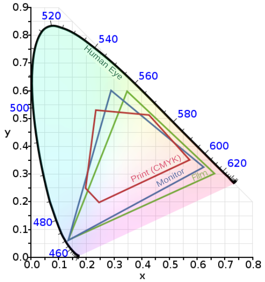
Although you might consider defining colors as only those which the human eye can see, you first must realize that the eye does not perceive all possible colors.

This graph is a depiction of the boundaries of human eye perception, an RGB computer monitor, and CMYK. In particular, consider the limitations imposed by generating a layout in RGB, then printing this in CMYK.
RGB
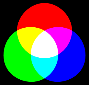
Nowadays we are highly familiar with this color model, since it is the one used in computer monitor displays. From the elemental colors Red, Green, and Blue, we use an additive process to create a balanced (gray) color, which at its highest brightness will approach white.

The RGB model offers a very wide gamut of color, some theoretically beyond human perception. As computer monitors improve, there is an increasing ability to display more of this spectrum. At the same time, a designer working in DTP for print must remain aware of limitations of print, and avoid extremes of hues.
CMYK
The CMYK (Cyan, Magenta, Yellow, and blacK) color model is of course the basis of printing, where these colors of ink are often used. Ink color is subtractive, since for example, a magenta ink is absorbing light, but reflecting that which is perceived as a magenta color. If you add cyan, you also absorb the light which cyan ink absorbs, so even less is reflected. The correct balance of cyan, magenta, and yellow approaches black. A truly black color, as well as shades of neutral gray can be produced with black ink.

As shown in the graph above, the CMYK gamut is smaller than RGB, but also note that there are inks which cannot be accurately displayed on a computer monitor. In addition, there are specialty inks like silver metallic that would have no representation in an RGB scheme.
Grayscale
Although in theory one can find RGB values or CMY combinations which are more or less gray, as a color model grayscale contains no color information, only a representation of the degree of blackness.
On your computer screen, grayscale must of course be represented by mixing the RGB colors it uses. In print, however, this is not necessarily the case, although some particularly intense blacks can be created using all the C, M, Y, and K inks. A minor issue here is cost, but also that using more different inks is time consuming and requires painstaking alignment for each reprinting with a new color. Thus, if possible, one might wish to use one or two colors only.
Duotone
In these situations we then might consider duotone, monotone, or trichrome, where one intentionally processes the color information to make use of a restricted number of inks. In this case, one might use unique colors of very particular hues, known as spot colors, to achieve this end.
Composing your palette
Whether it might come from some already created palette or one you create yourself, choosing a palette is an essential step in the creation of your document. Its importance relates to its ability to set a mood for your project and also affects legibility.
Sorting colors
Scribus has a dialog dedicated to Colors, brought up with the menu selection Edit > Colors. You will have a default selection of colors, each of which has a name, but also has an indicator which shows the color model used:
- CMYK – this is a color defined in this color space. What you see on screen is likely an inaccurate representation of how this will look in print.
- RGB –this is of course the native color model for your monitor, and while you can expect Scribus to convert to CMYK if your intended output is for a printer, you may easily lose some of the vibrancy you see on screen. On the other hand, if you are making a PDF primarily for web use, no such limitation will occur.
- Grayscale – if you wish to work in grayscale, clicking Delete Unused Colors will reduce your palette to White and Black, and Registration.
- Duotone – here again, Delete Unused Colors may be helpful as a starting point, after which you can choose colors to be used in your limited palette.
Note that removing colors doesn't absolutely eliminate their use in your document. If you import an image or graphic with color, these will still be in the output. Therefore, you must pre-process your images to grayscale if that is what you wish the output to in fact be.
Create colors
Once you have reduced your list of colors to its essentials, you are ready to complete your palette.
To add a color, click the New button. To change an existing color, click Edit. The dialog which appears next gives you a number of parameters to choose or edit. If you are making a new color, you may want to immediately choose a name for your color, and its color space, CMYK or RGB.
At the top and right of the dialog you see your default HSV Color Map, which gives you the entire range of color within your color space. Other choices will give you the colors from the various palettes included with Scribus, and in addition any palette you may have created and saved. You can either use these colors as they are, or modify them according to your needs, in which case you should change the name to avoid confusion.
The sliders underneath your new or chosen color allow you to modify the hue and saturation as you wish.
Spot Color
Spot colors are a special ink, frequently proprietary, with a premixed formula, used to precisely define a color for repetitive use, and may allow for limiting the number of inks used in printing. A commercial business may choose one or more spot colors for its logo.
Because these are premixed, you cannot modify the hue or other parameters and still use this spot color ink, even though Scribus will certainly allow these edits. If you include such a color without changing its name, your printer will use the original spot color.
Where possible, Scribus has made an attempt to include a number of spot color palettes from various vendors, and some other palettes as described by various government agencies.
Choosing colors
This echoes the title of this chapter, but now we begin to discuss the choice of specific colors for your document. This is a daunting prospect for beginners, to which some may react by excessively reducing their color set, and others by using a large palette in some sort of unbridled way. So here we will try to explain a rational approach. Begin by considering how the colors you use affect the mood of your document and how your colors interact with each other.
There is fortunately within Scribus a tool which can help with choices, the Color Wheel, brought up by clicking Extras > Color Wheel.
There is a fairly detailed description of the Color Wheel in the English version of the online manual. Here we will try to go over some overall concepts. For whichever color scheme you choose, you begin with a base color. This is a color you will definitely wish to use, and will use the Color Wheel to help you choose what others to use with it.
Now we see the various schemes – Monochromatic, Analogous, Complementary, Split Complementary, Triadic, and Tetradic. Monochromatic is perhaps the simplest, with two variations on your base color having more brightness or darkness, but the same hue. The rest of the schemes allow for choosing palettes with colors which are related (analogous), or those which offer the greatest contrast (complementary).
Replacing colors
It is very much worth mentioning that, should you use some color in your document, then change your mind yet not actually want to edit the original, you have the option by using Edit > Replace Colors... to change a color wherever it is used to a different one. This will not eliminate the original from your palette.
Patterns
Admittedly, it is far from obvious, but you also have the capability of saving and using patterns for use as a background fill for various objects. Once you become familiar with them, you may create or import some patterns, just as you prepare your color palette.
Getting patterns
Just as clicking Edit > Colors will bring up a dialog for colors, you can click Edit > Patterns to bring up a dialog to manage patterns. The first time you do this, you will no doubt be disappointed to see that there are no default patterns. You can easily find a number of free patterns on the web, typically in a zipped file. After you unzip, look for bitmap files – you will not be able to use files ending with .pat in case you run across these. Make sure you understand the licensing terms of any patterns you might download, since for example, they may allow for free personal use, but not in any commercial project.
Load individual patterns with Load File, or load an entire directory of patterns with Load Set.
Making your own patterns
From most objects you can create a pattern by right-clicking for the context menu, then choosing Send to Patterns.
Using patterns
Use patterns as you would a fill color. In the Color tab of Properties, clicking the button just below the selector for fill opens a drop-down list, which includes Patterns, and will show what patterns you have available. Note that if you have no patterns, this choice will not appear.
Now choose your pattern, after which you may adjust the position, scale, rotation, and opacity of your pattern. A limitation with setting a low opacity (more transparent) at this point is that content of a text or image frame will also be affected. You can work around this by adjusting the opacity of your object before you Send to Patterns.


