Color management
Sooner or later, anyone who works with layout and the graphical workflow will become concerned about the color rendering of a document once it is actually printed. You need to become familiar with the constraints which your document is under, depending on the format in which it will be published, and what sorts of problems may surface during printing. In order to minimize various problems, usage of color management is advised. This involves a series of steps, in an attempt to limit variability in anticipation of expected problems. At the core of color management are color profiles, commonly known as ICC profiles, which aim to act as a bridge between color spaces.
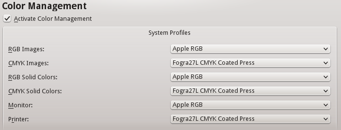
In Scribus, color management is accessible via File > Preferences > Color Management for global changes to act as your defaults, and through File > Document Settings > Color Management to be applied only to the currently open document.

Profile acquisition
The colors of the bitmap or vector image file are the initial source of color data. In photography, the camera is responsible for transmitting the information about the profile along with the image. If a scanned image is used, the scanner will supply this information. For a vector image, the software which created the vector image should include this information in the file. We can see the complexity created when we begin with a photograph from a camera (one profile), which is then printed (a second profile), then scanned (a third profile). Profile management is usually designed to preserve the profile of the original source document.
RGB is ubiquitous
One of the reasons for this is that it allows for a very large range of colors to be represented, thus permitting a finely tuned adjustment of color. In some cases, CMYK may be preferred, especially when this is known to be the final output of the publishing process.
It is also possible, for example when utilitizing a scanner, to create your own custom profiles, in order to have greater control over the final results. There is a methodology to this, and it requires special equipment and expertise to be done properly.
Profiles in Scribus
In Scribus, the profiles are managed in the Preferences Color Management tab as shown above. For RGB images, for example, there is a drop-down list of choices for standard certified profiles that will be applied to images which do not include a profile. Scribus supports CMYK profiles in the same way, allowing a choice of various ISO standard profiles, or a custom profile if you prefer.
The simplest way to add your own profiles is to place them where your operating system automatically stores them. For Windows, this is \Windows\System32\spool\drivers\color. Mac users can either use the share directory /Library/ColorSync/Profiles, or for those who do not have administrator rights, /Users/<username>/LIbrary/ColorSync/Profiles. On Linux distributions the directory is either /usr/share/color/icc, or for those without administrator rights /home/<username>/.color/icc. In these directories, ICC profiles will be automatically loaded when you launch Scribus.
The monitor profile
Ideally, for the best color control, working on screen should include color calibration of the display of your monitor. By definition, this is the RGB colorspace, and demonstrates why having the proper ICC profiles is so important.
Calibration is accomplished with the use of hardware to read the display and software to make adjustments. The method will generate a profile specific for the particular monitor in its particular environment – the brightness of the workspace is also a factor. This profile is then applied to the monitor. Scribus, for its part, allows selection of this profile in the Monitor setting in Preferences. By default, the profile of the manufacturer would be applied, if available.
How the profile is used
Monitor profiles are not intended to override the embedded ICC profile of an image, but rather to adjust the display in order to represent most accurately the actual colors of the objects in the image. Typically the standard white of a monitor will be too bright. The colors and brightness of the room around us will also affect us, depending on whether it might be a sunny or cloudy day. Thus, trying to keep the workspace environment a neutral gray color can be important for consistent work.
Color Profiles
Scribus has chosen to distinguish image profiles from color profiles. This makes it possible to utilize more ambitious bitmap RGB profiles while the user focuses on a different RGB profile better suited to the demands of layout and print (in text and shapes, for example).
Just as there are two drop down menus for choosing profiles for RGB and CMYK images, there are two for RGB and CMYK solid colors in the Color Management dialog in Preferences. The first would be used for output intended for the screen or web, and the latter for actual printing on paper.
Rendering
Profiles will hardly be useful unless you have a way to simulate the document as it will appear in the publication medium. This way you can preview the work to see the limitations of its profile and correct any problems.
Simulated conversion
Profiles contain color information. This is important since the origin of the image will determine how the image and solid colors will be converted to the appropriate color space.
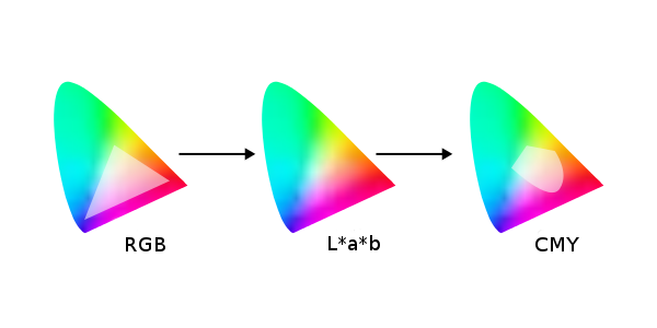
Conversion between color spaces is not made directly, even when those color spaces are similar. Instead there is an intermediary step to the widest possible mode: L*a*b.. Therefore, an RGB profile will first be converted to L*a*b before subsequent conversion to another RGB or CMYK profile. In comparing two different profiles, there will be values in one profile which fall completely outside of the other profile. Thus, you must adjust the entire profile and not just the values which do not match.

Simulating the maximal ink coverage
A profile can also be used to limit the analog result from a digital conversion. For example, and intense black on screen is not a problem. However, when printed, a direct conversion to CMYK values might end up with superimposed ink layers made up of 75% cyan, 65% magenta, 85% yellow, and 90% black, resulting in excessive ink and smearing.
To prevent this smudging, profiles will limit the amount of ink coverage (TAC for total area coverage) that a sheet of paper can accommodate. For some situations, this may be 240% TAC. European standards are limited to 320% or 300%.
Rendering intents
There are several rendering modes suitable for media publication. As with profile management, Scribus distinguishes image profiles from solid color profiles. Thus, you may use the profile best suited to a rendering mode for the particular object.
Rendering modes allow for a screen preview of the color conversion which will later occur when you export your document. There are four modes.
- Perceptible attempts to convert between profiles to preserve the relationship of similar colors, avoiding the creation of tonal bands. It is recommended for print publications.
- Relative Colorimetric focuses mainly on matching colors compared to the original, calibrating the white point for the output paper. It could also be suited for print publication.
- Absolute Colorimetric also attempts to match colors compared to the original, except there is no white point compensation. Therefore, it will be best suited to spot colors, and not useful for images.
- Saturation, as the name implies, will absolutely respect the original colors, at the expense of transitions. Just as with Absolute Colorimetric, it should be used only for spot colors, logos, or symbols.
Simulate Printer on the Screen
You can also display an on-screen preview of what will actually be exported to the particular media, especially in regard to printing equipment. It is possible to customize the simulation by forcing color to match those in the color space of the printer output. Begin by checking Convert all colors to printer space.
Check Mark Colors out of Gamut in order to see the colors which might not print correctly, usually because they do not exist in the destination color space.
Use Black Point Compensation is an operation to balance the contrast of an image to compensate for the mixing of inks. In a photograph, for example, the mixture of black corresponding to the darkest value of the image will be enhanced by the CMYK profile, so that the mixture of inks is not excessive at the time of printing.
Appying color management
Color management begins of course with the acquisition or creation of compositional elements, but the time of software layout is the most critical to determine the color profiles which will ultimately be applied.
User Preferences and settings
By default, color management is determined in the settings in File > Preferences > Color Management. The settings here will be applied to all newly created Scribus documents.
Sometimes, however, you may wish to alter the settings for a particular document. In that case, you might use File > Document Settings > Color Management to change settings for a particular document you are working on.
You can also change settings from the main window, using the Enable/disable Color Management icon to the right in the bottom toolbar, next to the Enable/disable Preview Mode icon. If you click-hold the color management icon, you see a button to click to Configure CMS.
You can, of course, choose not to apply color management, but this may cause significant differences between what you see onscreen and in the printed output.
What profiles should you use?
Profiles are as numerous as the number of different pieces of equipment used to display or print documents. A commercial printer may sometimes create their own profiles for their workflow and infrastructure, or call on specialists to generate them.
Manufacturers will usually provide a profile with the device they produce. Generally, it is advised to use these manufacturer-provided profiles, but you must consider that with time, the accuracy of the profile may shift. Monitor screens in particular, may show changes in colors and brightness over the working day (from heating of components) and over months (from wear). Demanding people will therefore recalibrate profiles using measurement devices to reflect these changes. Some equipment comes with adaptive software to adjust settings to real-time hardware changes. Argyll free software and its derivative such as dispcalGUI can create profiles.
There are also standard profiles which serve as global references in the absence of specific ones. These are generally produced by consortia, official groups who determine, based on media and the available world inks, generic profiles from specifications issued by the ICC (International Color Consortium). For Europe, the ECI (European Color Initiative - eci.org) publishes RGB and CMYK color profiles adapted to the European workflow based on the specifications of Fogra standards and ISO related to color. Profiles available from the ECI are also available in a version limiting maximum ink coverage to 300%. These profiles make an attempt to standardize procedures, and may be a reliable basis for work in the absence of information from the printer.
The difficulty of multimedia publication
There is great difficulty with profiling a document to be posted on the Web. While it is relatively easy and recommended to preview a document made with color profiles corresponding to a particular printing material, you cannot anticipate the screen rendering of a document which will be displayed on a huge range of screens accessing a Web page.
Not only are there a wide range of kinds of hardware for visual display, but some may not have accurate profiles with which they operate. You must accept that a document created with Scribus will not necessarily display accurately wherever it is viewed. The best approach is therefore to rely on the profiles most commonly used for RGB output: sRGB and Adobe RGB.


