


Selecting fonts
In typography, there are a number of terms one runs across, and it's easy to confuse one with another. You may have heard of names like Times, Garamond, Helvetica, Futura, DejaVu, and Droid. We can consider these as "font families". For example, in the DejaVu font family or typeface, we have Sans, Serif, Sans Condensed, and under each of these we may have a bold, or italics, or regular (often termed "Book") style. Then in a given document we may have 12 point or some other size of typeface. Strictly speaking, when we specify a font, it might be DejaVu Sans, Bold, and 10 pt.
It's also good not to confuse characters and glyphs. A character is the letter, number, or symbol one is trying to create. "A" and "B" are two different characters. A glyph is the representation of that character in some particular typeface, so that an "A" in Garamond is a different glyph than an "A" in DejaVu Sans, even though they are the same character.
Historically, of course, printers had and were able to make font sets, cast from lead, which they used until they became so worn they had to be recast. With modern printing methods, these have disappeared and have been replaced with computerized methods for creating fonts of any size and style.
Fonts today
Even though typeface creation no longer involves pouring lead into a cast, we still use the term "font foundry" to apply to the companies who make it their business to create computerized versions of typefaces.
Font characteristics
Most of the typefaces you will see will be either serif or sans serif (often abbreviated as sans). Serifs are small appendages at the various tails of letters, designed to make letters more distinctive. One challenge any typeface encounters is its legibility, or in other words, the ability to discern one character from another. Another is readability, which refers to the ease of reading a body of text. Each of these contributes to some extent to the fatigue one feels in reading large amounts of text, since poor legibility and readability lead to slow reading as well as rereading.


Here we see on top a Serif font, with the serifs highlighted. Below, a Sans Serif font.
Although there are some who feel that serif fonts have better readability, this has not been conclusively proven. There may be some tendency to favor Sans typefaces on the web, and Serif for print, but even this has no clear cut division, especially as we have increasingly high resolution screens to work with.
Letter spacing
Letter spacing in our context here refers to the space between individual letters, for which there are two general schemes, Proportional and Monospaced.
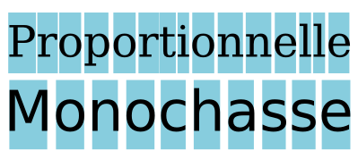
Here is shown the chief difference between these two types, with variable spacing between letters in the proportional typeface. Monospaced typefaces are similar to what may come from a typewriter, and can be useful when vertical alignment of characters is needed.
The main font families
With what we have said as a starting point, it is worth listing the main types of font families in common usage:
- Serif
- Sans serif, or Sans
- Monospaced, or Mono
- Cursive or Script, meant to resemble handwritten characters
- Ornamental or decorative, sometimes with very exotic distortions of glyphs
- Symbols, typically not alphanumeric characters. Dingbats is an example.
Weight
You should be familiar with Bold versus Regular (or Book), but there is a wide range of thicknesses of the glyphs, such as in addition Thin, Light, Demi-Bold, Heavy, and Black.
Italics and oblique
Italics are smaller size glyphs which are generally also more compactly printed, one of the reasons for which being to allow for a greater amount of text per printed page, something of concern when paper and other printing media were more expensive than now. Currently, italics is often used for emphasis, as an alternative or combined with a heavier typeface.
An oblique typeface will also be slanted, but will likely have a spacing similar to the regular version.
Some programs, such as word processors, may artificially create italics and oblique fonts from regular typeface, but for professional layout you should use italics specifically created as a separate typeface, and Scribus will only use an italics typeface specifically created as an italics typeface.
Font files
The fonts which your computer is able to use are contained in a number of files, which consist of the metrics for the font, in other words, the instructions for your computer to create them on screen and for export as a PDF for printing. In case it isn't apparent from the above, Scribus will need a set of metrics for each version of a typeface in order to use it. Therefore, for example, you will need a separate set of metrics for each of the following – DejaVu Sans Book, DejaVu Sans Bold, DejaVu Sans Bold Italic, DejaVu Sans Condensed, DejaVu Sans Condensed Bold, and so on.
There are 3 main categories of font files you will see: TrueType (extension .ttf), OpenType (extension .otf), and PostScript (extension .pfm or .pfb).
Installing new fonts
You should already have a number of fonts on your system, but to install additional fonts there are different procedures depending on your operating system:
- Windows 7/Vista – right-click on the file, choose InstallI.
- Windows XP – put the files into C:\Windows\Fonts
- Mac OS X – double-click on the file, then click button Install font.
- Linux – copy the folder containing the font family to /usr/share/fonts. You may also have a package for the font which can be automatically installed, depending on which version of Linux you are using.
If Scribus is running while you are installing a new font, you will need to restart it, since startup is when Scribus searches for fonts on your system.
Using a custom folder
You can install fonts in almost any location on your computer, but you will then need to tell Scribus about them. After starting Scribus, click File > Preferences > Fonts. You must do this with no document open, then select the Additional Paths tab to help Scribus locate your fonts.
Which fonts should you use?
A guiding principle in your layout is to avoid using a large number of different fonts, even though you may be tempted to try out any number of those fonts sitting in your computer. Use of too many fonts is first of all distracting, but as you become more experienced, you will also see that it is unattractive and takes away from the pleasing and coherent visual appearance you are trying to create.
It should rarely be necessary or desirable to use more than 2 or 3 fonts for most documents. Furthermore, it's a good idea to choose these ahead of time, since the type of font may play a role in the design process of other visual elements. A typical set of choices might be one font for headlines, another for subheadings, and a third for the text body.
Here are some additional essential characteristics you must consider:
- Does the font contain all of the characters I need? Different typefaces will have a variable extent of coverage for various languages or even for special characters like fractions or the copyright symbol.
- Is the encoding correct? Here you want to make sure that when you enter a particular character from your keyboard the correct glyph is shown.
- Are the glyphs appropriate for my use? You should run a test to see that, after export to PDF, the legibility is adequate for your needs. For example, some fonts designed for the web are not of sufficient quality for use in printed material.
- Is this a reliable, good font? Some fonts are simply better designed than others. A better designed font has letter spacing carefully created to allow characters to have a nice, even display in various combinations of glyphs. Again, looking at some sample text in an exported PDF is your best test.
Scribus runs some testing on fonts to ensure they meet some basic quality checks, but this is no replacement for some manual checks on your own. You certainly want to find out about problems with a font as soon as possible in the design and layout process, and not wait until you have gotten to the finished product.
To some extent, there is probably a greater likelihood of some issues with fonts having a huge number of glyphs, due to the work it takes to carefully design so many.
At the present time, Scribus does not adequately support non-Latin languages other than Cyrillic, but this is under active development.
Get help from a font manager
Even a basic system may have dozens of fonts included, and with time you may find you have hundreds, so using a font manager can help you sift through this for the 2 or 3 that you will use in your document.
What these allow for is an easy ability to scan the various glyphs, along with a classification of the font type, and to read metadata, including licensing for the font. Just because a font is free doesn't necessarily mean it allows unrestricted use. In addition, you can use the manager to inactivate fonts you do not want to use, which shortens the list of possible choices.
One such font manager easily available and recommended is Fontmatrix, found at http://fontmatrix.net/, and which has versions for Linux, Windows, and Mac OS X.
An alternative, a bit more simple, is Font manager http://code.google.com/font-manager/
What happens when I open a Scribus document which uses fonts not on my computer?
This might come about when you use a different computer from the the one you created the document on originally, or when you receive a document from someone else.
As soon as a document is loaded, Scribus checks to see that all of its fonts are present on your system. For each that is missing, you will see a dialog appear, suggesting a substitution, or with which you can choose some other font which you do have on your system.
Some reliable fonts to begin with
As we have noted above, not all fonts you may find are adequate for DTP purposes. Here we give a short list of free fonts with open licensing which you can expect to give you quality results in your PDFs.
- Liberation is a font family developed by Red Hat as an alternative to the proprietary Arial, Arial Narrow, Times New Roman, and Courier New. Since they were developed together they show a good consistency of style between them. This family includes Liberation Sans, Liberation Sans Narrow, Liberation Serif, and Liberation Mono.
To download: https://fedora-hosted.org/liberation-fonts/
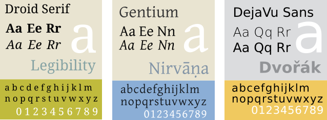
License: GPL v2, with exception for fonts - Droid is a font family developed for the Android operating system, consisting of Droid Sans, Droid Serif, and Droid Mono. As with the Liberation family, the fact they were developed together contributes to consistency.
To download: http://www.droidfonts.com/
License: Apache License v2 - Gentium a very attractive font family developed by Victor Gaultney, and which has some similarities to the classic Garamond font. The family includes Alternative Gentium, Gentium Basic, Gentium Book Basic, Gentium Plus, and Gentium Plus Compact.
To download: http://scripts.sil.org/gentium/
License: SIL Open Font License (OFL) - DejaVu is a font family based on Bitstream Vera, which has a good track record used onscreen. One of its highlights is a huge selection of glyphs – if you need something unusual, check DejaVu. It includes DejaVu Sans, DejaVu Sans Condensed, DejaVu Serif, and DejaVu Mono.
To download: http://dejavu-fonts.org/wiki/Main_Page/
License: specific permissive license, available at http://dejavu-fonts.org/wiki/License - Cantarell is a modern and complete font designed by Dave Crossland, with variations and Bold Oblique.
To download: http://abattis.org/cantarell/
License: SIL Open Font License (OFL)
Finding free fonts
Here are three reliable sources of good quality fonts:
- Open Font Library: http://openfontlibrary.org/
- Google Web Fonts: http://www.google.com/webfonts/
- Font Squirrel: http://www.fontsquirrel.com
A reminder: always check the license of your font before you use it, to be sure that it meets your needs.