


Mobile Browser Interface
How to open Mifos on mobile device
- Currently mobile-optimized pages
- How to change site type
-
- How to change site type temporarily
- How to change site type permanently
Mifos is a system which can be opened not only on computer, but also on mobile devices. You may use specially prepared mobile options, which help you to see Mifos pages optimized for your device. Based on the device you're logging into Mifos with (PC or mobile phone), Mifos will automatically display the version of the UI that is optimal for your screen. Depending on your needs, you can set the site type permanently or temporarily.
You have also an alternate way to access Mifos by using Mifos Android Client which is mobile version of Mifos. Mobile client allows user to view the most important information about the customers and accounts and to perform the basic financial operations. To see more information click <LINK>
Currently mobile-optimized pages:
Currently you can view the mobile optimized interface for the following sections of the Mifos application:
text-indent: 0in; ">
- Home page
- Selected date option
- Borrowers & Accounts page
- Client and accounts pages
- View center details
- View group details
- View client details
- View account details
- Search results
In the future it will be updated, so more pages will provide mobile options.
How to change site type
Mifos is by default set to automatically render pages based on device type. If you run Mifos on mobile device (i.e. smartphone, feature phone, etc.), then mobile version of web page is automatically loaded. But if you prefer to view Mifos pages in standard way then you can use 'Switch site type' link (this option does not cause permanent changes and after next launch system you will see website as it was set in Your settings) or set different site type permanently in Your settings area.
How to change site type temporarily
1. Click the Switch site type link on the top of the page.
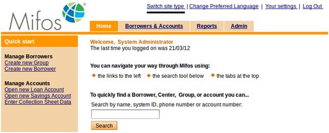
2. Page will be loaded in mobile version as shown below:

How to change site type permanently
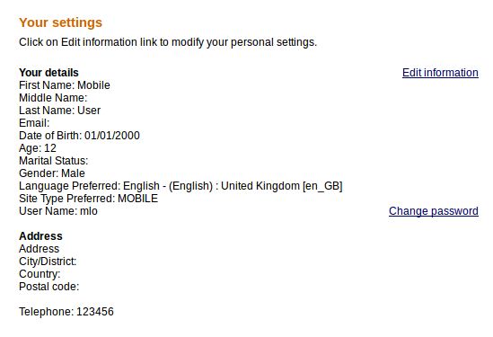
1. In the upper right corner of the Mifos screen, click Your settings. A list of all current settings appears.
2. Click Edit information link.
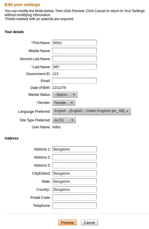
3. Select desired option from the Site Type Preferred dropdown list (AUTO, MOBILE, NORMAL).
You have three site type preferred options to choose form the drop down list:
AUTO – dynamically selects which pages to render based on device type (i.e. smartphone, feature phone, PC, etc)
MOBILE – force mobile options and display web site in smaller size regardless of kind of device
NORMAL – force normal size of displayed web size regardless of kind of device
4. After selecting desired site type, click Preview to review the list.
5. When you are satisfied with the site type, click Submit. (or click Cancel if you decide not to change site type at this time).